- Login/Sign Up for IBM Cloud
- Slides
- Workshop Replay
- Survey (We really appreciate any feedback :D)
- Follow Our Meetup Page to get updates on our events
- Check IBM Developer to learn and explore a variety technologies and services that you're interested in
- Dashboard Result HERE
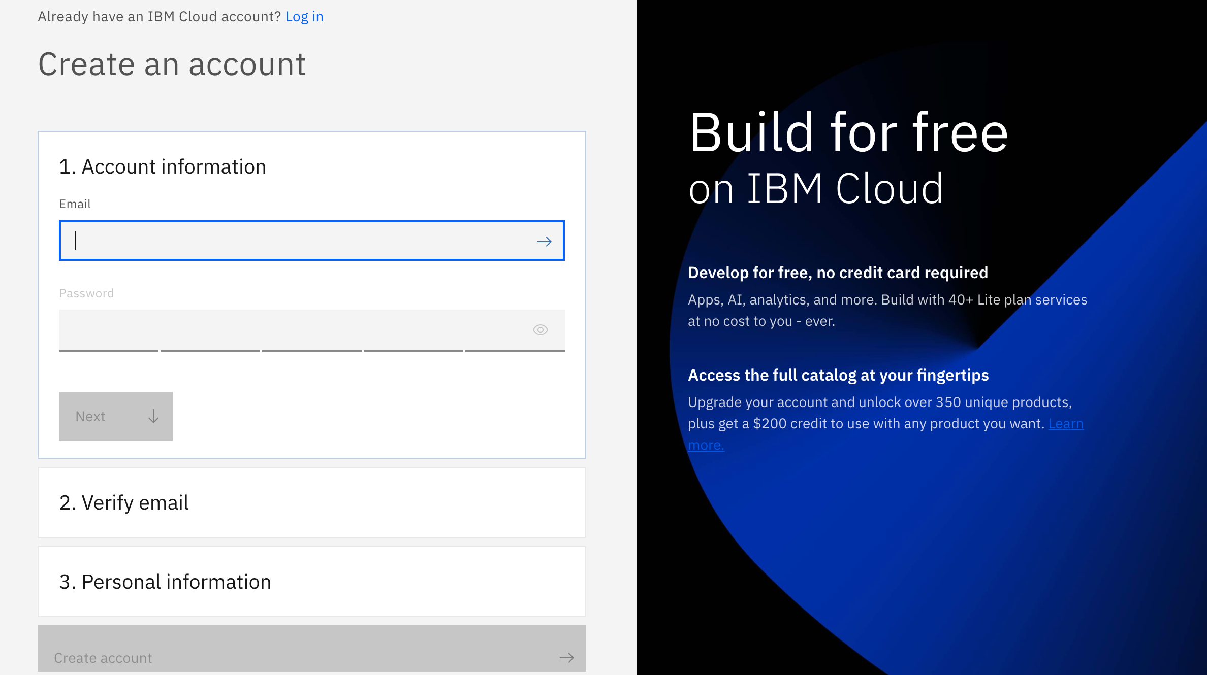
There are 3 steps to create your account on IBM Cloud:
1- Put your email and password.
2- You get a verification link with the registered email to verify your account.
3- Fill the personal information fields.

Banks prefer to not give loans to everyone, they want to know the customer that will most likely pay loans and those who won't. In this tutorial we will be working with a loan transaction dataset where we will be visualizing the data to make a better understanding of these customers and their credit risk.
In this tutorial, you will learn how to use Cognos Embedded on Watson Studio to gain insights into loan transaction data from a bank. We will focus on the role of the business analyst and see how Cognos Embedded can be used to gain insights into many visualization using different fields and information that can affect the risk like loan amount, loan durations, savings and owning a property.
To complete the tutorial, you need an IBM Cloud account. You can get a free trial account, which gives you access to IBM Cloud and Watson Studio.
Completing this tutorial should take about 30 minutes.
Download the asset german_credit_score.csv
In IBM Cloud main page, you can either type object storage in the search field, or click on Create resource and then search for object storage. Select the Lite plan and click Create.

Repeat the same step as the previous one, but this time search for Watson Studio. Select the Lite plan and choose any location you want.

Repeat the same step again, but this time search for Watson Studio. Select the Lite plan and choose any location you want.

Go back to the main page in IBM Cloud. You will see your Watson Studio service created in Resources under Services and software. Click on it and launch Watson Studio.

Once you open Watson Studio click on create a project and choose Create an empty project.

Inside your project, choose the Assets tab and click browse to upload the data file german_credit_data.csv (make sure that you have downloaded this repo to use the dataset file).

Click on the blue Add to project button and choose Dashboard. Give it a name and choose the cognos dashboard embedded service that you create it earlier at the beginning.

Choose a template layout. We will use the default one.

Click on the add button next to Selected sources to choose our dataset that we have uploaded before.

Click Data asset and and choose see the german_credit_data.csv file.

Now you should see the file under selected sources. Click on it to see all its fields.
There are multiple way to create visualizations in Cognos Dashbaord Embedded. First one is by draggind and dropping the field that we want to work with into the canvas. Drag and drop Loan Purpose and then Loan Amont (Make sure to drag Loan Amount into Loan Purpose since we want to use these fields together).In this case the service will autimatically choose a suitable visualization.

Now notice that the Loan Amount values are summed (This is done by default). We can change it to average instead of sum. On the top you will see 3 different tabs: Filters, Fields and Properties. These tabs help us to customize our visualizations. Click on Fields, and then on the ... icon next to Loan Amount under the y-axis. Choose Summarize and then Average.

Let's change this visualization to a pie chart. Above the visualization there is button and next to it you see the type of the current chart that you are using. Click on it, and click on All Visualizations. Select Pie. Now we have a pie chart instead of a line graph.

We can see that loans amounts are the highest for business, repairs and other purposes, and are lowest new cars and used cards
Now let's add a title to this visualization. Next to the button that allows us to change the visualization type, there is a button that allows to to add a title. Click on it and give a title to your visualization.

This time we will use another way to create a visualization. From the left side, click on the Visualization button, drag and drop Stacked bar

Obviously it will be empty since we didn't choose the fields yet. Drag and drop OwnsProperty to the Bars field, LoanDuration to the Length field and Risk to the Color field. For Loan Duration just like we did before, choose it to Average instead of Sum.


Here for example we can see that for people who have a real estate and applied for a loan with duration of more than 15 days show a risk. For people who have savings insurance, the risks starts for a duration that is longer than 20 days.
Let's repeat the same process but this time let's choose a Line visualization. Drag and drop LoanDuration to the y-axis, Risk to Color and LoanAmount to x-axis.

This initial graph layout is too compact, and a warning icon is displayed in the upper-right corner. The warning states that multiple items had to be clipped and that we should apply a filter to show less data.
Make the suggested adjustment by clicking the menu ... icon for the LoanAmount field, then enabling the Auto-group option.

This will result in a much more useful chart. We can see that the least risky loans are for small loan amount that have a large loan duration.

We can change the colors by going to Properties -> Visualization -> Change color palette.

For this one we are going to create a new tab. Just press the plus icon next to Tab1. Now we have a Tab2 and we will do this visualization in this new tab. Just like before, we repeat the steps. This time choose the Packed bubble visualization and drag it to the canvas. Drag and drop ExistingSavings to Bubbles and Color, and drag and drop Risk to Size.
 .
.
This is not very useful because all the bubble have the exact same size and that's because we are counting the unique values or Risk which are Risk and No Risk. So the first thing to do is to change the way we are counting the risk values. Open the menu of Risk that is on Size, choose summarize and then choose Count instead of Count distinct.

Now we counting all the values of risks. But to make it more useful, I want to check which category of the existing savings (range) has the higest risk and which has the lowest. Let's add a filter and drag Risk to this filter. Now because we have 2 tabs, make sure ro drag Risk to the second Filter Tab.

Click on this new added filter and choose only the Risk value.

Now are only counting the Risk value. This visualizations tells us that the customers who have savings between 500 and 1000 are much rikser than other customers. The least riksy are the customers who have savings less than 100 (We are ignoring the Unkown category).

Once you're done click the save button at the very top and then click on the share icon. This generates a link that can be shared with other people to see and interact with your dashboard.

Enable the share to anyone who has the link and share the generated link.

In this tutorial, we detailed how to use some of the features in Cognos Dashboard Embedded on Watson Studio to help visualize loan transactions. You learned how to create and customize charts and graphs to help explain credit risk, gains insights and have a better understanding of loan transactions.
- Login/Sign Up for IBM Cloud
- Slides
- Workshop Replay
- Survey (We really appreciate any feedback :D)
- Follow Our Meetup Page to get updates on our events
- Check IBM Developer to learn and explore a variety technologies and services that you're interested in