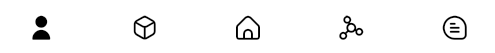
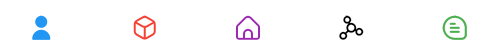
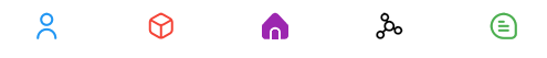
A custom navigation bar with smooth & dynamic ink blob transition effect.
This packages was inspired by this post from Dribbble
Implemented:


Simply add the package to your dependencies! No other steps required :)
To use the InkblobNavigationBar you can simply use it in the bottomNavigationBar field of your material scaffold:
Scaffold(
  ...
  bottomNavigationBar: InkblobNavigationBar(
    ...
  )
)| Attributes | Type | Description | Default |
|---|---|---|---|
showElevation |
bool |
Enable subtle shadow effect | true |
items |
List<InkblobBarItem> |
Item data for NavigationBar | required |
onItemSelected |
Function(int) |
Callback function when item tapped | null |
selectedIndex |
int |
Selected item index of navigation bar. | required |
previousIndex |
int |
Previously selected item index of navigation bar. | selectedIndex |
iconSize |
double |
Size of icons. | 24.0 |
backgroundColor |
Color |
Background color of [CustomNavigationBar] | Theme.bottomAppBarColor |
containerHeight |
double |
Height of the NavigationBar | 60 |
itemWidth |
double |
Total width of each item | 2*containerHeight |
curve |
Curve |
Animation curve of scale effect | Curves.easInOutExpo |
animationDuration |
Duration |
Duration of the total animation | Duration(milliseconds: 270) |
Attention: Both the selectedIndex and previousIndex are required for the animation to perform, an example of how to implement this is shown in the provided example app.
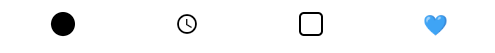
To customize the items in the navigation bar, just supply a list of InkblobBarItem like this.
InkblobNavigationBar(
  ...
  items: [
    // Simple Icon with a Title & Color
    InkblobBarItem(
      title: const Text('User'),
      filledIcon: const Icon(SpiriIcons.fi_sr_user),
      emptyIcon: const Icon(SpiriIcons.fi_rr_user),
      color: Colors.blue,
    ),
    // Custom Containers
    InkblobBarItem(
      filledIcon: Container(
        decoration: BoxDecoration(
          color: Colors.black,
          borderRadius: BorderRadius.circular(12),
        ),
      ),
      emptyIcon: Container(
        decoration: BoxDecoration(
          borderRadius: BorderRadius.circular(12),
          border: Border.all(color: Colors.black, width: 2),
        ),
      ),
    ),
    // Even Text Widgets
    InkblobBarItem(
      filledIcon: const Text('❤️', style: TextStyle(fontSize: 20)),
      emptyIcon: const Text('🖤', style: TextStyle(fontSize: 20)),
      color: Colors.red,
    ),
  ],
)Check the example app for a full implementation example.
Issues and pull requests are always welcome!
If you found this project helpful, consider buying me a cup of ☕