Dark appearance keyboards look bad #285
Comments
|
In the incorrect image, is dark mode enabled? |
Yes, the dark keyboard appears when dark mode is enabled in both IOS and KK, which is the expected result. It's honestly not a bug but a result of using wrong colors/visual parameters for the keyboard keys. I will take a look at it when I have time and report if I figure out how to fix this. |
|
This is a duplicate of another issue, but I’ll keep it around due to your great and detailed information 👍 This problem is caused by a bug(?) that results in there being no way to determine the state of the UI. If you have a dark appearance keyboard, both the keyboard appearance and the color scheme becomes dark, even if the color scheme is in fact light. I’ll explain further when I’m back, but I have been meaning to find a way to fix this soon. Let’s crack this once and for all 👍 |
|
I see. Will be happy to discuss this with you or help in any way I can. This is a really awesome library! |
|
If you create a new app with a keyboard extension and print out the keyboard appearance and color scheme in the extension, you will see that the color scheme will incorrectly become dark when you select a dark appearance text field in light mode. |
|
Hi again! I have no idea how to work around this problem, other than making the button colors transparent, but this would cause underlying colors to bleed through in an incorrect way 😭 |
|
I think the issue is that the button colors are transparent. Can we make them gray? I can try to play around with this. If I wanted to play around with colors of buttons and keyboard, which files/classes should I be modifying? |
|
@ibayramli2001 The button colors are not transparent, they're fully opaque. The color information is divided in multiple files.
The contextual rules determines whether to use dark appearance (not dark mode!) colors or not like this: This is because in dark mode, both light and dark appearance keyboards look the same. However, when This is why the colors are messed up for dark appearance keyboards in light mode. Making the colors transparent. could perhaps fix this, but then we need to define more colors, since for instance the callouts use these colors as well. |
|
hmm...not sure if I understand your previous comment because changing the button colors seems to have fixed it for me. Before: After: |
|
Looks nice, but but how does it look in dark mode? |
|
☝️ Accidentally created issue 🙃 |
|
This is on dark mode. I didn't do anything with the logic yet, just tried to see if the button color is the issue, and it does seem to be the issue. I created a |
|
Actually, this now looks bad against dark backgrounds: I think I understand your comment above now; the keyboard key colors need to change based on whether the background keyboard is spawned against is dark or light. I wonder if reducing opacity would help with this. |

|
I think that I have the colors nailed down pretty accurately, which you can verify in the embedded color asset catalog. It’s just the dark appearance/mode bug that’s messing up the appearance in certain cases. I wonder if applying a material would fix this. |
|
I see, the problem lies in that KK relies on private extension KeyboardContext {
var useDarkAppearance: Bool { colorScheme == .light && keyboardAppearance == .dark }
}Though, isn't it expected for colorScheme to return .dark on, say white Google pages? Even though the Google search page is white, the Safari UI is configured to be in the .dark mode, so userInterfaceStyle returns |
|
Perhaps, but there are two factors that I see affects the keyboard appearance:
The way I understand it, the This is the four modes that I'm seeing matters: Light mode + light appearance - keyboard should use the standard light colors However, perhaps the dark appearance is designed to cause the color scheme of the extension to become dark, that this is intended. However, that removes one piece of information for me to be able to determine how the keyboard should look. I guess we could solve this if there were some way of getting the system color scheme instead of the environment. |
|
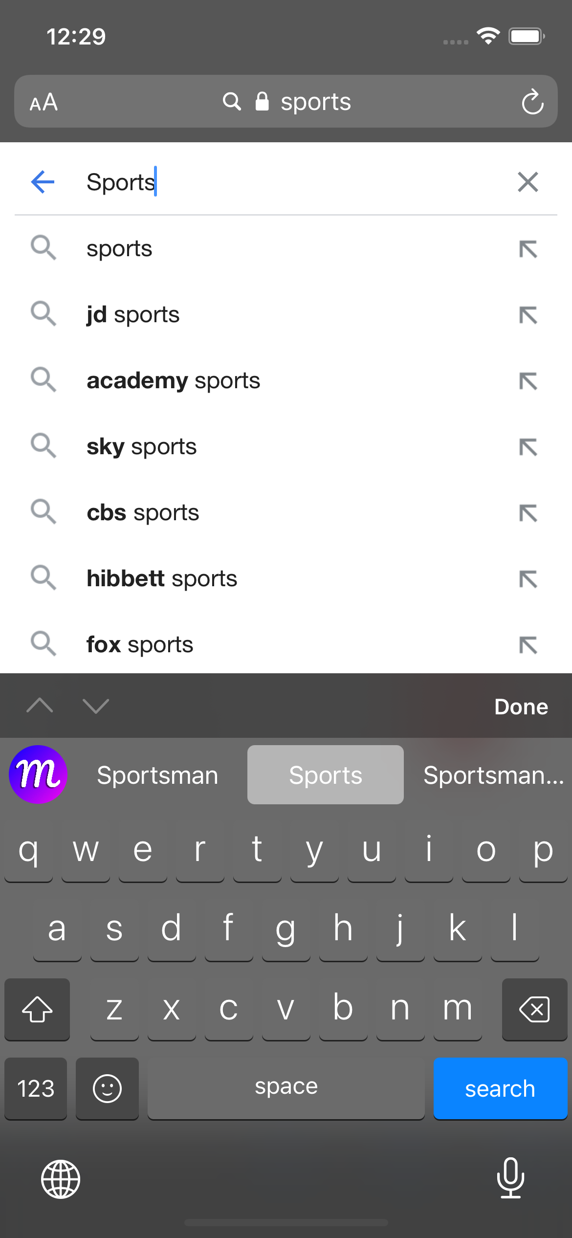
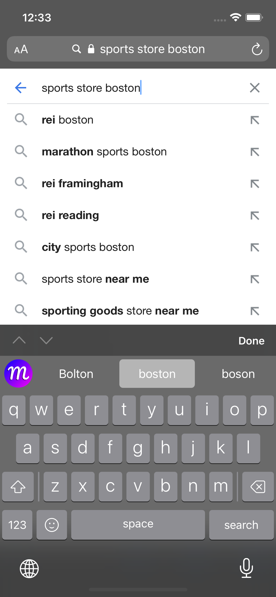
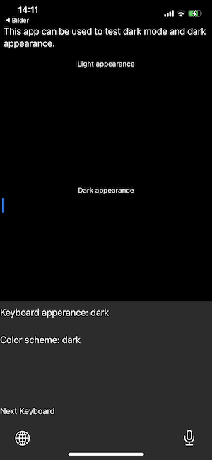
I'm preparing a new test app, with a light appearance text field and one for dark appearance. Look at the two images below, which feature the dark appearance text field in light and dark mode. The background is differently colored for the two, which is why I need to know if light mode is enabled or not.
Adding two labels that show the
After discussing with you, I expect that the "user interface style" is actually intended to be dark when you're in a dark appearance text field context, but it doesn't help us here :) |

|
Ok, I can confirm that the |
|
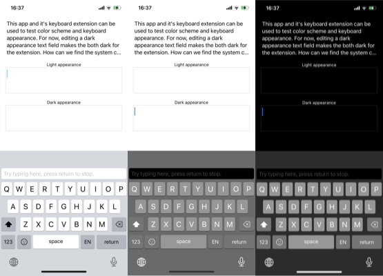
I have added a |
|
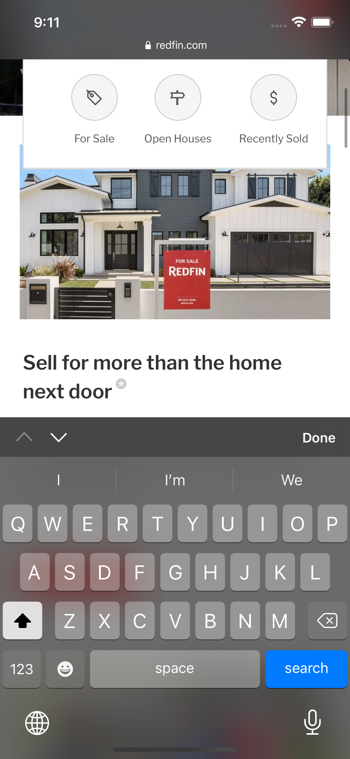
Hmm...I am not sure how to fix that bug, but if I am visiting a white website with dark mode safari, shouldn't the dark buttons be returned for the keyboard? Also, I think what Apple might be doing is actually related to transparency rather than changing the color of the buttons. Here are Apple and KK keyboard spawned against a background that has a red button in it:
As you can see, the Apple keyboard buttons that fall over the red button of the background website have a reddish color whereas the color of the KK keyboard does not adapt to the color of the background. I think that the issue I was documenting with keyboards looking weird against dark backgrounds has more to do with transparency of keyboard buttons than underlying colorScheme bug. |

|
You should get the dark appearance colors in your example above. Using the dark mode colors with a frost effect would still result in an incorrect tint. The buttons should have a frost effect as well, as described in this issue: #210, but that will be an iOS 15 exclusive feature. I am currently working in the bug app I just pushed, and am trying to find a way to get the original user interface style (color scheme) of the system or active app, but |
|
Grammarly gets nice colors for light and dark mode when using dark appearance keyboards, but the callout uses the darker of the two, which makes me suspect that they use transparency for the keys, which doesn't work for the callouts. Actually, if you look at the Grammarly callout in the image below, you can see that they get the same strange color combination as we get for dark appearance in light mode. It doesn't use the same color as the key.
|

|
I just realized that I could try to use the dark appearance colors in dark mode as well, instead of the regular colors adapted for dark mode. I actually think it looks pretty decent in both dark appearance and dark mode:
Sure, the colors are a bit light in dark mode, but that MUCH less of a problem compared to using the dark mode colors for dark appearance keyboards. I will go with this for now and see if this can be improved upon in the future. I have added more comments to the code, and with the bug test app, we can easily try new things moving forward. |
|
This is fixed in the new |
|
🎉 This looks great as a fix for now, thanks so much Daniel! |
|
Is it possible to change the colors? When changing keyboards in iMessage, for example, the color change is pretty drastic. We'd be happy to play around with this in a fork and try to fix it, would really appreciate your guidance to start. @danielsaidi |
|
@amirshane Is the color change drastic? In dark mode, the colors are brighter now due to this fix, but other than that, they should match the native keyboards. Do you have any images to show the differences? However, it's very easy to change the appearance. The easiest option is to create a custom appearance and set that on the view controller, much like the demo changes many other services. |
|
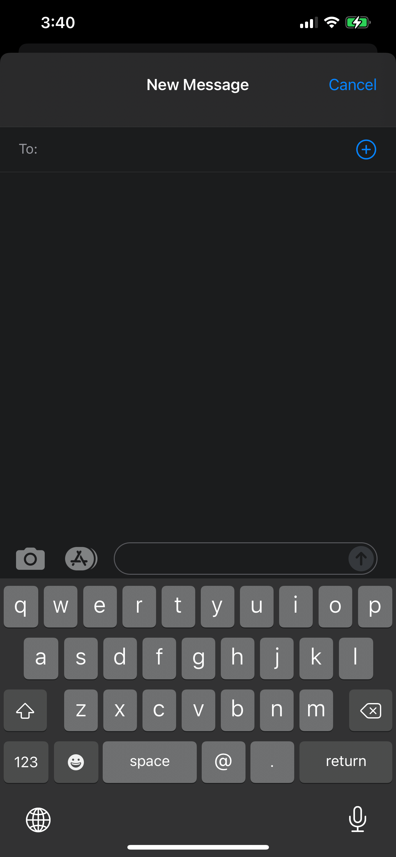
@danielsaidi I see, will look into changing the appearance. Here are some screenshots of the different keyboards in iMessage for your reference: Apple default: KK 4.6.2: |
|
@danielsaidi I agree with @amirshane, the new fix seems to have flipped the issue: now it looks good against white background and bad against dark ones. |
|
@amirshane Can you reduce the image sizes (e.g. 400 in height) to make them easier to overview? |
|
@ibayramli2001 Do you have an example of where it looks bad? I think it looks decent now, although the keys are a lighter brighter than before in dark mode...but perhaps you have an example I haven't noticed where this fix doesn't work? |
|
I'm reopening this until we are all happy with the result. We could make this look great if only we could tell what the color scheme is in the main app, but I have found no way to do that. |
|
@danielsaidi the issue with me is that whenever I switch from the IOS to KK keyboard, the keyboard keys seem noticeably brighter.
Not sure if this is what you mean, but with color picker I have found out that the IOS keys in dark mode are RGB(150,150,150, 255) when spawned against pitch black background and RGB(107,107,107, 255) when brought up against white background. |
|
@ibayramli2001 To clarify the problem:
We have to choose between the following:
Until we find a way to tell if the system is in light mode, I can't see a way to improve this. I also think that the current state is better than the previous state. |
|
The new KK version lets you control whether or not to use dark appearance. In addition to this, you can also inject a custom appearance to get granular control over the keyboard appearance. I will close this now and continue discussing the dark mode/appearance problems here: #305 |
The default keyboard in the demo looks significantly different (in a bad way) than the base IOS keyboard when on a light background. I have pasted the images of IOS and KK keyboards with different background below for comparison.
IOS keyboard in dark background:

KK in dark background (OK):

IOS keyboard in light background (OK):

KK in light background (not OK):

The KK keyboard keys blend in with the main keyboard body whereas they should preserve their gray color as in the IOS keyboard. Also, the shift, space, globe, etc. keys are darker than they should be.
The text was updated successfully, but these errors were encountered: