iOS keyboard extensions can't differ between dark mode and dark appearance #305
Comments
|
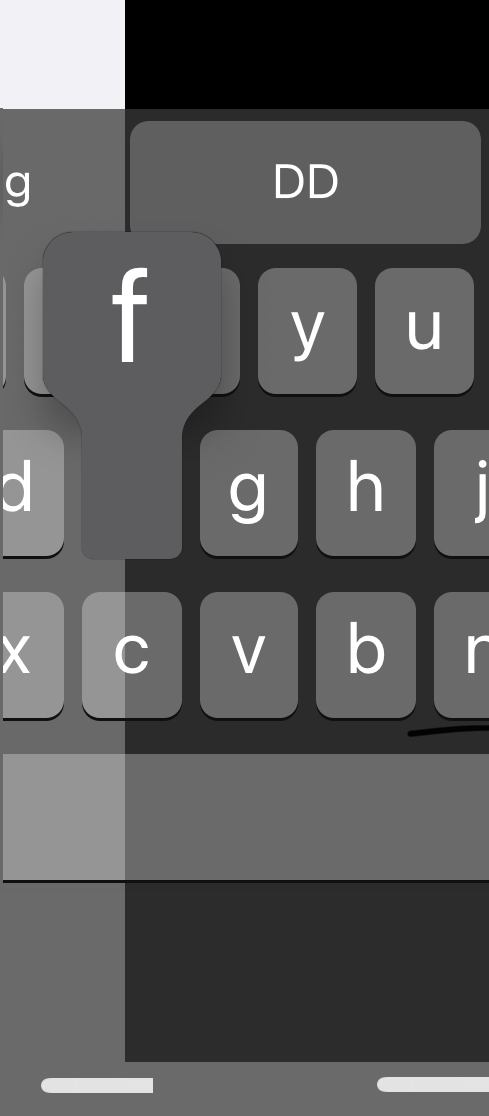
Two of our users discovered a bug that we think is due to the same bug. Here are screenshots of their keyboards in dark mode:
One of the devices is iPad Air 2.1 and the other is iPhone 7 plus, both running iOS 14.7. The bugs don't happen on light mode. |


|
Are there any hopes of dark appearance issue being fixed on Apple's end? Has this issue been brought to them / what their response was? Also, how do other keyboards (e.g. Grammarly, GBoard) work around it? |
|
@ibayramli2001 Could you please move the bug to a separate issue, so we don't mix it together with the dark mode/appearance bug? |
|
@ibayramli2001 Gboard uses the same color scheme for dark mode and dark appearance, and it's not the same as the system. It also uses a custom background color.
In the images above, you can see the big difference the between the system's dark appearance background color (bottommost in image 2) and the one that is used for dark mode (bottommost in image 3) |


|
I was going to do the same screens for Grammarly, and suddenly got this 🤔 :
So, there seems to be problems with how iOS informs keyboard extensions about the current color scheme. This is what it normally looks like:
But this is interesting! Perhaps these images can teach us something about how Grammarly handles the dark mode/appearance bug? Look at the first, incorrect image. Grammarly seems to have been given the information that dark mode is active, since the button text is white. However, it then seems to use a semi-transparent white as button background, instead of a solid color. |


|
Will move it to a new issue tomorrow morning. Hmm...not sure why it looks like that with white background. I tried Grammarly with several backgrounds for both light and dark mode and it seems to work well. How exactly did you reach that buggy appearance with Grammarly? (first image) Would it be possible to get something comparable to Grammarly? |
|
@ibayramli2001 I think you can leave the bug comment, since the same thing happened with Grammarly. The first image is an incorrect look, which must be caused by Grammarly being provided with the incorrect color scheme. After you posted your reply, I added three more images, showing how Grammarly looks when correct. I just got the bug by selecting the Grammarly keyboard after moving from dark mode to light more. |
|
Oh, so that bug is not persistent, just happens when switching light/dark modes right? The buggy version looks suspiciously similar to what were experiencing with the dark keyboard against light text field. |
|
With the two dark appearance/mode images side by side and the transparent info we got from image one, it should be a walk in the park to just create a blank project and find the correct white opacity. However, for now, the callouts use the same color as the buttons, which means that they would become transparent too. This has to be fixed, so that they use their own colors. Actually, you can see in Grammarly, that the callout background color is different and the same for both dark appearance and dark mode:
|
|
Great insight! I think just replicating what Grammarly does would be enough since as a user, I did not experience much difference between iOS and Grammarly keyboards. Can we hope for a new KK update sometime soon fixing this? |
|
Yeah, it shoudn't be so much work fixing this. |
|
great, looking forward to hearing from you! |
|
@danielsaidi any update on this? |
|
Not yet, I am quite busy with another project and haven't had time to look at it. I'll try to to look at it this week, but can't promise that I will get around to it. If you are in a hurry, you could take the image I posted above and try to find the right transparent button color, then sent it to me in a PR or as a comment here (attach a picture with the result in dark appearance and dark mode) and I'll take a look. |
|
@ibayramli2001 @amirshane I finally got to sit down with this and think I've got it. Grammarly uses white with 0.3 opacity. Here's a screenshot from an Xcode test project. The square between the button and space uses this new color.
I will add a new color, that's expressively named I will keep the original colors around, since they are correct given that we didn't have to work around this bug. I will just not use them by default. Before releasing this as a Just as Grammarly does, I will keep using the standard colors for the callouts, which means that their color will deviate a little. It's not possible to use the opacity workaround there, since the background would bleed through. |

|
For the darker buttons, the color seems to be white with 0.1 opacity:
|

|
I'm happy to say that the colors do work. Here are system keyboards, overlapped with KK keyboards:
Some remaining work before this can be released:
But overall, it looks promising! |

|
By the way, if you use the KK demo app and toggle dark mode while using Grammarly, it's not hard to get these really strange appearance bugs:
|

|
This screenshot demonstrates the problem with shadows on transparent colors: |

|
Awesome, thanks so much @danielsaidi. Can I ask how you found the colors? I played around with this for a bit and could find some colors that worked better but could not replicate the iOS native keyboard as closely as you did. |
|
I got help from awesome Twitter peep @mattxcurtis regarding the shadow problem. He sent me code that makes it possible to add a bottom "shadow" that is just the bottom shape of the button. This will solve the problem with the shadow making the transparent background darker, and that the shadow follows the transparency, which makes it weaker for semi-transparent buttons. I will implement this asap. |
|
@ibayramli2001 I took screenshots, added them to a new SwiftUI app project and changed the white opacity until the SwiftUI matched both colors. |
|
Awesome, thanks @danielsaidi, @mattxcurtis ! |
|
@ibayramli2001 I'm happy to say that I've got it working!
It works with the callouts as well. I will take this opportunity to reduce the shadow opacity in dark appearance as well, since the KK keyboard shadow is a little bit darker. |

|
This fix is available in 4.8. |
|
@danielsaidi Awesome! Thanks for the fix! |
The KeyboardContext
colorSchemebecomes wrong whenkeyboardAppearanceis.darkand the device runs in.lightmode. The keyboard extension will be told that the colorScheme is.darkinstead of.light.This is WRONG, since "dark appearance" keyboards should NOT look the same in light mode and dark mode. However, this is how iOS sets up the extension and not a bug in KeyboardKit.
Until this is fixed, set the
Color.darkAppearanceStrategyto a custom strategy if you want to customize KeyboardKit's standard strategy of always applying dark appearance colors when dark mode is enabled.The text was updated successfully, but these errors were encountered: