A customizable segment tab control. Can be used with or without TabView.
Made in lanars.com.

The package provides an advanced segmented control widget based on the TabController.

The package contains a SegmentedTabControl widget that requires a SegmentTab list.
SegmentedTabControl(
  tabs: [
    SegmentTab(
      label: "Home".
    ),
  ],
)
SegmentedTabControl also requires a TabController. You can provide it with a DefaultTabController or instantiate a TabController instead.
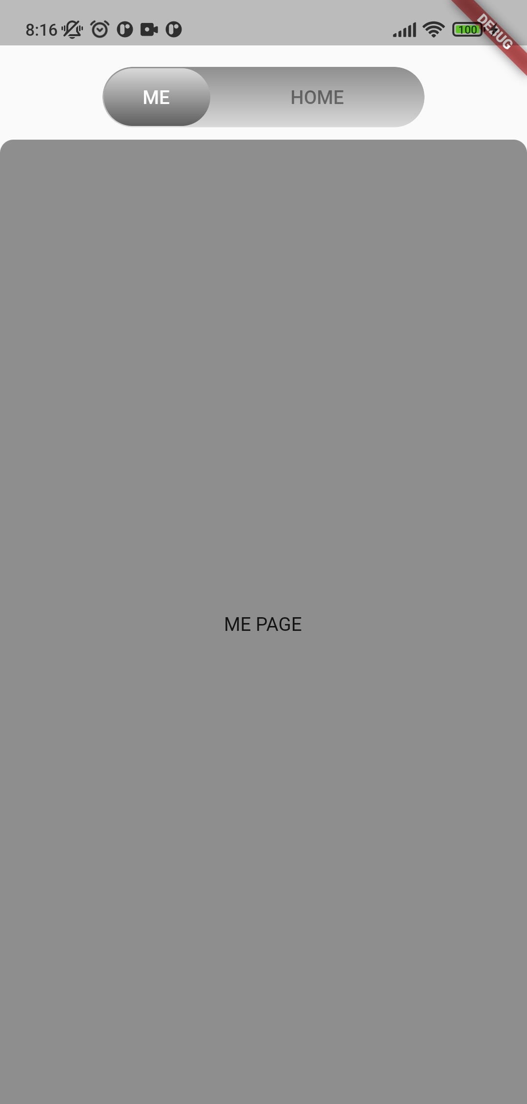
DefaultTabController(
  length: 2,
  child: SegmentedTabControl(
    tabs: [
      SegmentTab(
        label: "Home",
      ),
      SegmentTab(
        label: "Account",
      ),
    ],
  )
)
You can change the entire widget or an individual tab. Or combine it. All provided values in the SegmentedTabControl will be replaced with values from each tab.
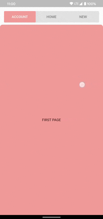
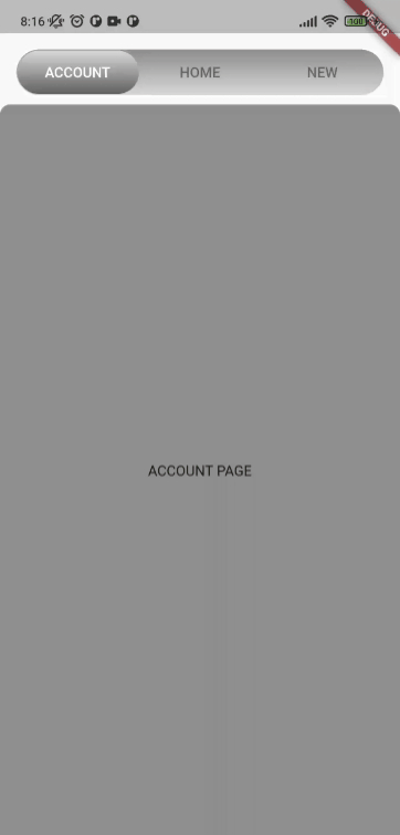
SegmentedTabControl(
  backgroundColor: Colors.grey.shade300,
  indicatorColor: Colors.orange.shade200,
  tabTextColor: Colors.black45,
  selectedTabTextColor: Colors.white,
  tabs: [
    SegmentTab(
      label: 'ACCOUNT',
      color: Colors.red.shade200,
    ),
    SegmentTab(
      label: 'HOME',
      backgroundColor: Colors.blue.shade100,
      selectedTextColor: Colors.black45,
      textColor: Colors.black26,
    ),
    const SegmentTab(label: 'NEW'),
  ],
),
Change tracking logic is identical to TabBar logic.
DefaultTabController.of(context).indexor
_controller.indexIf you have any ideas or are running into a bug, please submit an issue on github page: https://github.com/LanarsInc/animated-segmented-tab-control/issues