


Fully Coded Components
Argon Design System Angular is built with over 100 individual components, giving you the freedom of choosing and combining. All components can take variations in color, that you can easily modify using SASS files. You will save a lot of time going from prototyping to full-functional code, because all elements are implemented. This Kit is coming with pre-built examples, so the development process is seamless, switching from our pages to the real website is very easy to be done. Every element has multiple states for colors, styles, hover, focus, that you can easily access and use.
Complex Documentation
Each element is well presented in a very complex documentation. You can read more about the idea behind this kit here. You can check the components here and the foundation here.
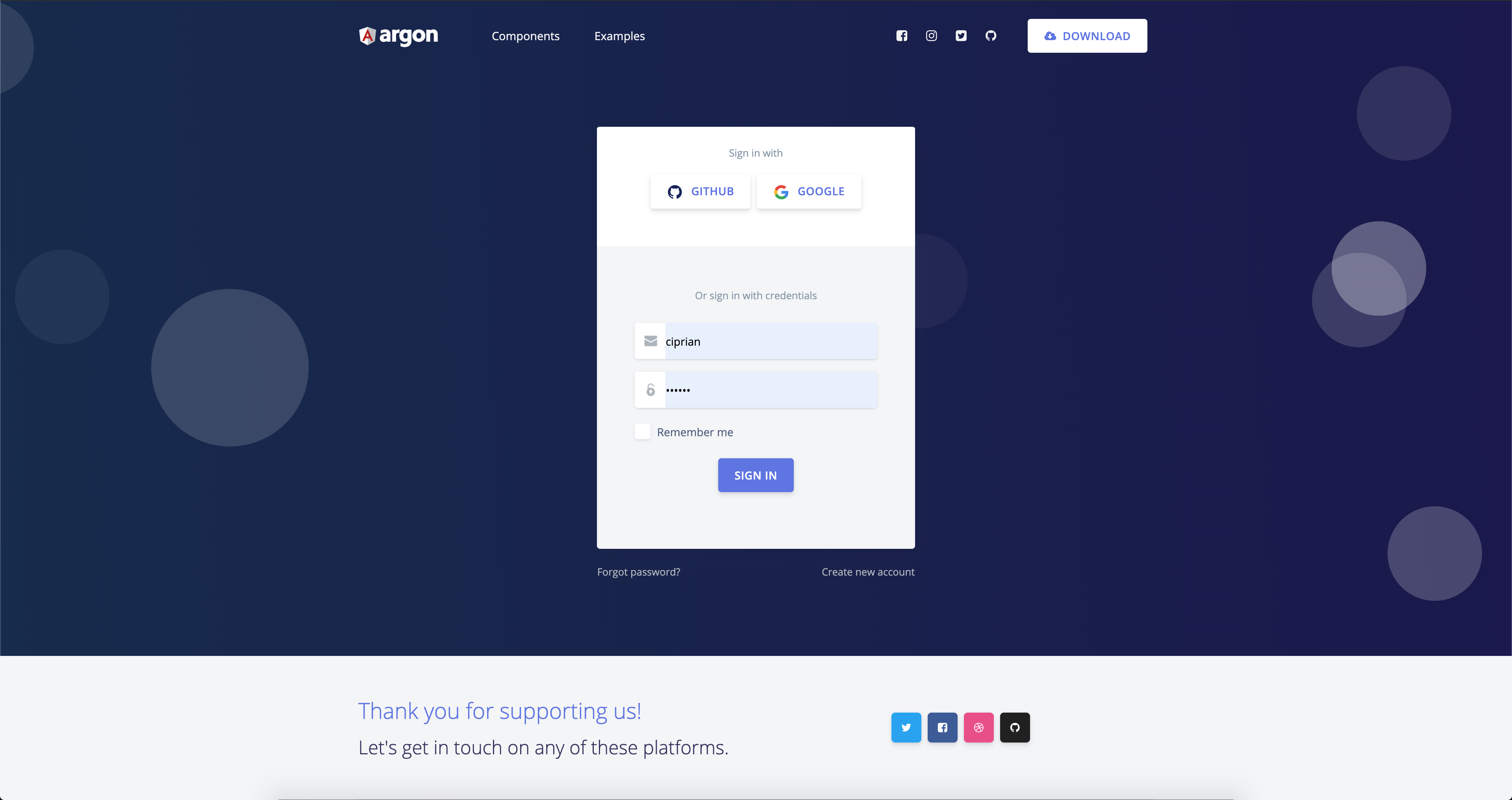
Example Pages
If you want to get inspiration or just show something directly to your clients, you can jump start your development with our pre-built example pages. You will be able to quickly set up the basic structure for your web project.
- Versions
- Demo
- Quick Start
- Documentation
- File Structure
- Browser Support
- Resources
- Reporting Issues
- Licensing
- Useful Links
| HTML | Angular | Vue |
|---|---|---|
 |
 |
 |
| Buttons | Inputs | Navbars |
|---|---|---|
 |
 |
 |
| Login Page | Landing Page | Profile Page | Register Page |
|---|---|---|---|
 |
 |
 |
 |
- Download from Github.
- Download from Creative Tim.
- Clone the repo:
git clone https://github.com/creativetimofficial/argon-design-system-angular.git.
The documentation for the Argon Design System Angular is hosted at our website.
Within the download you'll find the following directories and files:
argon-design-system-angular
├── CHANGELOG.md
├── ISSUES_TEMPLATE.md
├── LICENSE.md
├── README.md
├── angular.json
├── e2e
├── package-lock.json
├── package.json
├── src
│   ├── app
│   │   ├── app.component.html
│   │   ├── app.component.scss
│   │   ├── app.component.spec.ts
│   │   ├── app.component.ts
│   │   ├── app.module.ts
│   │   ├── app.routing.ts
│   │   ├── home
│   │   │   ├── home.component.html
│   │   │   ├── home.component.scss
│   │   │   ├── home.component.spec.ts
│   │   │   ├── home.component.ts
│   │   │   └── home.module.ts
│   │   ├── landing
│   │   │   ├── landing.component.html
│   │   │   ├── landing.component.scss
│   │   │   ├── landing.component.spec.ts
│   │   │   └── landing.component.ts
│   │   ├── login
│   │   │   ├── login.component.css
│   │   │   ├── login.component.html
│   │   │   ├── login.component.spec.ts
│   │   │   └── login.component.ts
│   │   ├── profile
│   │   │   ├── profile.component.html
│   │   │   ├── profile.component.scss
│   │   │   ├── profile.component.spec.ts
│   │   │   └── profile.component.ts
│   │   ├── sections
│   │   │   ├── alerts-section
│   │   │   │   ├── alerts-section.component.css
│   │   │   │   ├── alerts-section.component.html
│   │   │   │   ├── alerts-section.component.spec.ts
│   │   │   │   └── alerts-section.component.ts
│   │   │   ├── angular-section
│   │   │   │   ├── angular-section.component.css
│   │   │   │   ├── angular-section.component.html
│   │   │   │   ├── angular-section.component.spec.ts
│   │   │   │   └── angular-section.component.ts
│   │   │   ├── buttons-section
│   │   │   │   ├── buttons-section.component.css
│   │   │   │   ├── buttons-section.component.html
│   │   │   │   ├── buttons-section.component.spec.ts
│   │   │   │   └── buttons-section.component.ts
│   │   │   ├── crs-section
│   │   │   │   ├── crs-section.component.css
│   │   │   │   ├── crs-section.component.html
│   │   │   │   ├── crs-section.component.spec.ts
│   │   │   │   └── crs-section.component.ts
│   │   │   ├── inputs-section
│   │   │   │   ├── inputs-section.component.css
│   │   │   │   ├── inputs-section.component.html
│   │   │   │   ├── inputs-section.component.spec.ts
│   │   │   │   └── inputs-section.component.ts
│   │   │   ├── modal
│   │   │   │   ├── modal.component.html
│   │   │   │   ├── modal.component.scss
│   │   │   │   ├── modal.component.spec.ts
│   │   │   │   └── modal.component.ts
│   │   │   ├── navigation-section
│   │   │   │   ├── navigation-section.component.css
│   │   │   │   ├── navigation-section.component.html
│   │   │   │   ├── navigation-section.component.spec.ts
│   │   │   │   └── navigation-section.component.ts
│   │   │   ├── nucleo-section
│   │   │   │   ├── nucleo-section.component.css
│   │   │   │   ├── nucleo-section.component.html
│   │   │   │   ├── nucleo-section.component.spec.ts
│   │   │   │   └── nucleo-section.component.ts
│   │   │   ├── sections.component.css
│   │   │   ├── sections.component.html
│   │   │   ├── sections.component.spec.ts
│   │   │   ├── sections.component.ts
│   │   │   ├── sections.module.ts
│   │   │   ├── tabs-section
│   │   │   │   ├── tabs-section.component.css
│   │   │   │   ├── tabs-section.component.html
│   │   │   │   ├── tabs-section.component.spec.ts
│   │   │   │   └── tabs-section.component.ts
│   │   │   ├── typography-section
│   │   │   │   ├── typography-section.component.css
│   │   │   │   ├── typography-section.component.html
│   │   │   │   ├── typography-section.component.spec.ts
│   │   │   │   └── typography-section.component.ts
│   │   │   └── versions-section
│   │   │       ├── versions-section.component.css
│   │   │       ├── versions-section.component.html
│   │   │       ├── versions-section.component.spec.ts
│   │   │       └── versions-section.component.ts
│   │   ├── shared
│   │   │   ├── footer
│   │   │   │   ├── footer.component.html
│   │   │   │   ├── footer.component.scss
│   │   │   │   ├── footer.component.spec.ts
│   │   │   │   └── footer.component.ts
│   │   │   └── navbar
│   │   │       ├── navbar.component.html
│   │   │       ├── navbar.component.scss
│   │   │       ├── navbar.component.spec.ts
│   │   │       └── navbar.component.ts
│   │   └── signup
│   │       ├── signup.component.html
│   │       ├── signup.component.scss
│   │       ├── signup.component.spec.ts
│   │       └── signup.component.ts
│   ├── assets
│   │   ├── css
│   │   ├── img
│   │   ├── js
│   │   ├── scss
│   │   │   ├── angular
│   │   │   ├── argon.scss
│   │   │   ├── bootstrap
│   │   │   └── custom
│   │   └── vendor
│   ├── browserslist
│   ├── environments
│   ├── favicon.ico
│   ├── index.html
│   ├── karma.conf.js
│   ├── main.ts
│   ├── polyfills.ts
│   ├── styles.css
│   ├── test.ts
│   ├── tsconfig.app.json
│   ├── tsconfig.spec.json
│   └── tslint.json
├── tsconfig.json
└── tslint.json
At present, we officially aim to support the last two versions of the following browsers:
- Demo: https://demos.creative-tim.com/argon-design-system-angular/home?ref=adsa-github-readme
- Download Page: https://www.creative-tim.com/product/argon-design-system-angular?ref=adsa-github-readme
- Documentation: https://demos.creative-tim.com/argon-design-system-angular/documentation/tutorial?ref=adsa-github-readme
- License Agreement: https://www.creative-tim.com/license?ref=adsa-github-readme
- Support: https://www.creative-tim.com/contact-us?ref=adsa-github-readme
- Issues: Github Issues Page
We use GitHub Issues as the official bug tracker for the Argon Design System Angular. Here are some advices for our users that want to report an issue:
- Make sure that you are using the latest version of the Argon Design System Angular. Check the CHANGELOG from your kit on our website.
- Providing us reproducible steps for the issue will shorten the time it takes for it to be fixed.
- Some issues may be browser specific, so specifying in what browser you encountered the issue might help.
-
Copyright 2019 Creative Tim (https://www.creative-tim.com/?ref=adsa-github-readme)
-
Licensed under MIT (https://github.com/creativetimofficial/argon-design-system-angular/blob/master/LICENSE.md)
- Tutorials
- Affiliate Program (earn money)
- Blog Creative Tim
- Free Products from Creative Tim
- Premium Products from Creative Tim
- React Products from Creative Tim
- Angular Products from Creative Tim
- VueJS Products from Creative Tim
- More products from Creative Tim
- Check our Bundles here
Twitter: https://twitter.com/CreativeTim?ref=creativetim
Facebook: https://www.facebook.com/CreativeTim?ref=creativetim
Dribbble: https://dribbble.com/creativetim?ref=creativetim
Instagram: https://www.instagram.com/CreativeTimOfficial?ref=creativetim