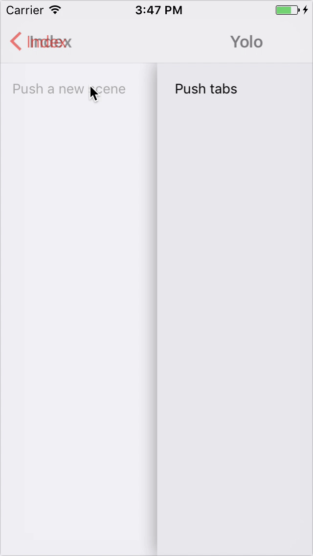
Navigation make it easy to explore and switch between different views.
import * as React from 'react'
import { Navigation, Card } from 'react-router-navigation'

const App = () => (
  <Navigation navBarStyle={{ backgroundColor: 'purple' }} titleStyle={{ color: 'white' }}>
    <Card exact path="/feed" component={require('./Feed')} />
    <Card
      backButtonTintColor="white"
      path="/feed/article/:id"
      component={require('./Article')}
    />
  </Navigation>
)- hideNavBar
?booleanwhether to display nav bar - renderNavBar
?stringcallback which renders a custom navigation bar - navBarStyle
?StyleSheetoverride style for the navigation bar - hideBackButton
?booleanwhether to display default back button - backButtonTintColor
?stringsets the color of the back button - backButtonTitle
?stringtext that appears on back button - renderLeftButton
?Functioncallback which renders a custom left button - title
?stringstring to be displayed in the navigation bar - titleStyle
?StyleSheetstyle override for the title element - renderTitle
?Functioncallback which renders a custom title component - renderRightButton
?Functioncallback which renders a right button
- ...
<NavBar />props - onTransitionStart
?Functionfunction invoked when the card transition animation is about to start - onTransitionEnd
?Functionfunction invoked once the card transition animation completes - cardStyle
?StyleSheetoverride style for the card component - configureTransition
?Functionfunction which customize animation - mode
?stringsets the mode configuration. Can be eithercard(default) ormodal - gesturesEnabled
?booleanwhether you can use gestures to dismiss this screen.
... <Route />props... <Navigation />props- routePath
?stringany valid URL path