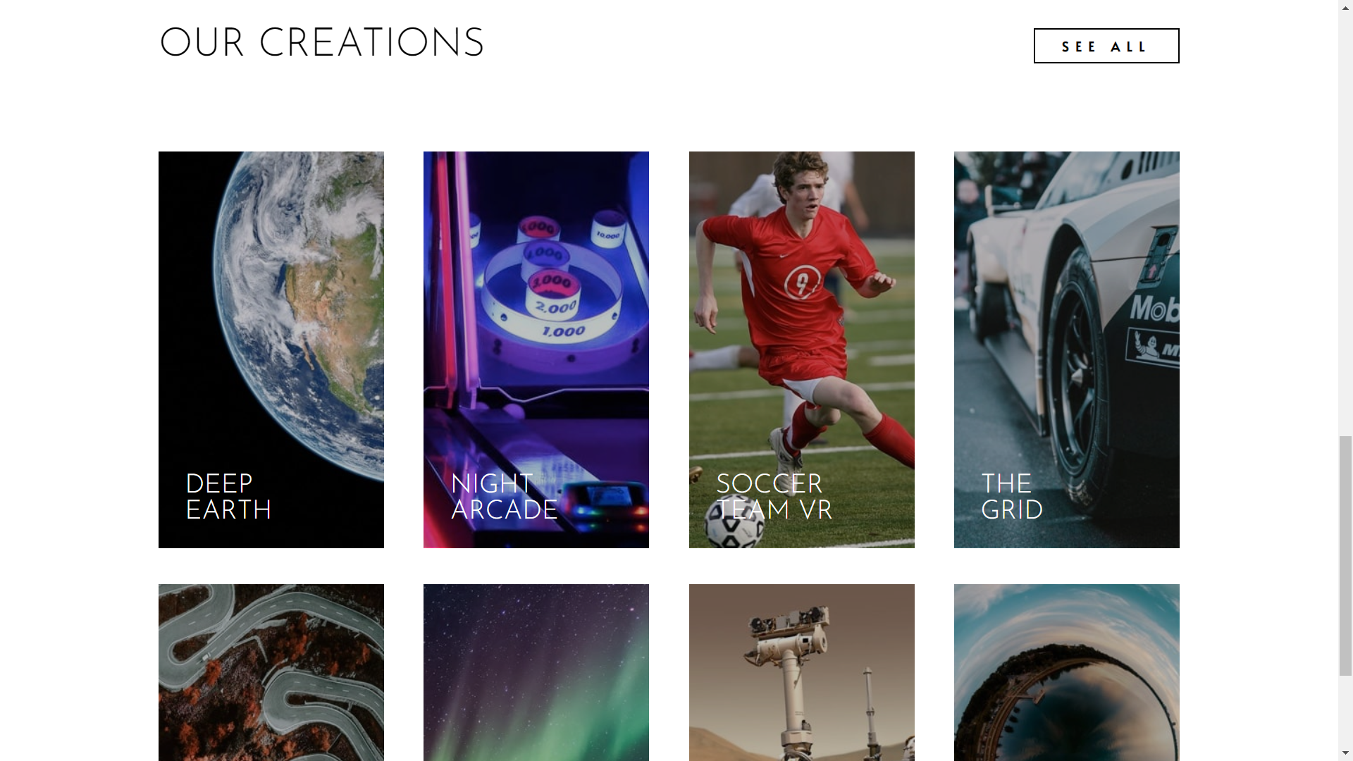
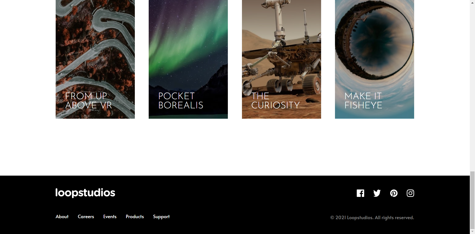
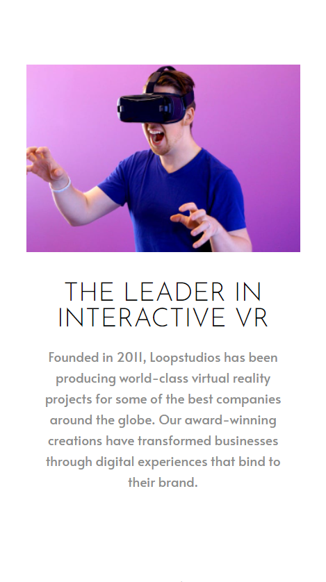
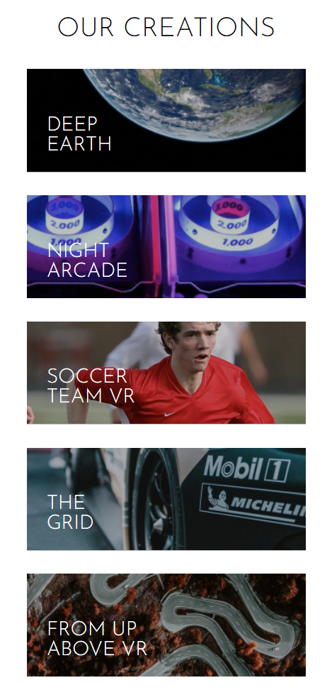
A Modern VR Company Landing Page featuring sections, navigations, footers, responsive design and a sliding mobile menu
This is a solution to the Loopstudios landing page challenge on Frontend Mentor.


- Solution URL: https://github.com/LiyanNguyen/Loopstudios
- Live Site URL: https://liyannguyen.github.io/Loopstudios
- Design the Desktop Viewport WHILE desinging the Mobile viewport at the same time using LESS CSS Preprocessor
- Design the flex/grid system, making sure to have both Desktop and Mobile Viewport layout correct
- Add in all the other HTML content
- Finished up all the CSS designs
- Create the mobile menu and make it toggle, open and closing it via JS
- Semantic HTML5 markup
- CSS custom properties
- Flexbox
- Grid
- Desktop-first workflow
- LESS CSS Preprocessor
- More Flexbox, Flex-wrap
- More LESS CSS Preprocessor
- Always use vh/vw as a starting point, then %width and %height then use rem units on smaller things
- Always use padding FIRST inside big sections before the putting in the flexboxes
- DO NOT manually position elements inside big sections
- Add padding FIRST! before flexing the items
- Website - Liyan Anajao
- Frontend Mentor - @LiyanNguyen
- Twitter - @LiyanAnajao