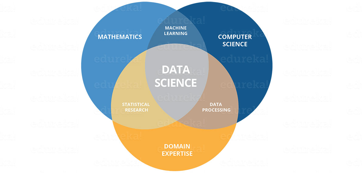
DATA SCIENCE: is the process of deriving knowledge and insights from large set of data through organizing, processing and and analysing the data. It is a multidisciplinary field that involved converting dta into information of knowledge. It combined different fields from mathematics to statistical computing to understanding business domain.
We will be handling:
1). Data science and Data overview.
2). Python for data science.
3). Analysising data using Python.
4). Data Visualization Using Python.
5). An introduction to Hadoop.
5). Machine learning using Python.
We are aiming to complete the section on February 2020 with a Common Capstone project where everyone is free to participate.
Statistical data types:
As we discussed there are 3 types of statistical data types as listed below:
- Numerical Data.
Numerical data is also known as quantitative data, there are further categorized into Discrete and continous.
examples
Continous cases-
speed of the car, Amount of water in a bottle, etc
Discrete cases-
IQ, NUmber of heads after 20 coin tosses. - Categorical Data.
This data type does not have mathematical meaning,They are also know as qualitative data and describes characteristics.
Examples:
Gender, Enthinicity,Nationality. etc - Ordina Data.
This data type mixes numerical and categorical data types A good example is Hotel Rating;
5 stars Hotel. 3 stars Hotel.
Data visualization is the discipline of trying to understand data by placing it in a visual context so that patterns, trends and correlations that might not otherwise be detected can be exposed.
Python offers multiple great graphing libraries that come packed with lots of different features. No matter if you want to create interactive, live or highly customized plots python has an excellent library for you.
Some of the most oftenly used data visualization libraryies in python are:
To get a little overview here are a few popular plotting libraries:
1).Matplotlib: low level, provides lots of freedom.
2).Pandas Visualization: easy to use interface, built on Matplotlib.
3).Seaborn: high-level interface, great default styles.
4) ggplot: based on R’s ggplot2, uses Grammar of Graphics.
5).Plotly: can create interactive plots
But before we look at some kinds of plots, we will introduce some basic rules. Those rules help us make nice and informative plots instead of confusing ones.
1).The first step is to choose the appropriate plot type. If there are various options, we can try to compare them, and choose the one that fits our model the best.
2). Second, when we choose your type of plot, one of the most important things is to label your axis. If we don’t do this, the plot is not informative enough. When there are no axis labels, we can try to look at the code to see what data is used and if we’re lucky we’ll understand the plot. But what if we have just the plot as an image? What if we show this plot to your boss who doesn’t know how to make plots in Python?
3). Third, we can add a title to make our plot more informative.
4). Fourth, add labels for different categories when needed.
5). Five, optionally we can add a text or an arrow at interesting data points.
6). Six, in some cases we can use some sizes and colors of the data to make the plot more informative.
There are many types of visualizations. Some of the most famous are: line plot, scatter plot, histogram, box plot, bar chart, and pie chart. But among so many options how do we choose the right visualization? First, we need to make some exploratory data analysis(That we did last meet-up). After we know the shape of the data, the data types, and other useful statistical information, it will be easier to pick the right visualization type.
:
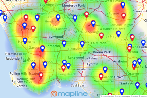
Heat map
Scatter plot

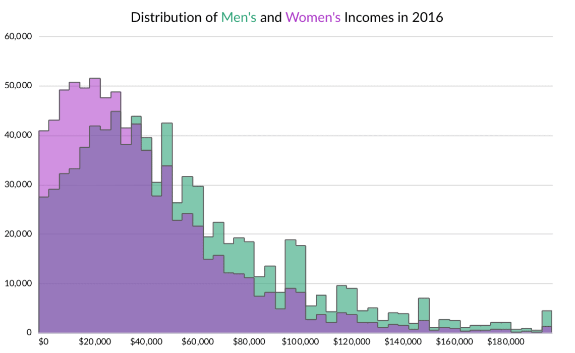
HistoGram
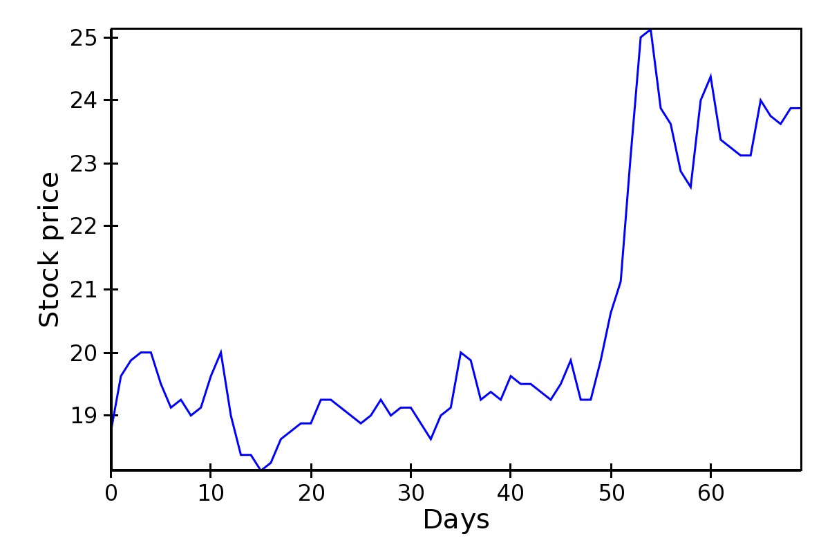
Lineplot.