This application serves as an introduction to fundamental CSS concepts, including CSS selectors, CSS Specificity and Hierarchy, writing CSS, the Box Model, and other fundamental styling attributes in CSS. I'd recommend forking, cloning, and opening this repository as you read along, so you can use the code files as reference.
CSS stands for "Cascading Style Sheets" - it's the styling language of the web. We use it in conjunction with HTML and JavaScript to make dynamic, appealing, easily navigable webpages. If HTML is the bones of a webpage, then CSS is the flesh of a webpage. (And frontend JavaScript is the nervous system and your backend is the brain.)
In order to style our webpage, we attach CSS styles to our specific HTML elements - think <div>, <h1>, <p>, and <img> elements, among many others. There are two essential steps to connecting our HTML elements to their corresponding CSS styling instructions - connecting our HTML and CSS files, and using the appropriate CSS Selectors.
When building out HTML for your webpage, there are a few sections that you'll likely fill out before you actually start creating HTML elements. One of these sections is the <head> section. You'll connect your CSS to your HTML using a link tag in this head section. Your head section will likely look like this:
<!DOCTYPE html>
<html lang="en">
<head>
    <meta charset="utf-8"/>
    <meta name="description" content=""/>
    <meta name="viewport" content="width=device-width, initial-scale=1"/>
    <title>Title of your Webpage</title>
    <link rel="stylesheet" href="<Your CSS Filename>"/>
</head>
Notice the <link> tag with rel="stylesheet" and href="<Your CSS Filename>". This is the link tag you'll need to add to your HTML document in order to connect your CSS to your HTML. The href here is referencing the relative path to your CSS file. If your CSS file is in a separate folder than your HTML file, you'll need to specify that in your href. Otherwise, you'll receive an error.
Now that you've got your CSS file hooked up to your HTML file, it's time to start selecting some HTML elements! Take a look at the basics.html file and the basics.css file - we'll be referencing both throughout the following sections.
When writing CSS, we'll reference a specific selector (universal, tagname, id, classname, etc.) to specify an html element or set of html elements we want to apply styles to. We'll then write the styles we want to apply to that element / that set of elements within curly braces. Each CSS styling attribute will consist of an attribute name and an attribute style separated by a colon. Different sets of corresponding names and styles are separated by a semicolon. So, your CSS will end up looking something like this:
<css selector> {
    <css attribute name>: <css attribute style>;
    <css attribute name>: <css attribute style>;
    <css attribute name>: <css attribute style>;
}
Now, let's talk about some of the most common selectors you'll use in your code.
If you check out your basics.css file, you'll see that at the top of our file we're using the * symbol. This symbol is known as the "universal selector". Using this selector means we're telling our CSS file to grab every HTML element in our file and apply the following set of styles to it. In this example, we're giving every element a padding of 0, a margin of 0, and a box-sizing of border-box (we'll discuss what these each mean in a later section).
* {
    margin: 0;
    padding: 0;
    box-sizing: border-box;
}
On a slightly more specific level, we can use HTML tag names - div, p, h1, img, etc - to select all HTML elements of that tag name type and apply styles to them. We can even do this to our <body> tag, which wraps the rest of our HTML elements. In our basics.css file, you'll notice that we're selecting our body tag and all of our h1 tags. We're giving our body a background color and our h1s a font-family of Caveat. This sets the font family of all h1 tags in our document to Caveat.
body {
    background-color: hsl(184, 31%, 46%);
}

h1 {
    font-family: Caveat;
}
Not sure what a <div> actually is? Here's some further reading from MDN Docs.
Check out our basics.html file. You'll notice that we have an <h1> tag with an id attribute of "specific-header" within its opening tag. By giving our HTML elements Ids, we can select them in our CSS files (and in our JavaScript files). Ids are special in that only one HTML element can have a certain Id - it's a very specific way to select a certain HTML element.
To select an HTML element by its Id in our CSS file, we use the # symbol in conjunction with the Id name. For example, in our basics.css file, we're selecting our "specific-header" h1 by writing #specific-header. We can then give is a set of styles:
#specific-header {
    color: purple;
    background-color: hsl(60, 20%, 80%);
    border: solid;
    margin: 10px 80px 20px 10px;
}
If you look elsewhere in our basics.css file, you'll notice that we're using Id selectors to grab our #info-section div and our #mountain-pic img.
While selecting elements by their Id offers us a high level of specificity, sometimes we'll want to apply styling more generally, while still being more specific than just using general tag names. We can do this using classnames.
Classnames can be given to multiple elements throughout your HTML file - elements can also have more than one classname. In general, you'll find that most people rely primarily on Classnames for selecting HTML elements (especially once you start working in React), but there are instances in which using other selector methods may be more appropriate.
Let's take a look at our <p> tags within our info-section <div>. You'll notice that each <p> tag has a class of "info-text" - two of our <p> tags also have a class of "bold-text".
To select elements by Class in our CSS files, we prepend the name of the class with a . If you check out our basics.css file, you'll notice that we're using .info-text and .bold-text to select our elements with those Classes. Then we're giving them a set of styles:
.info-text {
    font-family: Helvetica;
    font-size: 20px;
}

.bold-text {
    font-weight: bold;
}
If you check out basics.html in your browser, you'll notice that only the two paragraphs that have been given the additional class of .bold-text have bold font.
One key aspect of CSS is that we're able to override styles we've already written using more specific selectors. This allows us to set general, default styles for HTML elements on our webpage, then overwrite them as needed to achieve a specific aesthetic. The rules of CSS specificity, however, are a little bit strange.
At the basic level, CSS specificity is pretty straightforward. The universal selecter -*- is the least specific selector, tag name selectors - like div - are the second least specific, followed by classnames - .info-text - and finally Ids - #specific-header - which are the most specific selector. In case this still isn't clear, let's run through a little example. We'll start off by giving all of our HTML elements a green background color using our universal selector.
* {
    background-color: green;
}
Now let's imagine that we want all of our <h1> elements to have a different background color. Because using a tag name is more specific than using the universal selector, we can overwrite the styles set using our universal selector for our <h1> elements.
h1 {
    background-color: blue;
}
Now our <h1> elements will all have a blue background - however, all of our other elements will still have a green background, because the background-color set by the universal selector still applies. In order for it to not apply, we have to specifically overwrite it.
Let's go further - maybe we have a subset of <h1> elements that we want to give an orange background to. Maybe we also want to change their font family to Helvetica. Seems like a good time for a class! We give them a class of "helv-orng".
.helv-orng {
    background-color: orange;
    font-family: Helvetica;
}
All of our <h1> elements that we've given this classname will now have orange backgrounds and Helvetica font. All of our other <h1> elements will have blue backgrounds and default font, while all other elements on our page will still have green backgrounds. Each level of styling is still technically applying to all of the selected elements, its just that we've selected certain elements using more specific selectors and overwritten previously set styles.
Finally, we want to select a single <h1> element and give it a purple background. We've already given it a class of .helv-orng. Now, we're going to give it an Id of #purple-h.
#purple-h {
    background-color: purple;
}
Our Id selector now overrides our class selector, so the background is purple instead of orange. However, the font-family of our #purple-h is still Helvetica, since our class still applies - we've simply overridden the background-color specified by our class using our Id selector.
What we didn't discuss in the previous section about CSS Selectors is the fact that you can select elements by referencing the parent element, then referencing a child element or set of child elements within that parent element. The reason that we're discussing this here is that doing things like this can make specificity go pretty wonky.
Generally speaking, specifying a parent element then a child element within that parent element counts for greater levels of specificity. For example, if we uncomment the body h1 selector in our basics.css file, it will overwrite our h1 selector, even though they're technically selecting the same set of h1 elements.
h1 {
    font-family: Caveat;
}

body h1{
    /* This set of styles will override the set of styles above */
    font-family: 'Times New Roman';
    color: blue;
}
However, our #specific-header selector will still override our body h1 selector.
Let's check out a different scenario. We're specifying that we want to select the <img> inside of our #info-section div by writing #info-section img - telling CSS that we want to add styles to all <img> tags that are child elements of #info-section. We're also selecting that same <img> tag by referencing its Id, #mountain-pic. We have a set of contradicting styles: #info-section img is telling our <img> tag to be 20vh tall, while #mountain-pic is telling our <img> tag to be 200vh tall. Which one applies?
#info-section img {
    background-color: hsl(180, 50%, 50%);
    height: 20vh;
}

#mountain-pic {
    height: 200vh;
}
In this instance, our #info-section img styles apply, because it technically has greater specificity due to nesting. Feeling confused? Let's break it it down a bit.
Let's run back to our first example, where #specific-header overrode body h1. Why did using an Id override styles in that instance and not in our #info-section img instance? Well, let's look at the outermost level of our selector body and #specific-header. Because Ids have a greater specificity than simple tag names, #specific-header is going to override body h1 - the specificity of an Id counts for more than the specificity of adding h1 after our body tag.
However, in our #info-section img vs #mountain-pic instance, both #mountain-pic and #info-section are Ids - they carry the same weight of specificity. Therefore, because they have equal rank in the specificity hierarchy at this outermost level, adding the img tag after #info-section adds greater specificity to that selector, which means its styles are the styles that ultimately apply. If we were to change #info-section from an Id to a class - .info-section - we would see our #mountain-pic styles suddenly apply, since Ids are more specific than classes.
Basically, specifying child elements within parents elements will only result in greater specificity when that parent element has a specificity that is greater than or equal to the specificity of contradicting styles. If those contradicting styles' outermost specificity is greater than that of the parent selector, the contradicting styles will apply. This principle holds true throughout every level of nesting.
To read more on rules of Specificity, check out MDN docs.
Still a little confusing? Try playing around with this stuff yourself to see what does and doesn't apply. You may not run into these type of contradictory styles often, but when you do it's helpful to know which set of styles has the greatest authority.
Because computers read CSS files from top to bottom, the order in which your CSS is written matters. Let's imagine that you have two sets of styles with equal specificity. Whichever set of styles you've written further down in your file will apply, since that's the most recent set of styles the computer has read.
h1 {
     color: blue;
}

h1 {
    color: red;
}
In the above example, the second set of styles will apply, setting the font color of all h1 elements to red. This set of styles applies because they have the same level of specificity as the preceding style instructions and they appear further down in the file. This means the latter set of styles will successfully override the former set of styles.
All HTML elements follow what's known as the Box Model. To get a deeper insight into what the box model actually is, check out basics.html in your browser, inspect your page using developer tools, and check out the elements tab. Next, expand the Styles section in your dev tools so that you can view your Elements tab and your styles tab simultaneously.
Ex:

Now, click on the specific-header <h1> in your elements tab. Selecting an element in your elements tab means that all the styles displayed in your styles tab are styles that apply to that specific element. Styles that are crossed out are not being applied to the element, either because they are being overridden or because they are commented out in your CSS file.
Next, scroll down in your Styles tab until you can see the icon displaying nested rectangles, as seen in the example picture above. You'll notice that each of these rectangles has a name associated with it (except for the inner-most rectangle). These names are margin, border, and padding (The innermost rectangle is often referred to as content).
If you hover over each section - margin, border, padding, or content - you'll see that a corresponding area on your display is highlighted. This set of nested rectangles is a visual representation of the Box Model, which each HTML element has.
The outermost part of the Box Model is the margin - this defines the space around an HTML element(how far away it is from other elements and edges, like the edge of the screen). You can adjust the margin around an HTML element using the margin attribute in CSS. Ex:
#specific-header {
    margin: 10px 80px 20px 10px;
}
When giving four values to a margin, the leftmost value defines the margin at the top of the element, followed by the right, bottom, and left margins. If you only specify two values, the first will determine the top and bottom margin, while the second will determine the left and right value. Passing margin a single value will set the margin on all four sides to that value.
The second outermost layer on the box model is the border - this is the actual edge of the HTML element, and can be given its own set of styles:
#specific-header {
    border: solid;
    border-width: 4px;
    border-radius: 5px;
}
While all elements will have a default border - the edge of the element itself - you won't see a visible border on your elements until you give them one. In the above example, I've given my element a solid border that's 4px wide and has rounded corners. You can also set border styles for specific sides of you element, using border-top, border-right, border-bottom, and border-left.
Check out these docs to learn more about border styling:
https://www.w3schools.com/css/css_border.asp
https://developer.mozilla.org/en-US/docs/Web/CSS/border
Between the edge of an element and the content that element is supposed to display (such as the text in our #specific-header) lies the padding of an element. Padding is similar to margin, except it defines the space between the border and the content. We define padding similar to the way we define margin:
#specific-header {
    padding: 10px 40px 20px 90px;
}
Giving padding two values will determine top and bottom padding, respectively, while giving padding one value will set padding on all four sides (similar to margin).
The content portion of an element is the actual content that that element is supposed to display. This could be text for <h1> and <p> elements, or the image in an <img> element. Or, it could be other elements nested inside of your outer element - an <h1> tag inside of a <div>. There is no styling attribute for the content itself, but it's still an important part of the Box Model to understand.
We've covered the fundamentals of CSS - now let's talk about some actual styling attributes that you're likely to use.
Perhaps unsurprisingly, you can set both the width and the height of HTML elements, using the width and height styling attribute. You can assign elements fixed value widths and heights using px, em, and rem values (100px, 1em, 2rem - here's some further reading) as well as relative heights and values using vw (viewport width), vh (viewport height), and % (percent width or height of parent element).
When using vw or vh, each integer value (1, 10, 23, etc.) represents a percentage of the viewport width and viewport height. If we give an element a height of 10vh, we're telling it to be as tall as 10% of our total viewport height. This can be very handy, especially if we want an element to automatically resize depending on the size of the screen we're viewing it on.
Using relative heights is going to be essential in certain situations, but there are a few pitfalls to be wary of:
In order for styling attributes like vw and vh to work, you must have this meta tag in the <head> section of your HTML file:
<meta name="viewport" content="width=device-width, initial-scale=1"/>
This tag sets the viewport width and height to be scaled to whatever device the webpage is being viewed upon. You're basically always going to want this tag in your HTML, so this isn't a reason to avoid using vw or vh - it's just something to be mindful of.
If you neglect to give a parent element a set width and / or height, then try to use a % value to set the width and / or height of a child element, it won't work. In order to use % values for the width and / or height of an element, its parent element must have an established width and / or height.
This doesn't mean that you shouldn't use % values for width and height - they can often come in handy - but it does mean you have to be cognizant of how you're setting widths and heights along your element hierarchy. In many instances, using vw or vh is often more straightforward, since they'll always reference the viewport width or height.
CSS also allows us to set minimum and maximum widths and heights for our elements. This is an incredibly handy tool, especially if you're working with relative values. Let's say you have a <div> that you want to represent a card displaying a certain type of information. Let's imagine that you want this card's width and height to vary depending on the size of the screen it's being viewed on.
But, let's imagine you also want to make sure this card never gets too small or too large. (What if somebody is looking at it on their smartphone, or on an ultrawide monitor?) This is where minimum and maximum widths and heights come in. Using these attributes, you can tell your element to never grow beyond a certain size, or shrink past a certain point. Here's what using these styles might look like:
.card-div{
    width: 10vw;
    height: 10vh;
    max-width: 400px;
    min-width: 100px;
    max-height: 300px;
    min-height: 150px;
}
Since we just discussed the Box Model, along with all of its corresponding styles, let's jump into the box-sizing styling attribute, since it's responsible for controlling how the Box Model displays for HTML elements. We're going to talk about the difference between the content-box styling attribute and the border-box styling attribute, both of which can be assigned to box-sizing.
All elements are given a default value of content-box for the box-sizing attribute. In other words, if you don't specifically give an element a different box-sizing attribute (like border-box), that element will have default box-sizing of content-box. But what does that mean?
It has to do with the final width and height of your element. Elements with a box-sizing style of content-box will have a total width of that element's set width - width: 100px; - plus that element's padding - padding: 20px - plus the width of the element's border - border-width: 4px, which in this case would result in a total width of 124px. The same applies for height.
border-box handles things a little bit differently. Once an element with the box-sizing attribute of border-box has been given a set width and height - width: 100px; height: 200px - it will never exceed that width or height, no matter how much padding you give it or how thick you make your border.
Here's an example of the difference between using border-box and content-box. The yellow square is being selected by the class name basic-template, the green square is being selected by the class name border-box, and the blue square is being selected by the class name content-box.
.basic-template{
    width: 100px;
    height: 100px;
    background-color: hsl(60, 90%, 80%)
}

.border-box {
    box-sizing: border-box;
    height: 100px;
    width: 100px;
    padding: 10px;
    border: solid;
    border-width: 4px;
    background-color: green;
}

.content-box {
    /* content-box is default for box-sizing attribute */
    box-sizing: content-box;
    height: 100px;
    width: 100px;
    padding: 10px;
    border: solid;
    border-width: 4px;
    background-color: hsl(210, 90%, 50%)
}

As you can see, the element with border-box never grows beyond 100px, even though we've given it the same padding and border as our element styled with content-box.
Although it varies based on preference, I often like to give all my elements a default box-sizing attribute of border-box using the universal selector, since that way I'll only have to keep track of a single value when determining the widths and heights of my elements. It also makes adding and adjusting the border and padding of an element less disruptive to the overall layout of the webpage.
We can set the background color for elements using the aptly named background-color attribute. If you look at any webpage (like GitHub), you'll notice that different portions of the screen have different background-colors. This is all controlled by the background-color attribute. Knowing how to effectively use this attribute is essential to designing aesthetic, appealing webpages that make your website or application a joy to interact with.
Syntax:
body {
    background-color: blue;
}
If we were set to using simple color names to determine things like background, font, and border color, we'd have a pretty limited tool kit. Fortunately, CSS offers three different techniques for mixing colors: hsl, rgba, and hex.
hsl stands for hue, saturation, and lightness, and is written in the following manner:
body {
    background-color: hsl(0, 50%, 50%)
}
The first value within the parentheses determines the hue of the color you're selecting. You can choose numbers from 0 to 360 - 0 corresponds with red, 120 corresponds with green, 240 corresponds with blue, and 360 corresponds with red again. This first value is basically your color wheel - if you want some type of yellow color, you're going to likely be selecting values in the 40 to 80 range. If you want teal of some type, then 160 to 200 is likely a good choice. For purple, between 280 and 320.
The second value within the parentheses is always written as a percentage. It controls the saturation of the color, aka how much of that color you actually want. You can think of it as a vibrancy / greyscale controller. If you set this value to 0%, you're going to be working with shades of grey. If you set it at 100%, you're going to be working with the most saturated version of that color possible.
The third value within the parentheses is also always written as a percentage. It controls the lightness of a color. Setting the lightness to 0% will result in black - setting it to 100% will result in white. Ranges in the middle control how dark or light the pigmentation is. To create brown, for example, you would select a yellow color, then enter a low percentage level for lightness.
I personally prefer using hsl for most of my color selection needs, as I feel it's the most intuitive and easiest to use.
rgb stands for red green blue. Using rgb is similar to using hsl, except you choose a value for red, a value for green, and a value for blue. You can pick between 0 and 255 for each color, 0 being no color added, 255 being the most color added. If hsl is like a color wheel, rgb is more like a paint pallet that you can use to mix different colors to produce new colors.
The a portion of rgba controls the transparency of the color you select. This is similar to lightness, in that a greater transparency will make a color lighter, but it also allows you to display other elements that may be covered up by the element you're styling. This can run contrary to your goals at times, but at other times you might want to achieve this affect. rgba is a good tool to have in your back pocket, even if you don't use it often.
Giving your a portion a value of 1 will make it completely opaque. Giving it a value of 0 will make it completely transparent. Giving it values in between 0 and 1 will give it varying levels of transparency.
Syntax:
body {
    background-color: rgba(20, 100, 50, 0.5)
}
hex colors work similarly to rgb, in that you specify different levels of pigmentation. What differs is that, instead of selecting a single number, you enter numerical / lexical values from 00 to ff. You give three sets of these values - the first controls red, the second controls green, and the third controls blue.
Syntax:
body {
    background-color: ff142a;
}
For each set of colors, black corresponds with 00, full saturation corresponds with ff, and varying levels of saturation corresponding with combinations of numbers and letters, such as a1 or 2b. The increase in saturation goes from 0 - 9 followed by a - f. So a indicates a higher color saturation than 9, while b indicates a higher color saturation than a. The first number / character in the pair has a greater role in determining the saturation of the color, while the second number / character has a more incremental role in determining the saturation of the color. a1 is therefore much more saturated than 1a.
I'd recommend playing around with this color picker to get the hang of hex values, as they're the least intuitive color picker option (in my opinion). That doesn't mean you shouldn't use them, however! Plenty of people do, and some even prefer hex over rgba and hsl.
There are a variety of different types of font-stylings you can apply to your fonts including font-family, font-size, and color. You can also expand the number of fonts you have access to by importing fonts from Google Fonts.
the font-family attribute allows you to select the style of font that you want to use. The default font-family is set to Times New Roman. You're likely going to want to change this, however, as Times New Roman isn't the easiest font to read on the web (in general, you're going to want to go with "sans-serif" fonts, which are fonts that don't have any ornamentation added to the letter - just smooth curves or straight lines).
Setting the font-family is pretty easy:
h1 {
    font-family: Helvetica;
}
If you find a particular font on Google Fonts that you want to add to your CSS, you can import that font at the top of your CSS file, or drop the link to it in the <head> section of your HTML file. Google Fonts makes it easy for you to do either. Let's imagine I want to import the Roboto font from Google Fonts.
I can either drop this in my <head> tag:
<link rel="preconnect" href="https://fonts.googleapis.com">
<link rel="preconnect" href="https://fonts.gstatic.com" crossorigin>
<link href="https://fonts.googleapis.com/css2?family=Roboto:wght@100&display=swap" rel="stylesheet">
Or add this at the top of my CSS file:
@import url('https://fonts.googleapis.com/css2?family=Roboto:wght@100&display=swap');
Both will allow me to use this font within my CSS file.
font-size is pretty straightforward - it controls the size of your font. However, one thing to be cognizant of when styling your font-size is the size indicator you use. You can use any one you like - px, em, rem, vh, % - but many people opt for using rem. This article by DigitalOcean does a good job of breaking down the difference between em and rem, and why you may want to use one over the other.
rem derives its value from a root font size (that which is set at the document level). This defaults to 16px for most browsers, but you can adjust it by assigning the document itself a new root font size:
html {
    font-size: 18px
}
Giving an element a font-size styling of 1rem will now mean that it has a value of 18px. Giving it a value of 2rem will mean it has a value of 36px.
Using font-sizing in this way allows you to easily adjust the overall sizing of fonts in general - if you want to make all the font on your webpage slightly larger, you can adjust the root font.
You may not want to always do something like this, in which case other sizing indicators will work fine, but this is a handy tool to have in your back pocket.
The color attribute is responsible for setting the font color of an element or a set of elements. You can use all of the color selectors describe previously when choosing the font color.
a {
    color: black;
}
This example would set the font color of all <a> tags in your document to black.
The font-style and font-weight property allows you to set different styles to your font, such as italic or bold. To set a font to bold and italic, you would do something like this"
#specific-header {
    font-style: italic;
    font-weight: bold;
}
More on font-style: https://www.w3schools.com/cssref/pr_font_font-style.asp
More on font-weight: https://www.w3schools.com/cssref/pr_font_weight.asp
overflow is likely a property you'll only use on elements you use as containers, but it's an essential piece of CSS to know. It's name is pretty self-explanatory - it allows you to control how overflowing content inside of an element is displayed.
Let's imagine we have a div the we want to display some text. Inside that div, we have a <p> tag that contains a bunch of text. We've given our div a set width and height, to make sure it fits nicely in the overall layout of our webpage. However, we have a lot of text we're trying to display in our <p> tag - so much so that it spills outside of the height we've set on our div. This looks pretty messy, and we definitely don't want our final display to look like this.
This is where we can use the overflow property! By setting overflow to scroll or auto, our element will know to hide all content that falls outside of its width and height and add a scrollbar that will allow a user to scroll through to see the rest of the content.
.info-div {
    overflow: auto
}
To read more about overflow, check out these docs:
https://www.w3schools.com/css/css_overflow.asp
https://developer.mozilla.org/en-US/docs/Web/CSS/overflow
To make our lives easier, we're often going to want to set some default styles to our webpage. Maybe there's a certain font we want to use as default - maybe we want to make sure every element has the border-box box-sizing property. Or maybe we want to make sure all of our link tags default to being black with no underline:
a {
    color: black;
    text-decoration: none;
}
There are a certain set of styles that you can set using your universal selector - * - each time you start working on a new project. This will make styling easier and more consistent. You can always go further than this, but this is a great starting point for setting default styles:
* {
    margin: 0;
    padding; 0;
    box-sizing: border-box;
    font-family: <font-family of your choice>;
    font-size: <font-size of your choice>;
}
Why set these default styles? Well, some elements have pre-defined margins and padding that are included whenever you reference them in your HTML (think header elements like <h1>). Setting all margin and padding to 0 using the universal selector removes all of these pre-defined margins and padding, which makes controlling your layout a lot easier.
Giving all of your elements a box-sizing attribute of border-box means that once you set a width or height to an element, it won't exceed that width or height, regardless of whether or not you give it a border.
Setting a default font-family allows you to establish a clear styling theme throughout your website using a more attractive font that Times New Roman.
Finally, setting a default font-size allows you to use rem throughout your document and easily adjust the overall font sizing of your webpage. Browsers automatically default to a 16px base font size, so you don't strictly need this if that size works for your needs, but it's helpful to drop in to remind yourself that you can change the base font size if you want to.
Note: Adding this base font-size will also remove the default font-size styling on elements like <h1>. You can always add some additional default stylings for your <h1> elements if you want to, which can be based on this root font size. Ex:
h1 {
    font-size: 2em;
}
Let's put what we've learned into practice! Open up the folder labelled practice, then open practice.css and practice.html in your text editor. Go ahead and open practice.html in your browser as well to track your changes as you make them. If you don't have a live-refresh of your browser running every time you change your code, don't forget to refresh your browser after you've made changes.
- Our `practice.html` file already has it's basic structure implemented. But what is it missing if we want to connect it to our `practice.css` file?
- Now that they're successfully connected, let's create the following elements in `practice.html`:
- A div with an id of header
- An h1 inside of our header div with an id of title. Give it any text you want.
- A div with an id of main-display
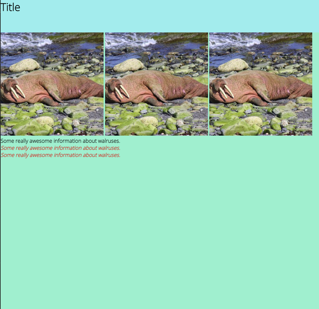
- 3 img tags, inside of our main-display. You can choose any images you want using the src attribute in the img tags. Ex:
img src="https://cdn.pixabay.com/photo/2018/05/27/15/51/walrus-3433733__340.jpg" alt="walrus" - 3 p tags, with text inside, inside of our main-display. Let's give them all the class "display-text", and give two of them an additional class of "colorful".
- It's time to start styling! Let's start with some default styles:
- Give all elements a default margin of 0
- Give all elements a default padding of 0
- Give all elements a box-sizing attribute of border-box
- Make the default font-size 18px
- Make the default font-family Open Sans (we'll need to import this font-family from Google Fonts)
- Give all h1 elements a default font size that is twice the size of the root font size
- Let's start setting some widths and heights:
- Let's give our header div a width that's as wide as the entire viewport and and a height that's 10% of the viewport height.
- Let's give our main display div a width that's as wide as the entire viewport and a height that's 90% of the viewport height.
- Let's set some background colors!
- Let's give both our header div and our main display div a unique background color. Use hsl, rgba, or hex to set the color style.
- Let's resize our images. What's a way we could select all of our images without giving them a class?
- Once you've selected them, let's give them all a fixed width and height, such that the images are now squares. You can choose what width and height you want to give them.
- Are your images all distorted now? Let's fix that - we can use the "object-fit" styling attribute and set it to "cover" for all of our images. This will resize and crop the images to fit in the specific width and height, rather than distorting them.
- Let's make all of our paragraphs bold.
- Let's give our two colorful paragraphs a livelier color. Use hsl, rgba, or hex. Let's also make them italicized, so that they stand out even more.
Your final product should look something like this: