[App Drawer] Fixing The App Drawer #254
Comments
|
Perfect! Thanks for providing all of this info @peth-yursick, there are actually refactors we need to do to the source too. So being able to resolve all this is important. Please let me get the ball moving on metamaps first then we can move forward on the drawer. Cheers! |
Tbh I think the app drawer in its current state is still way more important than metamaps. If you want to keep working on metamaps, hopefully @pakokrew or someone else will be able to push this forward meanwhile. That said, I've been thinking about metamaps a lot yesterday. I was setting up the Notion space & integrated the navigation board, but its super clunky & kind of useless. It got me thinking how awesome will it be to have a proper tool that dynamically generates maps based on eg. kanban boards 🤯 Happy new year dude! 2021 will be 🔥🐙 |
|
@peth-yursick, no worries! Let me shift focus to that today. Even though metamaps is functional, it's still a fair bit of work before an actual merge. Don't get me wrong, totally feel you about the app drawer. Cheers! |
|
@peth-yursick I took a look at this for a hot minute. It's doable, but going to need a lot of reworking from what it is now, since it was done so quickly. I'd probably prioritize it getting done right. It's a bit of a hack job right now (no offense to the dev, knowing it was last minute) |
|
@youngkidwarrior, no offense taken. What feedback do you have? Always open to criticism. |
|
It's been a few days since I looked, but generally I think the biggest flaw was flexbox could have been used a lot more elegantly to solve spacing problems. Also I've always been a big fan of using % for spacing over rem. Especially with all the absolute positioning thats being used. It avoids a lot of the weird spacing quirks. |
|
@youngkidwarrior, that makes a lot of sense. Do you think there is a way to not use absolute positioning? Because, if there is an effective way to convert this to a grid, it would probably solve a lot of these issues. If we do end up coming up with a good solution with grid instead of flexbox. It would probably involve changing the structure of the rest of the header. |
|
@TheLoneRonin We should divide and conquer this to get work done faster. |
|
@youngkidwarrior, I'm certain the app drawer menu can and should be done in a grid. Also, another big issue we need to tackle is effectively getting the This is a much broader issue that impacts the rest of the app. Since this is actually a W3C issue. And a lot of the designs use Either way, don't fret to roast anything here. Always happy to hear how it can be done better. |
|
Yes I agree, the drawer can be made a grid. I saw that. Whenever using images your gonna have to use position absolute. If we can't get it to work in css, an svg would be better. |
|
@youngkidwarrior, okay, let's confirm changes that we would want. Ideally @HammadJ and @pakokrew can sign off these changes for the next PR.
|
I would not call it "safe to use" as it doesn't "just work" in FF evergreen. But I'm partial to FF as it is my default browser by choice, and also highly value consistency and universal support. In my other PR I just added a transparent background as a fallback. So if we do use |
One that wasn't mentioned was the size difference in icons: |

|
Lot of things here, maybe we could create a new issue or create a post here that we update with all the TODO for this task, instead of having everything lost in the discution.
We'll do that on a separate task. Please create an issue specially specing this. I didn't put back my head in the code yet, but from I wrote before on #249 and #245 :
|
|
Issues remaining at this point are:
I actually don't agree with the latter two; neither are common UX in modern web apps. |
|
Chromium 87.0 on Ubuntu 20.04: |

Those look like the old icons. Do a few refreshes or force refresh and I think it will render fine. |
I cleared all the application data in the developer toolbox then hit Ctrl+Shift+R to no avail. I checked it out in Firefox and Chrome, and both look fine. |
I fixed the first issue in #300. Margins between rows are actually computed such that the rows fill the space evenly.
OK, looks like something in our CSS is not rendered the same in Chromium for some reason. @dysbulic Would you be able to take a look at this? I imagine it's a pretty straightforward fix. |
|
@alalonde, @HammadJ suggested in another pull request that this is related to the use of absolute units. I can look at it, but I'm currently trying to get MetaMaps to the point other's can easily contribute, and it may be a couple days. |
OK, no worries. I only asked because you are likely the only Chromium user working on this. |
Only because its not common? |
What is the motivation for moving the buttons in the navigation bar? From a UX perspective, moving elements around increases how hard a user has to work to use an interface. I should only have to learn how to access the Raid Map once, not have it disappear when the drawer is open. Additionally, the drawer is already pretty full and putting the four menu items into it only serves to make it more so. Also the XP and Seeds links at the top do not fit with the visual metaphor of the rest of the buttons. It's not immediately apparent they're navigation options. I think the navigation menu items should stay where they are. |

Yes |
You do. Then when you want to open raids, you click raids, you don't open the whole drawer when the raids button is already there. If you don't need raids, then it doesn't matter if it disappeared 🤷♂️ Its the same on mobile OSes, you open it and the buttons disappear, but I think the main reason I made it so back when I originally made the design is because there are few buttons. If the buttons don't move, the app drawer looked short & fat vs taller & thinner when there are more buttons.. But I don't think we will have this problem of "not enough apps" in the future, so I don't really care about it.
They're not navigation options, they're supposed to be numbers like on the phone where you have the clock & battery percentage. Maybe we don't need them since all that info will be displayed on the dashboard, though it might still be cool to have it accessible so people don't have to navigate back to the dashboard to see? Idk. |
That makes alot more sense. I agree that would be useful to display. |
|
#234 covered all the issues here, and if there's something unanswered buried in these myriad pages, it should be reentered as a new issue. |
As promised, time to expand on the issues mentioned for the app drawer!

Here's a few:
The drawer itself should be at least 30% thinner. Looks too big now + shows the noise the parts that are pasted from figma.
The apps in the bar itself should be centered, currently aligned top

The drawn out part should be smaller than the drawer on all sides, currently just on top left
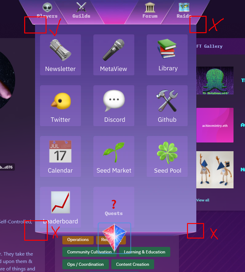
The drawer should be transparent blur like the cards in the profile & NFT gallery
The font should be IBM Plex Sans (I think currently its just IBM Plex)
There should be no underscore when hovering buttons
The apps in the drawer should have equal spacing on all sides, like in the original design

- There should be no blue frame around the logoThere should be no blue frame around the buttons

When the app drawer is open, the shortcuts from the navigation bar should move from the bar to the drawer itself.


- Different version of the logo should be usedMost importantly, the apps should be opening in a window like the NFT gallery, not in new pages.
The text was updated successfully, but these errors were encountered: