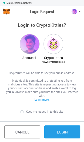
Login Request Screen #36
Comments
|
|
|
as discussed in last week's design review - I like the first to start, since it's more accurate (we're exposing the whole Ethereum provider API, not just knowledge of a single account). The second is an awesome goal we should continue to work towards. Also, Status team had some questions about the "log in" metaphor, going to direct them here .. |
|
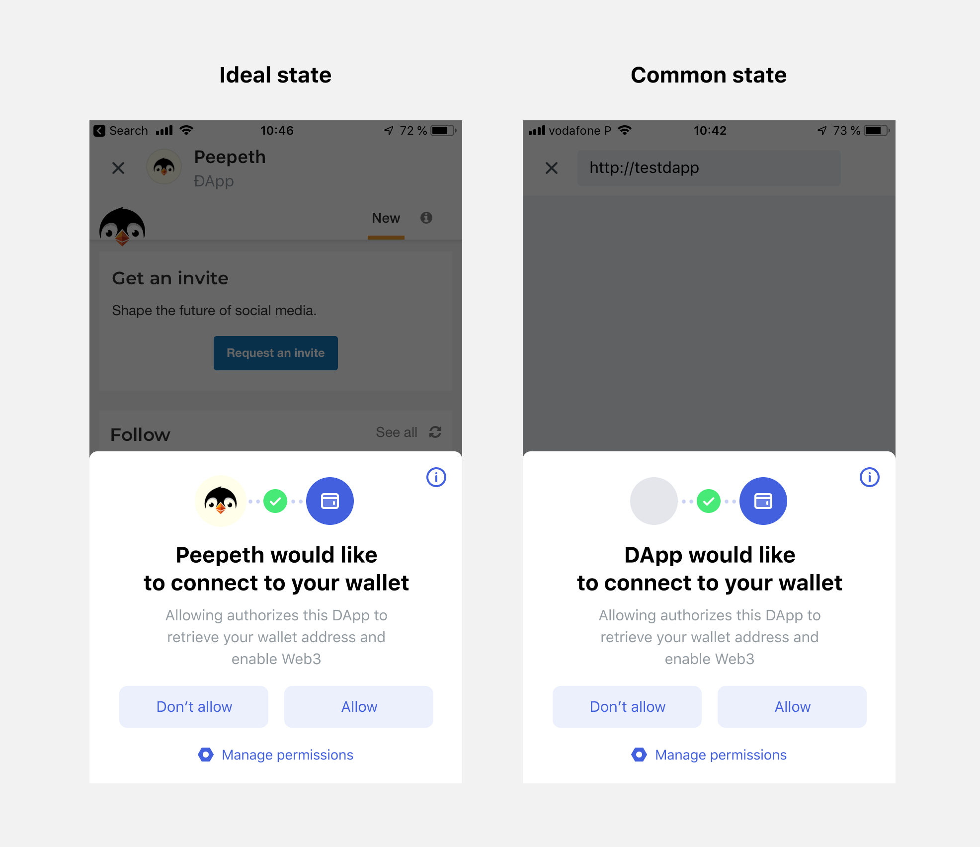
Hey there! My name is Denis and I work for Status as UI/UX designer. Currently, I'm working on the UX of the same thing. And after having some discussions with our dev team and checking your nicely done proposals, I came up with following screens:
The thing is the most of DApps (and probably DApps that what to fingerprint you) are trying to inject web3 right during the first loading of a website. And I think in this case "Log in" metaphor could confuse users because they didn't press any "Log in" button yet. That's why I decided to go with the word "Connect" here. For me, it has a more neutral context. What do you think? |
|
Hey @denis-sharypin. Thanks for sharing - these look great! First off, I'd like to make the distinction that the screens I shared above are intended for desktop, so the requirements will differ between desktop and mobile. That being said, you're mobile designs are very clear and coherent. Well done. I agree that "Connect" is a good metaphor considering dApps will request to connect as soon as the page loads. Good call! My only feedback here is that at first glance the icon w/blue background looked to me like a browser icon, not so much a wallet icon, which I assume is what that icon is supposed to represent? What will the "info" button mention? I expect it will may have info about what's technically happening under the hood? How are you thinking about "permissions" for this feature? |
|
@cjeria from our discussion today - I think we can tighten the copy. How about
|
|
@cjeria Hey, thanks for the feedback! Re: Icon Re: info button Re: permissions |

|
The conversation is moving in the right direction for us, but thought I'd throw in my 2 cents. We're using Metamask to log in via message signing, and only occasionally for fund transfers. Using the login metaphor, connecting to Metamask is asking for the user id. A login is performed when signing a challenge or entering a password. For this reason, I like @bdresser wording or similar variation and/or the word "Connect". These are neutral, technically accurate, and do not imply anything else other much other than reading the address. |
|
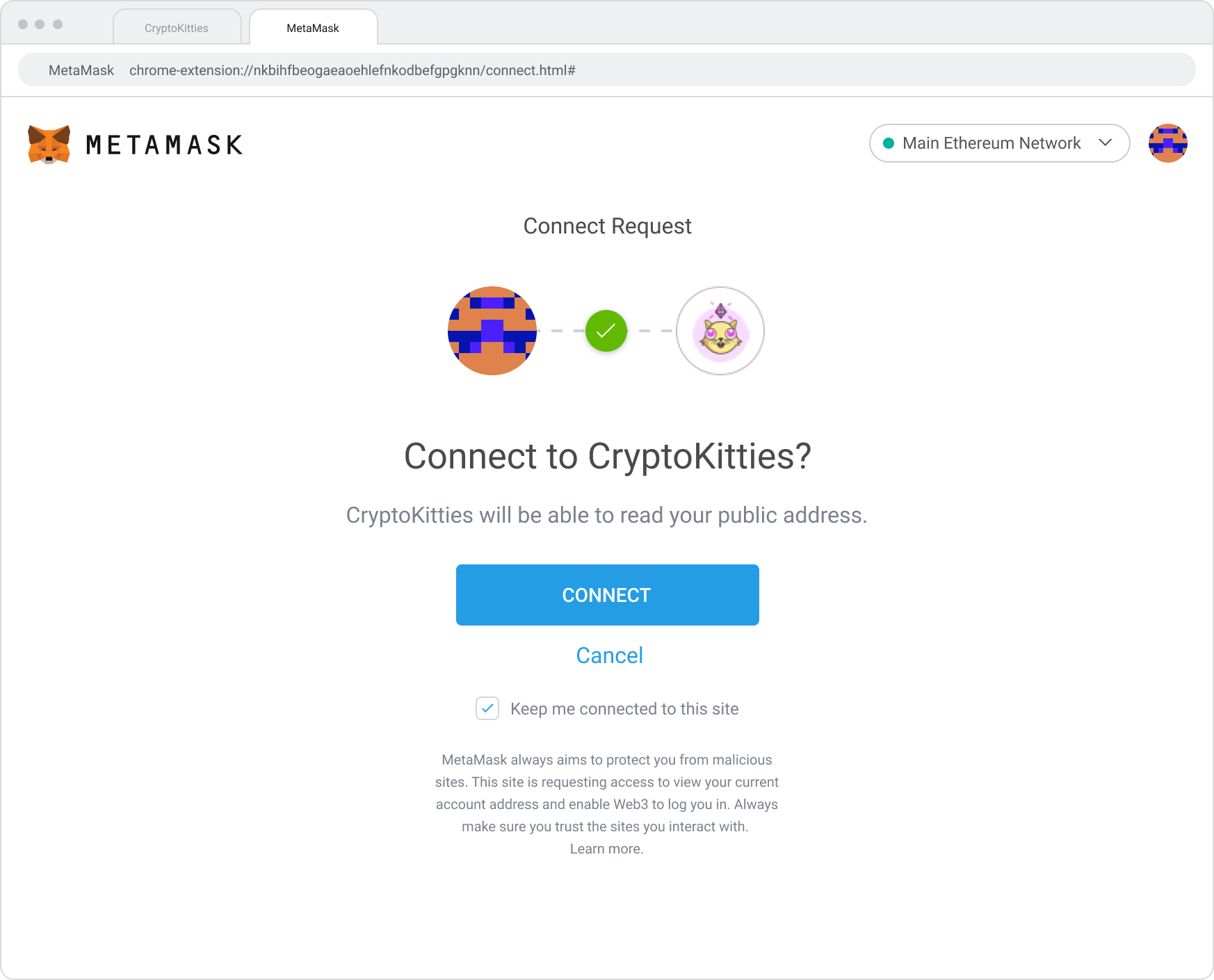
Have we considered opening up a new tab for the connect request screen like below? Once dapps begin to implement a connect button on their dapps, this would trigger the MetaMask connect screen (in new tab). The tab would then close out as soon as they connect or reject. Thoughts? @bdresser @danfinlay
|
|
I do like the full screen. Sort of similar to like a gmail auth flow or something similar, except ours would be new tab instead of in the same window. Would we close the tab once the user hits Also, what's the advantage over the popup version? Just that the user is less likely to lose / miss the modal? More familiar web experience? May be necessary to just ship one or the other and then continue to test and iterate on this presentation - it's a new paradigm and i'm sure we'll get a lot of feedback from folks. |
|
heads up @cjeria - @bitpshr has mentioned that this will be more complicated than the UI flow that's already been built. since we're initially going to roll out an opt-in "Privacy Mode" (MetaMask/metamask-extension#5496) I think we should launch with the initial pop-up UX, test this full screen flow with some users to make sure it's worth it (@omnat) and then roll out another iteration once we start to make Privacy Mode "on" by default. Sound good? |
|
Looking over the thread above and the design that @denis-sharypin suggested, I think it makes sense having the requester (dapp) show up on the left and the recipient (user account) on the right. Since the assumption would be that most dapps wouldn't have a main action button for users to connect at first. @bdresser @bitpshr Thoughts?
|

|
looks great @cjeria! agree the dapp on the left makes sense, good edit. for consistency's sake, can we re-use one of the top-bars we have across the extension now, rather than introducing a new one just for this popup? Might make sense to use this one, which would also give the user the ability to change the account they're using to connect
If that complicates the
|


|
@bdresser In both cases, the two headers are used in contexts that don't apply to the connect screen. The main app header doesn't make sense here because we don't provide the ability to change networks or change accounts in any of the action screen. The screenshot below (with the Edit button) is specifically for confirm transaction screens, where the user can edit the gas of the tx. It wouldn't make sense to have an edit button in the connect screen because there's nothing to edit. We also don't allow the user to change networks here either. The design I suggested above is intentionally made more like your second screenshot attached, accept the network is further simplified (background color of the network are is removed) which cleans up the presentation and reduces the height of that top bar. |
|
I think this may be good to close! :D |
The text was updated successfully, but these errors were encountered: