This project was made to help get me familiar with JavaFX by using its XYCharts. It gets the names of all CSV files in the data folder of the project and lets you select which ones you want to use for the data of a graph. There are 6 different types of graphs - line chart, bar chart, stacked bar chart, scatter chart, area chart and stacked area chart. Each of these graphs has its own tab and remembers your graph/settings when you click onto another tab so you don't have to worry about remaking a graph if you quickly switch graphs. For each of these graphs, you can select the CSV files you want to the x and y-axis names and the title of the graph. Each data point has a tooltip which means you can hover over the data point to see its value. Finally, you can save all of the graphs to PNG's and it will save the graph with the name of the title to your downloads folder. For a more in-depth breakdown of the system, you can look at the sections below.
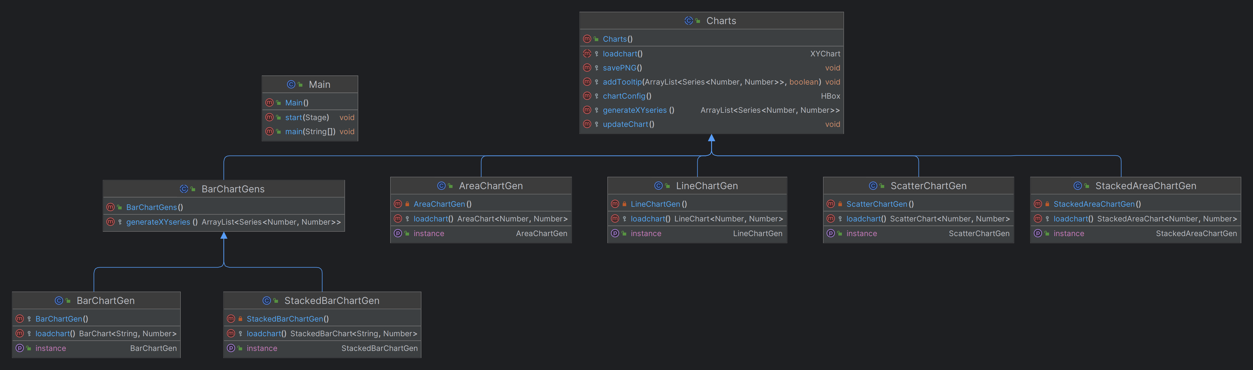
Below is a class diagram of the classes in the program:
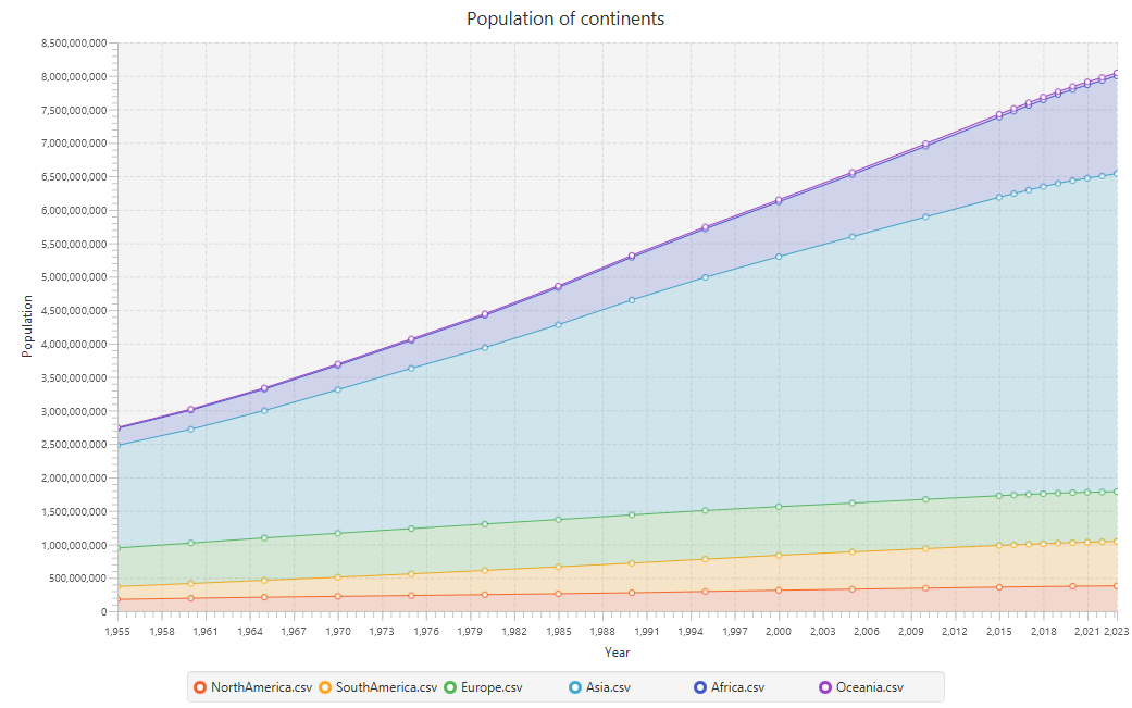
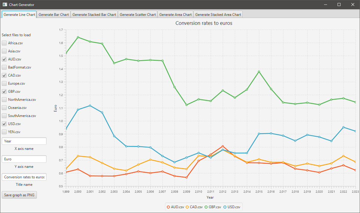
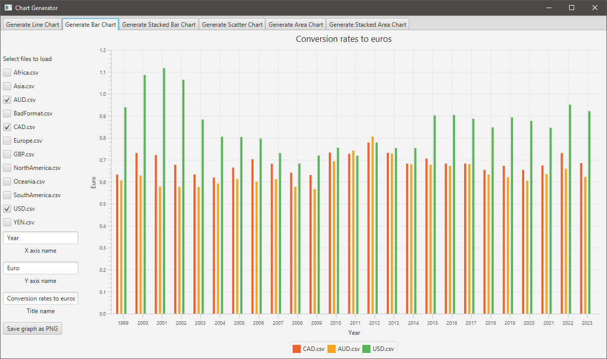
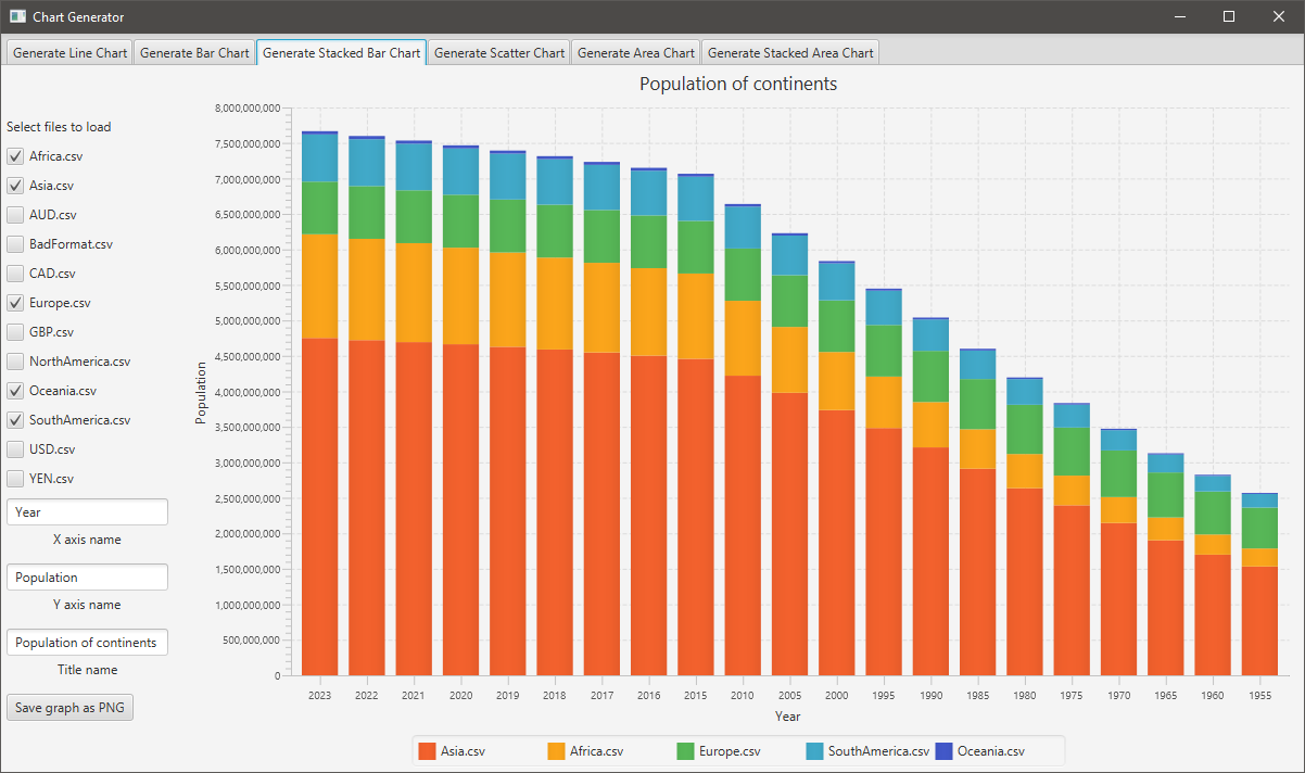
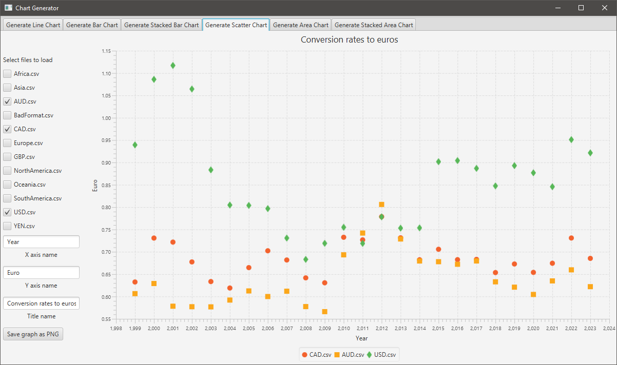
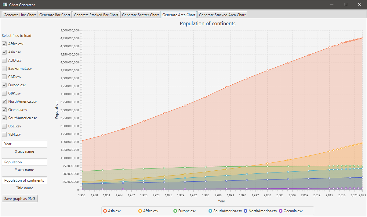
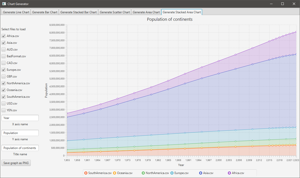
The program works and populates graphs through data in CSV files. There is a data folder under the resources folder, this is where the program reads the CSV files from and the data in the CSV file should be just 2 values on each line with a comma separating them (see the next section for how errors are dealt with). Each of the file names is added to a tickbox list and when the user ticks a box the data is added to the chart, then on unticking a box the data is removed from the graph. For testing purposes and proof of concept there are a series of files already in the data folder, there is different currency conversion rates from the past 20 years and the population of each continent over the past years and one file which has poorly formatted data.
A file must be a CSV file and formatted as in the example below:
datapoint-y-1,datapoint-x-1
datapoint-y-2,datapoint-x-2
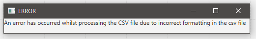
If a file isn't formatted correctly then when the user tries to load and select the file an error will occur. To deal with this error the code creates a popup stating that the file is incorrectly formatted and then it throws that error back so that the tick box is also unticked. Once the user closes the popup the program works as normal. The popup is as such:
When the program is reading the data it also calculates the min and max values of the x-axis to ensure that the graphs look nice. The reason why the x-axis specifically is taken is due to the step normally being not a round number whereas the y-axis will typically be a number that is round and goes up by a set amount. So the min and max of the x are taken to work out the step for the x-axis which is the max taken away from the min, but it also is rounded to the nearest nicely formatted number be it a single decimal point, a whole number or to the nearest 5. This is then given to the XYChart that javaFX provides. The code for calculating the step is as below:
double xstep = Math.ceil((xMaxMin[1] - xMaxMin[0]) /30) > 5 ? Math.ceil(((((xMaxMin[1] - xMaxMin[0]) / 30) + 5) /10)*10) : Math.ceil((xMaxMin[1] - xMaxMin[0]) /30);
NumberAxis xAxis = new NumberAxis(Math.ceil(xMaxMin[0]),Math.floor(xMaxMin[1]),xstep);
The second line changes depending on the chart as its specifying what the lowest and highest x value on the chart can go to, so for line charts it's just the max and lowest number as the flooring and ceiling of the values provide a little bit of space which aesthetically makes sense for line charts. However, for scatter charts, the min has the step taken away from it and the step added to the max as aesthetically it makes more sense for there to be a bigger gap. This is one of the reasons why loadchart method in the charts class is abstract as each graph has at least a slight difference in configuration.
One of the main features which XYCharts in javaFX lack is the ability to see what the value of each data point is, by default the only option is to show data points or not. This is the same for all types of charts even ones without points like bar charts, so hovering over a bar you cannot see the value of it. Thus this led me to use the tooltip in javaFX which is a component you can add to any node (a data point is a subclass of a node) and it is a small grey box that appears after hovering over the node. Then to make the nodes change color to black so it's clear what point you're looking at so on hover it applies a CSS class to just that node and then it removes the class when you stop hovering over it. The code to accomplish this is as such:
    protected void addTooltip(ArrayList<XYChart.Series<Number,Number>> series,boolean resize){
        // Loops through each series data points
        for(XYChart.Series<Number,Number> dataSeries: series) {
            for (XYChart.Data<Number,Number> data :dataSeries.getData()) {
                // Creates a tooltip with the value nicely formatted and the y label added to the end of it
                Tooltip tooltip = new Tooltip(new DecimalFormat("#,###.###").format(data.getYValue()) + " " + ytextField.getText());
                Tooltip.install(data.getNode(), tooltip);
                tooltip.setShowDelay(Duration.millis(100)); // Reduces time it takes to show tooltip from 1 second to 0.1
                // Makes the data point black when hovered over for clarity
                data.getNode().setOnMouseEntered(eventH -> data.getNode().getStyleClass().add("onHover"));
                // Makes the data point go back to normal when the mouse is no longer hovering over
                data.getNode().setOnMouseExited(eventH -> data.getNode().getStyleClass().remove("onHover"));
                // To reduce node size, it converts the node to a stackPane and sets its height and width
                if(resize) {
                    StackPane stackPane = (StackPane) data.getNode();
                    stackPane.setPrefWidth(7);
                    stackPane.setPrefHeight(7);
                }
            }
        }
    }
Here is a demo of all the tooltips on the various graphs:

All 6 of the different graphs can be exported and saved to a png image with the click of a button. The code for achieving this is very simple in JavaFX as most components have a snapshot feature that gives a writeable image and then I turn that writeable image into a buffered image through SwingFXUtils and then this buffered image is written to a file with ImageIO. Every image that the user saves is stored in the downloads folder with the file name of the chart title.
The code for this is:
    protected void savePNG(){
        // Gets a snapshot of the chart
        WritableImage image = chart.snapshot(null,null);
        // Creates an empty file for the image in downloads
        File imageFile = new File(System.getProperty("user.home") +"/Downloads/" + chart.getTitle() + ".png");
        try{
            // Writes the image into the empty image file in downloads
            ImageIO.write(SwingFXUtils.fromFXImage(image, null), "png", imageFile);
        }catch (Exception e){e.printStackTrace();}
    }
An example of the resulting image that is stored in the downloads folder is below: