UX and UI review #23
Comments
|
I wrote up a doc, viewable here because it is a bit long for a comment, with some of my own thoughts regarding the UX, as well as what happened when I had a few friends test the app for the first time. Over the next several days, I'll make some wireframes that show the ideas I had for usability improvement. I'd also be happy to make some nice, polished UI mockups later! @MichaelMure - Do you want me to post images in this thread, in a separate issue, or somewhere else? |
|
Thank you ! Awesome work. Images are fine here. Actually, the whole document is fine here too so everything is at the same place and doesn't get lost. I'll reply in more details a bit later. |
|
First, I just wanted to say that I appreciate that you actually suggest solution instead of just saying "this doesn't work" 👍 👍
I will deal with the easy wins in the next few days:
Those are also easy to do if we can finalize something
|
|
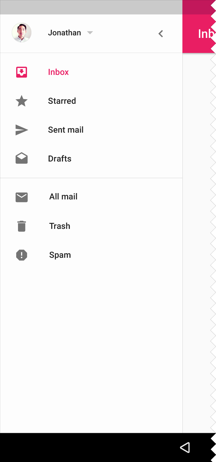
To answer your question about the profile photo at the top left-- I think I meant top right, sorry! I will edit it when I get home. In all of Google's Material apps, like Gmail, Drive, Calendar, etc, the user's profile information is in the top right corner when viewing on a desktop. Example from Google Calendar: Also, regarding icons-- I have a lot of free use icon packs, so I will look through them for some replacements. |

|
Ho, that make sense ... In the beginning, the right panel content was going up to the top of the window, but I aligned it to the left panel following some advise. Now there is space to use for the profile and maybe other things.. For the icons, be careful. It has to be with a license compatible with the project (GPLv3). Just non-paying is not enough. |
|
@htmelton |
|
@htmelton
I just found out that I actually don't use the global error anymore but it's available. The form for adding a contact with a pubkey is a weird case because there is a single input field so the resulting error (of all the form) could be assigned to this field. But it seems more consistent to me this way. What do you think ? Edit: that said, this form could have a stronger validation to give a feedback early when the text entered doesn't looks like a pubkey. |


|
@htmelton |

|
@MichaelMure Yes, that color is fine. I came up with the other one using a color picker extension for Chrome, so it isn't officially listed anywhere. As for your question with the pubkey field, it's a good idea to have the early feedback like you've now implemented! |
|
So, tonight I made some very basic wireframes that show off how I'm thinking the top bar and sidebar could look and how we can make better use of the screen space. I wasn't sure where to begin so I focused on the contacts section because it's the first thing a user sees after they make an account. I drew on a lot of inspiration from Google Contacts. Contacts Wireframe PossibilitiesView Contacts List Clicked on Individual Contact Hide/Delete Contact Floating Action Button Transformed to Add Contacts Add By Pubkey Suggested Contacts (also shows collapsed sidebar) NotesAs I mentioned, I was inspired by Google Contacts and thought about some ways to incorporate that into the app to help make better use of the space. I added a floating action button that transforms into a menu to be more consistent with Material Design guidelines, but the FABs are not mandatory so we can change it if you prefer the old style of button. I grouped hide and delete a contact under an overflow menu because the actions that can be taken in the dialog box should be grouped together, but having a toggle switch and a button or trash icon next to each other looked inconsistent. Finally, I used the Material icons I had available but I am looking around for some nicer icon kits that have the license we need. I will also think some more about how expanding and collapsing the sidebar may affect the layout so the spacing isn't 100% polished yet. |


Wireframes Showing 2 Column + Menu LayoutView Contacts Contact's Information Add By ID Suggested Contacts NotesHere's a version with 2 columns and no popup windows. To keep the 2 columns but reduce the potential for clutter, I thought maybe we could group the items in the second column into a card view (or a grid of cards, where applicable) and have that standardized across the app anywhere there is content in the second column. How it is right now, there isn't a clear visual "border" (for lack of a better term) that groups the information together in the second column, while in the first column, each element is neatly in its own little block with a clear border. So putting the second column in card view might make it seem more cohesive and not cluttered, as I think everything that's currently in the second column on each part of the app can be made into cards. |


|
Good work ! A few thoughts:
It's hard to make things simple :-( |
|
Yes, the menu can go up to the top of the window past the bar. Either way is accepted in Material Design. Regarding the settings and chat windows, I think it's probably best to have the top bar there anyway for consistency (but maybe without a search box because you can't search there). To be honest, I am not sold on the floating action button either. I've been trying to think of some possible alternatives, but we could just put a way to cancel/go back in the current setup. Finally, on your last point-- there are some ways to get around that. One way would be to make the left column wider and the list items expandable so when you click on the dropdown, the contact details show like on the "Topics" screen here and keep the right column available for suggestions/add. Another way would be if the contact details could open above the suggestions/add and push them down instead of making them disappear (not sure if this is possible). |
|
Yes, it's possible to scramble the UI. It's made with React and Redux, which means that it's just component in a hierarchy. Redux helps to avoid heavy dependencies between components, so using a different layout would not be that much work. |
|
Some expanded and closed navigation ideas with the new icon set I found. I thought the 3 connected circles button might be better for the share something page because it doesn't look like a message (which confused people in the usability test) and was ranked as the most easily recognizable in this study.
|


|
Awesome 👍 I notice that you don't have the dividers that groups the icons by theme. Is that by choice ? Also, there is a need for a button (at the bottom i guess) to open/close the menu. What would you use ? |
|
Here is some variations:
What do you think ? |


|
I implemented the open/close menu:
|


|
I do like the "activity" icon here. I think I prefer the menu either with the lighter dividers or completely without. I think Google traditionally uses the hamburger menu to expand the sidebar and a backwards arrow to close it, but I'm not a fan of the hamburger menu and its effectiveness is pretty heavily debated. For now, I think the collapse at the bottom is fine. |
|
Ok, what about: |


|
I like the double arrow version! |
|
Good choice 👍 |
|
@htmelton I started moving the search bar and the profile in a top bar. Have a look. |
|
Looks good! |
|
@htmelton I also reworked the chat and settings page to have the top bar and used the color scheme of your mockups. I also added a logout button in the top bar:
It's looking good everywhere but the chat window, it's less happy there
What do you think ? What would you change ? |


|
And also, the respective background colors with the light palette are much less contrasted: Is that ok ? |

|
@MichaelMure, @htmelton You guys need any help with the desktop app? |
|
Also, I'm unable to run the desktop app on my Windows 10. It says IPFS not found. |
|
@MichaelMure I will think about the chat screen today. @YashA08 Hi, nice to have you join! Do you have any thoughts on how we can improve the chat screen? |
|
Hi @htmelton, I haven't got the chance the look at the screens as yet. I'm to get the app running on my laptop first. |
|
@MichaelMure I was thinking of a few easy ideas that may help the chat screen. I think one of the main problems is that the conversations bar looks a little cramped.
|
|
Like this ? Or with the contact bar up to the top: With this as the fallback: |


|
@MichaelMure Visually, I think I prefer the conversations bar to be all the way up to the top so it matches the sidebar. I have some thoughts on the layout of the part of the screen that displays the actual chat messages as well... will draw up some sketches tonight |
|
@htmelton @YashA08 const dark = createMuiTheme({
palette: {
type: 'dark',
background: {
main: '#303030',
dark: '#252525',
light: '#424242',
darker: '#202020',
emphasize: '#484848',
}
},
})
const light = createMuiTheme({
palette: {
type: 'light',
background: {
main: '#fafafa',
dark: '#f5f5f5',
light: '#ffffff',
darker: '#e0e0e0',
emphasize: '#dcdcdc',
}
},
})So now I can change them easily. Is that good colors ? Also there may be some quirks here and there, please report if you see something wrong. Btw, you need to run |
|
@MichaelMure Looks pretty good, but is there a reason the search bar is now a different color than the rest of the top bar? It makes it kind of look like it's not a part of the top bar. think it would look most cohesive if it was the same color, or if the search bar was thinner and and had padding around it, like this example from Google Drive, so it would look like it's still "inside" of the top bar.
|

|
@htmelton fixed, I missed that. |


|
@MichaelMure Looks good! If you want, I can do an A/B test with the images |
|
I implemented a global privacy switch to stop sharing your contact list with your own contact if you want to: I also reworked the contact details view, with a reminder when the global privacy is enabled: As always, comments welcome |


|
Hi @MichaelMure Is there any place where I can take a look at the full UI of Arbore? I tried downloading the program but it wouldn't run |
Some polish is needed, please provide feedback here :)
The text was updated successfully, but these errors were encountered: