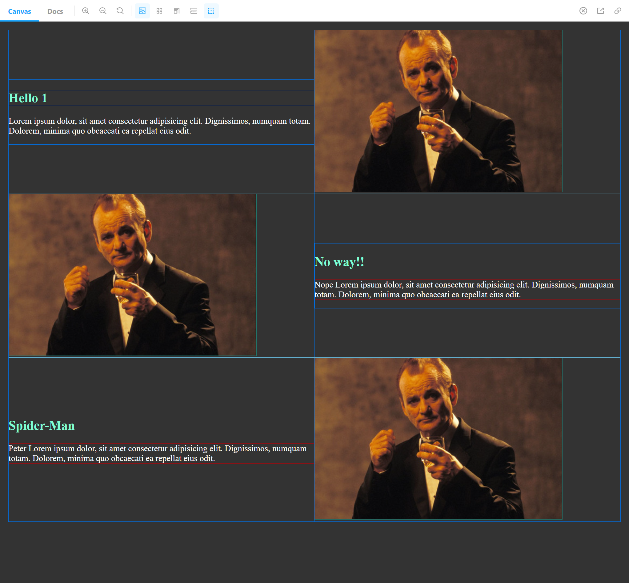
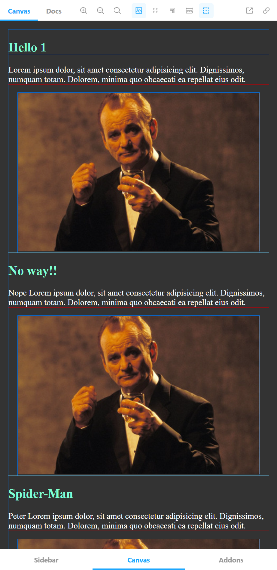
SnipSnap is a responsive React component that helps you create a zig-zag/switcharoo content layout without hassle. It uses styled-components for styling. (The only styling is flex related, there's no visual styling.) So you are required to install styled-components.
npm install snipsnap
import { SnipSnap } from "snipsnap";{
content.map((item, index) => (
<SnipSnap breakpoint="400px" reverseOrder={false} id={index}>
<div>
<h1 style={{ color: "aquamarine" }}>{item.title}</h1>
<p style={{ color: "white" }}>{item.post}</p>
</div>
<div>
<img src={item.img} />
</div>
</SnipSnap>
));
}Keep in mind that colors are only there to show you how this works. SnipSnap only styles the layout. And does a pretty minimal job at it. All the margins you see are browser defaults.
SnipSnap takes 3 props.
breakpoint: Is a string. It helps you define the responsiveness. i.e 630px This prop is 0px by default.
  @media (max-width: ${({breakpoint}) => breakpoint}) {
    flex-direction: column;
}id: SnipSnap is designed to used with map() method. This prop helps SnipSnap to reverse the order of content. Packages like uuid would not work since the component only works with numbers and checks if they are odd or even. So, the ideal usage of SnipSnap is as follows.
{
  content.map((item, index) => (
    <SnipSnap breakpoint="400px" reverseOrder={false} id={index}>
      <div>
        <h1>{item.title}</h1>
        <p>{item.post}</p>
      </div>
      <div>
        <img src={item.img} />
      </div>
    </SnipSnap>
  ));
}reverseOrder: This is false by default. If you are happy with the order of your layout, you shouldn't change this. If you change it to true, it reverses the content order inside the individual SnipSnaps.
const Root = styled.section`
  display: flex;
  align-items: center;
  flex-direction: ${({ layout }) => layout || "row"};

  & > div {
    flex: 1;
  }

  @media (max-width: ${({ breakpoint }) => breakpoint}) {
    flex-direction: column;
  }
`;SnipSnap.propTypes = {
breakpoint: PropTypes.string,
reverseOrder: PropTypes.bool,
id: PropTypes.number.isRequired,
children: PropTypes.element.isRequired,
};Default values of the props are as following.
SnipSnap.defaultProps = {
  breakpoint: "0px",
  reverseOrder: false,
};