yarn add @noe-p/react-buttons-componentsimport { ToggleMenuButton } from '@noe-p/react-buttons-components';
import { useState } from 'react';
export function Button(): JSX.Element {
const [isOpen, setIsOpen] = useState(false);
return <ToggleMenuButton isMenuOpen={isOpen} onClick={() => setIsOpen(!isOpen)} />;
}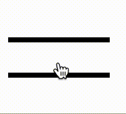
Required Props
| Props | Type | Description |
|---|---|---|
| isMenuOpen | boolean | Boolean to change button state |
| onClick | function(value: boolean) | Function to change button state |
Optional Props
| Props | Default | Type | Description |
|---|---|---|---|
| colorOpen | black | string | Bar colors when the menu is open |
| colorClose | black | string | Bar colors when the menu is close |
| width | 40 | number | Width and height (it’s a square) of the component (px) |
| spaceBetweenBars | 35% | string | Space between the two bars (%) |
| barThickness | 3 | number | Bar thickness (px) |
| animationDuration | 0.3s | string | Animation duration |
| mobileWidth | 30 | number | Mobile width and height (it’s a square) of the component (px) |
| mobileBarThickness | 2 | number | Mobile bar thickness (px) |

Required Props
| Props | Type | Description |
|---|---|---|
| isMenuOpen | boolean | Boolean to change button state |
| onClick | function() | Function to change button state |
Optional Props
| Props | Default | Type | Description |
|---|---|---|---|
| textOpen | Menu | string | Text when the menu is close |
| textClose | Close | string | Text when the menu is open |
| animationSpeed | 0.2 | number | animation speed between character (seconds) |
| animationOpacity | 50% | string | character opacity dureing animaiton |
| fontSize | 25px | string | Font Size |
| fontFamily | serif | string | Font Family |
| closeColor | black | string | Text color nwhen the menu is open |
| openColor | black | string | Text color nwhen the menu is close |
| animationTranslation | 100% | string | Text animation translation |
| mobileFontSize | 20px | string | Font Size on Mobile |
| style | null | CSS Style | Custom css style |