Skip to content
New issue

Have a question about this project? Sign up for a free GitHub account to open an issue and contact its maintainers and the community.

By clicking “Sign up for GitHub”, you agree to our terms of service and privacy statement. We’ll occasionally send you account related emails.

Already on GitHub? Sign in to your account

List-group: Branded #1466

Closed
wants to merge 5 commits into from
Closed

Conversation

louismaximepiton
Copy link
Member

@louismaximepiton louismaximepiton commented Aug 17, 2022

Fixes #1452.

On hold until design review of specs.

@netlify
Copy link

netlify bot commented Aug 17, 2022

Deploy Preview for boosted ready!

Name Link
🔨 Latest commit 24aa878
🔍 Latest deploy log https://app.netlify.com/sites/boosted/deploys/62fe0afb0e5c5d000720f5ca
😎 Deploy Preview https://deploy-preview-1466--boosted.netlify.app/docs/5.2/components/list-group
📱 Preview on mobile
Toggle QR Code...

QR Code

Use your smartphone camera to open QR code link.

To edit notification comments on pull requests, go to your Netlify site settings.

@louismaximepiton louismaximepiton marked this pull request as ready for review August 17, 2022 13:03
@isabellechanclou
Copy link
Member

Notes:

  • The focus state doesn't have the correct appearance in this PR. It will be corrected in the focus dedicated PR Apply visible focus design guidelines in all components #1437

  • In the #Flush paragraph, it might be useful to add a design callout saying that this flush variant shall be used inside a container with a top and a bottom border, to have at the end the same design as illustrated on the design specifications.

    --> Design specifications illustration:
    image

    --> Boosted illustration:

    image

  • In the #contextual-classes paragraph second example, the design specifications have to be checked with designers for the color of icons on the different interactive states (hover, pressed/active, ...) for what they've described for the light version is not consistent with what they've described for the dark version. In the light version, the icons keep the same color no matter the state when they change color in the dark version.

@isabellechanclou
Copy link
Member

isabellechanclou commented Aug 17, 2022

In List-group.md file:

  • paragraph #custom-content, the police size of <small>And some small print.</small> shall be 16px and not 14px.
  • paragraph #checkboxes-and-radios, I think the checkbox/radio button left margin should be 10px and not more, for in the design specification "Numbered", the number has a left margin of 10px. To me, it the same type of case.

@louismaximepiton
Copy link
Member Author

* paragraph `#custom-content`, the police size of `<small>And some small print.</small>` shall be 16px and not 14px.

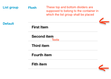
I don't think so, we don't have specs for this specific case + <small> should display a font-size of 14px. Maybe only a callout should do the trick ? Linked to #1199.

* paragraph `#checkboxes-and-radios`, I think the checkbox/radio button left margin should be 10px and not more, for in the design specification "Numbered", the number has a left margin of 10px. To me, it the same type of case.

Spoke together and we'll propose a shifted design for a design review: padding-left: 15px for every variant even Numbered.

@louismaximepiton louismaximepiton mentioned this pull request Aug 23, 2022
4 tasks
@louismaximepiton
Copy link
Member Author

Adding what was said in design spec meeting:

  • The specs for active states is great for the dark variant and should be backported to the white variant. -> Nothing to change atm
  • Flush variant should stay as-is but we might introduce some examples to show how to build the different variants. -> Open another issue to tackle it ?

@louismaximepiton
Copy link
Member Author

Please see #1467. Closing this one.

@louismaximepiton louismaximepiton deleted the main-lmp-list-group-branded branch November 16, 2022 13:51
Sign up for free to join this conversation on GitHub. Already have an account? Sign in to comment
Projects
None yet
Development

Successfully merging this pull request may close these issues.

List group: make the component branded with the specs.
2 participants