Styling UINavigationBar: Part 1
We get a lot of questions about styling the UINavigationBar ("navbar"). There are a lot of nuances to styling the navbar, especially considering there are several ways to specify what types of buttons are displayed. This post will talk through the various ways to define navbar buttons and how to style each of them. We'll being by talking about how to style the navbar itself. Note: This post is based on Pixate Engine 1.1 beta 1 or later running on iOS 6.x (an iOS 7 post will come later).
Styling the navbar itself is probably the easiest of the steps here. There is a long list of standard properties you can use, and you can see all of them here. Other than background-color, we'll also talk about a few properties that are specific to the navbar:
- vertical-position-adjustment
- opacity (boolean)
- shadow
- shadow-size
- shadow-inset
- shadow-padding
Additionally, navbar also has a few 'virtual children', or children that aren't actual controls (i.e. UIView's) but are accessed in the same way (e.g. "navigation-bar virtual-child-name { ... }"):
- bar-button
- back-bar-button
These virtual children will be discussed in part 2 of this post.
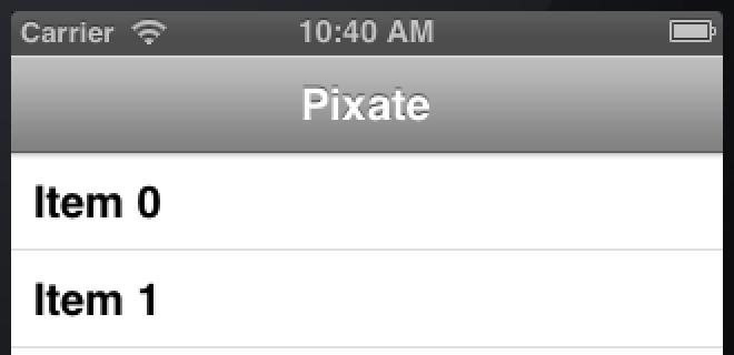
Let's begin with styling the navbar. Here's a navbar without any styling:

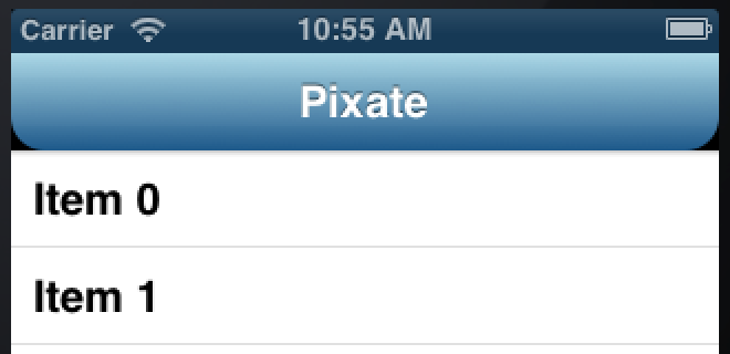
Now let's simply give it a tint color with this css:
navigation-bar {
    background-color: gray;
}
Which results in this:
So an important thing to note here is that when using a solid color, tint is applied to the navbar, not a solid fill. This means that it still has the default gradient, but just with another color. By the way, notice how iOS has automatically tinted the top status bar to match our custom color.
So of course you might now ask how might you specify a solid, flat color? We can use a "trick" here by creating a gradient that uses the same color for the "from" and "to" colors:
navigation-bar {
    background-color: linear-gradient(#215a88, #215a88);
}
Now we have a solid, dark blue navbar (with a status bar to match):

Can you use your own gradient or image? Of course you can. Here's an example of using a gradient and rounding only the bottom corners:
navigation-bar {
    background-color: linear-gradient(lightblue, #215a88);
    border-bottom-left-radius: 15px;
    border-bottom-right-radius: 15px;
}
If you look closely, you'll see a shadow under the navbar that goes straight across. This is automatically added by iOS. You can replace it with your own image, or just get rid of it using:
shadow: none;An example of using an image for both the navbar and its shadow might look like this (images courtesy of App Design Vault:
navigation-bar {
    background-image: url(oak-wood-menu-bar.png);
    shadow: url(oak-wood-underbar-shadow.png);
}
In part 2 of this post, coming soon, we'll talk about how to style the various button types on a UINavigationBar, as well as dealing with orientation changes.
[Published: 2013-07-31]