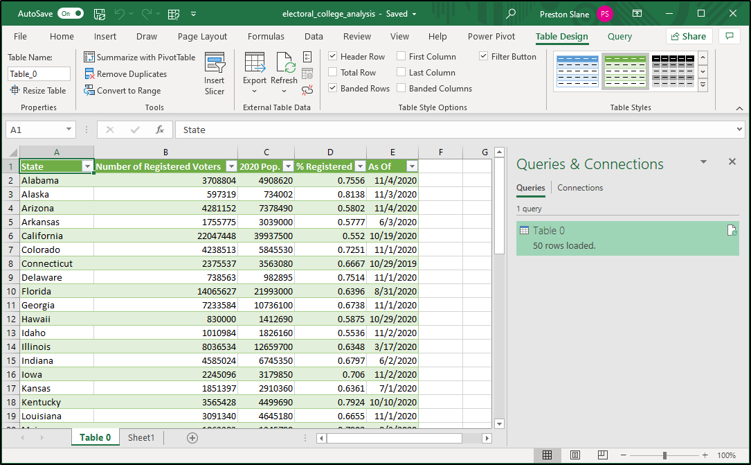
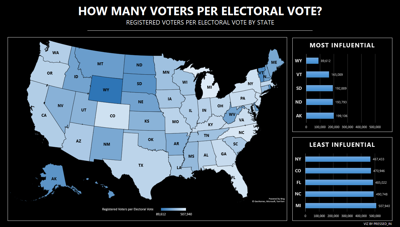
Infographic representing relative vote weight by state (calculated by registered voters / electoral votes). Created with Microsoft Excel
Steps for re-creation are obtaining data (1) and creating visualization (2)
Sources:
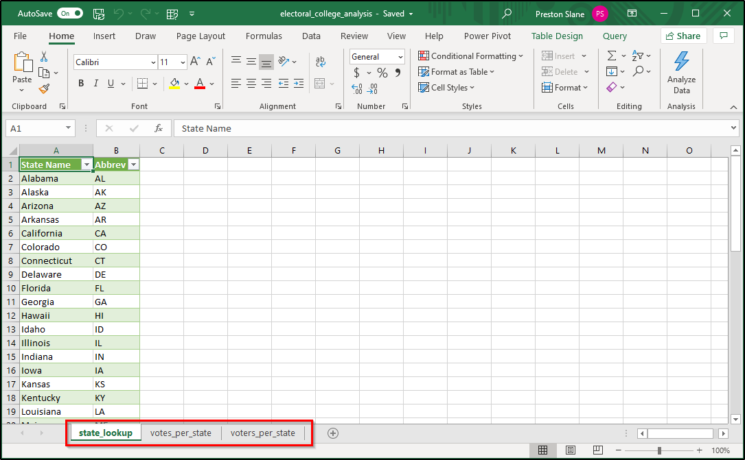
Voters per state
Electoral votes per state
State lookup table
Step 1: Getting the data from the web!
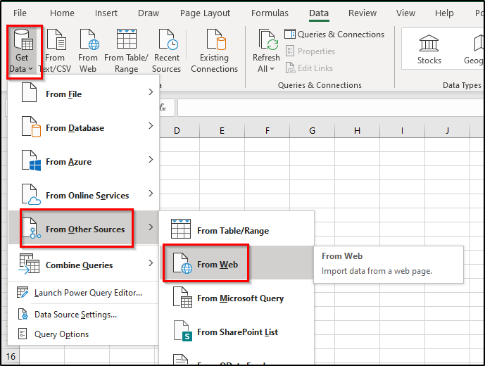
I've already gathered the necessary websites, so all that's left to do is get the information that they hold into our Excel file. When attempting to get data from the web, I always like to start out with Excel's nice Get Data --> From Other Sources --> From Web:
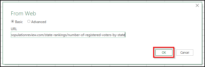
Simply paste in the website name, hit okay, and you should be met with this window:
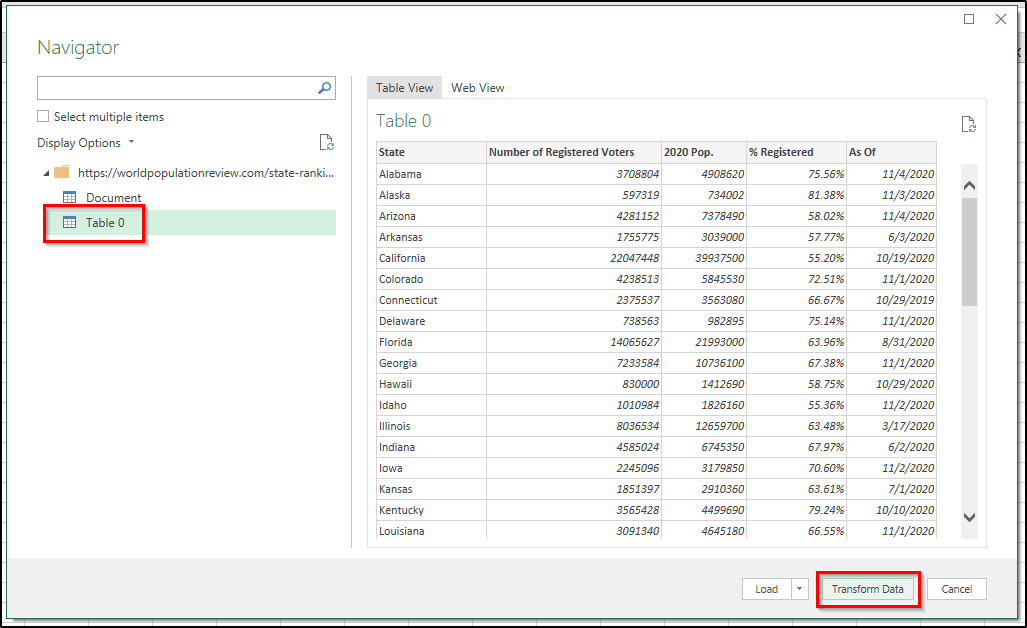
It looks like Table 0 is what we want, so that's what we select. It's good practice to check out your query in the query editor, so while this pull is simple and we could simply hit "Load" from here, let's instead hit "Transform Data" and open up that query editor:

Everything looks good, so let's hit that "Close and Load" button, and see that we've successfully loaded voter data for all 50 states:
Awesome!
Let's get data from the web from our 2nd website, pasting in the appropriate URL. This time, it looks like Table 1 is what we need, and we repeat the same "Transform Data" process as with the first data table.
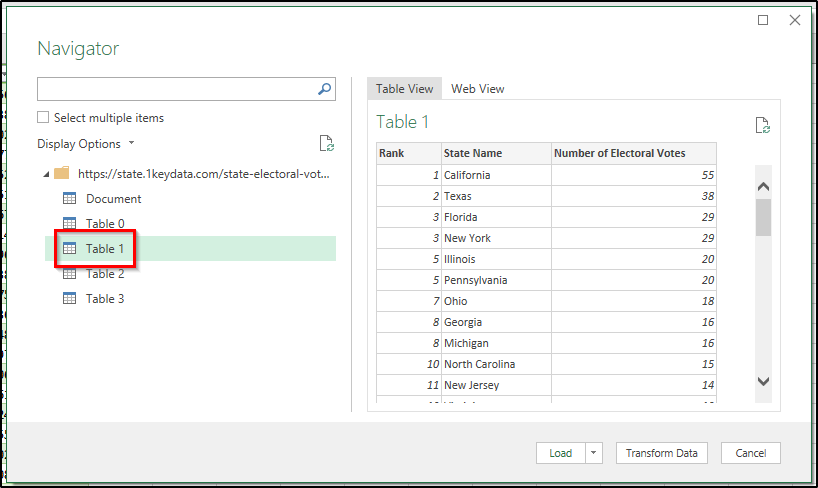
Onto the 3rd and final website, and now it looks like Table 0 is what we want. Let's hit "Transform Data", and see that we're met with something new. What should be our table headers are included as a row of data!
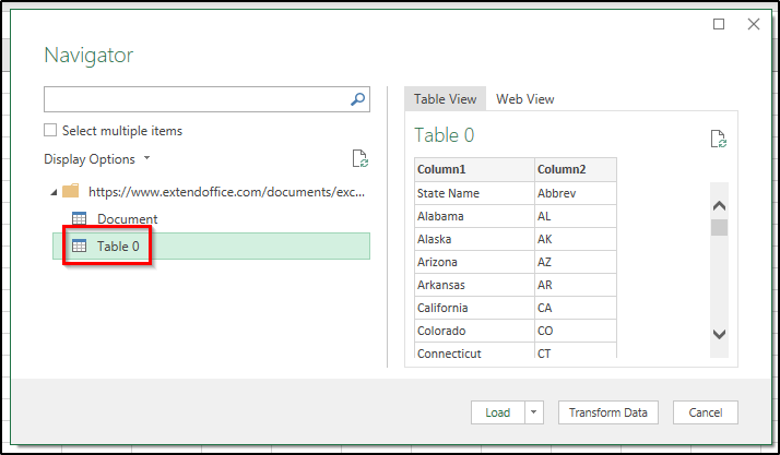
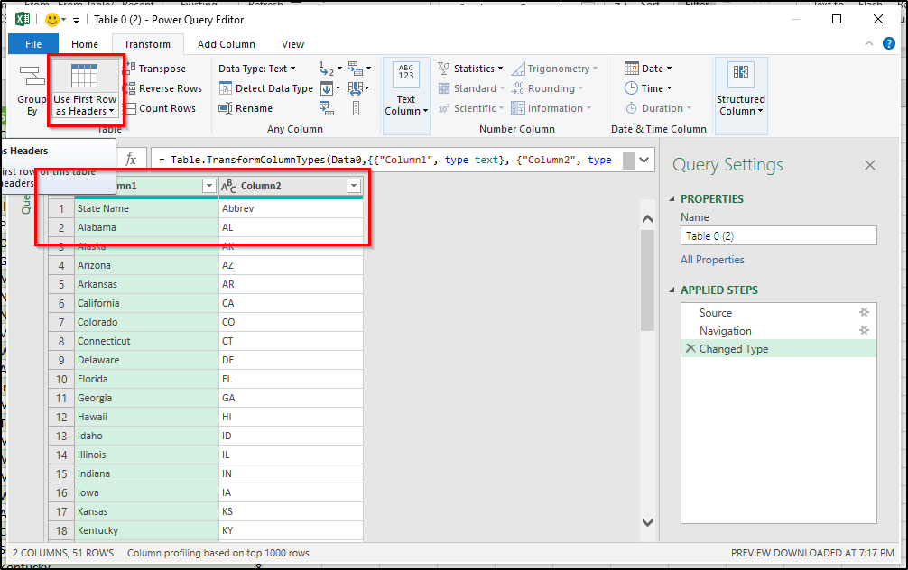
Thankfully that is an easy fix, as we can navigate to the "Transform" tab, and hit "Use First Row as Header's". Navigate back to the "Home" tab, Close & Load, and we have all of the data we need nicely loaded in our Excel file:
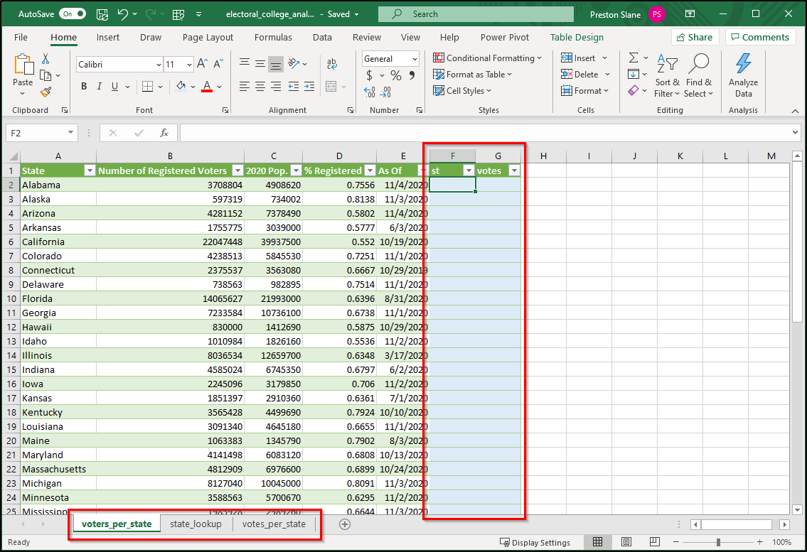
Our main table will be "voters_per_state" so I move it to the front, and we begin the process of data table joining in Excel. See: INDEX(MATCH())
We will need to add the state abbreviation from the "state_lookup" table (useful for visualization) as well as the number of electoral votes from the "votes_per_state" table. We start by inserting 2 new columns, "st" and "votes" (or whatever you'd like to call them). It is good practice to style added columns a different color from the main table:
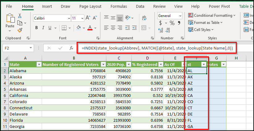
Now it's time for an index(match()), one of my all-time favorite Excel tools :). And since all of our data is currently in table format, we don't need to worry about building our formulae with explicit cell references, we can simply use table references.
I'll spare you the details of INDEX(MATCH()) in this post by stating the general layout for almost any INDEX(MATCH()):
=INDEX(return_range, MATCH(lookup_value, lookup_range, 0))
Where return_range is the range of data we want added to our table (separate table from original table)
Where lookup_value is the value of the first row we want to use as a lookup (in our original table)
Where lookup_range is the range of data where Excel will find the lookup_value's from our original table (separate table from original table)
And you can see the formulae has appropriately incremented itself and accurately populated the entire column with our desired state abbreviations. Yay!
We repeat the process to obtain total votes per state, and see our formula once again populated the entire column correctly:

Now let's calculate how many registered voters there are per electoral vote in each state. We add a new column "voters per vote", and populate it with basic division "Number of Registered Voters" / "votes". I clean up some number formats, and sort low-to-high (most influential to least influential):
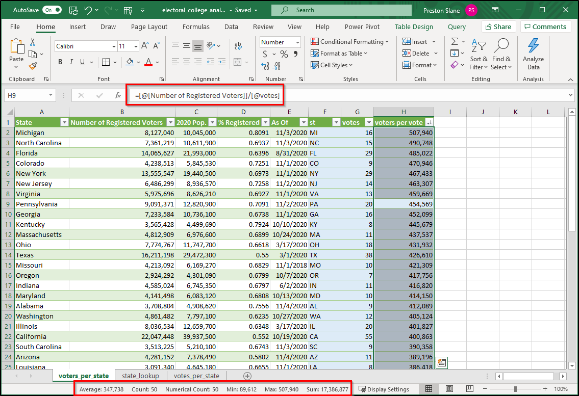
You can see we have all the data that we need, and highlighting the "voters per vote" column shows some interesting statistics in the status bar towards the bottom (discrepancy of over 400,000 between max & min!).
Now it's time to create our visualization, and I'm almost positive it will be an easier process than you think.
Our first step will be gathering the 3 visuals (map, top 5, bottom 5)
Let's begin by selecting anywhere in our voters_per_state final table, then navigate to Insert --> Maps --> Filled Map, and give it a click:
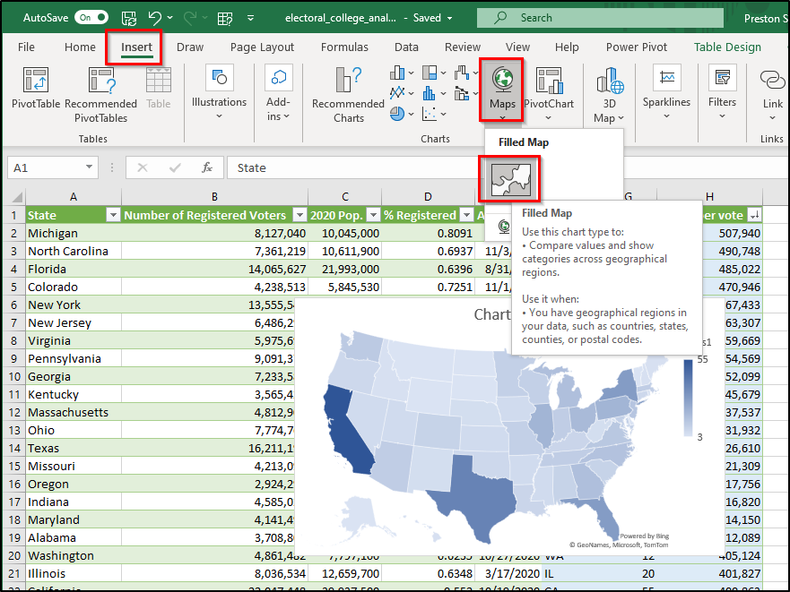
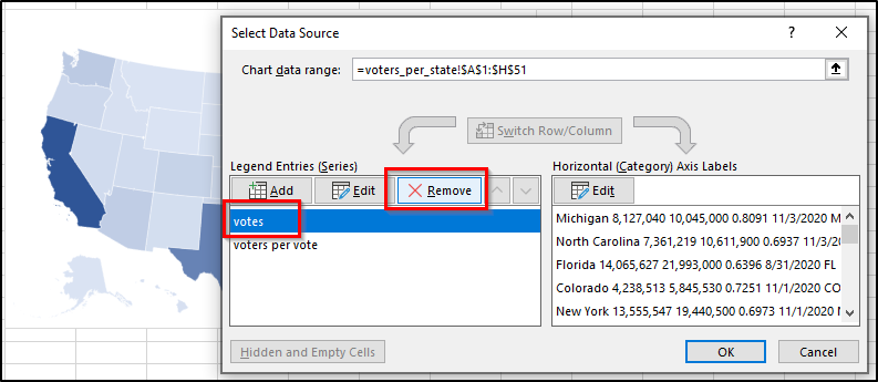
Holy moly, Excel is smart! ALMOST smart enough. Right now it's coloring each state according to it's total electoral college votes, and we want it to color each state according to our new "voters per vote" statistic.
To remedy this, let's right-click on the visual, click "Select Data...", and simply remove "votes" from the chart's Legend Entries:
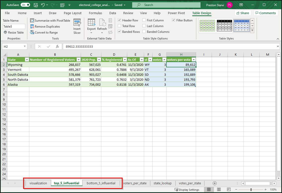
I then "cut" the visual away, and paste it into a new sheet (out final visualization sheet, titled "visualization"). I also create 2 more new sheets (top_5_influential, bottom_5_influential), where I paste the top 5 most influential and bottom 5 most influential states according to our new "voters per vote" statistic:
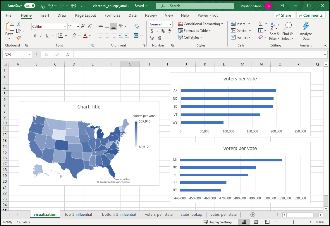
Now it is time to insert our 2 bar charts for the top 5 and bottom 5 most influential states.
For each table, select only & both the "st" and "voters per vote" columns, then navigate to Insert --> Recommended Charts --> All Charts --> Bar --> Clustered Bar (or get to Clustered Bar however you want). Cut & paste each bar chart into the "visualization" sheet:
Now we can really get going on some styling B)
Let's list the changes we want to make in order to have a nice & clean visualization
- Decide a theme
- I settled on night-mode
- Requires (eventually) removing gridlines & filling a large portion of the sheet with black
- Style the entire layout
- Insert a nice title
- Big text, little text, page break
- Utilize "Center Across Selection" and different font sizes
- Resize charts and move them around to your liking
- Holding 'alt' while dragging images snaps them to grid. This is a styling best-friend!
- Insert a nice title
- Style the map
- Change color direction (from lightest being the minimum and darkest being the maximum to lightest being the maximum and darkest being the minimum)
- Add state borders (black) and map visual border (white)
- Move legend to bottom
- Delete map title
- Add state abbreviation data labels
- Style the bar charts
- Alter titles
- Apply styling (black background, white text & highlights)
- Apply same scale to each (0 to 550,000)
- Alter bar width spacing
- Add number data labels
Most, if not all of the chart styling can be accomplished by right-clicking the chart and cycling through the various formatting options. Perhaps I will add that in or make a video about it someday, but it would be a lot of work and a many screenshots for what is really a rather quick process :P
Below is the result of my styled infographic!