Design // spacing for and around non-uniform cards #665
Comments
|
Please test https://test-shakespeareandco.cdh.princeton.edu/members/stirling-monica/cards/ |
|

|
BUT YES, spacing looks great on mobile! |

|
OK I tried again after a forced reload and the computer image looks good too: |

|
Although, I feel like I'm seeing things but I think the spacing still isn't quite the same? |
|
Am I look at spacing between cards or space with the dates beneath? |
|
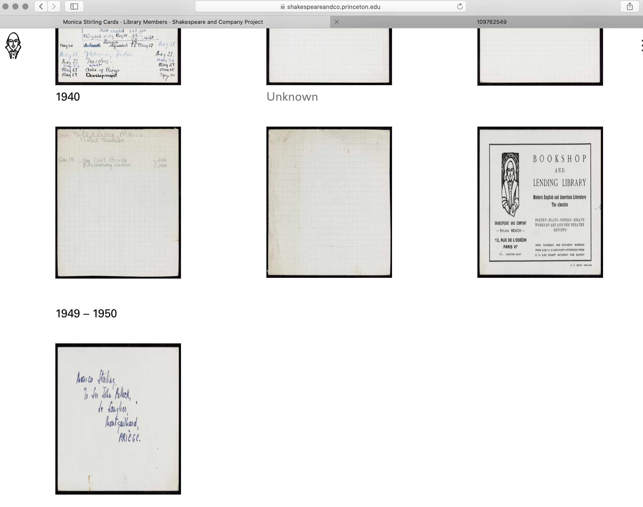
@clmahoney the most important thing is that the images that are different sizes (I think the last three in this case) display correctly and don't get squished into the usual lending library card size — compare this page on the test site and production (or Josh's screenshot) to see. |
|
Oh I finally see it! Thank you! I compared it to the production site and can clearly see now that the odd-sized images are NOT getting squished anymore! |
Not urgent // The spacing is off on https://shakespeareandco.princeton.edu/members/stirling-monica/cards/ -- I also attach a screen shot. I imagine this is due to the irregular size cards.
The text was updated successfully, but these errors were encountered: