This npm package allows you to implement a "Swiping Header" inspired by the mobile tool bar at the top or the windows lock screen into your React appliactions with ease!
npm install swiping-header@latest
... to Install the latest version of the Swiping Header component library
npm repo: https://www.npmjs.com/package/swiping-header
Github repo: https://github.com/PrivFelixKniest/swiping-header/edit/master
import { SwipingHeader, scrollToId } from "swiping-header"
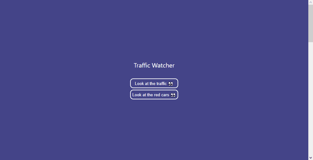
export const Testpage = () => {
const renderHeader = () => {
return (
<div style={{backgroundColor: "#444488", height: "100%", display: "flex", justifyContent: "center"}}>
<div style={{display: "flex", flexDirection: "column", justifyContent: "center"}}>
<p style={{textAlign: "center"}}>Traffic Watcher</p>
<button
onClick={e => scrollToId("trafficJam", true)}
style={{backgroundColor: "transparent", border: "2px white solid", borderRadius: "10px", color: "white", padding: "5px", cursor: "pointer", marginBottom: "5px"}}
>
Look at the traffic 👀
</button>
<button
onClick={e => scrollToId("cars", true)}
style={{backgroundColor: "transparent", border: "2px white solid", borderRadius: "10px", color: "white", padding: "5px", cursor: "pointer"}}
>
Look at the red cars 👀
</button>
</div>
</div>
)
}
const renderBody = () => {
return (
<div id="trafficJam" style={{backgroundColor: "lightblue", height: "1500px", display: "flex", justifyContent: "center", paddingTop: "40px"}}>
<div>
<p >Oh no, a traffic jam!</p>
<p style={{textAlign: "center"}}> 🚕🚗🛺 </p>
<p> 🛺🛺🛺 </p>
<p id="cars" style={{textAlign: "right"}}> 🚗🚗🚗 </p>
</div>
</div>
)
}
return (
<div style={{color: "white"}}>
<SwipingHeader
bodycomponent={renderBody()}
headercomponent={renderHeader()}
/>
</div>
)
}
Import the <SwipingHeader /> component and put it at the root of your page.
import {SwipingHeader} from "swiping-header"

const header = () =>{
  return <div />
}

const body = () =>{
  return <div />
}

export const MyPage = () => {
  return (
    <div> {/** make sure that this element has the whole page as its width and is `position: "static" or "relative"` */}
      <SwipingHeader headercomponent={header()} bodycomponent={body()} />
    </div>
  )
}
Since the internal logic breaks the <a href="#someid"> navigational system, the library also includes a "scrollToId()" function:
export const scrollToId = (elementId: string, smooth?: boolean) => {...}
import {scrollToId} from "swiping-header"

<a onClick={() => scrollToId("someId", true)} >Scroll to ID smoothly</a>
<a onClick={() => scrollToId("someId")} >Scroll to ID instantly</a>

<button onClick={() => scrollToId("someId", true)} >Scroll to ID </button>
<button onClick={() => scrollToId("someId")} >Scroll to ID instantly</button>
As a sideeffect, the usage of the SwipingHeader component also injects a css variable "--scroll", which is a value between 0 and 1, referencing the percentage of the whole page that has been scrolled over so far. The variable can be used in css to trigger scroll animations or any other scroll dependant change.
.background {
  transform: translateY(calc(var(--scroll) * 500px));
  ...
}