- Ever bored of designing repetative Form fields in Flutter Apps?
- Same designs in multiple projects ? Flutter custom Form Fields come to your rescue.
Flutter custom Form Fields comes with predefined Form Fields Styles, which is a light-weight package providing you cleaner code, reusable prestyled Form fields.
dependencies:
  custom_form_fields: <latest-version>
flutter pub get
import 'package:custom_field_styles/custom_field_styles.dart';return Scaffold(
body: SafeArea(
child: Center(
child: Container(
margin: const EdgeInsets.symmetric(vertical: 20, horizontal: 10),
child: Column(
mainAxisAlignment: MainAxisAlignment.center,
children: [
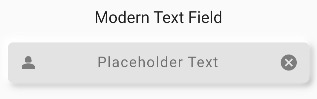
const Text(
"Modern Text Field",
style: TextStyle(fontSize: 20),
),
const SizedBox(
height: 20,
),
/// Custom Form Text Fields , Change [fieldstyle] to change designs
///Required Fields : [controller]
CustomTextField(
controller: controller,
fieldStyle: FieldStyle.modern,
prefixIcon: const Icon(Icons.person_2),
suffixIcon: const Icon(Icons.cancel),
),
const SizedBox(
height: 20,
),
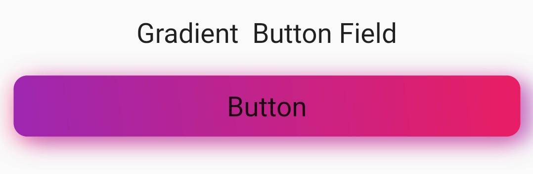
const Text(
"Gradient Button Field",
style: TextStyle(fontSize: 20),
),
const SizedBox(
height: 20,
),
/// Custom Form Buttons , Change [buttonstyle] to change designs
///Required Fields : [child]
CustomButtons(
onTap: () {
debugPrint("Hello , Button Pressed");
},
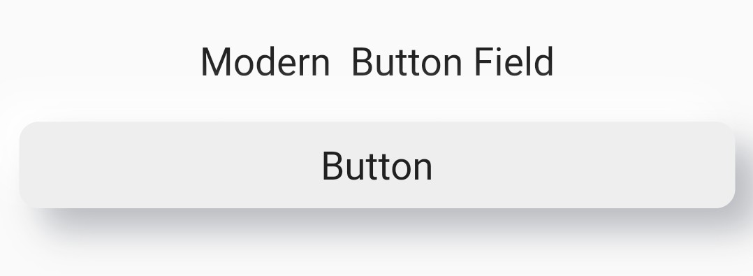
buttonStyle: CustomStyle.gradient,
firstGradientColor: Colors.purple,
secondGradientColor: Colors.pink,
enableShadow: true,
child: const Text(
"Button",
style: TextStyle(
fontSize: 20,
),
),
)
],
),
))),
);- Required fields are : controller for Textfields and child for Buttons.
For more details see the example.
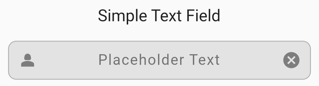
Form Fields
- Simple Text Field
Form Buttons
- Simple Button

Contributions are always welcome!
See CONTRIBUTING.md for ways to get started.
Yes, Some of the basic styles are pre-applied , to ease developement , you can also manually change specific styles.
We have restricted some styles in some specific Fieldstyles to maintain disctintiveness among each Fieldstyles.
Please refer CONTRIBUTING.md.
No, I am working on more styles. Will be adding soon.
If you have any feedback, please reach out to us at developer.dextrix@gmail.com
