In partnership with Santander, Transport for London (TfL) operate a public cycle hire scheme in London. At time of writing, there are over 11,000 bikes in operation at over 700 docking stations. The annual number of journeys undertaken on these bikes exceeded 10 million in 2021. TfL make available a unified API to facilitate the open sharing of data for many modes of transportation. They have also made available a bucket containing historical data detailing each of the journeys undertaken since 2015.
This repository contains a batch processing pipeline that uses the Google Cloud Platform (GCP) to extract TfL cycle data from multiple sources and combines it into a single database for analytics applications. In the primary dataset, each data point details a time and location for both the start and end of the journey. The pipeline also integrates the cycle data with weather data from the Met Office. Weather observations (rainfall, maximum temperature and minimum temperature) are interpolated onto a uniform grid (1km by 1km); the pipeline merges weather data over time for each cycle station using its nearest point on the grid.
Overview of the pipeline The pipeline is setup on GCP to ingest each dataset as it is released and perform a monthly transformation/integration in order to provide up-to-date data for performing analytics. In this README, an overview of the pipeline is provided; for further information, see the docs. The project is designed as per the diagram, below. Airflow, hosted by Docker, is used to orchestrate the running of the pipeline. Ingestion to Google Cloud Storage (GCS) is carried out by Airflow as new data is released. Every month, Airflow creates a Spark job to transform and integrate the various data before appending the current month's data to BigQuery. Finally, Data Studio is used to visualise the database as a dashboard.
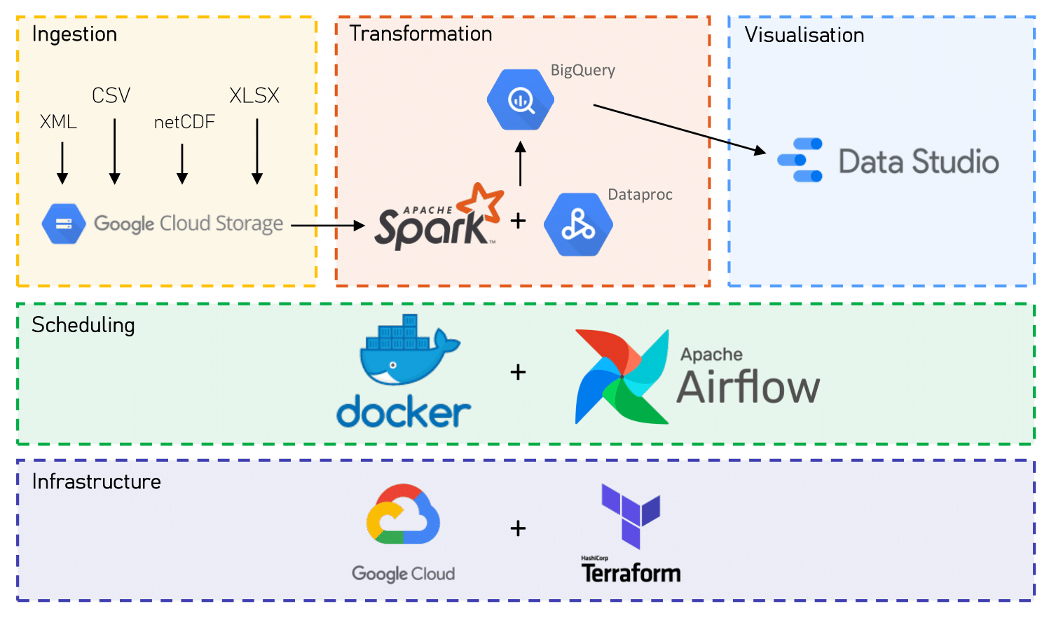
The technologies in the diagram are also listed below. The pipeline could have been simplified, however I wished to gain exposure to a set of new technologies and GCP.
GCP: Various google cloud services were used, including GCS, Compute Engine, BigQuery, Dataproc and Data Studio. Terraform: Terraform was used to manage GCP resources. Docker: Docker was used to host Airflow. Airflow: Airflow was used to orchestrate the data ingestion steps and the submission of Spark jobs to GCP. Spark: Spark was used to transform and integrate the locations, cycle and weather data, before loading them to BigQuery. The pipeline solves a number of challenges. For instance, while TfL's unified API is consistent, the data format and properties for the historical cycling data is not. The cycling data processed by the pipeline includes CSV, XML and XLS files. Furthermore, the weather data was stored in NetCDF format, which needed to be transformed to a compatible data type and integrated with the cycles data using latitude and longitude. Additionally, while the cycling data is released weekly, the weather data is released monthly, so the data is ingested separately before being combined into the final database at regular intervals.
Development of this project was restricted by the length of the GCP free trial. See the docs for a discussion of limitations and future directions for the pipeline.
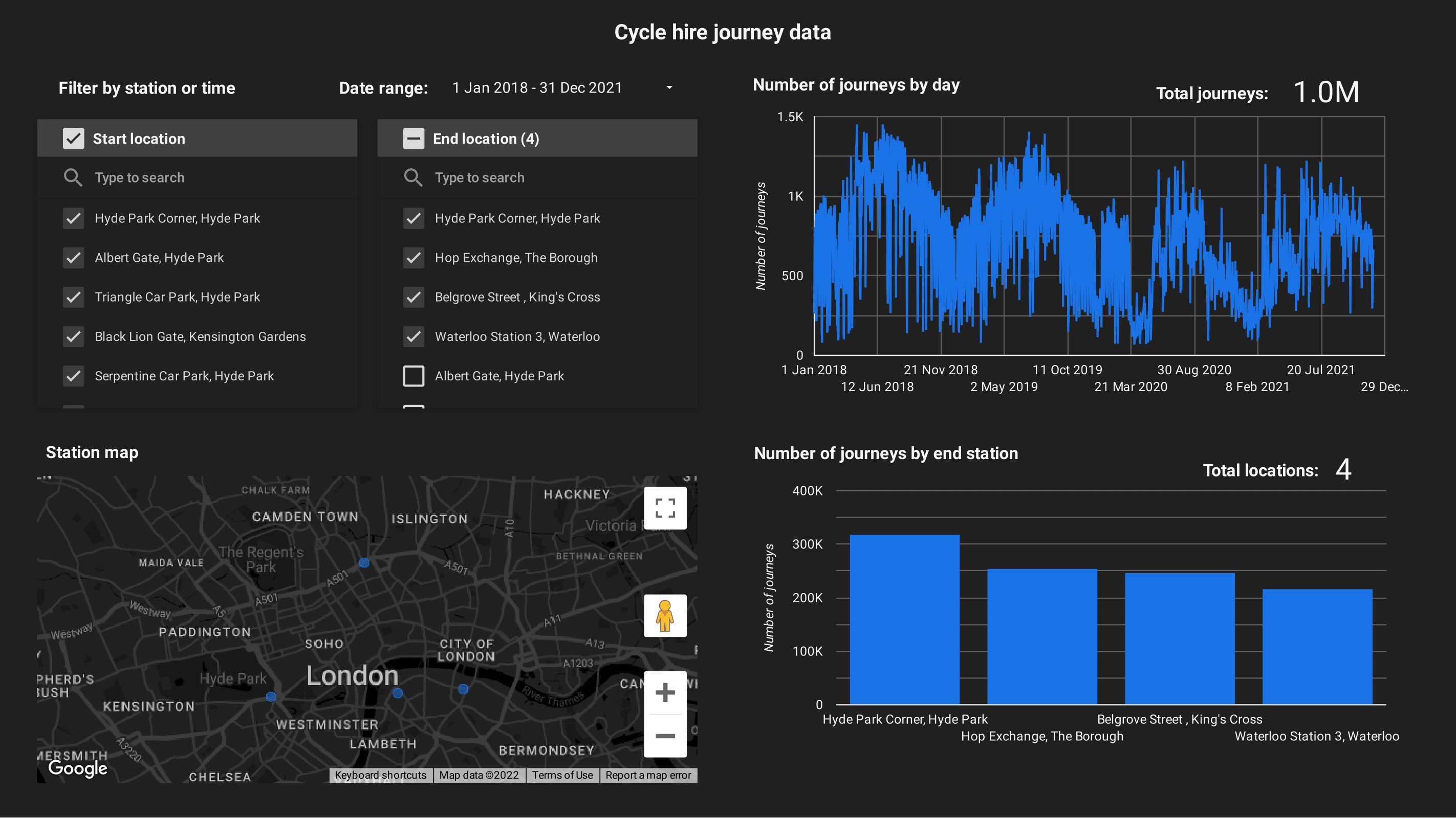
Dashboards To demonstrate how the pipeline can be used for analytics, GCP's Data Studio was used to create some simple dashboards. The main dashboard, visualised below, shows information for the cycle journeys. The journeys can be filtered by their date and by both the start and end docking station. The locations of the docking stations are shown in google maps, the number of journeys over time are displayed and the number of journeys for the most population destinations are shown. For the time period of 2018-2021, there were 41.2 million journeys undertaken!

The same dashboard is shown below, for the same date range but limited to the four most popular destinations. Despite only 4/750 locations being selected, there were still ~1 million journeys ending at these stations. As shown by the map, these stations are unsurprisingly located in fairly central locations. You might also notice a drop in journeys after March 2020, when the lockdowns began.
A second dashboard was created to demonstrate a simple example of how the cycle data can be combined with the weather data. This dashboard has the same filtering methods as the main dashboard, however the date range of 2018-2019 was selected and the search was restricted to journeys starting from "Hop Exchange, The Borough". Both the number of cycling journeys undertaken and the daily maximum/minimum temperatures for the docking stations follows a very similar pattern. It is probable that customers are less likely to travel by bike when the weather is poor.

Database The database was constructed in BigQuery, which is ideal for storing and querying large datasets. The database was designed with a star schema-like design, where the journeys are stored in a fact-like (or "fact-less") table which relates to lots of other dimensions (e.g. location information, weather). It is simple to join the journeys table to tables containing other information using the relationships demonstrated in the schema below:

The weather data is also stored such that it has an ID (timestamp_id) referencing the ID of the timestamp table and an ID (location_id) referencing the ID of the locations table. However, the intention is that the weather table be joined on to the journeys table directly and that joins between weather and other tables should be avoided.
Since the data is uploaded in monthly intervals, and we expect analysts will only need to extract data for particular month ranges, we make use of partitioned BigQuery tables. A monthly partitioning is used for the journey, weather and timestamp tables.
For further information about the database construction and structure, see the docs. For examples of queries that can be made against the database, see the following SQL file.
Scheduling The pipeline uses a set of directed acyclic graphs (DAGs), defined in airflow/dags, to schedule the weekly retrieval of cycle journey data and monthly ingestion of weather data. There are three types of weather data ingested, each from a different source. The DAG for rainfall is shown below:

The data is downloaded and ingested to CSV. This involves converting the data from netCDF format and filtering such that only data for the relevant locations is stored. The data can then be converted to parquet format before being uploaded to the GCS.
As new data is ingested and stored, it must be transformed and loaded to the BigQuery database. Near the start of each month, the previous month's data is transformed/integrated and appended to BigQuery. The DAG for this is as follows:

If there is not already a Dataproc cluster available, one is temporarily created for the purposes of submitting the spark job. The current spark script is also uploaded. A function is used to get the date range of the data that will be processed, before the spark job is submitted to process these data.