Startups play a major role in economic growth. They bring new ideas, spur innovation, create employment thereby moving the economy. There has been an exponential growth in startups over the past few years. Predicting the success of a startup allows investors to find companies that have the potential for rapid growth, thereby allowing them to be one step ahead of competition.
GMO being an investment management firm is committed to delivering superior investment advice to their clients that are interested in investing in startups. Thus, being able to predict the success of a startup will help GMO to be of greater value to their customers.
The objective of the project is to predict whether a startup which is currently operating turn into a success or a failure. The success of a company is defined as the event that gives the company's founders a large sum of money through the process of M&A (Merger and Acquisition) or an IPO (Initial Public Offering). A company would be considered as failed if it had to be shutdown.
This problem will be solved through a Supervised Machine Learning approach by training a model based on the history of startups which were either acquired or closed. The trained model will then be used to make predictions on startups which are currently operating to determine their success/failure. The final predictions of startup success/failure would then be visualized on a US map by grouping the startup prediction probabilities by state. Thus, states having higher mean startup success probabilities will be have higher percentage of successful startups as compared to states with lower probabilities. Each state will also have a diverging color scale based on their mean startup success probabilities. The user can interactively hover over each state to get additional information about them.
GMO has acquired data from another vendor on a trial basis. The data contains industry trends, investment insights and individual company information. Since the data was acquired on a trial basis, it only contains information about companies known till 2012. For this project, only the data of companies operating between 2005 and 2012 has been used. The train/test data contains all companies that were either acquired/closed (used a labels) within that time frame. After training the model, we predict whether startups still operating in the same time frame would be acquired/closed.
There are 49 columns out of which 31 will be used as features. The rest provide more information about the data, but will not be used for model training (like company name, company id, latitude, longitude, zip code etc.)
Some of the top features include:
- age_first_funding_year – quantitative
- age_last_funding_year – quantitative
- relationships – quantitative
- funding_rounds – quantitative
- funding_total_usd – quantitative
- milestones – quantitative
- age_first_milestone_year – quantitative
- age_last_milestone_year – quantitative
- state – categorical
- industry_type – categorical
- has_VC – categorical
- has_angel – categorical
- has_roundA – categorical
- has_roundB – categorical
- has_roundC – categorical
- has_roundD – categorical
- avg_participants – quantitative
- is_top500 – categorical
- status(acquired/closed) – categorical
Data was pre-processed by analyzing the data on mysql database and by joining data from multiple tables.
| Index (ID #) | "Domain" Task | Analytic Task (Low-level) | Search Task (Mid-level) | Analyze Task (High-level) |
|---|---|---|---|---|
| 1 | Understand the relationship between different features and labels | Identify | Explore | Discover |
| 2 | Discover best model of predicting startup success | Compare | Explore | Derive |
| 3 | Predict startup success/failure on new data and visualize results | Identify | Browse | Present |
In this visualization, one of the most correlated feature will be selected. It will then be grouped into different ranges and the count of records in each group will be correlated with the labels. At the analytic task, we will be identifying the top correlated features and grouping them into different ranges. The user can explore the relationship between features in each group to their labels. At the high-level, we are helping users visually discover the strong correlation between the feature and labels.
In this step, user will predict best model by comparing different machine learning models. He will also have to explore different hyper-parameters and then derive the final model.
Based on the model the user selects in the previous task, he will then make predictions and identify which startups are likely to succeed or fail. The predictions can be grouped by state and visualized at a state level. The use can browse through different states to discover new insights.
Initially the model can be trained with a basic Decision Tree model. This simple model will give the user a comprehensive analysis of the consequences of each feature, thereby helping him to decide which features should be included to train the final model. Once he gets an idea of how the model performs, the user can then try ensemble models like Random Forests and Gradient Boosting. Random Forests train several trees using a random sample of the data. This helps make the model more robust and less likely to overfit. Gradient Boosting builds trees one at a time by correcting the errors made by the previous trained tree. Hence these models were chosen for model training.
Each model will be evaluated by plotting ROC curves. Sometimes classification accuracy alone is not enough to decide if the model is good enough, especially in cases where the data can be unbalanced. If most of the data points belong to one specific class, the model can cleverly decide that the best thing to do is to always predict that class and achieve high accuracy. Thus, an ROC Curve which looks at the True Positive Rate and False Positive Rate thereby looking at models based on the balance thresholds of sensitivity and specificity would be a better way of evaluating the model.
This visualization tries to fulfill Task#1, to "Understand the relationship between different features and labels"
The first visualization is a scatter plot which shows the relationship between the amount spent on acquiring a company to the total funding a company received. The funding amount of a company would be on the x-axis represented in millions of dollars, and the amount spent on acquiring a company on the y-axis represented in billions of dollars. Companies that were not acquired will have an acquisition amount of 0.
This scatter plot will help visualize the relationship between total funding and price acquired, which will help the end user understand the correlation between the two.
The visualization to the right uses a sankey diagram to show the correlation between the number of milestones a company had to the company's success/failure. The nodes on the left are the number of milestones a company had which were grouped into different categories, for e.g.:
- companies with 0 milestones
- companies with 1-5 milestones
- companies with 5-10 milestones
The nodes on the right represent whether a startup was a success or failure. The links will connect each individual company milestone to its corresponding success/failure. The width of the links are proportional to the flow quantity.
Sankey diagrams help in locating dominant contributions to an overall flow by putting a visual emphasis on the major flows within a system. This will help the user visualize the correlation between the number of company milestones to its success/failure.

This visualization tries to fulfill Task#2, to "Discover best model of predicting startup success".
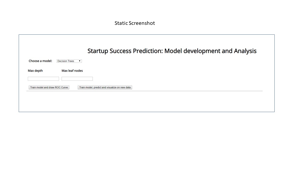
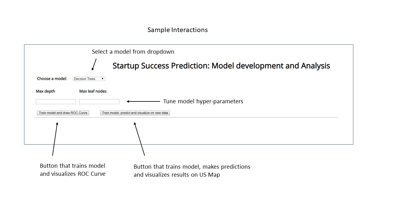
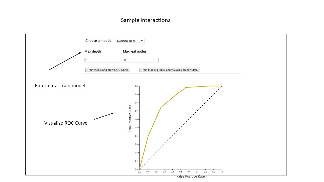
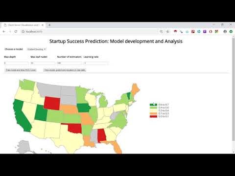
Here the end user should be able to train different machine learning models and visualize the model performance through an ROC curve. The user should be able to select different models to train from the dropdown. He can also tweak his model by providing different hyper-parameter values and re-train his model until he is satisfied with the feedback.
Based on the feedback the user gets from the ROC curve, he can juxtapose several ROC curves with different hyper-parameters and/or different models compare the results to decide upon the best model. The ROC Curve which looks at the True Positive Rate and False Positive Rate thereby looking at models based on the balance thresholds of sensitivity and specificity would be a better way of evaluating the model.

The next visualization fulfills Task#3, to "Predict startup success/failure on new data and visualize results".
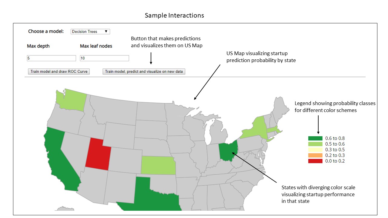
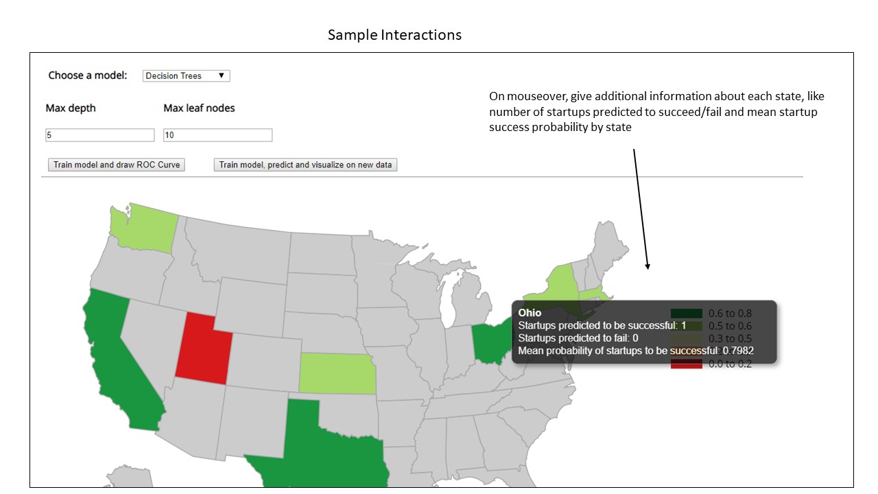
Once the user has decided upon his final model and hyper-parameters to use, he will then train the model and make predictions on new data. These predictions would decide whether a currently operating startup would be a success or failure. These results would then be grouped by state to get the mean startup success/failure probabilities. These probabilities will then be used to measure the state wise predictions of startup success/failure. Each state will have a diverging color scale based on the mean startup success probability of a state. The user should be able to interactively hover over each state to get additional information about them such as the number of companies predicted to succeed or fail in that state and mean probability of success.
As geographic location is one of the top factors in predicting startup performance, this visualization would give the end user an idea of how the startups would perform in each state. The user might discover new insights about companies that are performing surprisingly well in certain states, an intuition which they didn't have before. This new perception might give investors more confidence to invest heavily in startups from those states.

Based on these visualizations, we developed the final design sketches as follows:
Correlograms are images of correlation statistics which help us visualize the data in correlation matrices. By visualizing the correlations between features, we can gain intuitions about the high correlations between some variables. We might use these insights to drop a few high correlated features in variable selection of there is no significant loss of information in the model.
A diverging color palette was used as data from both the positive and negative correlations could be interesting. The positive correlations were represented by blue while the negative correlations were represented by red. From the below Correlogram, we can see that there isn’t a very high correlation between the individual features. Thus, most of the features are unique and can be used for training the model.

Below is a Sankey diagram showing the correlation between the number of company relationships to its success/failure. The nodes on the source end represent the number of relationships a company during its operation which have been grouped into 5 different groups. Color of the node denotes a particular grouping. The value of the node is the sum of incoming or outgoing link values connected to it. These values are visually represented by the nodes height, with longer bars denoting more incoming or outgoing values. The width of the links are directly proportional to the flow quantity. The nodes at the destination represent the labels which tell us whether a company was successful or not and are represented by green and red color respectively. These visualizations have been built in Plotly. The user can run the actual code through a Jupyter notebook and hover the mouse over the nodes/links to determine their strength and the count of incoming of outgoing link values.
From the below Sankey diagram, we can see that companies with fewer relationships are more likely to fail as compared to companies with more relationships.

Below is another Sankey diagram which is now showing the correlation between the number of company milestones to its success/failure. The design choices made were similar to the previous Sankey diagram. Here we can see that companies with more number milestones are more likely to succeed as compared to companies with fewer milestones.

The below visualization is a scatter plot which shows the relationship between the amount spent on acquiring a company to the total funding a company received. The funding amount of a company would be on the x-axis represented in millions of dollars, and the amount spent on acquiring a company on the y-axis represented in billions of dollars. Companies that were not acquired will have an acquisition amount of 0. We can see that there is a positive correlation between the two.
This visualization has also been built in Plotly. The user can run the actual code through the Jupyter notebook and hover the mouse over each point to interactively compare or show the closet data on hover.

This project implements a web-based client-side visualization connected via a REST API to server-side modeling which is running on your own server. The final visualization has been built in HTML, CSS, D3 and Flask(Python). Models have been trained in Python and deployed through a heroku app. You will need to install the following Python packages first:
- pandas
- sklearn
- numpy
- flask, flask_cors
- simplejson
- Werkzeug
- csv
The heroku app has been deployed at: http://startup-success-prediction-new.herokuapp.com/
The final visualization uses a diverging color scale showing the state-wise success probability of startups. Green and Red colors were consistently used through the project with green being used for states/companies with higher success probabilities and red used for states/companies with lower success probabilities. States like Alaska, North Dakota where no startups have been founded have been greyed out. The final visualization also has a legend showing probability classes for different color schemes. The user can also gain additional information like the number of startups predicted to be successful or unsuccessful at a state level. He can also find out what is the mean startup success probability in that state by hovering over any state.
Finally we have an app with the following functionalities:
- Train from a dropdown of different machine learning models and their corresponding hyper-parameters
- Visualize the performance of each model through an ROC Curve
- Juxtapose several ROC Curves to contrast the performance of different models and decide upon the best model
- Make predictions on new data
- Visualize these predictions at a state level
- Add interactively to allow the user to gain additional information about companies in each state
Scope for future:
- Provide more machine learning models for model training
- Allow the user to zoom in on any state and interactively visualize the region-wise performance of startups in that state using the company's latitude and longitude coordinates
Below is an embedded youtube video giving a walkthrough of the UI:
We were able to successfully build a machine learning model that predicts the success/failure of a startup. We were also able to implement a web-based client-side visualization connected via a REST API to server-side modeling. We were also able to generate interesting visualizations through preliminary insights and plots.
For future improvements, we could work on extracting more features like evaluate startup presence on the web, number of unique domains mentioning the startup, burn rate etc. Using these features, one could get more ideas on creating more interactive web-based visualizations.