Feature: Buttons (cta, primary, and secondary)! #34
Conversation
This file contains bidirectional Unicode text that may be interpreted or compiled differently than what appears below. To review, open the file in an editor that reveals hidden Unicode characters.
Learn more about bidirectional Unicode characters
 andria-dev
requested review from
domitriusclark,
magnificode and
racedale
as code owners
andria-dev
added
enhancement
andria-dev
changed the title
andria-dev
requested review from
domitriusclark,
magnificode and
racedale
as code owners
andria-dev
added
enhancement
andria-dev
changed the title
magnificode
approved these changes
Jun 6, 2020
Sign up for free
to join this conversation on GitHub.
Already have an account?
Sign in to comment
Add this suggestion to a batch that can be applied as a single commit.
This suggestion is invalid because no changes were made to the code.
Suggestions cannot be applied while the pull request is closed.
Suggestions cannot be applied while viewing a subset of changes.
Only one suggestion per line can be applied in a batch.
Add this suggestion to a batch that can be applied as a single commit.
Applying suggestions on deleted lines is not supported.
You must change the existing code in this line in order to create a valid suggestion.
Outdated suggestions cannot be applied.
This suggestion has been applied or marked resolved.
Suggestions cannot be applied from pending reviews.
Suggestions cannot be applied on multi-line comments.
Suggestions cannot be applied while the pull request is queued to merge.
Suggestion cannot be applied right now. Please check back later.
Buttons + Variations
This PR adds a new
<Button>component that takes avariantproperty and grabs the correct styles for that button while still allowing you to pass whatever props you want through to Chakra UIs<Button>component.Fixes #30
Pages/Interfaces that will change
None
Screenshots / video of changes
Screen recording of all variations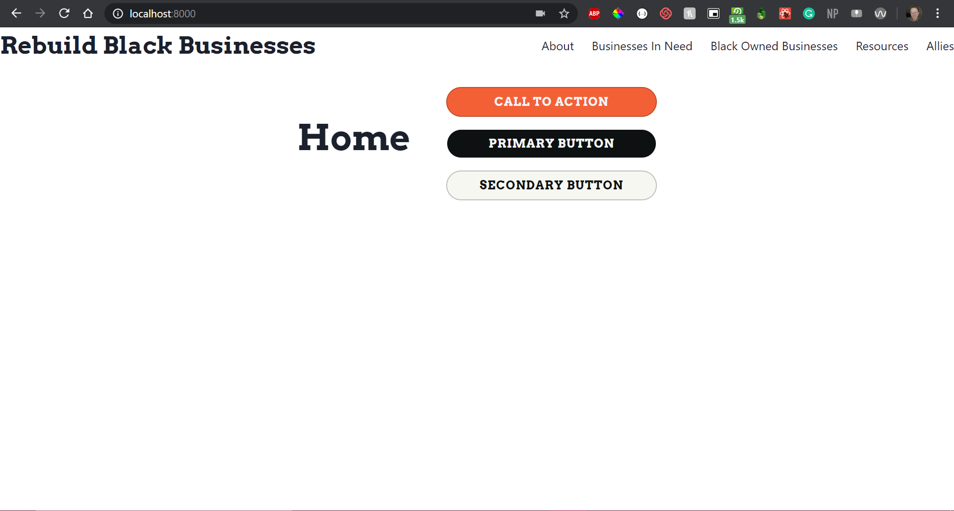
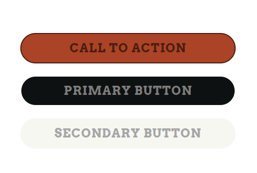
Default:
Disabled:
All default, hover, focus, active, and disabled styles should be present 👍