1KB (gzipped) next generation responsive grid made via custom element <eq-grid>.
It is made to to be used inside various modern JS frameworks; built around idea of element queries (responsiveness is based on container width, rather than window width). So you can use it inside components without a need to think, how wide is your comonent.
See its real usage in this React example app. (there are more howtos in layout section)
To install:
npm i eq-grid --save
To use in your project:
Import the initEqGrid from eq-grid and run it with optional parameters.
You need to do it before you render anything;
import { initEqGrid } from 'eq-grid';
initEqGrid(10, 1, 'rem');
initEqGrid accepts 4 optional parameters:
- 'column width' (default: 100)
- 'gap width' (default: 16)
- 'units' (default: 'px')
- 'maxColspan' (default: 6) - if it is six, classes like .eq-col-N will be generated with N upto 'maxColspan'
Your project needs to be either transpiled to es6 (es2015) or newer, or use es5 and include <script src="https://unpkg.com/@webcomponents/webcomponentsjs@2.0.3/custom-elements-es5-adapter.js"></script> in your <HTML><HEAD>
| <eq-grid> | Define element as grid container. |
| .eq-grid-dense | Add grid-auto-flow: dense;. It tries to fill empty gaps in the grid with out of order elements. |
| .eq-grid-N-collapse | (N: numbers from 2 to maxColspan)Tells when children of the container collapse to full width. eq-grid-n-collapse collapse when container is smaller than (n + 1) * columnWidth |
| .eq-grid-gap-N | (N: 0, 0-5, 2) Set the gap between elements of column 0 => 0 0-5 => half of default gap 1 => default (this is default hence there is not class for it) 2 => double of the default gap |
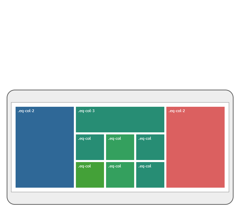
| .eq-col .eq-col-N |
(N:number from 2 to maxColspan)Define how many columns the element will take. |
| .eq-col-max | This element always has full (container's) width |
| .eq-row-N | (N:number from 2 to 3) Define how many rows the element will take. |
| .eq-col-N-M | (N, M: numbers from 2 to maxColspan) Define how many columns the element will take (N) at specific grid size (M) |
| .eq-col-N-collapse | Tells at which container size it sould collapse to full width. |
| Browser | Version |
|---|---|
| Edge | 79+ |
| Firefox | 69+ |
| Chrome | 64+ |
| Safari | 13.1+ |
| Opera | 52+ |
| iOS Safari | 13.4+ |
| Android Browser | yes |
| Opera mini | No |
| Chrome for Android | yes |
Eq-grid is a native component based and hence works in almost all FE frameworks, you can check test integrations with React, Angular, Vue and Svelte
(Note that some of the implementation don't use eq-grid npm package from github - but rather use local file, it is caused by limitation by codesandbox, which doesn't allow user to change some of default transpile settings for certain framework)