This repository has been archived by the owner on Aug 12, 2021. It is now read-only.
Card Actions
The card actions perform an action to the object represented by the card.

| Element | Description |
|---|---|
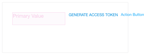
| Action Button | Used when the object represented by the Card have only one action For two or more Actions, the Action Trigger with the Action Menu Should be used |
| Actions Trigger | Located on the top right of the card. When clicked it shows the Actions Menu; the Actions Trigger remains highlighted as long as the Actions Menu is displayed. By clicking the Action Trigger when the Actions Menu is displayed, it hides the Actions Menu and return to normal -not highlighted. |
| Actions Menu | Display the a vertical list of Actions. This element can outgrow the dimensions of the card |
| Actions Menu Section | Used to group a set of related Actions. Int can include a header as well |
| Section header | Give a name for the a Actions Menu Section. For example: "Process" for a set of Actions like: "Aprove", "Reject", "Cancel". |
| Action | Perform an action on the object the Card represents. When hovered by the pointer, it highlights. When clicked it hides the Actions Menu and the Actions Trigger return to normal |
| Action + Icon | Display an accompanying icon next to the action caption |
| Separator | Used to separate tasks that are not related. Only visual guidance |
