docs: landing page #559
docs: landing page #559
Conversation
|
Deploy preview for fundamental-styles ready! Built with commit fec2948 |
|
It looks awesome, thank you for bringing it to life! Couple things I noticed:
|

|
Agreed, it looks great!
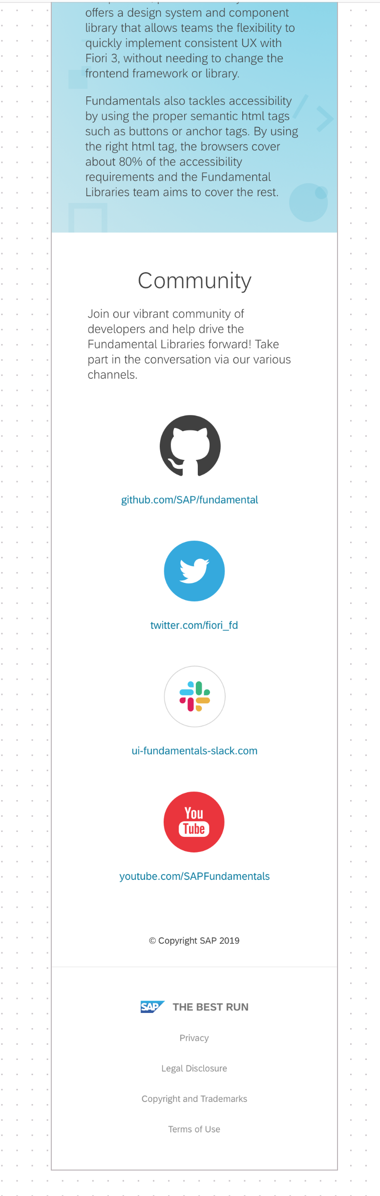
I was also thinking we should remove the links below the social media logos and hyperlink the images.
Thanks!
Vanessa
From: Estela Xu <notifications@github.com>
Reply-To: SAP/fundamental-styles <reply@reply.github.com>
Date: Friday, January 3, 2020 at 2:18 PM
To: SAP/fundamental-styles <fundamental-styles@noreply.github.com>
Cc: "Cusmich, Vanessa" <vanessa.cusmich@sap.com>, Review requested <review_requested@noreply.github.com>
Subject: Re: [SAP/fundamental-styles] docs: landing page (#559)
It looks awesome, thank you for bring it to life!
Couple things I noticed:
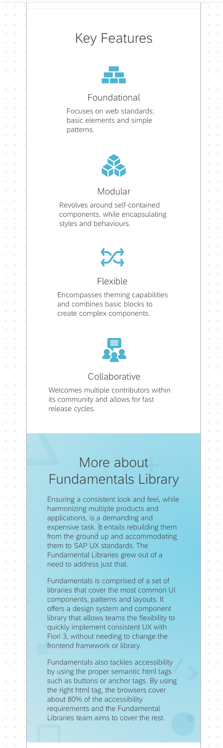
1. Key feature content should be left aligned instead of centered.
Zeplin file:
[Image removed by sender. Screen Shot 2020-01-03 at 2 13 04 PM]<https://user-images.githubusercontent.com/54589269/71743693-3673f400-2e33-11ea-8f7b-c1b95cb18f1d.png>
2. Could we add hover effect to the library tiles? All four tiles are currently outlined and have shadows, maybe we can take out the shadow when the tile is not selected so it is more interactive and responsive.
—
You are receiving this because your review was requested.
Reply to this email directly, view it on GitHub<#559?email_source=notifications&email_token=ANBQEXYJELWJJ7DH3PYV76DQ36FLHA5CNFSM4KCQWXH2YY3PNVWWK3TUL52HS4DFVREXG43VMVBW63LNMVXHJKTDN5WW2ZLOORPWSZGOEIB32SQ#issuecomment-570670410>, or unsubscribe<https://github.com/notifications/unsubscribe-auth/ANBQEX3XMLGL6YMLS67UU53Q36FLHANCNFSM4KCQWXHQ>.
|
Done |
Done |
|
pls. recheck layout on mobile - footer text is overlapping. |
9c37e42
to
9b3428d
Compare
9b3428d
to
ccba185
Compare
c1f40a3
to
d03e5f0
Compare
It's fixed now. Was a Safari issue. Thanks for catching it |
docs/_sass/_landingPage.scss
Outdated
| } | ||
| } | ||
|
|
||
| @media (max-width: 768px){ |
There was a problem hiding this comment.
Hi @InnaAtanasova
What about adding only one media query per max-width?
From largest (1024px) to smallest (600px)
There was a problem hiding this comment.
Doesn't look good without this breakpoint. O.w. it's not a problem to change it from 768 to 600px
There was a problem hiding this comment.
This is how the section looks like at 630px:

This is how the section looks like compared to the other sections:


|
LGTM |
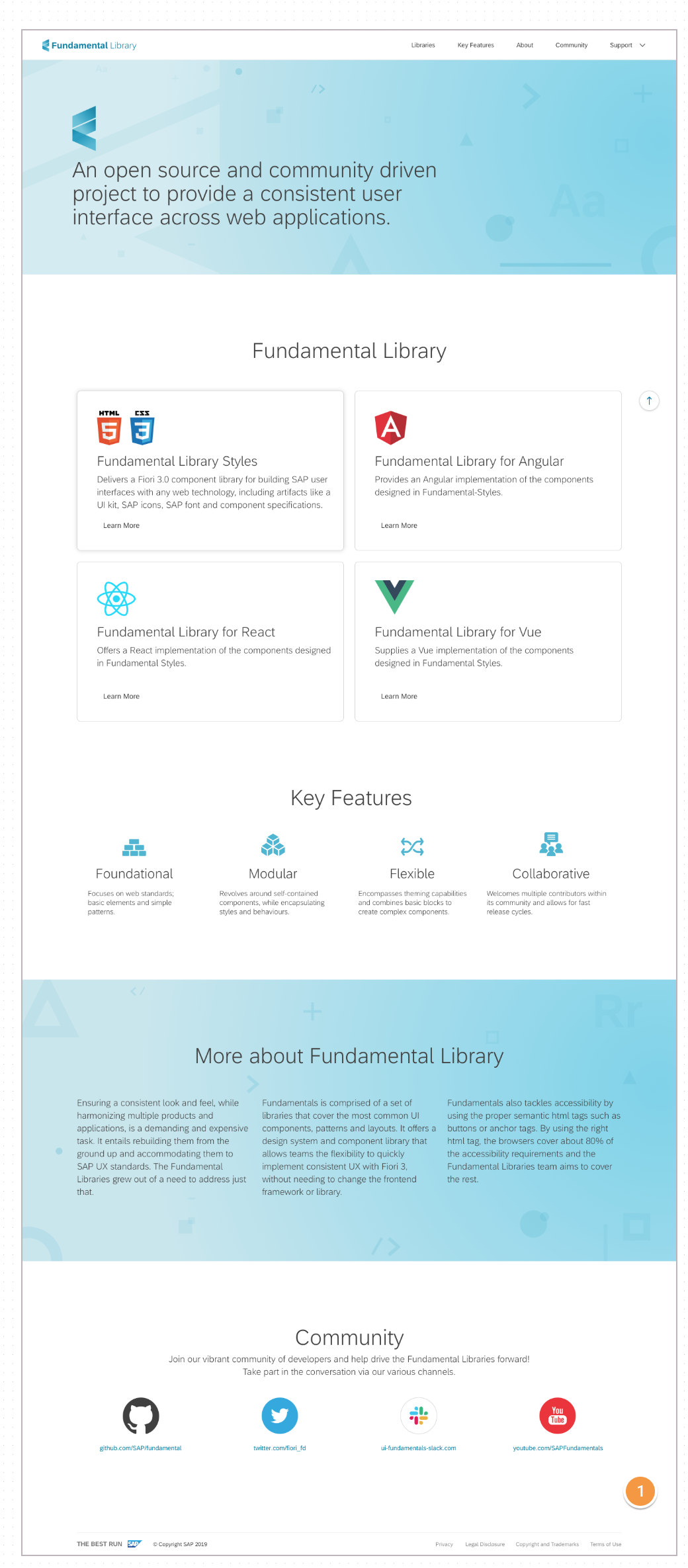
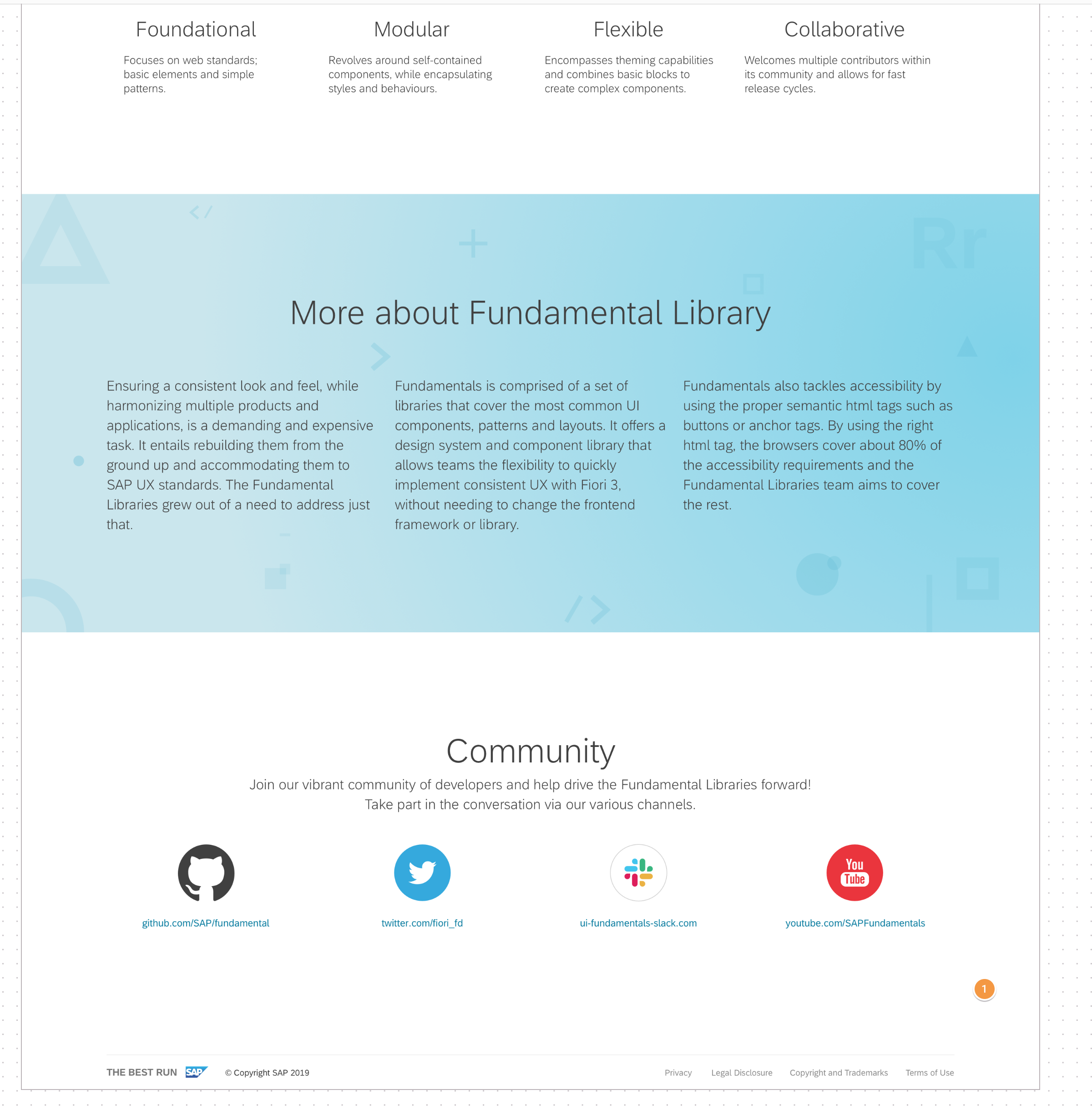
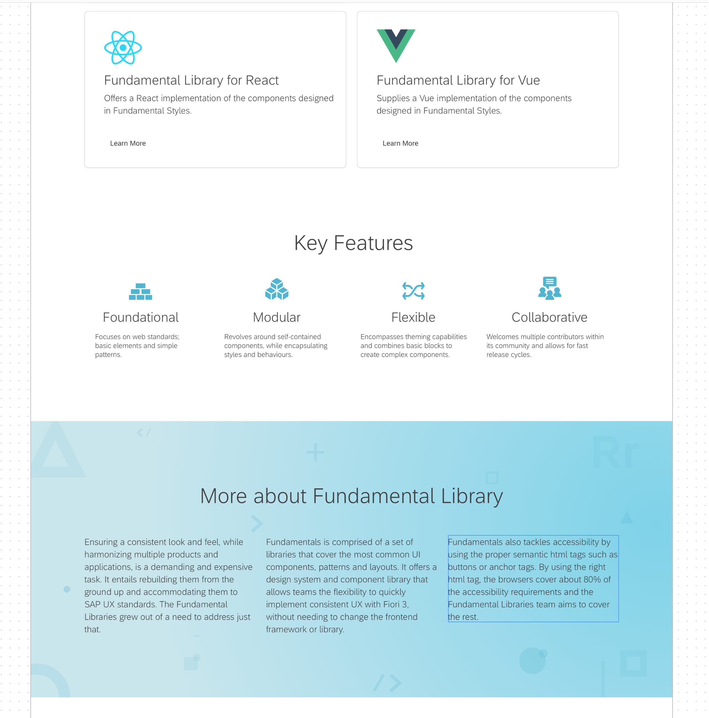
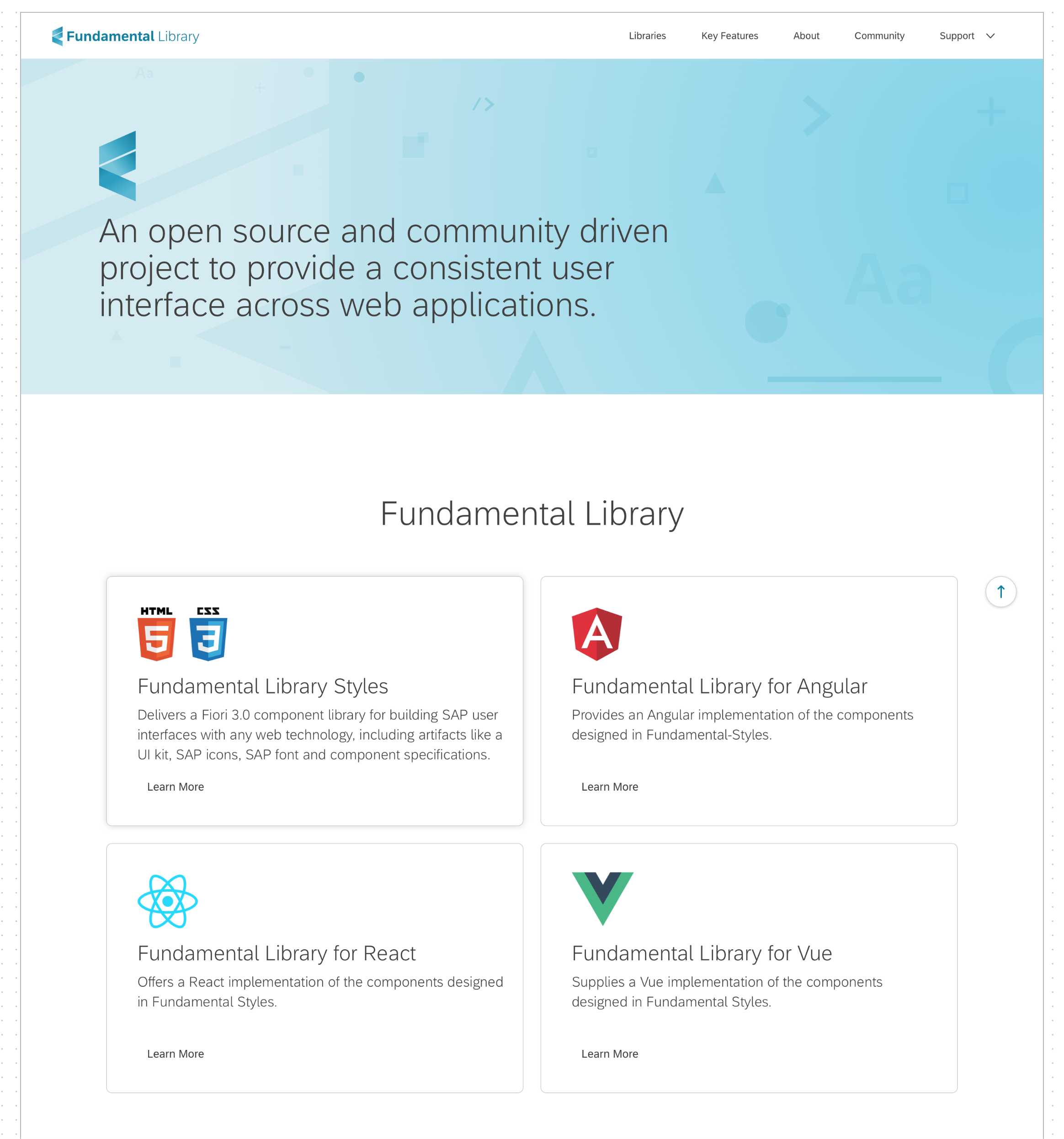
This is the implementation of the landing page. There are a few minor things to be changed when Leo gets back from vacation (update 1-2 logos and the background images in the first section and "More About Fundamental Library Setion). Here are the screenshots from Zeplin (the visuals):
Desktop:
Mobile: