Change shade of red used on Main Navigation (white backgrounds) #422
Comments
|
@kerri-augenstein , I personally like the brighter red #B1040E more myself and I agree that the visual contrast is greater. Good timing because we just refactored the main-nav to use a color map, so this change would be pretty easy if everyone thinks this is a go :) |
|
@kerri-augenstein and @yvonnetangsu this looks good to me. Maybe Rebecca and I could take care of it? |
|
@buttonwillowsix whatever you all decide works for me, I know @yvonnetangsu mentioned it should not be super complicated, and something she would naturally do before working on the subnav ticket. |
|
@buttonwillowsix , actually this one might be easier if you wait till the main nav PR (with the color map) get merged in :) |
Or actually it would be a (theoretically) really fast change so I'd be happy to just absorb that into the color map PR. Let me know :) |
|
@yvonnetangsu if this is fast for you, go for it! Reassigning. :) |
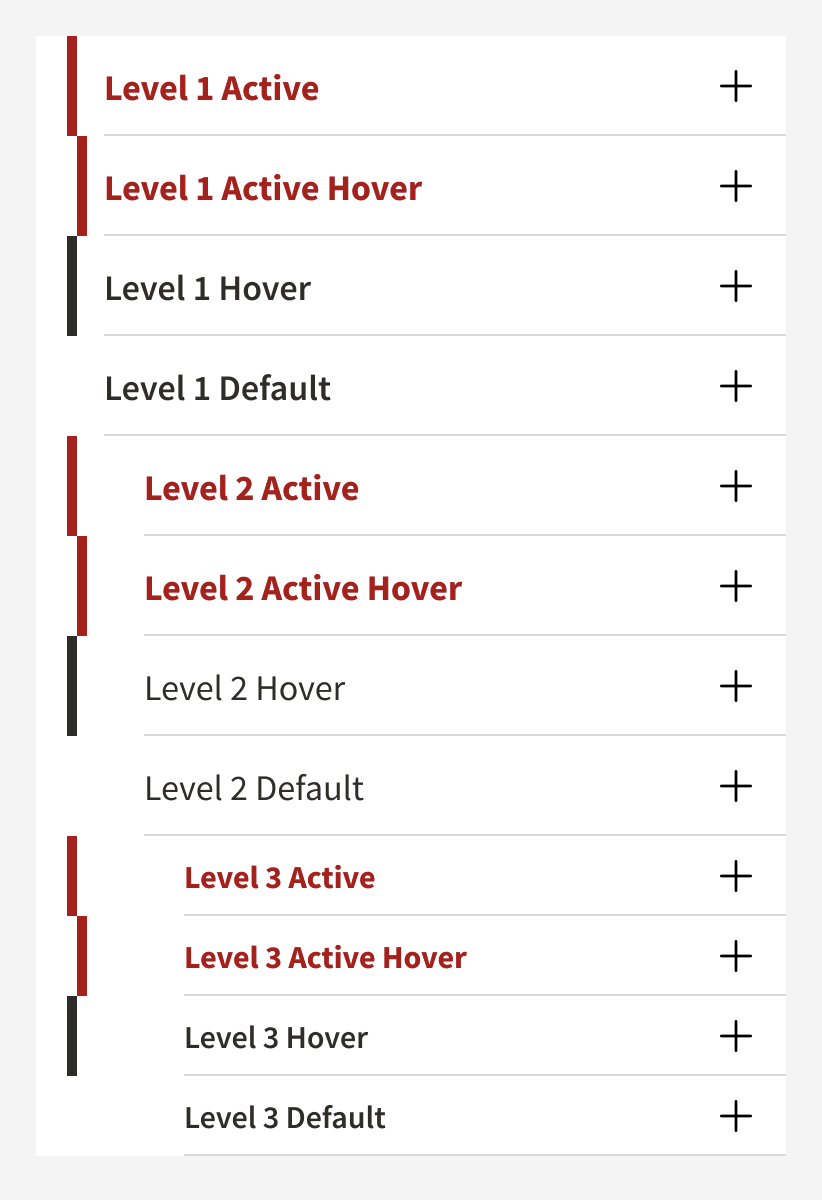
In order to increase accessibility of color, I recommend that instead of using #82000 anywhere in our main navigation links (or other links) that we only use #B1040E. Though this brighter red does not contrast with the standard gray text color of #2e2d29 at the recommended 3:1 color ratio for links adjacent to other non-linked text, it does increase that visual contrast, which is a better choice than using the darker #82000.
So I suggest changing all uses of the #82000 for active and hover states to the #B1040E. This includes the text itself and the vertical border on the left of the active and hover states.
source: https://www.figma.com/file/Kmd4utmJFPRMVeCFEEBQhLtx/Stanford-Design-Library?node-id=2384%3A1177

source: https://www.figma.com/file/Kmd4utmJFPRMVeCFEEBQhLtx/Stanford-Design-Library?node-id=2384%3A1177
Note: No need for any changes to the dark gray background navigation designs.
The text was updated successfully, but these errors were encountered: