This is a reusable React component that allows you to display a custom Datepicker in your application.
The component is TypeScript compatible and includes a type definition file (DatepickerReact.d.ts) for an improved development experience. In a TypeScript project, the TypeScript compiler will automatically use this definition file.
npm i datepicker-react-sw49go- Node.js v18.16.0
- "react": "^18.2.0"
- "react-dom": "^18.2.0"
- "prop-types": "^15.8.1"
- "react-icons": "^5.0.1"
- "dropdown-react-sw49go": "^0.1.2"
import { DatePickerReact } from 'datepicker-react-sw49go'
function App() {
const handleSeletedDate = (dateSelected) =>{
console.log('The date selected in datepicker:', dateSelected)
}
return (
<div>
<DatePickerReact onSelect={handleSeletedDate}
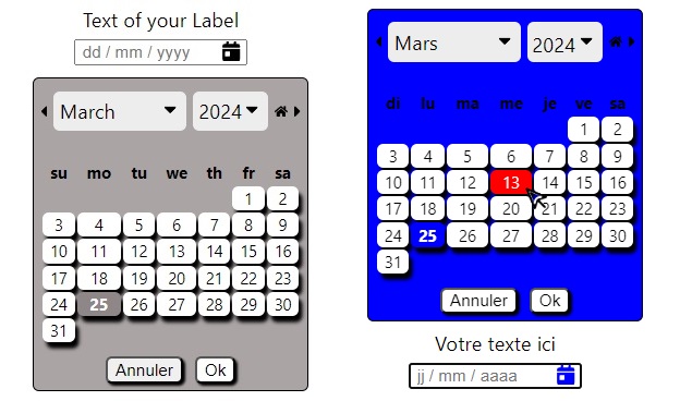
language={'fr'}
textLabel={'Votre texte ici' }
styleLabel={{fontSize:'1.5rem'}}
styleInput={{width:'10rem'}}
iconInputColor={'black' }
bckColor={'blue'}
dateColor={'red'}/>
</div>
)
}
| Props | Type | Default | Description |
|---|---|---|---|
textLabel |
string | N/A | The text for your Label |
styleLabel |
object | N/A | CSS Properties style for Label |
idInput |
string | N/A | The name for 'id' of Input |
iconInputColor |
string | N/A | Color for calendar icon in the Input |
styleInput |
object | N/A | CSS Properties style for Input |
language |
string | 'fr' | Language for informations of datepicker ('fr','en','de') |
positionDPR |
string | 'bottom' | position of the datepicker ('botton' or 'top') |
bckColor |
string | N/A | Background color of the datepicker |
dateColor |
string | N/A | Color of the day when mouseOver |
onSelect |
function | N/A | Callback function to return the date choosen |