Collapse
The Collapse component is a collapsible container that can show either some custom html, a form or a number of so called "cards". The component can hold several collapsibles and their cards and offers an "accordionMode" property that when true will hide all other collapsibles when one collapsible is expanded.
Since the nature of this component involves content to flow, it is best suited for responsive layouts in Servoy, although it is not limited to those.
- Collapse examples
- Developer properties view
- Collapse properties
- Custom types
- Collapsible events
- Collapsible API
- Custom styling
In its most simple form it will look like this

This screenshot shows two "collapsibles" and the expanded "Collapsible #1" with three simple cards.
The following screenshot shows a more flexible use case using some custom css, header and card content html:

An example showing a (collapsible) form:

An example with just plain html shown:

In Servoy Developer, the Collapse component appears in the Properties panel as follows:
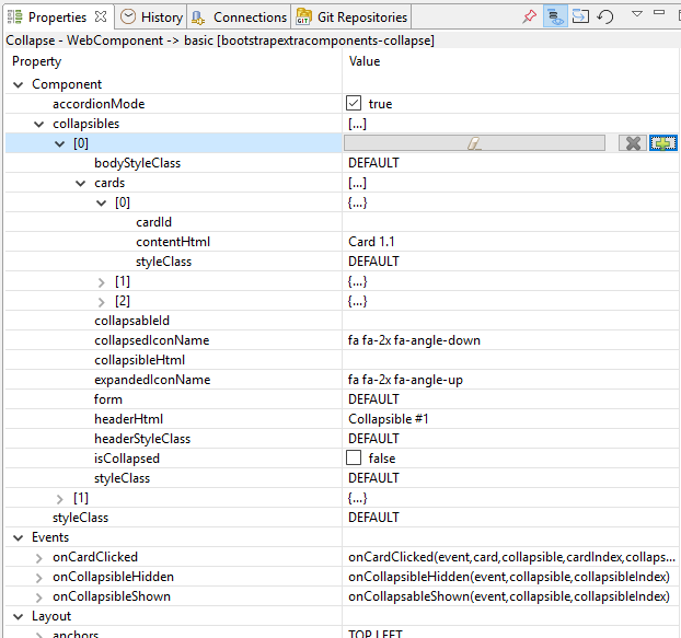
The example shows a collapse component with two collapsibles, the first one having three cards. To add a collapsible, either select the collapsible to insert below at or hit and hit the little plus icon or use the plus icon when selecting the collapsibles node to add a new collapsible at index 0.
The component has the following properties:
| Property | Type | Default | Description |
|---|---|---|---|
| accordionMode | Boolean | true | When true, only one collapsible at a time can be expanded |
| collapsibles | collapsible[] | null | An array of all collapsibles |
| styleClass | String | null | Additional style class(es) of the component |
The component uses two custom types to describe its model: "collapsible" and "card". The "collapsible" type holds properties of one collapsible block. When the collapsible does not show a form or plain html content, its content is taken from the cards array, which consists of "card" type items.
Collapsible is a component specific javascript type with the following properties:
| Property | Type | Default | Description |
|---|---|---|---|
| collapsableId | String | null | An Id used to identify the collapsible |
| headerHtml | String | null | Text or custom html to describe the header content |
| headerStyleClass | String | null | Additional style class(es) to control the css of the header |
| bodyStyleClass | String | null | Additional style class(es) to control the css of the content |
| collapsibleHtml | String | null | Text or custom html that is shown in the content when expanded (use one of form, collapsibleHtml or cards to describe the content) |
| form | Form | null | The form to be shown in the content |
| isCollapsed | Boolean | true | Whether this collapsible should be visible or not when the component is first shown |
| cards | card[] | true | An array of cards to be shown in this collapsible |
| styleClass | String | null | Additional style class(es) to control the css of this collapsible |
| collapsedIconName | String | fa fa-2x fa-angle-down | Icon style classes for the icon to be shown when the collapsible is collapsed (set to null to not show an icon) |
| expandedIconName | String | fa fa-2x fa-angle-up | Icon style classes for the icon to be shown when the collapsible is expanded (set to null to not show an icon) |
Card is a component specific javascript type with the following properties:
| Property | Type | Default | Description |
|---|---|---|---|
| cardId | String | null | An Id used to identify this card |
| contentHtml | String | null | Text or custom html to describe the content |
| styleClass | String | null | Additional style class(es) to control the css of this card |
| Event | Params | Return | Description |
|---|---|---|---|
| onCollapsibleShown | event:JSEvent, collapsible:collapsible, collapsibleIndex:Number |
Fired when a collapsible is expanded (content is revealed) | |
| onCollapsibleHidden | event:JSEvent, collapsible:collapsible, collapsibleIndex:Number |
Fired when a collapsible is collapsed (content is hidden) | |
| onCardClicked | event:JSEvent, card:card, collapsible:collapsible, cardIndex:Number, collapsibleIndex:Number |
Fired when a card is clicked |
| Method | Params | Return | Description |
|---|---|---|---|
| createCollapsible | collapsible | Creates and returns an new collapsible. | |
| createCard | card | Creates and returns an new card. | |
| getCardById | cardId:String | card | Returns the card with the given cardId. |
| addCollapsible | collapsible:collapsible | Adds the given collapsible to the component. | |
| setCollapsibles | collapsibles:collapsible[] | Sets all the collapsible of this component at once | |
| toggle | [index:Number] | Toggles the state of the collapsible at the given index or the first (and maybe only one) if no index is given | |
| show | [index:Number] | Shows (expands) the collapsible at the given index or the first (and maybe only one) if no index is given | |
| hide | [index:Number] | Hides the state of the collapsible at the given index or the first (and maybe only one) if no index is given | |
| removeCollapsibleById | [collapsibleId:String] | boolean | Removes the collapsible at the given collapsibleId |
| removeCollapsibleAt | [collapsibleIndex:Number] | boolean | Removes the collapsible at the given collapsibleIndex or the first (and maybe only one) if no collapsibleIndex is given |
| removeAllCollapsibles | boolean | Removes all the collapsibles |
Creates and returns an new collapsible
Returns collapsible
Example
var collapsible = component.createCollapsible('Collapsible #1');
collapsible.collapsableId = 'collapsable1';
collapsible.cards.push(component.createCard('Card #1', 'card1.1'));
collapsible.cards.push(component.createCard('Card #2', 'card1.2'));
collapsible.cards.push(component.createCard('Card #3', 'card1.3'));
component.addCollapsible(collapsible);
Creates and returns an new card
Params none
Returns card
Returns the card with the given cardId or null when not found.
Params
| Type | Name | Description | Required |
|---|---|---|---|
| String | cardId | The cardId | Required |
Returns card
Adds the given collapsible to the component. The new collapsible will be added after existing ones. Do not use this method to completely fill the component, for that use setCollapsibles instead.
Params
| Type | Name | Description | Required |
|---|---|---|---|
| collapsible | collapsible | The collapsible to add | Required |
Returns void
Sets all the collapsible of this component at once, possibly replacing existing ones.
Params
| Type | Name | Description | Required |
|---|---|---|---|
| collapsible[] | collapsibles | The collapsibles to set | Required |
Returns void
Toggles the state of the collapsible at the given index or the first (and maybe only one) if no index is given. The collapsible array is 0 based.
Params
| Type | Name | Description | Required |
|---|---|---|---|
| Number | collapsibleIndex | The index of the collapsible to toggle | Optional |
Returns void
Shows the content of the collapsible at the given index or the first (and maybe only one) if no index is given. The collapsible array is 0 based.
Params
| Type | Name | Description | Required |
|---|---|---|---|
| Number | collapsibleIndex | The index of the collapsible to show | Optional |
Returns void
Hides the content of the collapsible at the given index or the first (and maybe only one) if no index is given. The collapsible array is 0 based.
Params
| Type | Name | Description | Required |
|---|---|---|---|
| Number | collapsibleIndex | The index of the collapsible to hide | Optional |
Returns void
Removes the collapsible with the given ID. If the collapsible was showing a form, it will hide that form as well.
Params
| Type | Name | Description | Required |
|---|---|---|---|
| Number | collapsibleId | The id of the collapsible to remove | Required |
Returns boolean; true if the collapsible with the given id was removed; false if collapsibleId is not given, not found or if the form shown by this collapsible denied hide.
Remove the collapsible with the given index (the index is 0 based) or the first collapsible if no collapsibleIndex is given. If the collapsible was showing a form, it will hide that form as well.
Params
| Type | Name | Description | Required |
|---|---|---|---|
| Number | collapsibleIndex | The index of the collapsible to remove; if not given, the first collapsible is used | Optional |
Returns boolean; true if the collapsible at the give index (or 0 if not given) was removed; false if collapsibleIndex is out of bounds or if the form shown by this collapsible denied hide.
Removes all collapsibles. It will also hide the forms that are showing on any of the collpsibles. If one of the collapsibles has a form showing that denies hide, the removeAllCollapsibles operation will stop and return false. In this case, all collapsibles that had forms and were hidden so far will still be in the collapsible array but they will be 'collapsed'.
Params none
Returns boolean; true if all collapsibles were removed successfully; false if one of the collapsibles had a form which denied hide.
There are several CSS class selectors you can use for fine-grained styling of the collapse component.
| element selector | summary |
|---|---|
| .svy-collapse | the root element; this is where the component's styleClass(es) is added when set |
| .svy-collapse-collapsible | the collapsible container |
| .svy-collapse-header | the container holding the header element; this is where the collapsible's headerStyleClass(es) is added when set |
| .svy-collapse-header-container | the container holding the header content and collapse icon |
| .svy-collapse-header-container.collapsed | the container holding the header content and collapse icon when collapsed |
| .svy-collapse-header-content | the container holding the header content |
| .svy-collapse-header-icon | the icon span |
| .svy-collapse-collapsible-container | the container holding one or more collapsible cards |
| .svy-collapse-card-body | the container holding a single card or form; this is where the collapsible's bodyStyleClass(es) is added when set |
| .svy-collapse-card-body-container | the container holding the content of a single card; this is where a card's styleClass(es) is added when set |
Example for this sample with component styleClass property set to 'questions' and the collapsible's headerStyleClass set to 'questions-header'
/* Remove margin between the cards */
.questions > div.svy-collapse-collapsible {
	margin-bottom: 0px;
}

/* make background light green when expanded and adjust borders */
.questions-header {
	background-color: #99DBCF;
	border-width: 1px 1px 0px 1px;
	border-color: #99DBCF;
	color: #000000;
}

/* make background white when collapsed and remove all borders */
.questions-header.collapsed {
	background-color: #ffffff;
	border-width: 0px 0px 0px 0px;
	color: #000000;
}