Home
Welcome to the svyThemeRoller wiki!
Your Servoy solution can be styled using LESS as dynamic style sheet language and/or unprocessed CSS (3.0). When creating a Servoy NG Client solution, the solution is created with the Servoy default less theme ( is possible to opt-out ); the theme offers configurable styles for commonly used components and a set of utility classes.
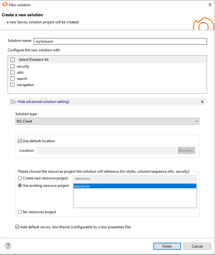
When creating a new solution the Servoy default less theme is included by default. To opt-out, in the Create a new solution wizard, click on Show advanced solution settings; uncheck the option "Add default servoy .less theme".
For existing Servoy solution instead, the less theme can be added using the solution's property styleSheet; click on "Add Less Theme Support" in the solution's styleSheet picker and follow the wizard.
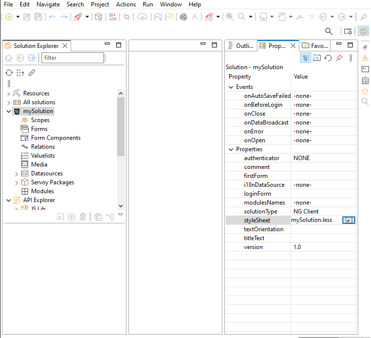
To configure the Theme colors and properties open the custom_servoy_theme_properties.less in the solution's Media node. The file should not be edited directly, it can be opened with the Servoy Theme Properties editor (on double click).
You can further enhance and customize the solution's style writing your own CSS/LESS in the solution's .less file, also present in the solution's Media node of the solution.
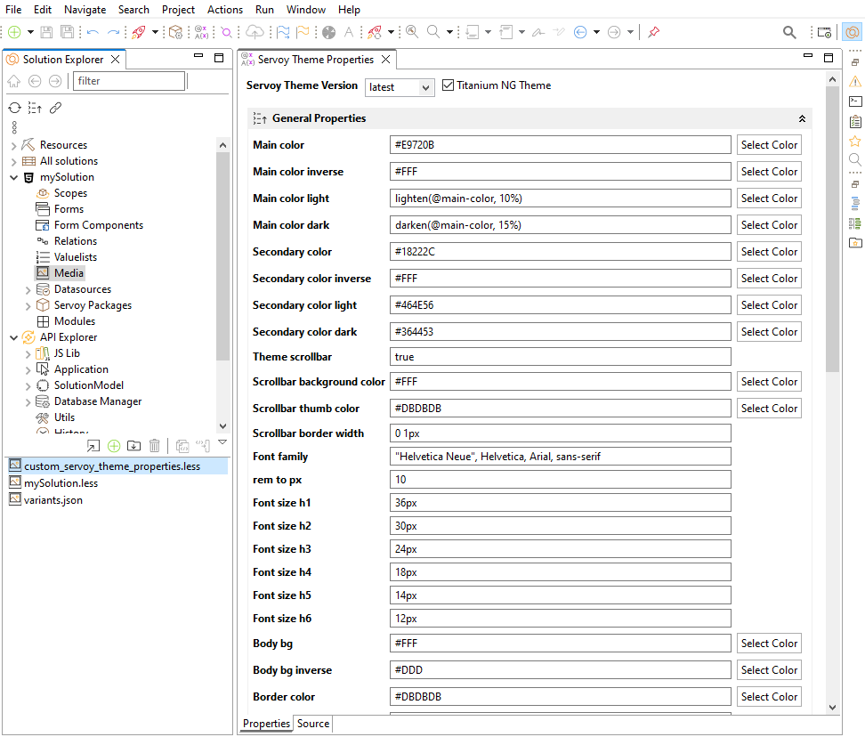
The custom_servoy_theme_properties.less file can be used to configure the theme properties, which are defined as less variables. The file should not be edited directly; it can be opened with the Servoy Theme Properties editor. To open the Servoy Theme Properties editor select in the context menu ( right-click ) of the active solution the entry "Configure the theme". Alternatevely you can find the custom_servoy_theme_properties.less in the solution's Media node; double-click it to open the Theme editor.
Every new version of Servoy may come with an updated version of the Theme, offering theme enhancements and fixes; note the theme enhancements may affect the overall style of your solution, particoularly if you have heavily customized the solution's style with your own CSS/LESS. To prevent breaking changes for your solution you can select a specific version of the Servoy Theme and decline the new enhancements. If you select 'latest' instead, you will always use the latest version of Servoy Theme.
Using the Servoy Theme Editor you can customize colors and properties to your preference. Theme properties are grouped in different categories; General properties affects the style globally, Brand colors affects the branding utilities ( e.g. btn-danger ), some of the most advanced Servoy components like sidenav, tabs etc.. have their own properties section.
For example you can change the value of the @main-color variable to use a different primary color applied to your theme. You can use any applicable CSS or LESS value as: #E9720B, orange, lighten(#E9720B, 10%)... You can also reference other less variables applicable to the same property, like @text-color-inverse: @text-color. If the property value is different than the default, the label color of the property is blue.
To reset the value to the default, right click the property name. In case you upgrade the theme to a newer version, and there are conflicts between properties values (so a value that was changed in the editor was also changed in the theme), the labels will be colored in red.
You can also view the actual content of the custom_servoy_theme_properties.less file, in the Source tab of the editor.
The Servoy themes provides a set of utilities classes which can be applied to Servoy elements ( styleClass property ). See below the list of classes which can be used when the LESS theme is enabled.
These classes can be used on any Servoy element or Servoy layout container ( in Advanced forms )
| class selector | summary |
|---|---|
| no-border | |
| border-default | |
| border-brand | See Colors & Branded classes |
| border-top,border-bottom,border-right,border-left | |
| clickable | |
| clickable-hover | |
| inactive | sets an opacity of 0.6 to indicate an inactive element of container |
These classes are esclusevely designed for Servoy Advanced Forms type ( Responsive ); can be used on any layout container and several component types ( Labels, Buttons )
| class selector | summary |
|---|---|
| full-size | set both height and width to 100% |
| full-width | set width to 100% |
| full-height | set height to 100% |
| width-auto | browser calculate the width based on the element's content |
| margin-10 | set the margin, configurable by Theme properties ( default 10px ) |
| margin-top-10,bottom,left,right | set margin 10 only for 1 dimension ( top, bottom, left, right) |
| margin-15 | set a fixed margin of 15 pixels |
| margin-top-15,bottom,left,right | set a fixed margin of 15 pixels only for 1 dimension ( top, bottom, left, right) |
| margin-20 | set the margin, configurable by Theme properties ( default 20px ) |
| margin-top-20,bottom,left,right | set margin 20 only for 1 dimension ( top, bottom, left, right) |
| margin-30 | set the margin, configurable by Theme properties ( default 20px ) |
| margin-top-30,bottom,left,right | set margin 30 only for 1 dimension ( top, bottom, left, right) |
| padding-10 | set the padding, configurable by Theme properties ( default 10px ) |
| padding-top-10,bottom,left,right | set padding 10 only for 1 dimension ( top, bottom, left, right) |
| padding-15 | set a fixed padding of 15 pixels |
| padding-top-15,bottom,left,right | set a fixed padding of 15 pixels only for 1 dimension |
| padding-20 | set the padding, configurable by Theme properties ( default 20px ) |
| padding-top-20,bottom,left,right | set padding 20 only for 1 dimension ( top, bottom, left, right) |
| padding-30 | set the padding, configurable by Theme properties ( default 30px ) |
| padding-top-30,bottom,left,right | set padding 30 only for 1 dimension ( top, bottom, left, right) |
Most of the classes supports branded colors (see branded classes). Branded colors defines the color schema for the branded classes selector; use branded selectors to highlight specific elements of your solutions, for instance you can use the selector .btn-danger on the delete button to color it as red. For each branded color variable there is a @brand-color-inverse which is used to create a color contrast between the background and foreground.
| Brands | summary |
|---|---|
| primary | use @brand-primary color |
| tertiary | use @brand-tertiary color |
| success | use @brand-success color |
| info | use @brand-info color |
| danger | use @brand-danger color |
| warning | use @brand-warning color |
Branding colors can be used in different class selectors, the following class selectors supports the branded colors.
| class selector | summary |
|---|---|
| bg-primary | sets the background color (and default color) |
| border-primary | sets the border color |
| btn-primary | sets the style of a button (background & color) |
| btn-outline-primary | sets the style of a button (color & background) |
| text-primary | sets the color of a text |
| form-primary | sets the background color of an input field |
| class selector | summary |
|---|---|
| bg | sets the background color (and default foreground color) to the @body-bg value |
| bg-inverse | sets the background color (and default inverse foreground color) to the @body-bg-inverse value |
| bg-main | sets the background color (and foreground color) to the @main-color value |
| bg-brand | use any of the brand colors to set background and foreground color |
Selector applicables on labels and icons
| class selector | summary |
|---|---|
| clickable | shows a pointer cursor |
| clickable-hover | shows a pointer cursor with a darker background color during hover and focus |
| text-center | center the text of a label; note the label will use the entire horizontal space in responsive forms |
| text-uppercase | |
| text-lowercase | |
| text-underline | |
| font-weight-bold | |
| h1,h2,h3,h4,h5,h6 | sets the font size |
| text-brand | use the branded color as foreground |
| form-required | add a content suffix to the label, indicating the user input is required |
Selector applicables on buttons
| class selector | summary |
|---|---|
| btn-round | button with extremely rounded borders |
| btn-xs,sm,md,lg | an extra small, small, medium (default) and large button |
| btn-brand | use the branded color for the button background |
| btn-outline-brand | use the branded color for the button foregrounds and the inverse branded color for the background |
| text-uppercase | |
| text-lowercase | |
| text-underline | |
| font-weight-bold |
| Input Fields class selector | summary |
|---|---|
| text-brand | use the branded color as foreground for input fields |
| form-brand | use the branded color as background for input fields |
| form-invalid | used to mark an input field as invalid |
| Checkgroups class selector | summary |
|---|---|
| check-horizontal | use the branded color as foreground for input fields |
| check-spacing-10,20,30 | sets spacing across radio or check for a checkgroup |
| Navbar class selector | summary |
|---|---|
| navbar-default |
| Tables class selector | summary |
|---|---|
| no-row-selected | remove the highlighted color for the selected row of a table. Since 2019.06 |
| align-left | can be applied to the column styleClass or header styleClass; align the content of the column or of the header to the left. Since 2020.06 |
| align-center | can be applied to the column styleClass or header styleClass; align the content of the column or of the header to the center. Since 2020.06 |
| align-right | can be applied to the column styleClass or header styleClass; align the content of the column or of the header to the right. Since 2020.06 |
| NG Grids class selector | summary |
|---|---|
| ag-theme-servoy | A new theme to be used for the NG Grid components. Using this theme is possible to make use of the ng-table* style selectors which are not applied for other themes of the NG Grid components. Since 2019.06 |
| Inline Group Container | summary |
|---|---|
| input-group-xs | sets a min height of 22px to the left and right inline group containers. applicable only to the inline-group 12 Grid layout |
| input-group-sm | sets a min height of 30px to the left and right inline group containers. applicable only to the inline-group 12 Grid layout |
| input-group-md | sets a min height of 34px to the left and right inline group containers. applicable only to the inline-group 12 Grid layout |
| input-group-lg | sets a min height of 44px to the left and right inline group containers. applicable only to the inline-group 12 Grid layout |
When nesting responsive form using tab/tabless panels, the inner form usually have an extra 15px margin left & right. To remove the margin set the styleClass margin-reset
| class selector | summary |
|---|---|
| margin-reset | to be used on tabs/tabless when containing a nested responsive form having row has top layout container |
Theme properties are grouped with the following categories
- General properties to configure global properties affecting main colors and default style for text, input fields.
- Sidenav properties to configure the style of the Servoy Sidenav component.
- Navbar properties to configure the style of the Servoy Navbar component.
- Tabs properties to configure the style of the Tabpanel component.
- Windows properties to configure the style of Window dialogs.
- Dialogs properties to configure the style of the dialogs created with the dialogs plugin.
- Tables properties to configure the style of the Tables.
- Breadcrumb properties to configure the style of the Breadcrumb component.
- Brand colors properties to define the color schema for the branded classes selectors, ( e.g. btn-info ).
- Validation properties to configure style related to validation selectors (e.g. form-required )
- Margin and Padding properties to configure the margins & paddings dimensions set by the helper classes: margin-10, margin-20, margin-30, padding-10 etc...
Use these properties to configure global look & feel of your soluction. You can define the main colors and default style for text, input fields.
| General | Description |
|---|---|
| Main color | Changing the value will affect the 'Main color' of the theme! |
| Main color inverse | Changing the value will affect the 'Main color inverse' of the theme! |
| Main color light | Changing the value will affect the 'Main color light' of the theme! |
| Main color dark | Changing the value will affect the 'Main color dark' of the theme! |
| Secondary color | Changing the value will affect the 'Secondary color' of the theme! |
| Secondary color inverse | Changing the value will affect the 'Secondary color inverse' of the theme! |
| Secondary color light | Changing the value will affect the 'Secondary color light' of the theme! |
| Secondary color dark | Changing the value will affect the 'Secondary color dark' of the theme! |
| Theme scrollbar | If true - use custom scrollbar theme, if false - use the default browser webkit. |
| Scrollbar background color | Only when theme-scrollbar is true. |
| Scrollbar thumb color | Only when theme-scrollbar is true. |
| Scrollbar border width | Only when theme-scrollbar is true |
| Font family | Changing the value will affect the 'Font family' of the theme! |
| rem to px | Changing the value will affect the 'rem to px' of the theme! |
| Font size h1 | Changing the value will affect the 'Font size h1' of the theme! |
| Font size h2 | Changing the value will affect the 'Font size h2' of the theme! |
| Font size h3 | Changing the value will affect the 'Font size h3' of the theme! |
| Font size h4 | Changing the value will affect the 'Font size h4' of the theme! |
| Font size h5 | Changing the value will affect the 'Font size h5' of the theme! |
| Font size h6 | Changing the value will affect the 'Font size h6' of the theme! |
| Body bg | Changes the background for the bg class. Is also used as part of other less vars like Tab border color, dialogs, breadcrumb, grid menu panel. |
| Body bg inverse | Changing the value will affect the 'Body bg inverse' of the theme! |
| Border color | Changing the value will affect the 'Border color' of the theme! |
| Border width | Changing the value will affect the 'Border width' of the theme! |
| Border style | Changing the value will affect the 'Border style' of the theme! |
| Border radius | Changing the value will affect the 'Border radius' of the theme! |
| Text font size | Changing the value will affect the 'Text font size' of the theme! |
| Text color | Changing the value will affect the 'Text color' of the theme! |
| Text color inverse | Changing the value will affect the 'Text color inverse' of the theme! |
| Text color default | Changing the value will affect the 'Text color default' of the theme! |
| Text color default inverse | Changing the value will affect the 'Text color default inverse' of the theme! |
| Field font size | Changing the value will affect the 'Field font size' of the theme! |
| Field bg | Changing the value will affect the 'Field bg' of the theme! |
| Field disabled bg | Changing the value will affect the 'Field disabled bg' of the theme! |
| Field color | Changing the value will affect the 'Field color' of the theme! |
| Field addon bg | Changing the value will affect the 'Field addon bg' of the theme! |
| Field width | Changing the value will affect the 'Field width' of the theme! |
| Field border radius | Changing the value will affect the 'Field border radius' of the theme! |
| Check and Radio Color | Changing the value will affect the 'Check and Radio Color' of the theme! |
Override these properties to customize the look & feel of the Servoy Sidenav component, commonly used as navigation menu.
| Sidenav | Description |
|---|---|
| Sidenav color | Changing the value will affect the 'Sidenav color' of the theme! |
| Sidenav text color | Changing the value will affect the 'Sidenav text color' of the theme! |
| Sidenav text font size | Changing the value will affect the 'Sidenav text font size' of the theme! |
| Sidenav border width | Changing the value will affect the 'Sidenav border width' of the theme! |
| Sidenav border color | Changing the value will affect the 'Sidenav border color' of the theme! |
| Sidenav selected color | Changing the value will affect the 'Sidenav selected color' of the theme! |
| Sidenav selected text color | Changing the value will affect the 'Sidenav selected text color' of the theme! |
| Sidenav selected border color | Changing the value will affect the 'Sidenav selected border color' of the theme! |
| Sidenav selected border width | Sidenav border for selected top-level item top |
| Sidenav secondary color | Changing the value will affect the 'Sidenav secondary color' of the theme! |
| Sidenav secondary text color | Changing the value will affect the 'Sidenav secondary text color' of the theme! |
| Sidenav secondary text font size | Changing the value will affect the 'Sidenav secondary text font size' of the theme! |
| Sidenav secondary border width | Changing the value will affect the 'Sidenav secondary border width' of the theme! |
| Sidenav secondary border color | Changing the value will affect the 'Sidenav secondary border color' of the theme! |
| Sidenav secondary selected color | Changing the value will affect the 'Sidenav secondary selected color' of the theme! |
| Sidenav secondary selected text color | Changing the value will affect the 'Sidenav secondary selected text color' of the theme! |
| Sidenav secondary selected border color | Changing the value will affect the 'Sidenav secondary selected border color' of the theme! |
| Sidenav secondary selected border width | Sidenav secondary border for selected top-level item top |
Override these properties to customize the look & feel of the Servoy Navbar component, commonly used as top bar in your menu.
| Navbar | Description |
|---|---|
| Navbar background color | Changing the value will affect the 'Navbar background color' of the theme! |
| Navbar highlighted item | Changing the value will affect the 'Navbar highlighted item' of the theme! |
| Navbar text color | Changing the value will affect the 'Navbar text color' of the theme! |
| Navbar dropdown bg | Changing the value will affect the 'Navbar dropdown bg' of the theme! |
| Navbar dropdown text color | Changing the value will affect the 'Navbar dropdown text color' of the theme! |
| Navbar active bg | Changing the value will affect the 'Navbar active bg' of the theme! |
| Navbar active text color | Changing the value will affect the 'Navbar active text color' of the theme! |
| Navbar active border color | Changing the value will affect the 'Navbar active border color' of the theme! |
| Navbar active border width | Changing the value will affect the 'Navbar active border width' of the theme! |
Override these properties to customize the look & feel of the Servoy Tabpanel component.
| Tabs | Description |
|---|---|
| Tab bg | Changing the value will affect the 'Tab bg' of the theme! |
| Tab text color | Changing the value will affect the 'Tab text color' of the theme! |
| Tab text transform | Changing the value will affect the 'Tab text transform' of the theme! |
| Tab border color | Changing the value will affect the 'Tab border color' of the theme! |
| Tab border width | Changing the value will affect the 'Tab border width' of the theme! |
| Tab border radius | Changing the value will affect the 'Tab border radius' of the theme! |
| Tab active bg | Changing the value will affect the 'Tab active bg' of the theme! |
| Tab active text color | Changing the value will affect the 'Tab active text color' of the theme! |
| Tab active border color | Changing the value will affect the 'Tab active border color' of the theme! |
| Tab active border width | Changing the value will affect the 'Tab active border width' of the theme! |
Override these properties to customize the look & feel of the Servoy Window dialogs created with application.createWindow(...).
| Windows | Description |
|---|---|
| Window header bg | Changing the value will affect the 'Window header bg' of the theme! |
| Window header color | Changing the value will affect the 'Window header color' of the theme! |
| Window body bg | Changing the value will affect the 'Window body bg' of the theme! |
| Window footer bg | Changing the value will affect the 'Window footer bg' of the theme! |
| Border radius for window and dialogs | Changing the value will affect the 'Border radius for window and dialogs' of the theme! |
| Popup selected bg | Changing the value will affect the 'Popup selected bg' of the theme! |
| Popup selected text | Changing the value will affect the 'Popup selected text' of the theme! |
| Popup disabled color | Changing the value will affect the 'Popup disabled color' of the theme! |
Override these properties to customize the look & feel of the Servoy dialogs created with plugins.dialogs... .
| Dialogs | Description |
|---|---|
| Info Dialog header bg | Changing the value will affect the 'Info Dialog header bg' of the theme! |
| Info Dialog header color | Changing the value will affect the 'Info Dialog header color' of the theme! |
| Question Dialog header bg | Changing the value will affect the 'Question Dialog header bg' of the theme! |
| Question Dialog header color | Changing the value will affect the 'Question Dialog header color' of the theme! |
| Input and Select Dialog header bg | Changing the value will affect the 'Input and Select Dialog header bg' of the theme! |
| Input and Select Dialog header color | Changing the value will affect the 'Input and Select Dialog header color' of the theme! |
Override these properties to customize the look & feel of the Servoy Tables. While the Table properties affects any type of Servoy Table component, note the NGGrids properties are specific to the NG Grid components having the ag-theme-servoy. The ag-theme-servoy theme can be set in the NG Grid element's styleClass property.
| Tables | Description |
|---|---|
| Table bg | Changing the value will affect the 'Table bg' of the theme! |
| Table border width | Changing the value will affect the 'Table border width' of the theme! |
| Table border radius | Changing the value will affect the 'Table border radius' of the theme! |
| Table header bg | Changing the value will affect the 'Table header bg' of the theme! |
| Table header color | Changing the value will affect the 'Table header color' of the theme! |
| Table header font style | Changing the value will affect the 'Table header font style' of the theme! |
| Table header text transform | Changing the value will affect the 'Table header text transform' of the theme! |
| Table row odd bg color | Changing the value will affect the 'Table row odd bg color' of the theme! |
| Table row odd text color | Changing the value will affect the 'Table row odd text color' of the theme! |
| Table row even bg color | Changing the value will affect the 'Table row even bg color' of the theme! |
| Table row even text color | Changing the value will affect the 'Table row even text color' of the theme! |
| Table row selected bg color | Changing the value will affect the 'Table row selected bg color' of the theme! |
| Table row selected text color | Changing the value will affect the 'Table row selected text color' of the theme! |
| Table row border width | Changing the value will affect the 'Table row border width' of the theme! |
| NGTable cell value line height | Changing the value will affect the 'NGTable cell value line height' of the theme! |
| NGGrids row group bg | Changing the value will affect the 'NGGrids row group bg' of the theme! |
| NGGrids row group color | Changing the value will affect the 'NGGrids row group color' of the theme! |
| NGGrids row group bg level 0 | Changing the value will affect the 'NGGrids row group bg level 0' of the theme! |
| NGGrids row group color level 0 | Changing the value will affect the 'NGGrids row group color level 0' of the theme! |
| NGGrids row group cell font weight | Changing the value will affect the 'NGGrids row group cell font weight' of the theme! |
| NGGrids menu panel bg | Changing the value will affect the 'NGGrids menu panel bg' of the theme! |
| NGGrids menu panel text color | Changing the value will affect the 'NGGrids menu panel text color' of the theme! |
| NGGrids side panel bg | Changing the value will affect the 'NGGrids side panel bg' of the theme! |
| NGGrids side panel text color | Changing the value will affect the 'NGGrids side panel text color' of the theme! |
| NGGrids side button bg | Changing the value will affect the 'NGGrids side button bg' of the theme! |
| NGGrids side button text color | Changing the value will affect the 'NGGrids side button text color' of the theme! |
| NGGrids side button selected bg | Changing the value will affect the 'NGGrids side button selected bg' of the theme! |
| NGGrids side button selected text color | Changing the value will affect the 'NGGrids side button selected text color' of the theme! |
| NGGrids search field height | Changing the value will affect the 'NGGrids search field height' of the theme! |
Override these properties to customize the look & feel of the Servoy Breadcrumb component.
| Breadcrumb specific style | Description |
|---|---|
| Breadcrumb bg | Changing the value will affect the 'Breadcrumb bg' of the theme! |
| Breadcrumb color | Changing the value will affect the 'Breadcrumb color' of the theme! |
| Breadcrumb selected color | Changing the value will affect the 'Breadcrumb selected color' of the theme! |
Define the color schema for the branded class selectors. Branded colors defines the color schema for the branded classes selector; use branded selectors to highlight specific elements of your solutions, for instance you can use the selector .btn-danger on the delete button to color it as red. For each branded color variable there is a @brand-color-inverse which is used to create a color contrast between the background and foreground.
| Brand colors | Description |
|---|---|
| Brand primary | Changing the value will affect the 'Brand primary' of the theme! |
| Brand tertiary | Changing the value will affect the 'Brand tertiary' of the theme! |
| Brand success | Changing the value will affect the 'Brand success' of the theme! |
| Brand info | Changing the value will affect the 'Brand info' of the theme! |
| Brand warning | Changing the value will affect the 'Brand warning' of the theme! |
| Brand danger | Changing the value will affect the 'Brand danger' of the theme! |
| Text-tertiary | Changing the value will affect the 'Text-tertiary' of the theme! |
| Brand primary inverse | Changing the value will affect the 'Brand primary inverse' of the theme! |
| Brand tertiary inverse | Changing the value will affect the 'Brand tertiary inverse' of the theme! |
| Brand success inverse | Changing the value will affect the 'Brand success inverse' of the theme! |
| Brand info inverse | Changing the value will affect the 'Brand info inverse' of the theme! |
| Brand warning inverse | Changing the value will affect the 'Brand warning inverse' of the theme! |
| Brand danger inverse | Changing the value will affect the 'Brand danger inverse' of the theme! |
| Brand primary highlighted | Changing the value will affect the 'Brand primary highlighted' of the theme! |
| Brand tertiary highlighted | Changing the value will affect the 'Brand tertiary highlighted' of the theme! |
| Brand success highlighted | Changing the value will affect the 'Brand success highlighted' of the theme! |
| Brand info highlighted | Changing the value will affect the 'Brand info highlighted' of the theme! |
| Brand warning highlighted | Changing the value will affect the 'Brand warning highlighted' of the theme! |
| Brand danger highlighted | Changing the value will affect the 'Brand danger highlighted' of the theme! |
| Brand primary highlighted inverse | Changing the value will affect the 'Brand primary highlighted inverse' of the theme! |
| Brand tertiary highlighted inverse | Changing the value will affect the 'Brand tertiary highlighted inverse' of the theme! |
| Brand success highlighted inverse | Changing the value will affect the 'Brand success highlighted inverse' of the theme! |
| Brand info highlighted inverse | Changing the value will affect the 'Brand info highlighted inverse' of the theme! |
| Brand warning highlighted inverse | Changing the value will affect the 'Brand warning highlighted inverse' of the theme! |
| Brand danger highlighted inverse | Changing the value will affect the 'Brand danger highlighted inverse' of the theme! |
Define style related to validation selectors
| Validations | Description |
|---|---|
| Form required label suffix | Changing the value will affect the 'Form required label suffix' of the theme! |
The theme classes margin-10, margin-20, margin-30, padding-10 etc... they set margin and padding of the element or layout container they are applied to. Default value are respectevely 10px, 20px, 30px. Changing the box size properties to any value of your preference.
| Margins and Padding | Description |
|---|---|
| Box size 10 | Changing the value will affect the margin-10 and padding-10 helpers! |
| Box size 20 | Changing the value will affect the margin-20 and padding-20 helpers! |
| Box size 30 | Changing the value will affect the margin-30 and padding-30 helpers! |
Your solution .less file may contain your own css/less styles and using variables from the properties.less file is allowed. Here you can also add your own .less variables which can be used in your own less style.
Example
@import 'custom_servoy_theme_properties.less';

// Add your custom less/css to this file you can use the same less properties that are specified in the above properties.less

/* Secondary background color, re-use theme variables to create new styles */
.bg-secondary {
	background-color: @secondary-color;
	color: @secondary-color-inverse;
}

a.bg-secondary:hover {
	background-color: @secondary-color-light;
	color: @secondary-color-inverse;
}

// new less variable
@brand-fourth: #F6B900;

/* Fourth variation for a background-color using new less variables */
.bg-fourth {
	background-color: @brand-fourth;
	color: @text-color;
}

a.bg-fourth:hover {
	background-color: @brand-fourth;
	color: @text-color;
}