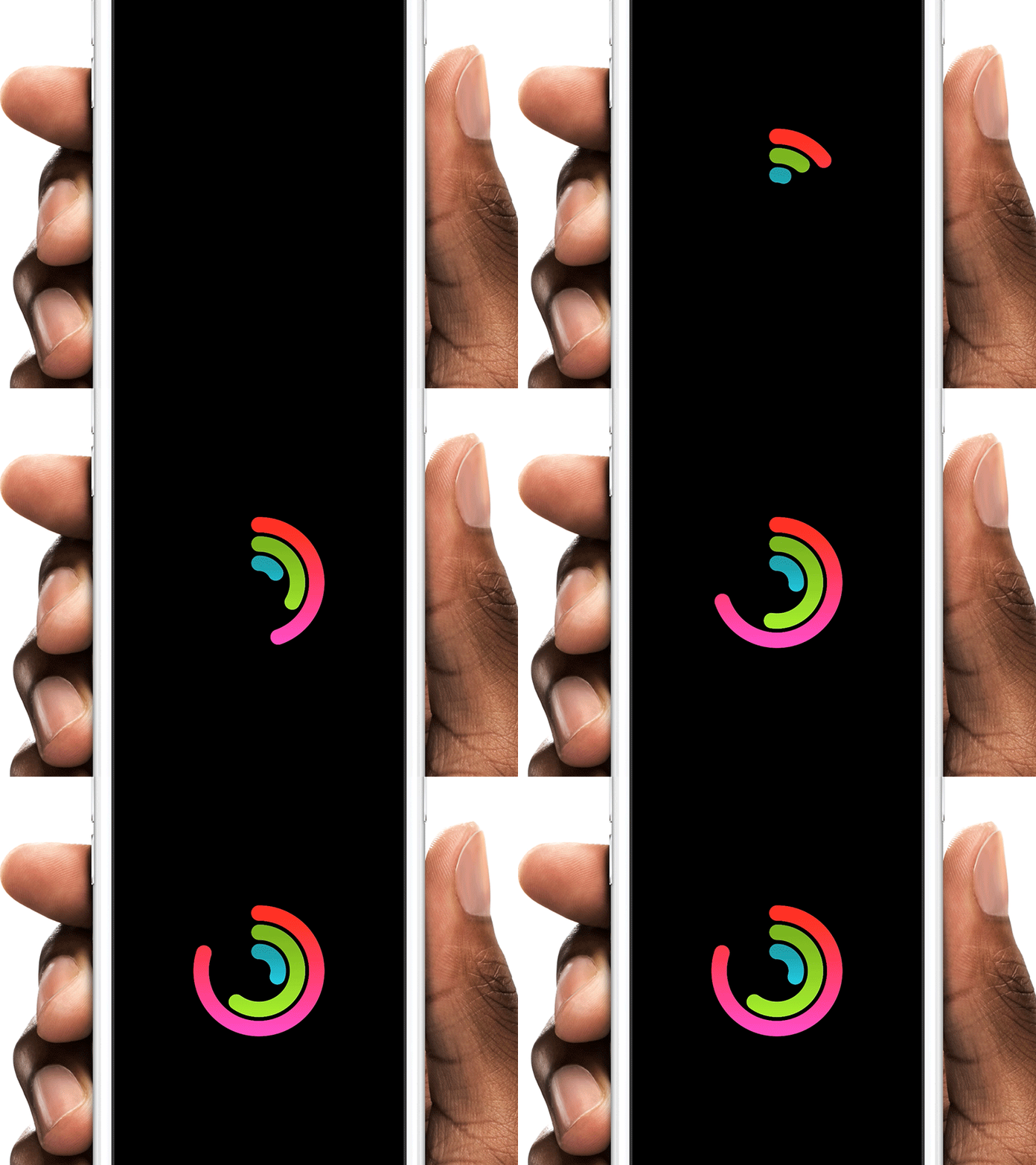
Apple Watch Activities: http://share.framerjs.com/0w3wirptkfc9/
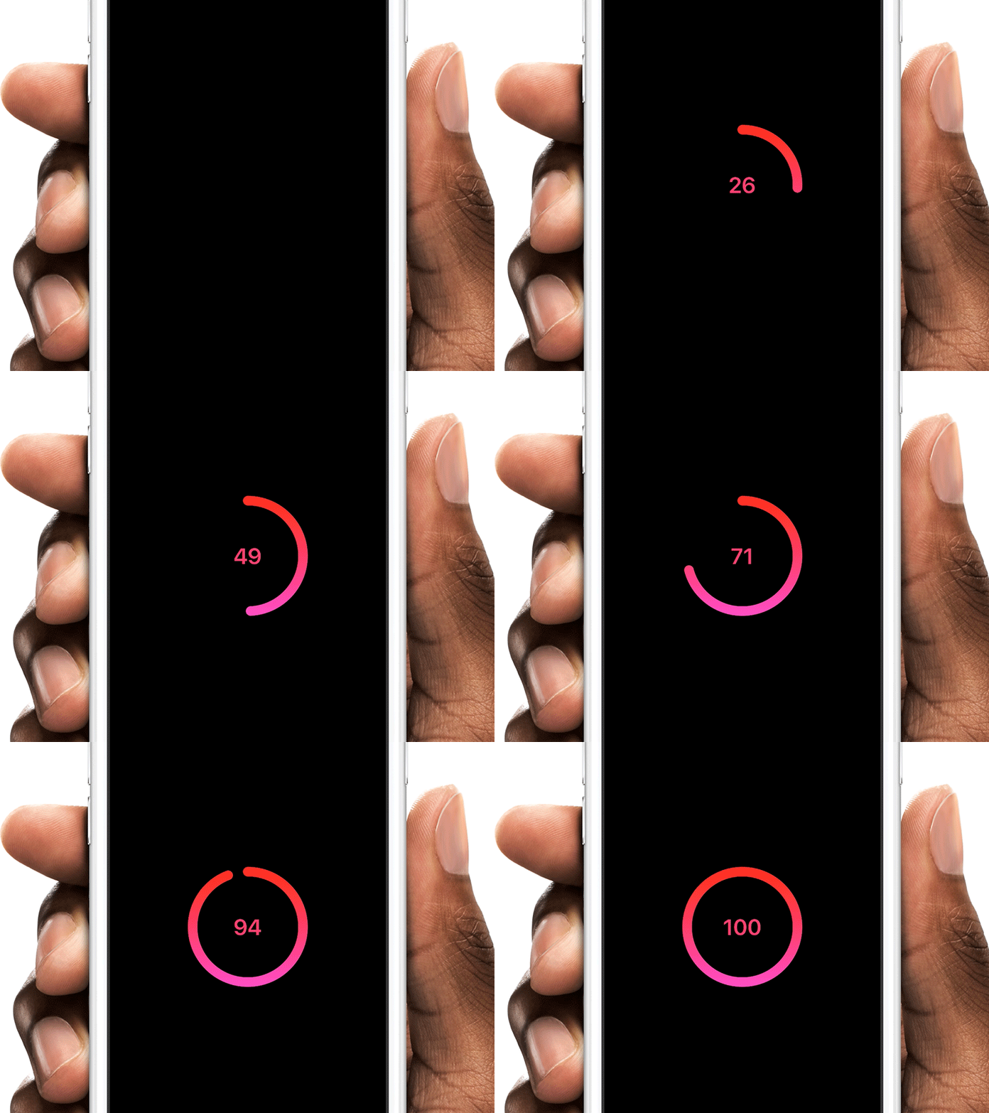
Countdown: http://share.framerjs.com/8as5o1wn1f0a/
Thank you Henrique Gusso for writing that great article.
- Download the
circleModule.coffeefile - Create or open a framer project and drop
circleModule.coffeeinside the /modules folder - Add
{Circle} = require "circleModule"at the top of your document (case-sensitive).
circle = new CircleYou can also change the size of the circle circleSize: 400 and the strokeSize circleSize: 20.
You can animate to a certain value (percent-based). You can change the value any time in your prototype.
circle.changeTo(50) # Animates to 50% of circle in the default time

# Options: Speed (in seconds)
circle.changeTo(50, 10) # Animates to 50% of circle in the 10s
Or just set a initial value (percent-based)
circle.startAt(10)You can use the circle also for countdowns
countdownCircle = new Circle
	hasCounter: true
Change the text color counterColor: "#fff" and font-size counterFontSize: 20 to your liking.
You can get a callback when animation is completed
circle.onFinished = ->
	print "animation done"
Get the current value of the circle
circle.onFinished = ->
	if circle.currentValue == 80 # TRUE if circle was animated to "circle.changeTo(80)"
print "80%"You can either use a plain color (default) for the circle or a gradient.
gradientCircle = new Circle
	topColor: "#7cc201"
	bottomColor: "#a3fe00"

plainCircle = new Circle
color: "#7cc201"You can easily animate the circles visibilty using standard framer functions. For instant changes:
circle.hide()
circle.show()You can also customize the circle with following properties:
| property | Description |
|---|---|
circleSize |
The size of the circle (default: 300) |
strokeWidth |
The thickness of the stroke (default: 24) |
strokeColor |
The color of the stroke (default: "#fc245c") |
linecap |
The shape of the stroke's endcaps. Use "butt", "round" or "square" (default: "round") |
topColor |
Top Gradient Color |
bottomColor |
Bottom Gradient Color |
hasCounter |
Set it to true, will show a countdown label (default: null) |
counterColor |
Text color of countdown label (default: "#fff") |
counterFontSize |
Font size of countdown label (default: 60) |
hasLinearEasing |
Allows to change the animation curve to "linear" for "ease-in-out". Set it to `true (default: null) |
loadingCircle = new Circle
	circleSize: 200
	strokeWidth: 30
	linecap: "round"

	topColor: "#ff150f"
	bottomColor: "#ff23bd"

	hasCounter: true
	counterColor: "#fff"
	hasLinearEasing: true

	counterColor: "red"
	counterFontSize: 100

loadingCircle.center() # center the circle

loadingCircle.changeTo(100)

loadingCircle.onFinished = ->
	print "animation is done"
