-
Notifications
You must be signed in to change notification settings - Fork 1.2k
New issue
Have a question about this project? Sign up for a free GitHub account to open an issue and contact its maintainers and the community.
By clicking “Sign up for GitHub”, you agree to our terms of service and privacy statement. We’ll occasionally send you account related emails.
Already on GitHub? Sign in to your account
Support tooltip for Page primary & secondary actions #6709
Conversation
|
👋 Thanks for opening your first pull request. A contributor should give feedback soon. If you haven’t already, please check out the contributing guidelines. |
32a7959
to
2f14f2b
Compare
|
/snapit |
2f14f2b
to
f1becbf
Compare
size-limit report 📦
|
f1becbf
to
21e31e0
Compare
|
/snapit |
|
🫰✨ Thanks @aminpaks! Your snapshot has been published to npm. Test the snapshot by updating your yarn add @shopify/polaris@0.0.0-snapshot-release-20220722103118 |
adb2e3a
to
e58de56
Compare
|
/snapit |
|
🫰✨ Thanks @aminpaks! Your snapshot has been published to npm. Test the snapshot by updating your yarn add @shopify/polaris@0.0.0-snapshot-release-20220722172021 |
|
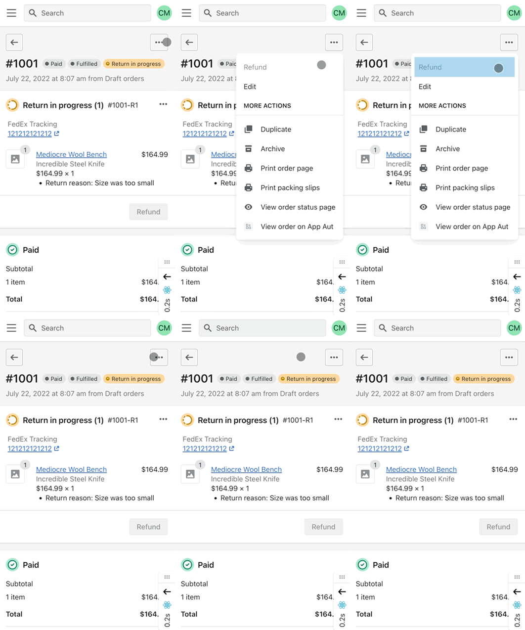
This looks good on larger screens. Works on hover and focus as expected. Couple things on small screens:
|
|
Thanks for the feedback @sarahill , for those two items, we are planning on following up on a UX pattern for mobile but IIRC the team had concerns around tooltips on mobile (stacking actions) obscuring other items, so the tooltip would have to be custom styled. They wanted to get this shipped while they come up with a solution. As for the interact-able button, I looked at what this is like now on the Page component and it seems this is currently how that button behaves for small screen disabled actions, so not a regression from this PR. I put up a code sandbox using Polaris 9.2.1 to confirm if you want to take a look. https://codesandbox.io/s/tmg9qm?module=App.js&file=/App.js . Even though in this case the button is properly disabled, there are some Polaris styles on hover and active that make it appear interact-able. |
e7f09e2
to
03d934e
Compare
03d934e
to
b52223c
Compare
b52223c
to
4379d08
Compare
4379d08
to
0d35548
Compare
|
/snapit |
|
🫰✨ Thanks @peterlazzarino! Your snapshot has been published to npm. Test the snapshot by updating your yarn add @shopify/polaris@0.0.0-snapshot-release-20220728132629 |
|
Snapped and 🎩 on |
|
🎉 Thanks for your contribution to Polaris! |

WHY are these changes introduced?
Fixes https://github.com/Shopify/core-access/issues/409
These changes are being introduced because we want to be able to provide context for a user if there is a reason why we disable a Page Action. The above ticket shows an example of this where we want to show a Tooltip so we can tell the user why this button is disabled for them.
This change will allow us to provide this context to consumers of Polaris that utilize Page actions, it's optional and will not effect existing Page actions.
WHAT is this pull request doing?
Adds an option tooltip prop to Page actions.
How to 🎩
Top-hat instructions available in this PR which is using a snapshot of this Polaris change. https://github.com/Shopify/web/pull/69430
🖥 Local development instructions
🗒 General tophatting guidelines
📄 Changelog guidelines
Copy-paste this code in
playground/Playground.tsx:🎩 checklist
Not tophatted on mobile since this change does not effect
Pageactions inside the mobile ...ActionList. Not tested for accessibility since it is not adding any new visual elements.README.mdwith documentation changes