[Toast] Updates to fit a more compact layout #7763
Conversation
 n-filatov
force-pushed
the
nik-filatov/toast-redesign
branch
from
n-filatov
force-pushed
the
nik-filatov/toast-redesign
branch
from
ed3e599
to
9effb76
Compare
size-limit report 📦
|
n-filatov
force-pushed
the
nik-filatov/toast-redesign
branch
3 times, most recently
from
8421a6d
to
eabf218
Compare
|
/snapit |
|
🫰✨ Thanks @n-filatov! Your snapshots have been published to npm. Test the snapshots by updating your yarn add @shopify/plugin-polaris@0.0.0-snapshot-release-20221122113531yarn add @shopify/polaris-icons@0.0.0-snapshot-release-20221122113531yarn add @shopify/polaris@0.0.0-snapshot-release-20221122113531 |
n-filatov
force-pushed
the
nik-filatov/toast-redesign
branch
from
eabf218
to
e8dec31
Compare
.changeset/perfect-games-cough.md
Outdated
| '@shopify/polaris': major | ||
| --- | ||
|
|
||
| Redesign the Toast component to a more compact layout |
There was a problem hiding this comment.
| Redesign the Toast component to a more compact layout | |
| Updated the Toast component to a more compact layout |
| } | ||
| } | ||
|
|
||
| .LeftIcon { |
There was a problem hiding this comment.
Can we call this LeadingIcon or just Icon instead? We're working towards removing left / right / top / bottom phrasing from the system. Not a blocker but if you could make the change here and to leftIconMarkup => leadingIconMarkup or iconMarkup that would be awesome
There was a problem hiding this comment.
Got it, thank you for feedback 🙏
Fixed:
polaris/polaris-react/src/components/Frame/components/Toast/Toast.tsx
Lines 65 to 69 in 173bbf9
n-filatov
force-pushed
the
nik-filatov/toast-redesign
branch
from
e8dec31
to
173bbf9
Compare
n-filatov
changed the title
|
Can we double check the tokens being used here? In the Figma doc there are lots of incorrect tokens being used. For example, we shouldn't be using border tokens to style text. |
Thanks for the very useful comment, Joe! |
n-filatov
changed the title
n-filatov
changed the title
n-filatov
changed the title
Sounds good. If y'all want to jam together on it just reach out. Happy to jump in a session and collab on it. |
|
Thanks for catching that @heyjoethomas. I noticed that when I was adding them to the UI Kit. Here's a link to the branch in Figma |
n-filatov
force-pushed
the
nik-filatov/toast-redesign
branch
from
173bbf9
to
e8d063d
Compare
@sarahill thanks for the Figma link. I have changed the tokens in my PR. The main UI difference is the color for action text, it will be like the main text(using --p-text-on-interactive token) It will look like this:
|


|
I think we should also create an issue to update the action text/close button color when there are available tokens. |
There was a problem hiding this comment.
Tokens are good but I just noticed 2 things:
- Close button isn't center aligned when there's an action present
- The designs look like they have a shadow but I'm not seeing that here.. correct me if I'm missing it though:
shadow-popover
close button not center

shadow (it's subtle)

cc: @jameswfindlater
 n-filatov
force-pushed
the
nik-filatov/toast-redesign
branch
from
n-filatov
force-pushed
the
nik-filatov/toast-redesign
branch
from
e8d063d
to
9cd7360
Compare
n-filatov
changed the title
Yea, my bad. Thanks for noticing 🙌.
|

|
Following up on UI Kit updates here: I went ahead and merged in the |
This PR was opened by the [Changesets
release](https://github.com/changesets/action) GitHub action. When
you're ready to do a release, you can merge this and the packages will
be published to npm automatically. If you're not ready to do a release
yet, that's fine, whenever you add more changesets to main, this PR will
be updated.


# Releases
## @shopify/stylelint-polaris@5.0.0

### Major Changes

- [#7691](#7691)
[`38b2a00a6`](38b2a00)
Thanks [@aaronccasanova](https://github.com/aaronccasanova)! - Stylelint
Polaris v5 release

## @shopify/polaris-icons@6.7.0

### Minor Changes

- [#7816](#7816)
[`afe77e584`](afe77e5)
Thanks [@allyshiasewdat](https://github.com/allyshiasewdat)! - Add
returns major icon

## @shopify/polaris-migrator@0.10.0

### Minor Changes

- [#7726](#7726)
[`22c4107b3`](22c4107)
Thanks [@qt314](https://github.com/qt314)! - Added migration to insert
disable comments for @shopify/stylelint-polaris

### Patch Changes

- [#7836](#7836)
[`77736370e`](7773637)
Thanks [@qt314](https://github.com/qt314)! - Decouple polaris migrator
test from stylelint config so it's easier to maintain

- Updated dependencies
\[[`38b2a00a6`](38b2a00)]:
    -   @shopify/stylelint-polaris@5.0.0

## @shopify/polaris@10.14.0

### Minor Changes

- [#7833](#7833)
[`e47595193`](e475951)
Thanks [@mrcthms](https://github.com/mrcthms)! - Separated BulkActions
and SelectAllActions for new sticky bulk actions experience


- [#7812](#7812)
[`e51d2c2d2`](e51d2c2)
Thanks [@chazdean](https://github.com/chazdean)! - Created `Divider`
component with guidance and examples

### Patch Changes

- [#7763](#7763)
[`28529baaf`](28529ba)
Thanks [@n-filatov](https://github.com/n-filatov)! - Update the Toast
component to a more compact layout

- Updated dependencies
\[[`afe77e584`](afe77e5)]:
    -   @shopify/polaris-icons@6.7.0

## @shopify/plugin-polaris@0.0.19

### Patch Changes

- Updated dependencies
\[[`22c4107b3`](22c4107),
[`77736370e`](7773637)]:
    -   @shopify/polaris-migrator@0.10.0

## polaris.shopify.com@0.27.0

### Minor Changes

- [#7812](#7812)
[`e51d2c2d2`](e51d2c2)
Thanks [@chazdean](https://github.com/chazdean)! - Created `Divider`
component with guidance and examples

### Patch Changes

- Updated dependencies
\[[`afe77e584`](afe77e5),
[`e47595193`](e475951),
[`28529baaf`](28529ba),
[`e51d2c2d2`](e51d2c2)]:
    -   @shopify/polaris-icons@6.7.0
    -   @shopify/polaris@10.14.0

Co-authored-by: github-actions[bot] <github-actions[bot]@users.noreply.github.com>
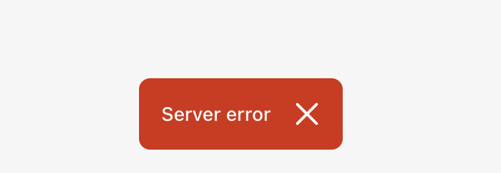
### WHY are these changes introduced? Resolves: Shopify#7766 Updates the toast to fit a more compact layout. Figma: https://www.figma.com/file/wgbt21f1PZm5lrUecbB5oY/%F0%9F%8D%9E-Toast-component-rework?t=t1DGV6KQXGXBfkaQ-0 ### WHAT is this pull request doing? Redesign screenshots: <details> <summary>Default</summary> Before: <img width="194" alt="default Toast component before changes" src="https://user-images.githubusercontent.com/11233957/203293475-8ee315bd-94f9-4413-b9da-ada89f74b9fa.png"> After: <img width="252" alt="default Toast component after changes" src="https://user-images.githubusercontent.com/11233957/203294027-2e37d8a5-146e-468c-bc2e-e13015397545.png"> </details> <details> <summary>With Action</summary> Before: <img width="304" alt="Toast with action before changes" src="https://user-images.githubusercontent.com/11233957/203293640-f0a2a97a-ef7c-4771-a5ec-f58439452c94.png"> After: <img width="221" alt="Toast with action after changes" src="https://user-images.githubusercontent.com/11233957/203294132-9e40966a-b991-4008-b767-f829ebea89f7.png"> </details> <details> <summary>Error</summary> Before: <img width="364" alt="Toast with error before changes" src="https://user-images.githubusercontent.com/11233957/203293759-7a2207ec-5160-477b-8ee6-b03593cc0dd2.png"> After: <img width="243" alt="Toast with error after changes" src="https://user-images.githubusercontent.com/11233957/203294225-025cd97a-af39-4b7b-a02e-ba4f92c153fe.png"> </details> ### How to 🎩 🖥 [Local development instructions](https://github.com/Shopify/polaris/blob/main/README.md#local-development) 🗒 [General tophatting guidelines](https://github.com/Shopify/polaris/blob/main/documentation/Tophatting.md) 📄 [Changelog guidelines](https://github.com/Shopify/polaris/blob/main/.github/CONTRIBUTING.md#changelog) #### Test in spin Spin instance: https://admin.web.nf-tost-web.nikita-filatov.eu.spin.dev/store/shop1/products?selectedView=all <details> <summary>Default toast</summary> Create a new product here: [link](https://admin.web.nf-tost-web.nikita-filatov.eu.spin.dev/store/shop1/products/new) **Expected result** <img width="1511" alt="image" src="https://user-images.githubusercontent.com/11233957/203316338-b8a97d25-ef8a-4666-8b54-37fdd07ce748.png"> </details> <details> <summary>Toast with error</summary> 1. Create a new product here: [link](https://admin.web.nf-tost-web.nikita-filatov.eu.spin.dev/store/shop1/products/new) 2. Before clicking on the Save button disable the wifi:  **Expected result:** <img width="976" alt="image" src="https://user-images.githubusercontent.com/11233957/203317249-ce3b54ab-7123-4ec9-ac9c-ad69fdf11658.png"> </details> #### Test on local machine 1. Open http://localhost:6006/?path=/story/all-components-toast--default 5. Check 2.1 Default toast 2.2. Toast with action 2.3 Toast with error </details> ### 🎩 checklist - [x] Tested on [mobile](https://github.com/Shopify/polaris/blob/main/documentation/Tophatting.md#cross-browser-testing) - [x] Tested on [multiple browsers](https://help.shopify.com/en/manual/shopify-admin/supported-browsers) - [x] Tested for [accessibility](https://github.com/Shopify/polaris/blob/main/documentation/Accessibility%20testing.md) - [ ] Updated the component's `README.md` with documentation changes - [ ] [Tophatted documentation](https://github.com/Shopify/polaris/blob/main/documentation/Tophatting%20documentation.md) changes in the style guide
This PR was opened by the [Changesets
release](https://github.com/changesets/action) GitHub action. When
you're ready to do a release, you can merge this and the packages will
be published to npm automatically. If you're not ready to do a release
yet, that's fine, whenever you add more changesets to main, this PR will
be updated.


# Releases
## @shopify/stylelint-polaris@5.0.0

### Major Changes

- [Shopify#7691](Shopify#7691)
[`38b2a00a6`](Shopify@38b2a00)
Thanks [@aaronccasanova](https://github.com/aaronccasanova)! - Stylelint
Polaris v5 release

## @shopify/polaris-icons@6.7.0

### Minor Changes

- [Shopify#7816](Shopify#7816)
[`afe77e584`](Shopify@afe77e5)
Thanks [@allyshiasewdat](https://github.com/allyshiasewdat)! - Add
returns major icon

## @shopify/polaris-migrator@0.10.0

### Minor Changes

- [Shopify#7726](Shopify#7726)
[`22c4107b3`](Shopify@22c4107)
Thanks [@qt314](https://github.com/qt314)! - Added migration to insert
disable comments for @shopify/stylelint-polaris

### Patch Changes

- [Shopify#7836](Shopify#7836)
[`77736370e`](Shopify@7773637)
Thanks [@qt314](https://github.com/qt314)! - Decouple polaris migrator
test from stylelint config so it's easier to maintain

- Updated dependencies
\[[`38b2a00a6`](Shopify@38b2a00)]:
    -   @shopify/stylelint-polaris@5.0.0

## @shopify/polaris@10.14.0

### Minor Changes

- [Shopify#7833](Shopify#7833)
[`e47595193`](Shopify@e475951)
Thanks [@mrcthms](https://github.com/mrcthms)! - Separated BulkActions
and SelectAllActions for new sticky bulk actions experience


- [Shopify#7812](Shopify#7812)
[`e51d2c2d2`](Shopify@e51d2c2)
Thanks [@chazdean](https://github.com/chazdean)! - Created `Divider`
component with guidance and examples

### Patch Changes

- [Shopify#7763](Shopify#7763)
[`28529baaf`](Shopify@28529ba)
Thanks [@n-filatov](https://github.com/n-filatov)! - Update the Toast
component to a more compact layout

- Updated dependencies
\[[`afe77e584`](Shopify@afe77e5)]:
    -   @shopify/polaris-icons@6.7.0

## @shopify/plugin-polaris@0.0.19

### Patch Changes

- Updated dependencies
\[[`22c4107b3`](Shopify@22c4107),
[`77736370e`](Shopify@7773637)]:
    -   @shopify/polaris-migrator@0.10.0

## polaris.shopify.com@0.27.0

### Minor Changes

- [Shopify#7812](Shopify#7812)
[`e51d2c2d2`](Shopify@e51d2c2)
Thanks [@chazdean](https://github.com/chazdean)! - Created `Divider`
component with guidance and examples

### Patch Changes

- Updated dependencies
\[[`afe77e584`](Shopify@afe77e5),
[`e47595193`](Shopify@e475951),
[`28529baaf`](Shopify@28529ba),
[`e51d2c2d2`](Shopify@e51d2c2)]:
    -   @shopify/polaris-icons@6.7.0
    -   @shopify/polaris@10.14.0

Co-authored-by: github-actions[bot] <github-actions[bot]@users.noreply.github.com>
WHY are these changes introduced?
Resolves: #7766
Updates the toast to fit a more compact layout.
Figma: https://www.figma.com/file/wgbt21f1PZm5lrUecbB5oY/%F0%9F%8D%9E-Toast-component-rework?t=t1DGV6KQXGXBfkaQ-0
WHAT is this pull request doing?
Redesign screenshots:
Default
Before:

After:

With Action
Before:

After:

Error
Before:

After:

How to 🎩
🖥 Local development instructions
🗒 General tophatting guidelines
📄 Changelog guidelines
Test in spin
Spin instance: https://admin.web.nf-tost-web.nikita-filatov.eu.spin.dev/store/shop1/products?selectedView=all
Default toast
Create a new product here: link
Expected result

Toast with error
Create a new product here: link
Before clicking on the Save button disable the wifi:

Expected result:

Test on local machine
2.1 Default toast
2.2. Toast with action
2.3 Toast with error
🎩 checklist
README.mdwith documentation changes