[Bleed] Refactor props to use logical property names #7779
Conversation
 laurkim
changed the title
laurkim
changed the title
size-limit report 📦
|
laurkim
force-pushed
the
lo/update-bleed-props
branch
2 times, most recently
from
216e1ef
to
7d5ad73
Compare
laurkim
requested review from
sarahill,
nayeobkim,
kyledurand,
chazdean and
aveline
 laurkim
force-pushed
the
lo/update-bleed-props
branch
from
laurkim
force-pushed
the
lo/update-bleed-props
branch
from
7d5ad73
to
a810312
Compare
|
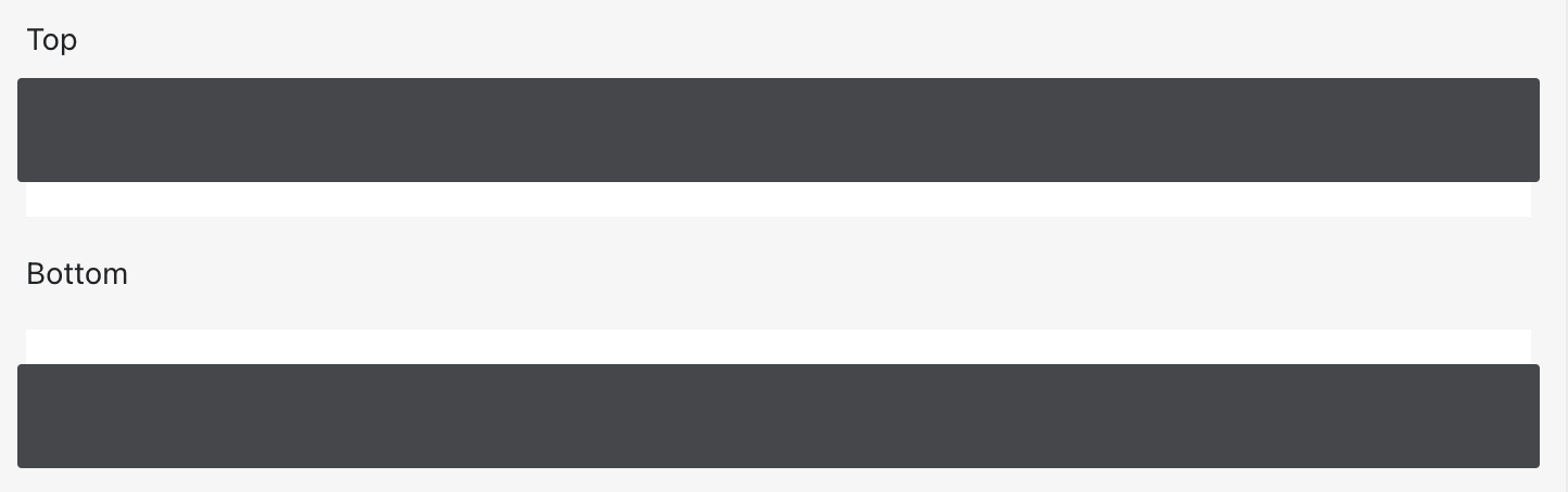
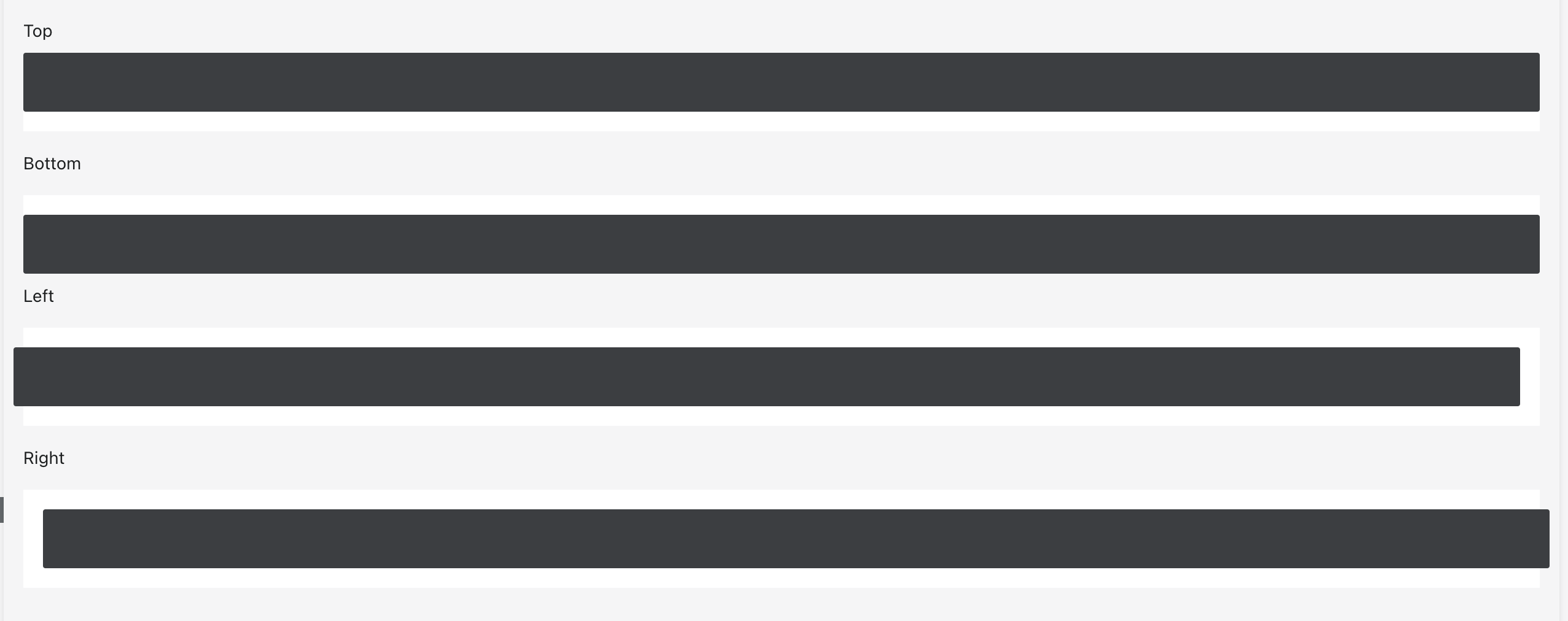
@laurkim The top and bottom examples look like they're also adding bleed to left and right. Is that intentional?
|
Oh interesting. It was a little confusing to me since the left and right examples just show that one direction but I'll defer to you for what you think the best example is for the use case. |
@sarahill I think you're right, it's a bit confusing so I've reset it so that it doesn't show horizontal bleed for top and bottom examples! |
Resolves #7772.
Updates `Bleed` to use logical properties.
Style guide has been updated to reflect new prop names.

[Storybook](https://5d559397bae39100201eedc1-jximmitnfv.chromatic.com/?path=/story/all-components-bleed--with-specific-direction).

Updates `Bleed` to use logical properties:
- `vertical` -> `marginBlock`
- `horizontal` -> `marginInline`
- `top` -> `marginBlockStart`
- `bottom` -> `marginBlockEnd`
- `left` -> `marginInlineStart`
- `right` -> `marginInlineEnd`

The logic to get the negative margins when `horizontal` or `vertical`
was passed in was flipped and causing issues so I've also fixed that.

🖥 [Local development
instructions](https://github.com/Shopify/polaris/blob/main/README.md#local-development)
🗒 [General tophatting
guidelines](https://github.com/Shopify/polaris/blob/main/documentation/Tophatting.md)
📄 [Changelog
guidelines](https://github.com/Shopify/polaris/blob/main/.github/CONTRIBUTING.md#changelog)

- [x] Tested on
[mobile](https://github.com/Shopify/polaris/blob/main/documentation/Tophatting.md#cross-browser-testing)
- [ ] Tested on [multiple
browsers](https://help.shopify.com/en/manual/shopify-admin/supported-browsers)
- [ ] Tested for
[accessibility](https://github.com/Shopify/polaris/blob/main/documentation/Accessibility%20testing.md)
- [ ] Updated the component's `README.md` with documentation changes
- [x] [Tophatted
documentation](https://github.com/Shopify/polaris/blob/main/documentation/Tophatting%20documentation.md)
changes in the style guide
### WHY are these changes introduced?

Resolves #7772.
Updates `Bleed` to use logical properties.
Style guide has been updated to reflect new prop names.


[Storybook](https://5d559397bae39100201eedc1-jximmitnfv.chromatic.com/?path=/story/all-components-bleed--with-specific-direction).

### WHAT is this pull request doing?

Updates `Bleed` to use logical properties:
- `vertical` -> `marginBlock`
- `horizontal` -> `marginInline`
- `top` -> `marginBlockStart`
- `bottom` -> `marginBlockEnd`
- `left` -> `marginInlineStart`
- `right` -> `marginInlineEnd`

The logic to get the negative margins when `horizontal` or `vertical`
was passed in was flipped and causing issues so I've also fixed that.

### How to 🎩

🖥 [Local development
instructions](https://github.com/Shopify/polaris/blob/main/README.md#local-development)
🗒 [General tophatting
guidelines](https://github.com/Shopify/polaris/blob/main/documentation/Tophatting.md)
📄 [Changelog
guidelines](https://github.com/Shopify/polaris/blob/main/.github/CONTRIBUTING.md#changelog)

### 🎩 checklist

- [x] Tested on
[mobile](https://github.com/Shopify/polaris/blob/main/documentation/Tophatting.md#cross-browser-testing)
- [ ] Tested on [multiple
browsers](https://help.shopify.com/en/manual/shopify-admin/supported-browsers)
- [ ] Tested for
[accessibility](https://github.com/Shopify/polaris/blob/main/documentation/Accessibility%20testing.md)
- [ ] Updated the component's `README.md` with documentation changes
- [x] [Tophatted
documentation](https://github.com/Shopify/polaris/blob/main/documentation/Tophatting%20documentation.md)
changes in the style guide
This PR was opened by the [Changesets
release](https://github.com/changesets/action) GitHub action. When
you're ready to do a release, you can merge this and the packages will
be published to npm automatically. If you're not ready to do a release
yet, that's fine, whenever you add more changesets to main, this PR will
be updated.


# Releases
## @shopify/polaris-icons@6.6.0

### Minor Changes

- [#7456](#7456)
[`3bc63f7f9`](3bc63f7)
Thanks [@SereneChen-7](https://github.com/SereneChen-7)! - Add
attribution model icons


- [#7724](#7724)
[`d748c20ef`](d748c20)
Thanks [@jaychashop](https://github.com/jaychashop)! - Added passkey
major and minor icons


- [#7686](#7686)
[`6b989379e`](6b98937)
Thanks [@matyikriszta](https://github.com/matyikriszta)! - Update
FormMajor icon

## @shopify/polaris@10.13.0

### Minor Changes

- [#7803](#7803)
[`23665dfd2`](23665df)
Thanks [@aveline](https://github.com/aveline)! - Added support for `ul`
element on `Box`


- [#7799](#7799)
[`508e148f1`](508e148)
Thanks [@chazdean](https://github.com/chazdean)! - Updated `Box` to
accept role attribute


- [#7746](#7746)
[`757aeebe3`](757aeeb)
Thanks [@laurkim](https://github.com/laurkim)! - Removed `ContentBlock`
and its examples in the style guide


- [#7775](#7775)
[`300b6d4bc`](300b6d4)
Thanks [@laurkim](https://github.com/laurkim)! - Removed `Tiles` and
examples in style guide


- [#7788](#7788)
[`0eb43a9fd`](0eb43a9)
Thanks [@laurkim](https://github.com/laurkim)! - Added storybook example
for `AlphaCard` with subdued section


- [#7794](#7794)
[`d43e3bc88`](d43e3bc)
Thanks [@aveline](https://github.com/aveline)! - Added support for
responsive spacing on `Bleed`


- [#7790](#7790)
[`dc4540ca7`](dc4540c)
Thanks [@laurkim](https://github.com/laurkim)! - Added support for
responsive padding to `AlphaCard` and updated default padding to be
responsive


- [#7767](#7767)
[`cb24dbb9e`](cb24dbb)
Thanks [@aveline](https://github.com/aveline)! - Updated `Box` and
`AlphaStack` to accept aria attributes


- [#7697](#7697)
[`b7b729235`](b7b7292)
Thanks [@aveline](https://github.com/aveline)! - Added support for
responsive padding to `Box`


- [#7754](#7754)
[`aee0c5c4c`](aee0c5c)
Thanks [@aveline](https://github.com/aveline)! - Added support for
responsive `gap` on `Inline`


- [#7619](#7619)
[`15570cc15`](15570cc)
Thanks [@Rmnlly](https://github.com/Rmnlly)! - Added `truncateText` prop
to `Navigation.Item` to prevent text wrapping


- [#7806](#7806)
[`5f3b61d0a`](5f3b61d)
Thanks [@aveline](https://github.com/aveline)! - Added support for `li`
and `tabIndex` on `Box`

### Patch Changes

- [#7768](#7768)
[`4cb1c6a8b`](4cb1c6a)
Thanks [@laurkim](https://github.com/laurkim)! - Renamed storybook
example names for consistency


- [#7808](#7808)
[`ed3444d77`](ed3444d)
Thanks [@laurkim](https://github.com/laurkim)! - Temporarily removed
console warnings for deprecated typography components


- [#7755](#7755)
[`1e5a2b665`](1e5a2b6)
Thanks [@kyledurand](https://github.com/kyledurand)! - Added position,
opacity, top, left, right, bottom, z-index to `Box`


- [#7761](#7761)
[`81f379315`](81f3793)
Thanks [@laurkim](https://github.com/laurkim)! - Refactored `Columns`
`gap` to use `getResponsiveProps` util


- [#7777](#7777)
[`cb882f460`](cb882f4)
Thanks [@laurkim](https://github.com/laurkim)! - Refactored `position`
properties on `Box` to use logical property names


- [#7757](#7757)
[`f9e1985c9`](f9e1985)
Thanks [@aveline](https://github.com/aveline)! - Fixed typo in
`responsive-props` mixin. Added jsdoc examples for responsive spacing
props in `Box`.


- [#7764](#7764)
[`9ab44a69f`](9ab44a6)
Thanks [@laurkim](https://github.com/laurkim)! - Cleaned up prop
descriptions and added missing default values for `Box`, `AlphaCard`,
`AlphaStack`, `Columns`, `Tiles`, `Bleed`, and `Inline`


- [#7769](#7769)
[`a9e018ec4`](a9e018e)
Thanks [@nabihaalikhan](https://github.com/nabihaalikhan)! - Updated
badge spacing to right align with secondary action icons


- [#7748](#7748)
[`ed3da747e`](ed3da74)
Thanks [@laurkim](https://github.com/laurkim)! - Renamed `spacing` prop
to `gap` on `Inline`, `AlphaStack`, `Columns`, and `Tiles`


- [#7732](#7732)
[`d08e1c30c`](d08e1c3)
Thanks [@kyledurand](https://github.com/kyledurand)! - Removed `spacing`
prop from Bleed component


- [#7779](#7779)
[`7c0a4b6a9`](7c0a4b6)
Thanks [@laurkim](https://github.com/laurkim)! - Updated `Bleed` props
to use logical properties, fixed reversed logic for horizontal/vertical
bleed, and updated style guide


- [#7793](#7793)
[`824aef031`](824aef0)
Thanks [@Rmnlly](https://github.com/Rmnlly)! - Extends Navigation Item
highlight to full width to cover secondary actions

- Updated dependencies
\[[`3bc63f7f9`](3bc63f7),
[`d748c20ef`](d748c20),
[`6b989379e`](6b98937)]:
    -   @shopify/polaris-icons@6.6.0

## @shopify/plugin-polaris@0.0.18

### Patch Changes

- Updated dependencies
\[[`28220456f`](2822045)]:
    -   @shopify/polaris-migrator@0.9.1

## @shopify/polaris-migrator@0.9.1

### Patch Changes

- [#7744](#7744)
[`28220456f`](2822045)
Thanks [@laurkim](https://github.com/laurkim)! - Fixed mapping for
`TextStyle` `variation="strong"` to use `Text` `fontWeight="semibold"`
instead of `fontWeight="bold"`

## polaris.shopify.com@0.26.0

### Minor Changes

- [#7746](#7746)
[`757aeebe3`](757aeeb)
Thanks [@laurkim](https://github.com/laurkim)! - Removed `ContentBlock`
and its examples in the style guide


- [#7775](#7775)
[`300b6d4bc`](300b6d4)
Thanks [@laurkim](https://github.com/laurkim)! - Removed `Tiles` and
examples in style guide


- [#7790](#7790)
[`dc4540ca7`](dc4540c)
Thanks [@laurkim](https://github.com/laurkim)! - Added support for
responsive padding to `AlphaCard` and updated default padding to be
responsive


- [#7754](#7754)
[`aee0c5c4c`](aee0c5c)
Thanks [@aveline](https://github.com/aveline)! - Added support for
responsive `gap` on `Inline`

### Patch Changes

- [#7745](#7745)
[`70ed3137b`](70ed313)
Thanks [@laurkim](https://github.com/laurkim)! - Updated alpha status
message that documentation is in development for `Bleed`, `Columns`,
`Tiles`, `Inline`, `AlphaCard`, `AlphaStack`, and `Box`


- [#7803](#7803)
[`23665dfd2`](23665df)
Thanks [@aveline](https://github.com/aveline)! - Added support for `ul`
element on `Box`


- [#7799](#7799)
[`508e148f1`](508e148)
Thanks [@chazdean](https://github.com/chazdean)! - Updated `Box` to
accept role attribute


- [#7761](#7761)
[`81f379315`](81f3793)
Thanks [@laurkim](https://github.com/laurkim)! - Refactored `Columns`
`gap` to use `getResponsiveProps` util


- [#7777](#7777)
[`cb882f460`](cb882f4)
Thanks [@laurkim](https://github.com/laurkim)! - Refactored `position`
properties on `Box` to use logical property names


- [#7747](#7747)
[`0ec96f068`](0ec96f0)
Thanks [@kyledurand](https://github.com/kyledurand)! - Fixed bleed
examples


- [#7794](#7794)
[`d43e3bc88`](d43e3bc)
Thanks [@aveline](https://github.com/aveline)! - Added support for
responsive spacing on `Bleed`


- [#7757](#7757)
[`f9e1985c9`](f9e1985)
Thanks [@aveline](https://github.com/aveline)! - Fixed typo in
`responsive-props` mixin. Added jsdoc examples for responsive spacing
props in `Box`.


- [#7764](#7764)
[`9ab44a69f`](9ab44a6)
Thanks [@laurkim](https://github.com/laurkim)! - Cleaned up prop
descriptions and added missing default values for `Box`, `AlphaCard`,
`AlphaStack`, `Columns`, `Tiles`, `Bleed`, and `Inline`


- [#7767](#7767)
[`cb24dbb9e`](cb24dbb)
Thanks [@aveline](https://github.com/aveline)! - Updated `Box` and
`AlphaStack` to accept aria attributes


- [#7778](#7778)
[`e0c64cd5b`](e0c64cd)
Thanks [@laurkim](https://github.com/laurkim)! - Removed link to deleted
`Tiles` component and cleaned up links


- [#7748](#7748)
[`ed3da747e`](ed3da74)
Thanks [@laurkim](https://github.com/laurkim)! - Renamed `spacing` prop
to `gap` on `Inline`, `AlphaStack`, `Columns`, and `Tiles`


- [#7744](#7744)
[`28220456f`](2822045)
Thanks [@laurkim](https://github.com/laurkim)! - Fixed mapping for
`TextStyle` `variation="strong"` to use `Text` `fontWeight="semibold"`
instead of `fontWeight="bold"`


- [#7732](#7732)
[`d08e1c30c`](d08e1c3)
Thanks [@kyledurand](https://github.com/kyledurand)! - Removed `spacing`
prop from Bleed component


- [#7779](#7779)
[`7c0a4b6a9`](7c0a4b6)
Thanks [@laurkim](https://github.com/laurkim)! - Updated `Bleed` props
to use logical properties, fixed reversed logic for horizontal/vertical
bleed, and updated style guide


- [#7806](#7806)
[`5f3b61d0a`](5f3b61d)
Thanks [@aveline](https://github.com/aveline)! - Added support for `li`
and `tabIndex` on `Box`

- Updated dependencies
\[[`3bc63f7f9`](3bc63f7),
[`4cb1c6a8b`](4cb1c6a),
[`d748c20ef`](d748c20),
[`6b989379e`](6b98937),
[`ed3444d77`](ed3444d),
[`1e5a2b665`](1e5a2b6),
[`23665dfd2`](23665df),
[`508e148f1`](508e148),
[`757aeebe3`](757aeeb),
[`300b6d4bc`](300b6d4),
[`0eb43a9fd`](0eb43a9),
[`81f379315`](81f3793),
[`cb882f460`](cb882f4),
[`d43e3bc88`](d43e3bc),
[`f9e1985c9`](f9e1985),
[`dc4540ca7`](dc4540c),
[`9ab44a69f`](9ab44a6),
[`cb24dbb9e`](cb24dbb),
[`b7b729235`](b7b7292),
[`aee0c5c4c`](aee0c5c),
[`a9e018ec4`](a9e018e),
[`ed3da747e`](ed3da74),
[`15570cc15`](15570cc),
[`d08e1c30c`](d08e1c3),
[`7c0a4b6a9`](7c0a4b6),
[`5f3b61d0a`](5f3b61d),
[`824aef031`](824aef0)]:
    -   @shopify/polaris-icons@6.6.0
    -   @shopify/polaris@10.13.0

Co-authored-by: github-actions[bot] <github-actions[bot]@users.noreply.github.com>
### WHY are these changes introduced?

Resolves Shopify#7772.
Updates `Bleed` to use logical properties.
Style guide has been updated to reflect new prop names.


[Storybook](https://5d559397bae39100201eedc1-jximmitnfv.chromatic.com/?path=/story/all-components-bleed--with-specific-direction).

### WHAT is this pull request doing?

Updates `Bleed` to use logical properties:
- `vertical` -> `marginBlock`
- `horizontal` -> `marginInline`
- `top` -> `marginBlockStart`
- `bottom` -> `marginBlockEnd`
- `left` -> `marginInlineStart`
- `right` -> `marginInlineEnd`

The logic to get the negative margins when `horizontal` or `vertical`
was passed in was flipped and causing issues so I've also fixed that.

### How to 🎩

🖥 [Local development
instructions](https://github.com/Shopify/polaris/blob/main/README.md#local-development)
🗒 [General tophatting
guidelines](https://github.com/Shopify/polaris/blob/main/documentation/Tophatting.md)
📄 [Changelog
guidelines](https://github.com/Shopify/polaris/blob/main/.github/CONTRIBUTING.md#changelog)

### 🎩 checklist

- [x] Tested on
[mobile](https://github.com/Shopify/polaris/blob/main/documentation/Tophatting.md#cross-browser-testing)
- [ ] Tested on [multiple
browsers](https://help.shopify.com/en/manual/shopify-admin/supported-browsers)
- [ ] Tested for
[accessibility](https://github.com/Shopify/polaris/blob/main/documentation/Accessibility%20testing.md)
- [ ] Updated the component's `README.md` with documentation changes
- [x] [Tophatted
documentation](https://github.com/Shopify/polaris/blob/main/documentation/Tophatting%20documentation.md)
changes in the style guide
This PR was opened by the [Changesets
release](https://github.com/changesets/action) GitHub action. When
you're ready to do a release, you can merge this and the packages will
be published to npm automatically. If you're not ready to do a release
yet, that's fine, whenever you add more changesets to main, this PR will
be updated.


# Releases
## @shopify/polaris-icons@6.6.0

### Minor Changes

- [Shopify#7456](Shopify#7456)
[`3bc63f7f9`](Shopify@3bc63f7)
Thanks [@SereneChen-7](https://github.com/SereneChen-7)! - Add
attribution model icons


- [Shopify#7724](Shopify#7724)
[`d748c20ef`](Shopify@d748c20)
Thanks [@jaychashop](https://github.com/jaychashop)! - Added passkey
major and minor icons


- [Shopify#7686](Shopify#7686)
[`6b989379e`](Shopify@6b98937)
Thanks [@matyikriszta](https://github.com/matyikriszta)! - Update
FormMajor icon

## @shopify/polaris@10.13.0

### Minor Changes

- [Shopify#7803](Shopify#7803)
[`23665dfd2`](Shopify@23665df)
Thanks [@aveline](https://github.com/aveline)! - Added support for `ul`
element on `Box`


- [Shopify#7799](Shopify#7799)
[`508e148f1`](Shopify@508e148)
Thanks [@chazdean](https://github.com/chazdean)! - Updated `Box` to
accept role attribute


- [Shopify#7746](Shopify#7746)
[`757aeebe3`](Shopify@757aeeb)
Thanks [@laurkim](https://github.com/laurkim)! - Removed `ContentBlock`
and its examples in the style guide


- [Shopify#7775](Shopify#7775)
[`300b6d4bc`](Shopify@300b6d4)
Thanks [@laurkim](https://github.com/laurkim)! - Removed `Tiles` and
examples in style guide


- [Shopify#7788](Shopify#7788)
[`0eb43a9fd`](Shopify@0eb43a9)
Thanks [@laurkim](https://github.com/laurkim)! - Added storybook example
for `AlphaCard` with subdued section


- [Shopify#7794](Shopify#7794)
[`d43e3bc88`](Shopify@d43e3bc)
Thanks [@aveline](https://github.com/aveline)! - Added support for
responsive spacing on `Bleed`


- [Shopify#7790](Shopify#7790)
[`dc4540ca7`](Shopify@dc4540c)
Thanks [@laurkim](https://github.com/laurkim)! - Added support for
responsive padding to `AlphaCard` and updated default padding to be
responsive


- [Shopify#7767](Shopify#7767)
[`cb24dbb9e`](Shopify@cb24dbb)
Thanks [@aveline](https://github.com/aveline)! - Updated `Box` and
`AlphaStack` to accept aria attributes


- [Shopify#7697](Shopify#7697)
[`b7b729235`](Shopify@b7b7292)
Thanks [@aveline](https://github.com/aveline)! - Added support for
responsive padding to `Box`


- [Shopify#7754](Shopify#7754)
[`aee0c5c4c`](Shopify@aee0c5c)
Thanks [@aveline](https://github.com/aveline)! - Added support for
responsive `gap` on `Inline`


- [Shopify#7619](Shopify#7619)
[`15570cc15`](Shopify@15570cc)
Thanks [@Rmnlly](https://github.com/Rmnlly)! - Added `truncateText` prop
to `Navigation.Item` to prevent text wrapping


- [Shopify#7806](Shopify#7806)
[`5f3b61d0a`](Shopify@5f3b61d)
Thanks [@aveline](https://github.com/aveline)! - Added support for `li`
and `tabIndex` on `Box`

### Patch Changes

- [Shopify#7768](Shopify#7768)
[`4cb1c6a8b`](Shopify@4cb1c6a)
Thanks [@laurkim](https://github.com/laurkim)! - Renamed storybook
example names for consistency


- [Shopify#7808](Shopify#7808)
[`ed3444d77`](Shopify@ed3444d)
Thanks [@laurkim](https://github.com/laurkim)! - Temporarily removed
console warnings for deprecated typography components


- [Shopify#7755](Shopify#7755)
[`1e5a2b665`](Shopify@1e5a2b6)
Thanks [@kyledurand](https://github.com/kyledurand)! - Added position,
opacity, top, left, right, bottom, z-index to `Box`


- [Shopify#7761](Shopify#7761)
[`81f379315`](Shopify@81f3793)
Thanks [@laurkim](https://github.com/laurkim)! - Refactored `Columns`
`gap` to use `getResponsiveProps` util


- [Shopify#7777](Shopify#7777)
[`cb882f460`](Shopify@cb882f4)
Thanks [@laurkim](https://github.com/laurkim)! - Refactored `position`
properties on `Box` to use logical property names


- [Shopify#7757](Shopify#7757)
[`f9e1985c9`](Shopify@f9e1985)
Thanks [@aveline](https://github.com/aveline)! - Fixed typo in
`responsive-props` mixin. Added jsdoc examples for responsive spacing
props in `Box`.


- [Shopify#7764](Shopify#7764)
[`9ab44a69f`](Shopify@9ab44a6)
Thanks [@laurkim](https://github.com/laurkim)! - Cleaned up prop
descriptions and added missing default values for `Box`, `AlphaCard`,
`AlphaStack`, `Columns`, `Tiles`, `Bleed`, and `Inline`


- [Shopify#7769](Shopify#7769)
[`a9e018ec4`](Shopify@a9e018e)
Thanks [@nabihaalikhan](https://github.com/nabihaalikhan)! - Updated
badge spacing to right align with secondary action icons


- [Shopify#7748](Shopify#7748)
[`ed3da747e`](Shopify@ed3da74)
Thanks [@laurkim](https://github.com/laurkim)! - Renamed `spacing` prop
to `gap` on `Inline`, `AlphaStack`, `Columns`, and `Tiles`


- [Shopify#7732](Shopify#7732)
[`d08e1c30c`](Shopify@d08e1c3)
Thanks [@kyledurand](https://github.com/kyledurand)! - Removed `spacing`
prop from Bleed component


- [Shopify#7779](Shopify#7779)
[`7c0a4b6a9`](Shopify@7c0a4b6)
Thanks [@laurkim](https://github.com/laurkim)! - Updated `Bleed` props
to use logical properties, fixed reversed logic for horizontal/vertical
bleed, and updated style guide


- [Shopify#7793](Shopify#7793)
[`824aef031`](Shopify@824aef0)
Thanks [@Rmnlly](https://github.com/Rmnlly)! - Extends Navigation Item
highlight to full width to cover secondary actions

- Updated dependencies
\[[`3bc63f7f9`](Shopify@3bc63f7),
[`d748c20ef`](Shopify@d748c20),
[`6b989379e`](Shopify@6b98937)]:
    -   @shopify/polaris-icons@6.6.0

## @shopify/plugin-polaris@0.0.18

### Patch Changes

- Updated dependencies
\[[`28220456f`](Shopify@2822045)]:
    -   @shopify/polaris-migrator@0.9.1

## @shopify/polaris-migrator@0.9.1

### Patch Changes

- [Shopify#7744](Shopify#7744)
[`28220456f`](Shopify@2822045)
Thanks [@laurkim](https://github.com/laurkim)! - Fixed mapping for
`TextStyle` `variation="strong"` to use `Text` `fontWeight="semibold"`
instead of `fontWeight="bold"`

## polaris.shopify.com@0.26.0

### Minor Changes

- [Shopify#7746](Shopify#7746)
[`757aeebe3`](Shopify@757aeeb)
Thanks [@laurkim](https://github.com/laurkim)! - Removed `ContentBlock`
and its examples in the style guide


- [Shopify#7775](Shopify#7775)
[`300b6d4bc`](Shopify@300b6d4)
Thanks [@laurkim](https://github.com/laurkim)! - Removed `Tiles` and
examples in style guide


- [Shopify#7790](Shopify#7790)
[`dc4540ca7`](Shopify@dc4540c)
Thanks [@laurkim](https://github.com/laurkim)! - Added support for
responsive padding to `AlphaCard` and updated default padding to be
responsive


- [Shopify#7754](Shopify#7754)
[`aee0c5c4c`](Shopify@aee0c5c)
Thanks [@aveline](https://github.com/aveline)! - Added support for
responsive `gap` on `Inline`

### Patch Changes

- [Shopify#7745](Shopify#7745)
[`70ed3137b`](Shopify@70ed313)
Thanks [@laurkim](https://github.com/laurkim)! - Updated alpha status
message that documentation is in development for `Bleed`, `Columns`,
`Tiles`, `Inline`, `AlphaCard`, `AlphaStack`, and `Box`


- [Shopify#7803](Shopify#7803)
[`23665dfd2`](Shopify@23665df)
Thanks [@aveline](https://github.com/aveline)! - Added support for `ul`
element on `Box`


- [Shopify#7799](Shopify#7799)
[`508e148f1`](Shopify@508e148)
Thanks [@chazdean](https://github.com/chazdean)! - Updated `Box` to
accept role attribute


- [Shopify#7761](Shopify#7761)
[`81f379315`](Shopify@81f3793)
Thanks [@laurkim](https://github.com/laurkim)! - Refactored `Columns`
`gap` to use `getResponsiveProps` util


- [Shopify#7777](Shopify#7777)
[`cb882f460`](Shopify@cb882f4)
Thanks [@laurkim](https://github.com/laurkim)! - Refactored `position`
properties on `Box` to use logical property names


- [Shopify#7747](Shopify#7747)
[`0ec96f068`](Shopify@0ec96f0)
Thanks [@kyledurand](https://github.com/kyledurand)! - Fixed bleed
examples


- [Shopify#7794](Shopify#7794)
[`d43e3bc88`](Shopify@d43e3bc)
Thanks [@aveline](https://github.com/aveline)! - Added support for
responsive spacing on `Bleed`


- [Shopify#7757](Shopify#7757)
[`f9e1985c9`](Shopify@f9e1985)
Thanks [@aveline](https://github.com/aveline)! - Fixed typo in
`responsive-props` mixin. Added jsdoc examples for responsive spacing
props in `Box`.


- [Shopify#7764](Shopify#7764)
[`9ab44a69f`](Shopify@9ab44a6)
Thanks [@laurkim](https://github.com/laurkim)! - Cleaned up prop
descriptions and added missing default values for `Box`, `AlphaCard`,
`AlphaStack`, `Columns`, `Tiles`, `Bleed`, and `Inline`


- [Shopify#7767](Shopify#7767)
[`cb24dbb9e`](Shopify@cb24dbb)
Thanks [@aveline](https://github.com/aveline)! - Updated `Box` and
`AlphaStack` to accept aria attributes


- [Shopify#7778](Shopify#7778)
[`e0c64cd5b`](Shopify@e0c64cd)
Thanks [@laurkim](https://github.com/laurkim)! - Removed link to deleted
`Tiles` component and cleaned up links


- [Shopify#7748](Shopify#7748)
[`ed3da747e`](Shopify@ed3da74)
Thanks [@laurkim](https://github.com/laurkim)! - Renamed `spacing` prop
to `gap` on `Inline`, `AlphaStack`, `Columns`, and `Tiles`


- [Shopify#7744](Shopify#7744)
[`28220456f`](Shopify@2822045)
Thanks [@laurkim](https://github.com/laurkim)! - Fixed mapping for
`TextStyle` `variation="strong"` to use `Text` `fontWeight="semibold"`
instead of `fontWeight="bold"`


- [Shopify#7732](Shopify#7732)
[`d08e1c30c`](Shopify@d08e1c3)
Thanks [@kyledurand](https://github.com/kyledurand)! - Removed `spacing`
prop from Bleed component


- [Shopify#7779](Shopify#7779)
[`7c0a4b6a9`](Shopify@7c0a4b6)
Thanks [@laurkim](https://github.com/laurkim)! - Updated `Bleed` props
to use logical properties, fixed reversed logic for horizontal/vertical
bleed, and updated style guide


- [Shopify#7806](Shopify#7806)
[`5f3b61d0a`](Shopify@5f3b61d)
Thanks [@aveline](https://github.com/aveline)! - Added support for `li`
and `tabIndex` on `Box`

- Updated dependencies
\[[`3bc63f7f9`](Shopify@3bc63f7),
[`4cb1c6a8b`](Shopify@4cb1c6a),
[`d748c20ef`](Shopify@d748c20),
[`6b989379e`](Shopify@6b98937),
[`ed3444d77`](Shopify@ed3444d),
[`1e5a2b665`](Shopify@1e5a2b6),
[`23665dfd2`](Shopify@23665df),
[`508e148f1`](Shopify@508e148),
[`757aeebe3`](Shopify@757aeeb),
[`300b6d4bc`](Shopify@300b6d4),
[`0eb43a9fd`](Shopify@0eb43a9),
[`81f379315`](Shopify@81f3793),
[`cb882f460`](Shopify@cb882f4),
[`d43e3bc88`](Shopify@d43e3bc),
[`f9e1985c9`](Shopify@f9e1985),
[`dc4540ca7`](Shopify@dc4540c),
[`9ab44a69f`](Shopify@9ab44a6),
[`cb24dbb9e`](Shopify@cb24dbb),
[`b7b729235`](Shopify@b7b7292),
[`aee0c5c4c`](Shopify@aee0c5c),
[`a9e018ec4`](Shopify@a9e018e),
[`ed3da747e`](Shopify@ed3da74),
[`15570cc15`](Shopify@15570cc),
[`d08e1c30c`](Shopify@d08e1c3),
[`7c0a4b6a9`](Shopify@7c0a4b6),
[`5f3b61d0a`](Shopify@5f3b61d),
[`824aef031`](Shopify@824aef0)]:
    -   @shopify/polaris-icons@6.6.0
    -   @shopify/polaris@10.13.0

Co-authored-by: github-actions[bot] <github-actions[bot]@users.noreply.github.com>
WHY are these changes introduced?
Resolves #7772.
Updates
Bleedto use logical properties.Style guide has been updated to reflect new prop names.
Storybook.
WHAT is this pull request doing?
Updates
Bleedto use logical properties:vertical->marginBlockhorizontal->marginInlinetop->marginBlockStartbottom->marginBlockEndleft->marginInlineStartright->marginInlineEndThe logic to get the negative margins when
horizontalorverticalwas passed in was flipped and causing issues so I've also fixed that.How to 🎩
🖥 Local development instructions
🗒 General tophatting guidelines
📄 Changelog guidelines
🎩 checklist
README.mdwith documentation changes