[Navigation.Item] Fix navigation sub item selected indicator when no nav icon
#8343
Conversation
 alexanderMontague
force-pushed
the
fix-no-icon-polaris-nav
branch
from
alexanderMontague
force-pushed
the
fix-no-icon-polaris-nav
branch
from
604d066
to
b980d67
Compare
alexanderMontague
changed the title
[Navigation.Item] Fix navigation sub item selected indicator when no nav icon
size-limit report 📦
|
|
/snapit |
|
cc @henryyi just want to make sure this doesn't affect any of your nav work |
|
🫰✨ Thanks @alexanderMontague! Your snapshots have been published to npm. Test the snapshots by updating your yarn add @shopify/polaris-cli@0.0.0-snapshot-release-20230214161645yarn add @shopify/polaris-icons@0.0.0-snapshot-release-20230214161645yarn add @shopify/polaris-migrator@0.0.0-snapshot-release-20230214161645yarn add @shopify/polaris@0.0.0-snapshot-release-20230214161645yarn add @shopify/polaris-tokens@0.0.0-snapshot-release-20230214161645yarn add @shopify/stylelint-polaris@0.0.0-snapshot-release-20230214161645 |
alexanderMontague
force-pushed
the
fix-no-icon-polaris-nav
branch
from
b980d67
to
fb55ecd
Compare
 alexanderMontague
force-pushed
the
fix-no-icon-polaris-nav
branch
from
alexanderMontague
force-pushed
the
fix-no-icon-polaris-nav
branch
from
fb55ecd
to
2f8857a
Compare
|
Not sure if intended but the change causes the sub-nav indentation to be wider than it is currently: in spin: |


|
@henryyi how did you come across this? Unless I'm missing something it seems to be the same: In Spin/storybook: In prod/web: |


This happens in a store with the global-nav. You can check this test store: https://henry-dev2.myshopify.com/admin |
|
@henryyi you are correct, this seems to only be happening for the plus side nav there. This brings into question (since I've never actually seen this nav view before), the highlight bug is actually in effect in this nav as you can see here:
The sub item spacing has not been consistent with the rest of Polaris Icon sub nav items. So this actually makes them consistent with that, but should this be the case? I wouldn't mind some design input on this. Basically, should the sub nav items all have the same left indent regardless of if the parent has an icon or not, or should there be less padding like it currently is on that plus nav right now |


|
@dustinmalik do you mind having a look to determine what the preferred indentation is when we are not using icons (e.g when global-nav is visible). |
|
For more context, I was able to boot this view up in spin with the change. This is what it looks like on this view:
It does look a little too justified without the icon, but this is the same indent as web |


|
Any updates @henryyi @dustinmalik ? |
I'll wait for Dustin's input but my gut feeling is that we'll want to keep the lesser spacing since that is what merchants currently see despite the selection bug. |
|
Tried finding old Figma files for this but couldn't find anything. I would keep the sub nav items flush with the rest of the nav items like when there is an icon.
@alexblaise was the designer on this. Thoughts? |

|
Discussed with @chrisblinstrub. Let's go with 24px padding. Thanks!
|

 alexanderMontague
force-pushed
the
fix-no-icon-polaris-nav
branch
from
alexanderMontague
force-pushed
the
fix-no-icon-polaris-nav
branch
from
2f8857a
to
a330e7e
Compare
|
/snapit |
|
🫰✨ Thanks @alexanderMontague! Your snapshots have been published to npm. Test the snapshots by updating your yarn add @shopify/polaris-cli@0.0.0-snapshot-release-20230216174113yarn add @shopify/polaris-icons@0.0.0-snapshot-release-20230216174113yarn add @shopify/polaris-migrator@0.0.0-snapshot-release-20230216174113yarn add @shopify/polaris@0.0.0-snapshot-release-20230216174113yarn add @shopify/polaris-tokens@0.0.0-snapshot-release-20230216174113yarn add @shopify/stylelint-polaris@0.0.0-snapshot-release-20230216174113 |
|
Thanks for the follow up everyone, appreciate it!! @henryyi ready for review again: Storybook: http://240.26.37.19:6006/?path=/story/playground--nav-1 Admin: https://admin.web.web-nths.alex-montague.us.spin.dev/store/shop2/draft_orders?selectedView=all Plus admin nav: https://admin.web.plus-home-k10h.alex-montague.us.spin.dev/store/shop5/draft_orders
|


…o nav icon (Shopify#8343)

<!--
  ☝️How to write a good PR title:
- Prefix it with [ComponentName] (if applicable), for example: [Button]
  - Start with a verb, for example: Add, Delete, Improve, Fix…
  - Give as much context as necessary and as little as possible
  - Prefix it with [WIP] while it’s a work in progress
-->

### WHY are these changes introduced?

Fixes Shopify#8342

Before:

<img width="257" alt="Screenshot 2023-02-14 at 10 32 05 AM"
src="https://user-images.githubusercontent.com/29992628/218789163-ea365e03-732b-4592-9aab-5945377626ae.png">

<img width="262" alt="Screenshot 2023-02-14 at 10 32 16 AM"
src="https://user-images.githubusercontent.com/29992628/218789445-7ff2875d-48ba-4bd2-bb14-27f2be1749d2.png">

After:

<img width="326" alt="image"
src="https://user-images.githubusercontent.com/29992628/218789292-fa10a152-7060-4576-a4ad-b39c941c89f1.png">

<img width="333" alt="image"
src="https://user-images.githubusercontent.com/29992628/218789515-99038b3f-a2a4-4edf-91db-707bd429ad48.png">


### WHAT is this pull request doing?

- While building a nav in Partners I stumbled across this weird
behaviour, more details in the linked issue above
- TLDR: when a nav item does not have an icon and there are sub items,
if one of those sub items are selected the selector indicator (green
indicator on left of item) does not fully hug the leftmost margin
- This was due to legacy no icon styles that were introduced a while ago
- See this PR that added in these styles
Shopify#2874

### How to 🎩

- head to my spin
http://240.26.37.19:6006/?path=/story/playground--nav-1
- toggle between `nav-1` and `nav-2` which are the navs with an icon and
without
- they should now have the same spacing and the selector should fully
hug the left margin

🖥 [Local development
instructions](https://github.com/Shopify/polaris/blob/main/README.md#local-development)
🗒 [General tophatting
guidelines](https://github.com/Shopify/polaris/blob/main/documentation/Tophatting.md)
📄 [Changelog
guidelines](https://github.com/Shopify/polaris/blob/main/.github/CONTRIBUTING.md#changelog)


### 🎩 checklist

- [x] Tested on
[mobile](https://github.com/Shopify/polaris/blob/main/documentation/Tophatting.md#cross-browser-testing)
- [x] Tested on [multiple
browsers](https://help.shopify.com/en/manual/shopify-admin/supported-browsers)
- [x] Tested for
[accessibility](https://github.com/Shopify/polaris/blob/main/documentation/Accessibility%20testing.md)
- [ ] Updated the component's `README.md` with documentation changes
- [x] [Tophatted
documentation](https://github.com/Shopify/polaris/blob/main/documentation/Tophatting%20documentation.md)
changes in the style guide
WHY are these changes introduced?
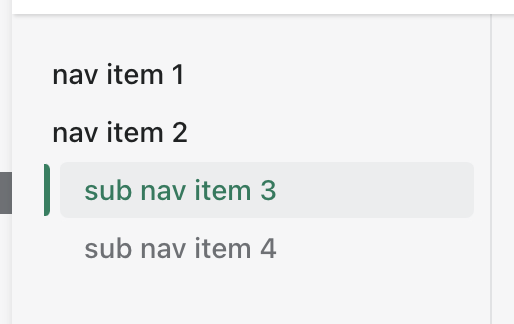
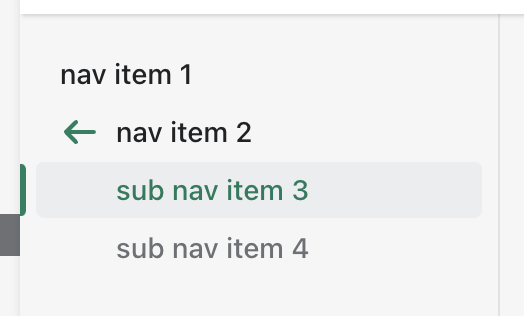
Fixes #8342
Before:
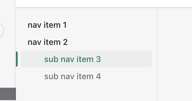
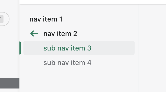
After:
WHAT is this pull request doing?
How to 🎩
nav-1andnav-2which are the navs with an icon and without🖥 Local development instructions
🗒 General tophatting guidelines
📄 Changelog guidelines
🎩 checklist
README.mdwith documentation changes