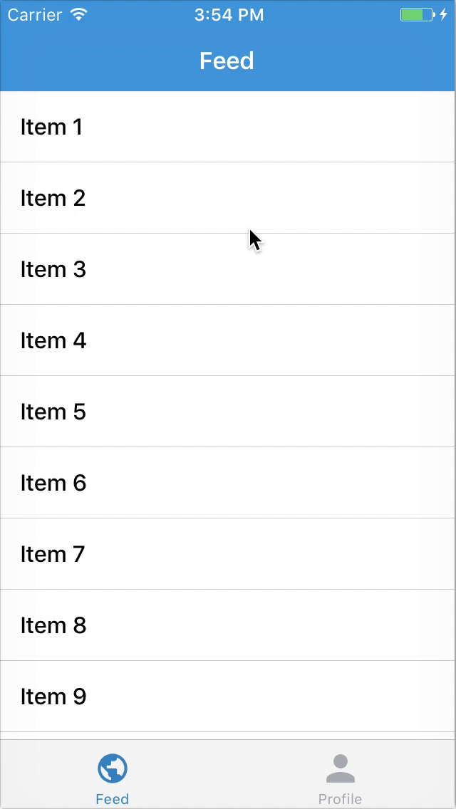
Bottom navigation bars make it easy to explore and switch between top-level views in a single tap.
import * as React from 'react'
import { BottomNavigation, Tab } from 'react-router-navigation'

const App = () => (
  <BottomNavigation lazy={false} tabActiveTintColor="blue">
    <Tab label="Feed" path="/feed" component={require('./Feed')} />
    <Tab label="Profile" path="/profile" component={require('./Profile')} />
  </BottomNavigation>
)- hideTabBar
?booleanwhether to display tab bar - tabBarStyle
?StyleSheetoverride style for the tab bar - renderTabBar
?Functioncallback which renders a tab bar - tabStyle
?StyleSheetoverride style for the tab item - tabTintColor
?stringlabel and icon color of the tab - tabActiveTintColor
?stringlabel and icon color of the active tab - label
?stringtext that appears on each item - labelStyle
?(StyleSheet | Function)styling text item - renderLabel
?Functioncallback which renders a label - renderTabIcon
?Functionoptional callback which receives the current scene and returns a React Element to be used as an icon
... TabBar props- style
?StyleSheetoverride or extend the default style for<View />container - initialLayout optional object containing the initial
heightandwidth, can be passed to prevent the one frame delay in rendering - lazy
?booleanwhether to load tabs lazily when you start switching
... <Route />props... TabBar props- routePath
?stringany valid URL path - initialPath
?stringany valid URL path - onReset
?Functioncallback which resets the current tab