Advanced User Tweaks
My aim is to support a range of potential configurations of Playnite since it's flexibility is one of my own favorite aspects, but some preferences are not available to be so easily adjusted or are specific to my own theme. Within reason, I've tried to add support for the adjustment of the theme to fit more specific use cases by the editing of variables in Constants.xaml (in the theme directory), which ThemeModifier exposes to the user in a settings a page, or by renaming of files. These are a few of the easiest ways to further customize Magpie to suit your own preferences.
These are all subject to adjustment or removal without notice and may allow you to break your installation of this theme.
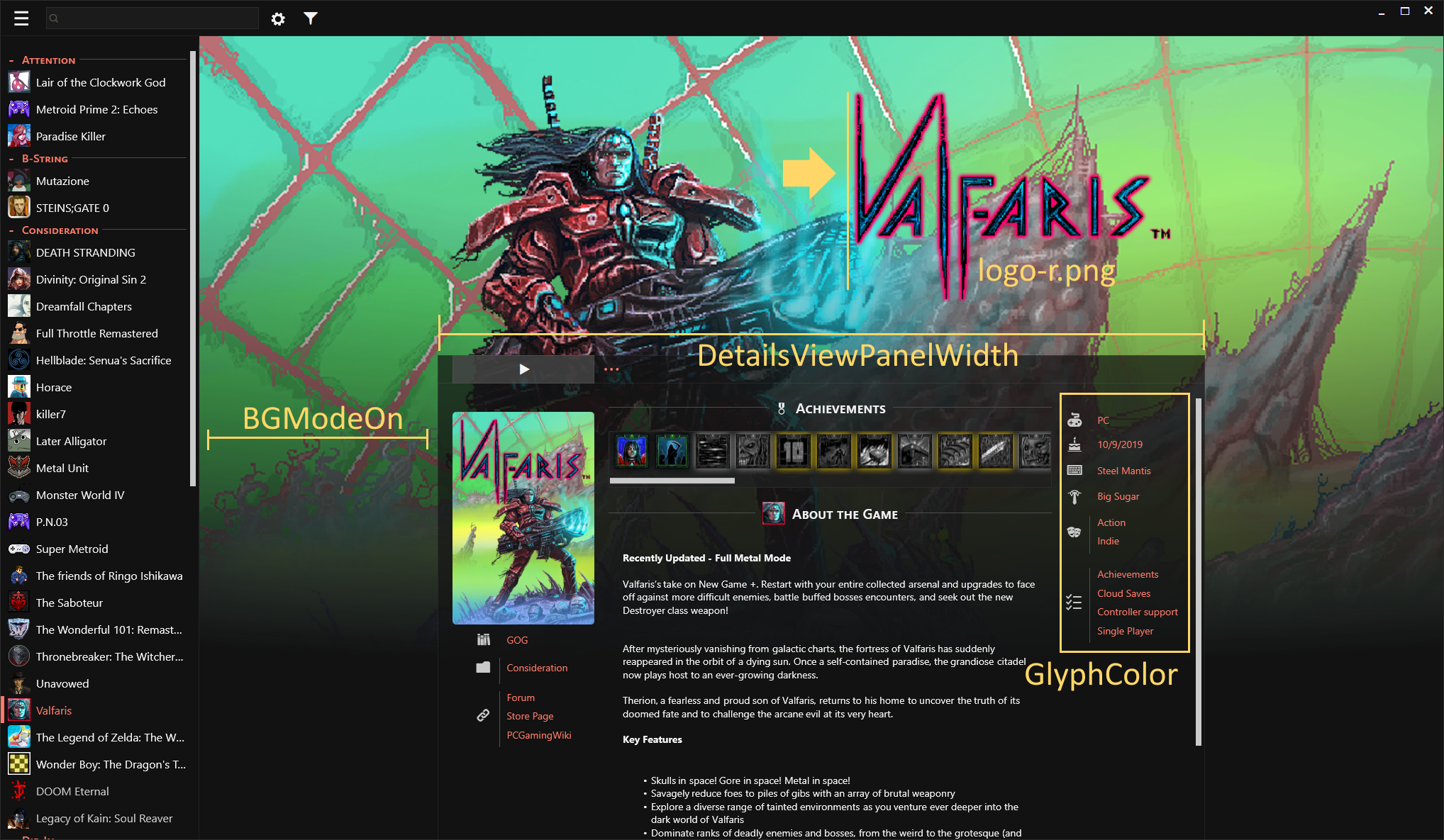
I'm generally pleased with how logos behave in my theme, but some hero/background and logo combinations don't work as well. Steam uses individual game configuration files to support individual precise positioning of the logo. I will not attempt to do this. If you care to, use an image editor or implement it in a/my theme yourself. However, basic support for three positions of the logo exists in Magpie - left, middle, and right. None of these will place the logo outside the horizontal bounds of the middle details panel, but, in my testing, most can be placed to fit acceptably with whatever hero/background you have for the game.
Assuming that you have already acquired a logo image, it will default to being center-aligned when named logo.png, which is what DarkLinkPower's extension downloads it as.
Simply rename logo.png to logo-l.png and it will be left aligned.
Likewise, rename logo.png to logo-r.png and it will be right aligned.
This is implemented by attempting to load and place all three logo files, so it could load and display multiple logos in different alignments if they exist (maybe you want that).
 Now that the theme supports logos, I have personally shifted toward a Steam-like logo and banner configuration, but recognize that previously and for many users, using the background image metadata as an actual background image makes more sense. Formatting for this is not concordant with my banner/logo preferences, though.
If your preference is for more square, generally background-proportioned images, I recommend changing the value of BGModeOn in Constants.xaml to true. This changes the formatting of that image to be more similar to the default theme and allows it to extend behind the details panel. Note: This is distinct from using the background image as the window background, which is an appearance setting in Playnite.
This is the maximum width of the panel in details view (and grid view with the banner variant) and is set to a value of 1280 by default, which I feel is appropriate for 1080p-1440p screens and the average amount of metadata that my games have. For different amounts of metadata or screen sizes, another value may be better suited. This may be set with this variable.
For readability, I settled on having a single color (still technically monochrome!) and determined to set that by default to the blue used in some parts of Playnite's web page. My preference (to match my keyboard) and my be yours also, is for another color. This can be set by changing the value of this variable. Reproduced below are several suggestions I've left as comments in the file, which are colors I've used or recommended to others.
For grey try: #A6A6A6, for gold try #FFD768 (my preference), for salmon try #FF7A68 (a pleasant accidental find), for red try #E34141 (used for my testing releases and the clear filters button), for blue try #62C3DF (the default)

By default, if there is not a logo found, Magpie displays a text version of the title in its place. You may prefer for it not to. Set this variable to hidden to keep this text from showing when there is no logo.