Session 2 - Layouting with LayoutSpec
Session 3 - Create a List of Product Cards
Session 4 - Usage Comparison with UIKit
The session covers the basic of Texture that is the introduction of ASDisplayNode and how to use it along with node container.
Also we will learn how to build a simple layout with layoutSpecBlock
This session is labeled under Start inside the Session 1 - Basic folder in the Xcode project example. We will code together on the subsection Rendering Component in Texture Way.
Before we learn the basics of Texture, it is better we take a look at how UIKit structuring the views to rendering component on screen first.
- Run the project
- Tap on
Basic UIKit.
On the screen, you can see a colored box centering on the page. Open the BasicUIKitViewController.swift to see the implementation. You may be familiar with the code, how to set up the viewcontroller, the child view, and the constraints. We will create something similar to that by using Texture, so let's get started!
The file will look like this:
import UIKit

class BasicTextureViewController: UIViewController {

}
The BasicTextureViewController still inherit the UIViewController so we need to change the subclass
Before we change the subclass, we need to import the framework Texture by adding import AsyncDisplayKit. Next we change the subclass viewController into ASDKViewController<ASDisplayNode>. Why we do have a generic on our ViewController?. This generic used to determined which type of root node we want to use. In this case we just need a plain ASDisplayNode as our root node.
import AsyncDisplayKit
import UIKit

class BasicTextureViewController: ASDKViewController<ASDisplayNode> {

}
Note: In the Create Product Card List Session we will configure the root node with a different type of ASDisplayNode
Next, we need to create an initializer for our viewController. We can start by adding an empty init() but we need to add the override keyword before the init. The compiler will throw an error that we need to satisfy by adding required init?(coder: NSCoder)
......

class BasicTextureViewController: ASDKViewController<ASDisplayNode> {
    override init() {
        super.init()
    }

    required init?(coder: NSCoder) {
        fatalError("init(coder:) has not been implemented")
    }
}We have successfully changed our ViewController to ASDKViewController but the viewController shows a blank view with a black color background. That means our root node has still not been configured yet, let's start by changing the init into super.init(node: ASDisplayNode).
The parameter node means that we can use any kind of ASDisplayNode as our root node but let's stick with a simple ASDisplayNode for now.
We can change the background color or any property of the root node by accessing the node. property in our ViewController. It similar to when we are accessing the view. property in UIViewController.
Let's change the background color to white color
......
class BasicTextureViewController: ASDKViewController<ASDisplayNode> {
    override init() {
        super.init(node: ASDisplayNode())
        node.backgroundColor = .white
    }
    ......
}Now the fun part begins, we will create a rectangle box as the child of ViewController. Create the box by initialize ASDisplayNode().To make the box see clearly on the screen we can add some color and set the size of the box.
For the size, we can use frame property for now and let's start by adding a simple size by adding subNode.frame = CGRect(x: 0, y: 0, width: 300, height: 300).
After that, add your box into your viewController by using node.addSubNode(subNode), It similar to UIKit view.addSubview.
......
class BasicTextureViewController: ASDKViewController<ASDisplayNode> {
    override init() {
        super.init(node: ASDisplayNode())
        node.backgroundColor = .white

        let subNode = ASDisplayNode()
        subNode.backgroundColor = .orange
        subNode.frame = CGRect(x: 0, y: 0, width: 300, height: 300)

        node.addSubnode(subNode)
    }
    ......
}The box is showing up, but what are the advantages of layouting in Texture? it looks similar to UIKit.
Introduction: LayoutSpecBlock
LayoutSpecBlock is a closure where you play around with the layout. This is where the Flexbox concept is applied. The LayoutSpecBlock has 2 parameters:
node: thenodeitselfconstrainedSize: the size of the rootnode
We don't need those 2 parameters for now so just omit them using _, _. The block needs a return type of ASLayoutSpec which is the kind of layout we want to use. There are many types of layout that we will learn in this workshop but for now, we will use ASCenterLayout to center the node.
......
class BasicTextureViewController: ASDKViewController<ASDisplayNode> {
    override init() {
        super.init(node: ASDisplayNode())
        node.backgroundColor = .white

        let subNode = ASDisplayNode()
        subNode.backgroundColor = .orange
        subNode.frame = CGRect(x: 0, y: 0, width: 300, height: 300)

        node.addSubnode(subNode)
        node.layoutSpecBlock = { _, _ in
            return ASCenterLayoutSpec(centeringOptions: .XY,
                                      sizingOptions: [],
                                      child: subNode)
        }
    }
    ......
}
The ASCenterLayout has 3 parameters:
centeringOptions: the position of the child, We use the.XYvalue that means we will center the child onHorizontalandVerticalposition.sizingOptions: how much space the center spec will take up. We don't need this configuration right now instead we can use an empty value[].child: the node that will be centered, in this case, issubNodeobject.
The result is not the same as we not expected, the child node covers the whole screen, to fix that we can go to the next step.
Why did the child node cover the whole screen? the answer is we haven't set the size yet. We already set the size before on .frame but because right now we are using layoutSpecBlock the frame value is no longer valid. The goal of layoutSpecBlock is to apply the FlexBox concept which means we don't need to calculate the position & size manually. So let's fix the size.
By adding the style.preferredSize, we specified a constant size to our child node.
......
class BasicTextureViewController: ASDKViewController<ASDisplayNode> {
    override init() {
        super.init(node: ASDisplayNode())
        node.backgroundColor = .white

        let subNode = ASDisplayNode()
        subNode.backgroundColor = .orange
        // Change this
        // subNode.frame = CGRect(x: 0, y: 0, width: 300, height: 300)
        // Into this
        subNode.style.preferredSize = CGSize(width: 300, height: 300)

        node.addSubnode(subNode)
        node.layoutSpecBlock = { _, _ in
            return ASCenterLayoutSpec(centeringOptions: .XY,
                                      sizingOptions: [],
                                      child: subNode)
        }
    }
   ......
}
Cool! Finally, we have successfully created a simple component using Texture by creating a node, plug it into viewController, and configure the layout using layoutSpecBlock. In the next session, we will explore various LayoutSpecs!
This session covers the various types of LayoutSpec that we can use to configure the layouting of elements in our ViewController as well as creating a custom/reusable node of ASDisplayNode type.
This session is labelled under ASLayoutSpec - Interactive in the XCode project example.
The files used in this session is under Session 2 - InteractiveUI.
- For each
LayoutSpec(e.g.:ASInsetLayoutSpec), there will be a folder containing 2 files. FooLayoutVCcontains the real implementation of theLayoutSpecFooLayoutVCInteractivecontains a bordered sandbox which displays the view ofFooLayoutVCscaled to the size of the sandboxFooLayoutVCInteractivealso contains a set of labelled buttons for the audience to configure the arguments used in the relativeLayoutSpec
We have created 2 ViewControllers that implement a layout that uses a combination of different LayoutSpecs.
In this session, we hope to provide the audience with layout examples that may relate more to real-life cases when developing an app, which may help the audience understand more about the behaviours of various LayoutSpecs and how to achieve a specific layout by combining them.
The goal of the exercises in this session is for the audience to re-create the layout provided in the example (top-right button in navigation bar of every Exercise page), all the elements (nodes) are provided
- Exercise 1 - Learn how to create the layout using a combination of
ASStackLayoutSpecandASInsetLayoutSpec - Exercise 2 - Edit the layout from
Exercise 1by addingASBackgroundLayoutSpecto the layout - Exercise 3 - Learn how to create a reusable custom node of
ASDisplayNodetype and achieve the same result asExercise 2, but only instantiatingCustomNodeinstead of a bunch of elements in theViewController
- Cheats for
Exercise 1,Exercise 2, andExercise 3are provided underSession 2 - InteractiveUI/Components/Cheats - It is recommended that the audience do not look at the cheats until the exercises are complete or they are completely stuck
This session breaks down the process of creating a component using Texture.
Product Card is one of the most used components in Tokopedia App. It is used to represent the description of a product. However, every product has different amount of information. Thus, the presentation of each Product Card may vary.
After this session, you are expected to learn three things using Texture:
As stated earlier, not every Product Card displays the same amount of information. This session shows how to create a Product Card based on the information provided.
This session shows how to display a collection of products using List format.
This session shows how easy it is to update the UI of a Texture component.
I. Create Live Update on Component
This session is covered in the folder labelled as Session 3 - Create Product Card
Before we start, to have a better picture on what we are going to create, do the followings.
- Run the project
- Tap on
Create Product Card. - Then, tap on
Expected
Also, take a look at the information model.
- Go back to Xcode
- Open
Product.swift
Now, let's start!
This is the main class of the Product Card component.
Let's put product image, name and price first.
-
Add the nodes as properties
let imageNode = ASNetworkImageNode()
let nameNode = ASTextNode()
let priceNode = ASTextNode()
-
Setup the nodes
imageNode.url = model.imageUrl
imageNode.style.preferredSize = CGSize(width: 80, height: 80)

nameNode.attributedText = NSAttributedString(
    string: description.name,
    attributes: [
        NSAttributedString.Key.font : UIFont.systemFont(ofSize: 12, weight: .regular)
    ]
)

priceNode.attributedText = NSAttributedString(
    string: description.price,
    attributes: [
        .font: UIFont.systemFont(ofSize: 14, weight: .bold)
    ]
)
-
Arrange it in
LayoutSpecThatFitslet verticalStack = ASStackLayoutSpec( direction: .vertical, spacing: 10, justifyContent: .start, alignItems: .start, children: [ nameNode, priceNode ] ) let mainStack = ASStackLayoutSpec( direction: .horizontal, spacing: 8, justifyContent: .start, alignItems: .start, children: [ imageNode, verticalStack ] ) let mainInset = ASInsetLayoutSpec( insets: UIEdgeInsets(top: 8, left: 8, bottom: 8, right: 8), child: mainStack ) return mainInset
-
Run the project and see the result
Before we continue, it is better to refactor the right hand side of the Product Card into a new class. Else, we might have a bloated code like this.
override func layoutSpecThatFits(_ constrainedSize: ASSizeRange) -> ASLayoutSpec {
    let shopStack = ASStackLayoutSpec(
        direction: .horizontal,
        spacing: 4,
        justifyContent: .start,
        alignItems: .start,
        children: [
            badgeNode,
            nameNode
        ]
    )

    let verticalStack = ASStackLayoutSpec(
        direction: .vertical,
        spacing: 10,
        justifyContent: .start,
        alignItems: .start,
        children: [
            nameNode,
            priceNode,
            shopNode
        ]
    )

    let mainStack = ASStackLayoutSpec(
        direction: .horizontal,
        spacing: 8,
        justifyContent: .start,
        alignItems: .start,
        children: [
            imageNode,
            verticalStack
        ]
    )

    let mainInset = ASInsetLayoutSpec(
        insets: UIEdgeInsets(top: 8, left: 8, bottom: 8, right: 8),
        child: mainStack
    )

    return mainInset
}
So, let's move the vertical stack
-
Cut this
let nameNode = ASTextNode()
let priceNode = ASTextNode()
-
This
nameNode.attributedText = NSAttributedString(
    string: description.name,
    attributes: [
        NSAttributedString.Key.font : UIFont.systemFont(ofSize: 12, weight: .regular)
    ]
)

priceNode.attributedText = NSAttributedString(
    string: description.price,
    attributes: [
        .font: UIFont.systemFont(ofSize: 14, weight: .bold)
    ]
)
-
And This
let verticalStack = ASStackLayoutSpec(
    direction: .vertical,
    spacing: 10,
    justifyContent: .start,
    alignItems: .start,
    children: [
        nameNode,
        priceNode
    ]
)
-
Then paste it to
Start/Components/ProductCardDescriptionNode.swift -
Add this node into
Start/ProductCardNode.swiftlet descriptionNode: ProductCardDescriptionNode
descriptionNode = ProductCardDescriptionNode(description: model.description)
let mainStack = ASStackLayoutSpec(
    direction: .horizontal,
    spacing: 8,
    justifyContent: .start,
    alignItems: .start,
    children: [
        imageNode,
        descriptionNode
    ]
)
Phew, now that we got that out of the way, let's... WAIT! One more thing. This shop row is a bit different from name row and price row, because the badge may or may not be displayed based on the shop type.
Please take a look at
Start/CreateProductCardViewController.swift. That is the data that we will feed into the product card. Let's change the shop type from.officialStoreto.none. After that, run the project again and take a look at the expectedProduct Card. Something is missing...
Okay now, let's continue :).
-
Open
Start/Components/ProductCardShopNodeWe will create the shop row here -
Add the nodes as properties
let badgeNode: ASImageNode?
let nameNode = ASTextNode()
You might notice the optional, what is that for? Well, remember that the badge can disappear?
-
Setup the nodes
switch shop.type {
    case .officialStore:
        badgeNode = ASImageNode()
        badgeNode.image = UIImage(named: "official_store")
    case .powerMerchant:
        badgeNode = ASImageNode()
        badgeNode.image = UIImage(named: "power_merchant")
    case .none:
        badgeNode = nil
}

badgeNode?.style.preferredSize = CGSize(width: 16, height: 16)

nameNode.attributedText = NSAttributedString(
    string: shop.name,
    attributes: [
        .font: UIFont.systemFont(ofSize: 12, weight: .regular),
        .foregroundColor: UIColor.darkGray
    ]
)
-
Arrange it in
LayoutSpecThatFitsreturn ASStackLayoutSpec( direction: .horizontal, spacing: 4, justifyContent: .start, alignItems: .start, children: [badgeNode, nameNode] )
Oh no, there is an error! The reason is that
childrenexpects[ASLayoutElement]not[ASLayoutElement?]. What do we do? We may define achildrenproperty before adding it into the stack.let children: [ASLayoutElement] if let badgeNode = badgeNode { // safe unwrap children = [badgeNode, nameNode] } else { children = [nameNode] } return ASStackLayoutSpec( direction: .horizontal, spacing: 4, justifyContent: .start, alignItems: .start, children: children )
Or we can take advantage of Swift's High Order Function
compactMap.return ASStackLayoutSpec( direction: .horizontal, spacing: 4, justifyContent: .start, alignItems: .start, children: [badgeNode, nameNode].compactMap { $0 } )
Basically,
compactMapfilters all nil values out of a collection. -
Add this node into
Start/Components/ProductCardDescriptionNode.swiftlet shopNode: ProductCardShopNode
shopNode = ProductCardShopNode(shop: description.shop)
return ASStackLayoutSpec(
    direction: .vertical,
    spacing: 10,
    justifyContent: .start,
    alignItems: .start,
    children: [
        nameNode,
        priceNode,
        shopNode
    ]
)
-
Run the project and see the result
One thing you might notice about this row is that the stars are stacked horizontally, and then the star stack is stacked again with review count text. This time, there is no need to move the star stack into a new class because the layout is relatively simple.
-
Open
Start/Components/ProductCardReviewNode.swiftWe will create the review row here -
Add the nodes as properties
let starNodes: [ASImageNode]
let reviewCountNode = ASTextNode()
-
Setup the nodes
var tempStarNodes = [ASImageNode]()

for index in 1...5 {
    let starNode = ASImageNode()
    starNode.image = UIImage(named: index >= review.rating ? "active_star" : "inactive_star")
    starNode.style.preferredSize = CGSize(width: 11, height: 11)
    tempStarNodes.append(starNode)
}

starNodes = tempStarNodes

reviewCountNode.attributedText = NSAttributedString(
    string: "(\(review.reviewCount))",
    attributes: [
        .font: UIFont.systemFont(ofSize: 12, weight: .regular),
        .foregroundColor: UIColor.gray
    ]
)
-
Arrange it in
LayoutSpecThatFitslet starStack = ASStackLayoutSpec( direction: .horizontal, spacing: 1, justifyContent: .start, alignItems: .start, children: starNodes ) let mainStack = ASStackLayoutSpec( direction: .horizontal, spacing: 2, justifyContent: .start, alignItems: .center, children: [starStack, reviewCountNode] ) return mainStack
-
Add this node into
Start/Components/ProductCardDescriptionNode.swiftlet reviewNode: ProductCardReviewNode
reviewNode = ProductCardReviewNode(review: description.review)
return ASStackLayoutSpec(
    direction: .vertical,
    spacing: 10,
    justifyContent: .start,
    alignItems: .start,
    children: [
        nameNode,
        priceNode,
        shopNode,
        reviewNode
    ]
)
-
Run the project and see the result
This row is optional, as free shipping badge may only be shown if isFreeShipping == true (refer to Start/CreateProductCardViewController.swift). Also, this row only contains one image node so there is no need to create a new node class.
-
Add this node into
Start/ProductCardDescriptionNode.swiftlet freeShippingNode: ASImageNode?
freeShippingNode = description.isFreeShipping? ASImageNode() : nil
freeShippingNode?.image = UIImage(named: "free_shipping")
freeShippingNode?.style.preferredSize = CGSize(width: 67, height: 16)
return ASStackLayoutSpec(
    direction: .vertical,
    spacing: 10,
    justifyContent: .start,
    alignItems: .start,
    children: [
        nameNode,
        priceNode,
        shopNode,
        reviewNode,
        freeShippingNode
    ].compactMap { $0 }
)
-
Run the project and see the result
-
What if we want to add more spacing between reviewNode and freeShippingNode?
freeShippingNode?.style.spacingBefore = 4 // there is also spacing after if you need it
in this part, we will refactor the ImageNode to Class ProductCardImageNode, and we will attach a wishlist in the top corner(inside) of the image
-
Open
ProductCardNode. -
Move
imageNodeintoProductCardImageNode.
 let imageNode: ASNetworkImageNode
 // in init
 imageNode = ASNetworkImageNode()
 imageNode.url = imageUrl
 imageNode.style.preferredSize = CGSize(width: 80, height: 80)
imageNode.cornerRadius = 6-
Add
ProductCardWishlistNodelet wishlistNode = ProductCardWishlistNode()
-
Create layout for
ProductCardImageNode
let wishlistInset = ASInsetLayoutSpec(
  insets: UIEdgeInsets(top: 4, left: 4, bottom: .infinity, right: .infinity),
  child: wishlistNode
)

return ASOverlayLayoutSpec(child: imageNode, overlay: wishlistInset)-
Add
ProductCardImageNodeintoProductCardNodelet imageNode: ProductCardImageNode
imageNode = ProductCardImageNode(imageUrl: model.imageUrl)
let mainStack = ASStackLayoutSpec(
    direction: .horizontal,
    spacing: 8,
    justifyContent: .start,
    alignItems: .start,
    children: [
        imageNode,
        descriptionNode
    ]
)
-
Run the project and see the result
Well, there you go. Easy, isn't it? In a nutshell, there are three steps to create a component using Texture:
- Create properties of all nodes
- Setup the nodes
- Arrange it in
LayoutSpecThatFits.
Now let's move on to the next step: Creating a List of Product Card.
In this part, we will show how to create lists using a Table node with auto height.
Next, we will create a List of Product Card using TableNode.
- Change
ProductCardNodesubclass toASCellNode - Open
ProductCardStarterViewController - Change the
ASDKViewController<ASDisplayNode>generic toASDKViewController<ASTableNode>andsuper.initto confirm withASTableNode - For use
TableNodewe needdata sourceto give information what data we will render
node.dataSource = selfthen we need to implement two method numberOfRowsInSection this method
give the detail to how many data we will render and nodeForRowAt to give
the information which cell will render
 extension ProductCardViewController: ASTableDataSource {
  func tableNode(_ tableNode: ASTableNode, numberOfRowsInSection section: Int) -> Int {
   return model.count
  }

  func tableNode(_ tableNode: ASTableNode, nodeForRowAt indexPath: IndexPath) -> ASCellNode {
   let data = model[indexPath.row]
   return ProductCardFinalNode(model: data)
  }
 }
- Build and run the app now our
ProductCardListseems good with different detail of height but we still find a separtor now we will delete it to delete it we need implement methodviewDidLoadbecause we will acess thetableNode.view
 override func viewDidLoad() {
  super.viewDidLoad()
  node.view.separatorStyle = .none
}In this part, we will perform a live update component on wishlist refer to product card expected wishlist could toggle on and off.
- Open
start/ProductCardWishlistNode. - Add action to activeNode and inactiveNode.
 activeNode.addTarget(self, action: #selector(changeWishlistState), forControlEvents: .touchUpInside)
inactiveNode.addTarget(self, action: #selector(changeWishlistState), forControlEvents: .touchUpInside)- Move to line create a new property to handle state wishlist.
var isWishlist = false- Move to function
changeWishlistStateadd toogle on and toogle off for wishlist
 @objc func changeWishlistState() {
  // change the state vice versa
  isWishlist = !isWishlist
  setNeedsLayout()
 }
by calling setNeedsLayout() we trigger the layoutSpecThatFits to layout again.
5. Move to layoutSpecThatFits this function will return an active node because we want to toggle on/off the wishlist so that we will add.
 var child: ASImageNode

 if isWishlist {
  child = activeNode
 } else {
  child = inactiveNode
 }

 let wishlistInset = ASInsetLayoutSpec(
  insets: UIEdgeInsets(top: 2, left: 2, bottom: 2, right: 2),
  child: child
)- Build and run
In this part, you can see that our lists of product cards are working fine. You can toggle the wishlist, but we have an inset issue from our product cards, so the challenge is to fixing the card inset.
- Clue: background and insets
- Cheat: you can checkout branch
BeautyProductCard.
In this session, we will compare with the usage of UIKit for the same UI component, which is Wish List Product Card, from the implementation and performance perspective.
In UIKit, we usually use Auto Layout and managing Constraints to dynamically calculate the size and position of all the views. Sometimes it can be cumbersome to manage the Constraints if we had a lot of UI components, and these components need to be optionally placed on the view hierarchy. In this example, we use Constraints to manage UI components' size and position.
We already created an example of UIKit implementation for Wish List Product Card. The view itself located in the InterfaceBuilder folder group, and we use XIB to construct it. Also, we had created a separated sub-component for the Rating View in the Components folder group to make it easy to manage.
Next, open the ProductCardWishlistTableViewCell.xib file. We declared this UI component as UITableViewCell because we want to put it on UITableView. If you dig deeper into the child-views, you can see these components heavily-dependent on Constraints to manage its size and position.
With implementation like this, how to hide the view components that not need to be shown in a certain condition? To achieve that, usually, we can manage Constraints by:
- Managing it's
constantproperty - Managing it's
isActivestate
In this file, we already implement the code for us. We see that we have Constraint Outlets section. We will heavily depend on that.
In the current implementation, to change the Shop Badge image, we can change the shopBadgeImage.image property to the preferred image. But for managing the hidden state, we still only change the shopBadgeImage.isHidden property. If you run this code, this implementation only hiding the view itself and leaving blank space on it.
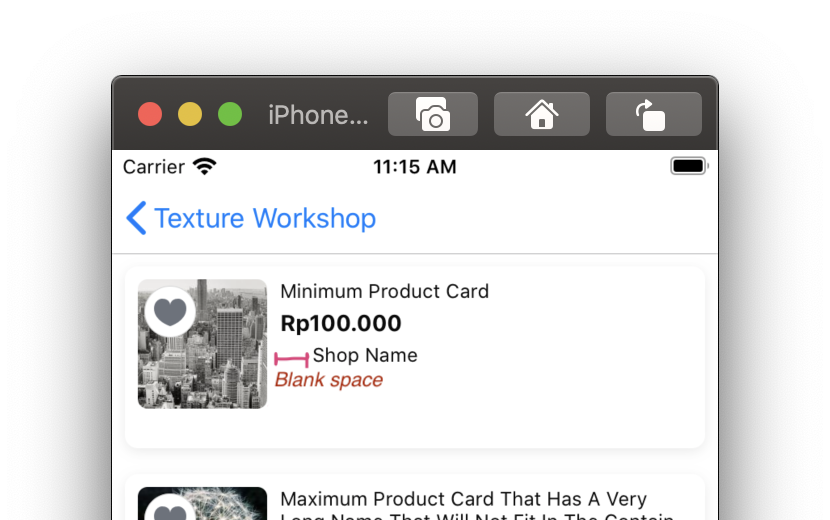
But, if we want to hide the view and also remove the blank space, how to do that?
In the refreshUi() method, you can see the switch case section for shop type. In each case, you can try to enable: showShopBadge(with:) or hideShopBadge() code and make the rest disabled by commenting them out. After that, let's try to run it.
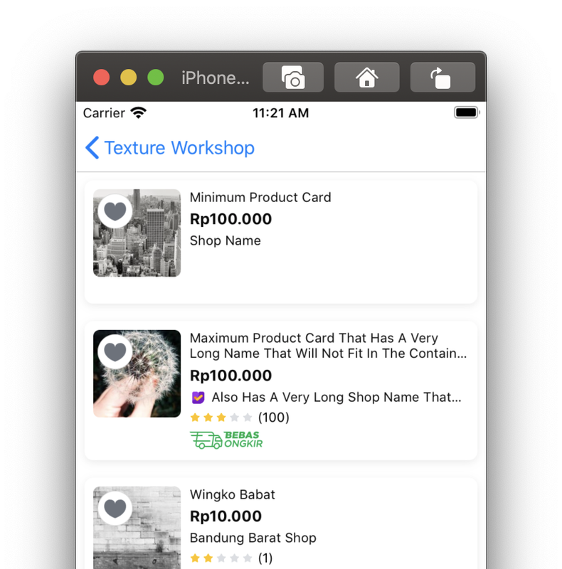
You can see, the new implementation can make the Shop Badge image hidden and eliminate the blank space. If you see the showShopBadge(with:) and hideShopBadge() code, we managing constant property of shopBadgeWidthConstraint and shopBadgeGap Constraints to hide the blank space.
By this implementation, the sizing can be wrong, which can be caused by human error if we need to change the view size in the XIB but we forget to change in the .swift too. This error can be minimized if we implementing full UI implementation programmatically without using XIB.
If we see the Managing Shop Badge Image implementation, the implementation looks simple. But it can be otherwise if we need to handle multiple Views' state.
We have already run the previous implementation. If we look at the screen, we can see there's blank space too while hiding the Rating and Bebas Ongkir view.
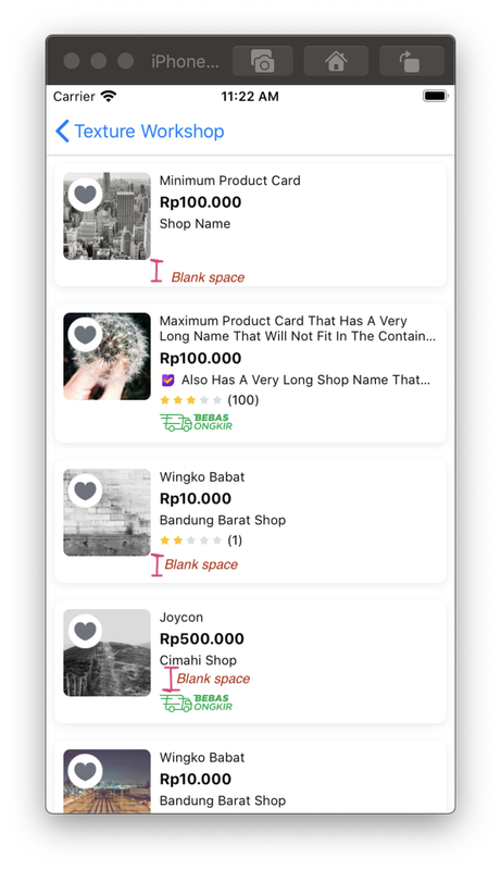
To fix that we can see in the ProductCardWishlistTableViewCell.swift file, on the refreshUI() method, there's a section called #2 Extra Cases: Hiding both rating bar and free shipping.
Below that section, we need to disable the codes that have commented on it by comment it out. Also, we need to enable other codes below of previous code, which has commented on it too, by uncommenting it. Try to run the code.

As we can see, now the UI can be shown properly by removing blanks space if the Rating and/or Free Shipping image was hidden. If you see the codes that you enable by uncommenting-out before, we heavily managing the Constraints state there. We need to turn-off the un-needed Constraints first and enable what we need. If you wrongly manage it, the Constraints can be broken and the UI can be glitched because the OS will attempt to fix that broken Constraints and sometimes it fixed in the wrong way.
Imagine if we had many View components that need to be dynamically shown based on a certain state.
In some years ago, Apple introduced UIStackView that we can use to easily manage the View components state. If we hide a view in the stack, UIStackView will automatically manage for removing blank space of that view.
But in some conditions, it can be painful to control UIStackView if we had deep-nested UIStackView and some child-view have a different size than the other. Also for spacing between each element, it should be of the same size. For handling that, usually we need to use dummy UIView that acts as spacer.
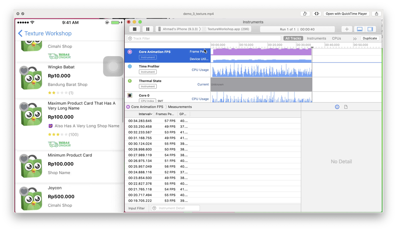
As we know, Texture has the benefit of its UI Calculation because it is done in the background thread, contrary to UIKit that the calculation is done in the main thread.
We already made a video showing the performance of both, that shown in FPS metrics. In that video, we showing the implementation of iPhone 5 with iOS 9. In that video, it clearly shows that UIKit implementation have performance drop. It has an average of 30++ fps compared to Texture that has an average of 50++ fps.
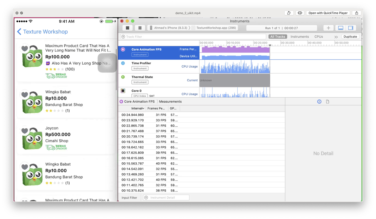
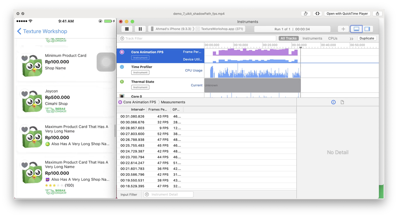
We can improve the UIKit implementation by implementing shadowPath for showing the shadow. Also, we already made a video showing the performance while using shadowPath. The FPS increased to average 40++ fps, but still can't on par with Texture.
https://bit.ly/twOct2020Supplementary
So far we talk about past and present, and now this time we will talk about future. We've talk about the advantages of using Texture, and what make we more confident to use Texture is by looking at some big companies like Pinterest and Telegram are using Texture in their iOS apps.
All of our workshop session show lot of benefit of using Texture, but if you check at the syntax of Texture, it still have lot of code and not "declarative" like SwiftUI. For SwiftUI, we can't used it yet on our main app because we still need to support iOS < 13, and SwiftUI is "a bit" buggy on iOS 13 as well. This is how our Texture layout code looks like:
let vStack = ASStackLayoutSpec(
	direction: .vertical,
	spacing: 16,
	justifyContent: .start,
	alignItems: .start,
	children: [tokopediaText, tokopediaButtonNode]
)

return ASStackLayoutSpec(
	direction: .horizontal,
	spacing: 16,
	justifyContent: .start,
	alignItems: .start,
	children: [vStack, goBtnNode]
)
Compare to SwiftUI code, the Texture code still look much more code than the SwiftUI one.
HStack {
	VStack {
		Text("Hello World")
		Button("Tokopedia") {}
	}
	Button("Go!") {}
}
That's where the TextureSwiftSupport shines. This library can made your Texture layouting code more like SwiftUI code by leveraging function builder swift feature that introduced in Swift version 5.1.
That texture code can be converted to SwiftUI like this:
LayoutSpec {
	HStackLayout(spacing: 16) {
		tokopediaText
		tokopediaButtonNode
	}
	goBtnNode
}
And by the way, if you follow the Tokopedia iOS hotest news in early October, we've launch our first Widget! Built exclusively using SwiftUI. and our devs said that learning Texture make it easier for them to learn SwiftUI!
For final word, this is our quote of the day:
One step closer to learn SwiftUI but with UIKit foundation in a simpler way