Skip to content

TommyFu/responsive-web-design-tricks

Folders and files

NameName
Last commit message
Last commit date

Latest commit


History

7 Commits


Repository files navigation

responsive-web-design-tricks

1. float, float: left|right

try it yourself

2. inline block, display: inline-block

try it yourself

float vs inline-block

  • Float need to clear, no vertical centering
  • Inline-block white space collapse issue
  • Float or inline-block. it depends on your preference

3. flexible box, display:flex

try it yourself

Flex vs float / inline-block

  • Flex could be a replacement for float and inline-block
  • Flex has vertical centering and equal heights
  • Horizontal only vs Both Horizontal and Vertical
  • There are multiple ways to do the same thing with flexbox
  • Complex syntax and not supported by older browsers with flexbox

Can I use flex ?

4. grid, display:grid

try it yourself 1

try it yourself 2

Grid vs Flex

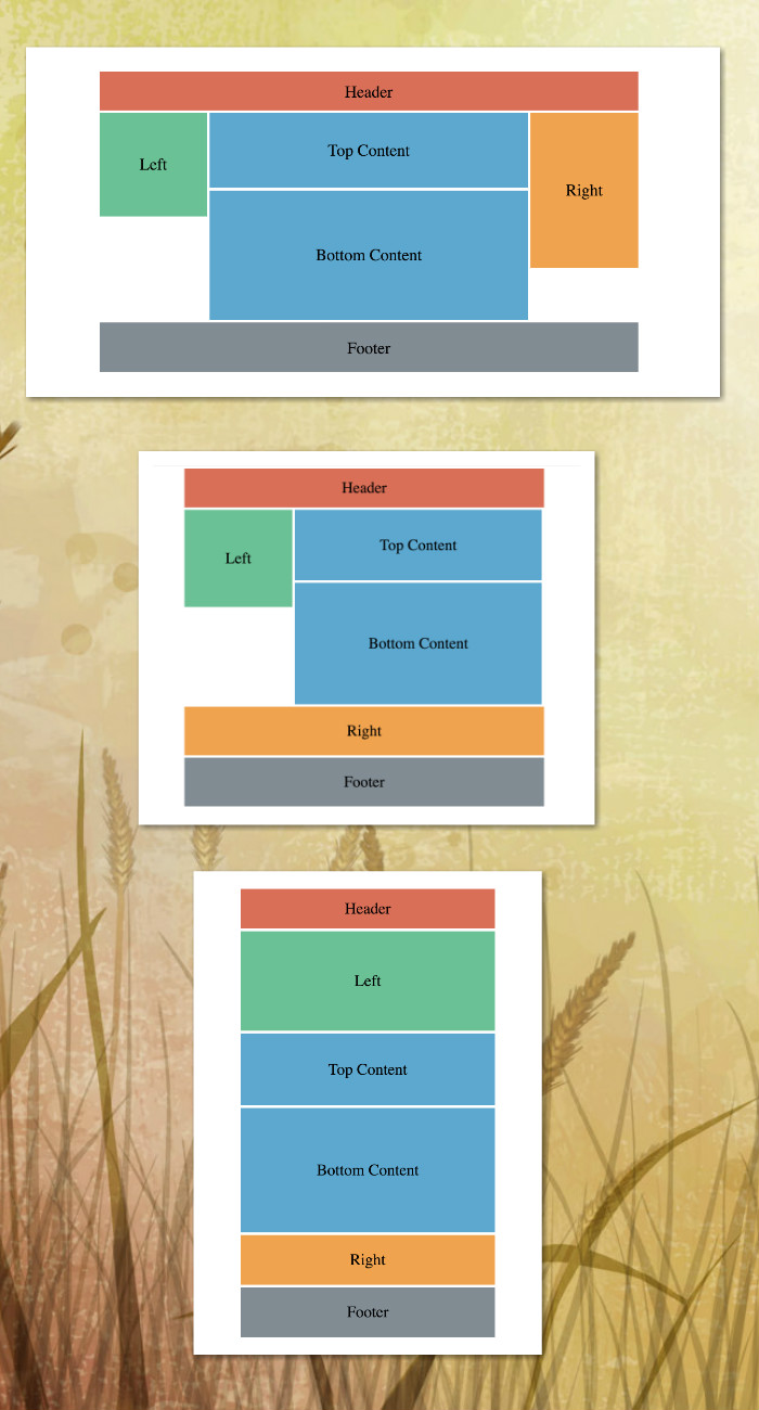
  • One dimensional vs Two dimensional
  • Major layouts(Grid) vs UI elements(Flex)
  • Grid is easier to learn and to use
  • Grid has a bit less browser support.

Can I use grid ?

Releases

No releases published

Packages

No packages published

Languages