


Note: This version only works with Vue 3
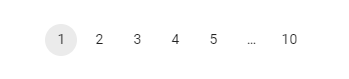
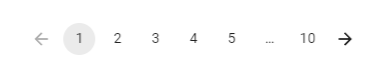
The Pagination component allows the user to choose a particular page from a selection of pages.
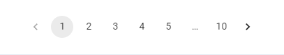
You can optionally enable first-page and last-page buttons.
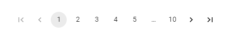
You can optionally disable the previous-page and next-page buttons.
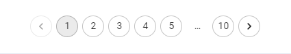
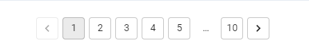
It's possible to customize the control icons.
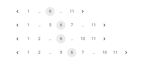
You can specify how many digits to display either side of current page with the siblingCount prop, and adjacent to the start and end page number with the boundaryCount prop.
Explore the API reference documentation for the Vuejs Pagination component, where you can discover information regarding its props, classes, and other available APIs.
This is a simple Demo environment for the package where you can use and test the package.
App.vue
<script setup>
// Import the package
import { Pagination } from "paginate-vuejs";

// Import the CSS file to apply the default styling.
import 'paginate-vuejs/dist/style.css';

const clickCallback = (pageNum) => {
  // Add your code here
};
</script>

<template>
  <Pagination :total="100" :clickHandler="clickCallback" />
</template>main.js
import { createApp } from 'vue';
import App from './App.vue';

// Import the package
import Pagination from 'paginate-vuejs';

// Import the CSS file to apply the default styling.
import 'paginate-vuejs/dist/style.css';

// Register the package
createApp(App).use(PaginateVuejs).mount('#app');

import { Pagination } from "paginate-vuejs";
App.vue
<script setup>
const clickCallback = (pageNum) => {
  // Add your code here
};
</script>

<template>
  <Pagination :total="100" :clickHandler="clickCallback" />
</template>| Name | Type | Default | Description |
|---|---|---|---|
| total | integer |
___ | The total count of pages is required. |
| perPage | bool |
10 |
The number of items or records displayed on each page. |
| currentPage | integer |
1 |
The current page active. |
| siblingCount | integer |
1 |
Number of always visible pages before and after the current page. |
| boundaryCount | integer |
1 |
Number of always visible pages at the beginning and end. |
| hideNextButton | bool |
false |
If true, hide the next-page button. |
| hidePrevButton | bool |
false |
If true, hide the previous-page button. |
| showFirstButton | bool |
false |
Show the First button. |
| showLastButton | bool |
false |
Show the Last button. |
| clickHandler | func |
___ | Callback fired when the page is changed. function(page: number) => void page The page selected. |
| type | 'link' | 'button' |
'button' |
HTML Element type of the pagination component. |
| linkUrl | string |
'#' |
Necessary when the type attribute is configured as 'link' and should include the "{page}" placeholder for it to be substituted with the actual page number when rendering. |
| disablePagination | bool |
false |
Toggle the buttons for the entire component on/off. |
| disablePagination | bool |
false |
Toggle the buttons for the entire component on/off. |
| paginationTypes | 'normal' | 'standard' | 'minimal' | 'of' |
false |
The style of pagination to be applied ('normal', 'standard', 'minimal', or 'of'). |
| Name | Default | Description |
|---|---|---|
| pageContainerClass | 'pagination-container' |
Styles applied to the component's container. |
| pageItemClass | 'page-item' |
Styles applied to individual page items. |
| pageLinkClass | 'page-link' |
Styles applied to page links. |
| activeClass | 'active' |
Styles applied to the currently active page. |
| ellipsisClass | 'pagination-ellipsis' |
Styles applied to the ellipsis indicator. |
These slot names can be utilized for Vue Slots to insert custom HTML into the specified element.
| Name | Target |
|---|---|
| firstBtn | First page button |
| lastBtn | Last page button |
| prevBtn | Previous page button |
| nextBtn | Next page button |
| ellipsisText | Ellipsis indicator |