Improve message coloring #945
Comments
|
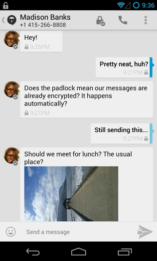
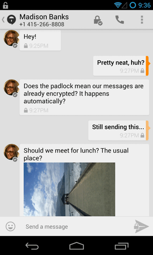
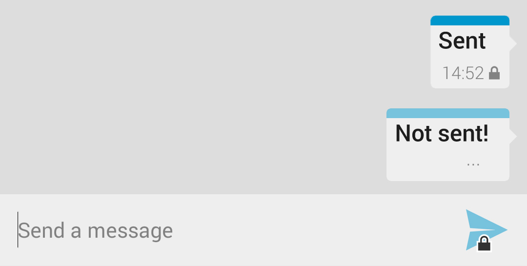
Green has been commonly associated with SMS for years now. We can thank Apple for that because that's what they used for SMS. It wasn't until the release of iMesssage that they added blue for data-based messages. Although it may make sense for you and I to see green as secure, it wouldn't make sense for the average user. I think the TextSecure developers should stick to green for SMS but switch the blue colour for secure data-based messages to orange. Blue only indicates that it's data-based so another colour to indicate security is nice. Red and purple are not suitable so that leaves orange. EDIT: LIke so: |

|
@Anaron We should get as many opinions about this as possible, but I personally think the first association with green is security and it would be bad for the user experience if it symbolizes something different. About the third color for encryption: The one thing we are basically on the same page about is that we should not overuse colors, especially not to convey two different meanings at the same time (data+encryption). |
|
@Lindworm Would your friends and mother have made the same association with an iPhone running iOS 7? Apple set the "green for SMS" standard once the iPhone became popular. And that's a device marketed towards the average non-tech savvy consumer (like your mother). In the image below, the left is iMessage (blue chat bubbles) and the right is regular SMS. I agree that green should be used for encryption because it makes sense but the issue is that it wouldn't make sense with the average consumer. Apple kinda messed things up by popularizing the colour green for SMS. For now, we're left with orange. And it makes sense when green is the colour most people think of when it comes to SMS. If anything, options for different colour schemes should be implemented. Also, I thought data=encrypted so there's no point in differentiating the two. There's no way they can encrypt outgoing SMS. The only encryption for that is for locally-stored SMS and that's to keep it safe from someone that manages to copy it from your phone so it can be viewed externally. |

This is wrong - TextSecure has been sending encrypted SMS for years now. The one thing it couldn't do was data. |
|
@Lindworm Are you sure? I'm finding it hard to believe that they can encrypt regular SMS to non-TextSecure users. How can other users decrypt such messages? It doesn't make any sense. I know that messages between TextSecure users are encrypted via SMS (old way) and data (new way). Perhaps you misunderstood what I was trying to say. I should have been a little more specific earlier. |
|
@Anaron No, the SMS to non TextSecure users are of course not encrypted, but the SMS between TextSecure users are. I'm not sure how you would want to signal the difference between secure and insecure SMS though. ;-) |
|
@Lindworm Okay. What about green for unencrypted SMS, orange for encrypted SMS, and blue for encrypted push messages? Green obviously wouldn't have the padlock icon and orange/blue would. It's great because blue is already associated with data thanks to Apple's iMessage service. And orange wouldn't clash with the other colours like purple and red. |

|
I don't think we should use colors to indicate the message encryption at all. It's simply too confusing. What do you think about the partial coloring instead of the full message body? |
|
I like the partial coloring; it definitely improves readability. A colored line at the top as in @Lindworm's suggestion looks cleaner to me as the one on the right in @phenx-de's mockup (mostly because the latter over-emphasizes the speech-bubble in my opinion). As for the coloring, I think it is important to note that we are discussing an Android app, not one for iOS. Green has this 'everything is alright' connotation, so using it for SMS seems counter-intuitive. |
|
@Lindworm Thank you very much for putting our discussion from the other issue to this one in so much detail. I have nothing to add to your first post 👍 @noschinl I'm glad that you mention the iOS vs. Android difference here. The two systems use distinct visual styles, so I see no need to copy what iMessage does. It seems that the meaning "green = SMS" is not common sense yet for most of the users, especially those from the Android world, as indicated by @Lindworm and also consistent with my experience from non-tech-savvy friends. The single most confusing point for most of them was: "Why are some messages encrypted (meaning green) and some are not (meaning blue)". And also: "Why is there still a lock symbol on non-encrypted messages (meaning blue again)". So they totally got confused. I can understand the argument that this has been the default coloring in TextSecure for some years now (has it? I'm a fairly new user), but since the rollout to the masses only started recently with the release of version 2, I don't think it's too late to change colors to something more sensible. |
|
@phenx-de I had the same misconception about encryption vs non-encryption (green/blue) when I used TS for the 1st time now. My suggestion would be to have one message bubble color meaning encrypted and one color meaning unencrypted. This makes the lock icon at the bottom of each message obsolete. Instead, it can be replaced with an icon indicating transport channel. That means we need an icon to represent SMS and one to represent push. I like @Lindworm 's suggestion of using a different shade while the message is traveling. In the light theme this should be a lighter shade of the color, in the dark team a darker. |
|
I would still keep the message bubbles of the sender a uniform color (instead of using the bar). It can just be a light shade of the color we end up choosing. I agree that the current colors, green and blue, are too saturated and prominent, also impacting text contrast on the sender's messages negatively. A lighter shade of the color (or darker in the dark theme) can alleviate this. On that note: in the dark theme, the text is always white on dark gray or blue/green bg message bubbles. For the same reason, in the light theme, the messages should use a light shade of the color, so black text can be used, too, for the sender's messages. |
|
@phenx-de
Nope, it was basically black on white: |


|
@Lindworm I don't think so. It's only 3 colours, 2 of which are easily recognizable as regular SMS (green) and data (blue). Both the send icon and padlock icon can complement the colours. To totally avoid confusion, it can say something like "Now via SMS" under the message. The same thing is done in Hangouts. With that said, I'm not the average user and this app should be designed for the average user. The less confusing it is, the better. I like @virtualritz's one colour for encrypted and non-encrypted messages idea.
I think it's great. I really like the horizontal partial colouring. I think it looks much better than the vertical one. However, I imagine it would look worse with the dark theme. For that reason, I think it's better that we stick with a solid colour for the chat bubble rather than a partial one. The lighter shade indicating that the message is still being sent is a very good idea.
Actually, we're discussing what's currently an Android app. Open Whisper Systems have plans to release an iOS version of TextSecure called "Whisper". They're also going to rename TextSecure on Android with the same name. You can read about it on their blog here. It's important to keep that in mind when discussing changes to the UI. The more consistent the apps are across platforms, the better it is for brand image. @virtualritz I think you're onto something with the colours. It's better to have black text in a coloured chat bubble just like Kik Messenger. It offers consistency and it's aesthetically-pleasing. |
|
I really really like style of message bubbles from "Colorset 2" above (thin color stripe at top, white bubble). In "Colorset 1" there is not enough contrast between the bubble background and text colors IMHO. However I do not like the use of orange. Like it or not, Ale seems to have set a standard here. Surely not for the Android platform but keep in mind that TS will be available for iOS really soon and I would fully expect it to be consistent a) with the Android client and b) with the Ale app. |
|
Just a very personal view on one of the colors in the discussion: For me, orange (and yellow) are warning colors, like: "Look, something could go wrong, it has not yet reached 'red', but you have to have a look at it!". I wonder if it is like this for others. |
I thought about that and really liked the idea at first (you know how much I like the state of encryption to be clear ;-). I agree that it's usually more important to to communicate to the user if his conversations are private than if he has to pay a few cents for each message. But the state of encryption is generally not going to change during the conversation, while the transport does change dynamically and may do so several times a day. If we do it, I'd propose to use red and green for encrypted and unencrypted messages respectively, for the reasons we already discussed. In an encrypted conversation the green color will probably positively reinforce the user, to use encryption whenever possible. But I guess we can't solve all problems at once. For now, I think the color should indicate transport, because it's the property which changes more frequently.
I agree, but for now I'm mainly working on the light theme. When we have a working color set and iconography there, it should'nt be too hard to invert the interface.
I guess that's personal preference. I tried it, but didn't like it too much. It still seemed too playful and toy-like to me. We may consider choosing one for the default and making a seperate theme for the other option.
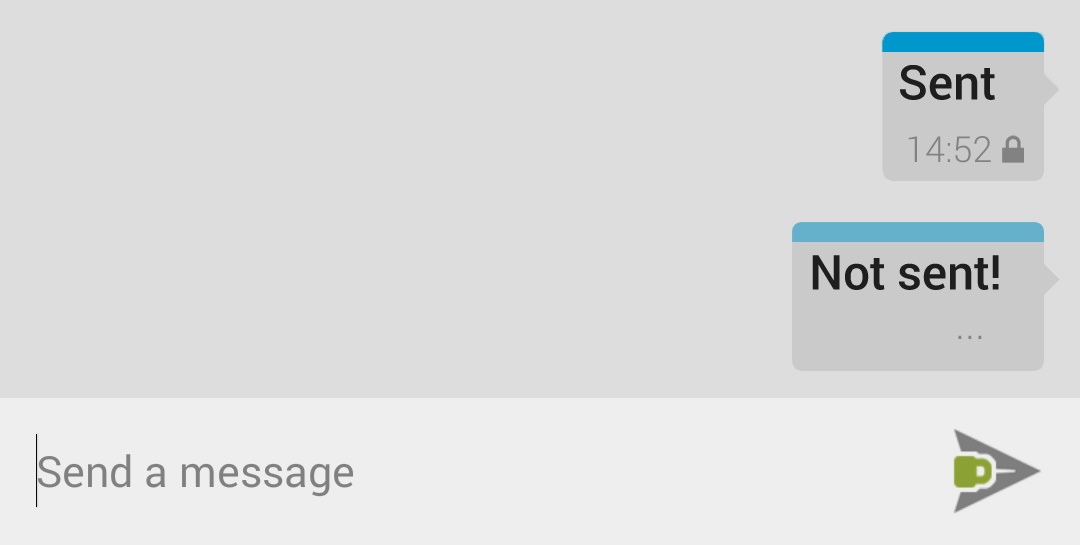
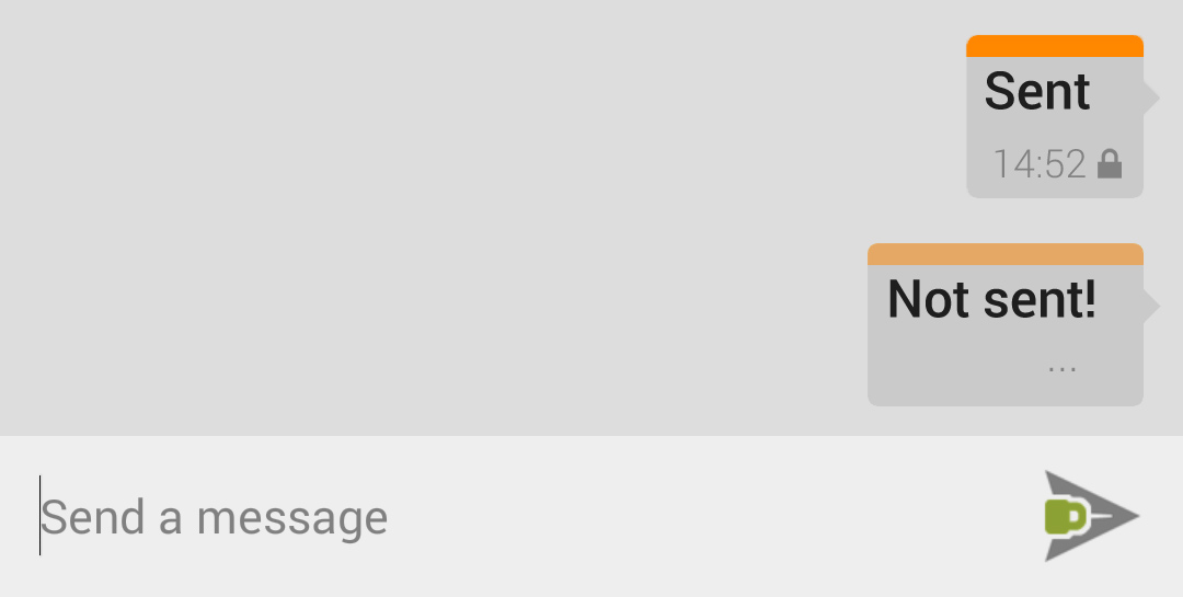
Absolutely. That's why I like the nearly white messages in the mockups above so much. It's really tiring with the current theme. @Anaron That's because I don't have to change the colors of the bars. The sent messages always have a strong color, that doesn't get in the way because it's just a small strip. I personally dislike the current dark theme, mainly because it uses dark blue bubbles on black. If we use fully colored but toned down bubbles it will always look bad in the dark theme because it's hard to distinguish dark blue from black. Really dark red would probably look even worse. The dark theme was actually not much work. I basically just swapped the colors used for text and background, while the color strips and grey notification icons and text stay the same. @sagischwarz: when used in together with green and red, I feel the same about orange. But when it's used with blue, as phenx-de and I suggested, it doesn't come off as a warning to me. |

|
My personal take on this is to have the colour represent the channel, and the padlocks the encryption. That being said, I agree with @sagischwarz on orange being a bad choice. A little bit of warning connotation, but especially it's blue's complementary colour and that just doesn't mix well. I mean, even if the colours are only applied to a part of the message, having blue and orange messages next to each other - which could happen - is just plain ugly. Take a look at @Anaron 's screenshot if you're not convinced. |
|
@Lindworm My goodness, you're right. What I imagined was much different than that screenshot. |


|
@Lindworm: I very much like the dark theme as shown in your new image as well. Looks very clean and crisp to me. Allthough I am still not quite happy with green as the color for SMS, but there seem to be some valid points for green, so I'd like to collect them here. Reasons to use green instead of yellow/orange:
While the main reason to use yellow/orange would be:
Regardless of the final decision, there really is a need to explain the colors to new users to avoid confusion one way or the other, for a discussion how this could be accomplished, see #908. |
|
@phenx-de
Point taken, I'm not a fan but I agree that it should be consistent across platforms.
Did you see the two examples with orange and blue messages in one screen I just posted? I don't mind them at all.
That usually happens in the context of green and read, which then makes up a traffic light. |
|
If we go for the top (or side) colour strip we can literally use any colour. Why not a darkish blue for push and some light blue or even turquoise (yeah, compromising between blue and green here) for the text messages ? That way you'd have a light/dark contrast as well. That would give something like this : http://46.19.37.204/playwithcolours.html#push=#009AD9&text=#5ee5c6 (if there is an authentication request just cancel it you'll be fine) I just think we should experiment a bit before selecting any colour :) |
|
Don't change the message boxes. One could easily argue that orange messages are broken... Do not use colours to indicate encryption. The padlock does it. If you believe the padlock is too small, experiment with having it as a big faded background of the message (something tells me this isn't a good solution, clutter). Or even just increase the contrast of the message sub-text. Having that small bar instead of a full coloured box will make it more difficult to find your message, say that the screen is cluttered with long texts, the full coloured message box will be much less confusing than the coloured bars. Do not apply these bars, it would make it more difficult to identify who's who. The bars makes it more difficult for the user to find their messages, do not implement this. You need a clear indication of who's message it is. Good luck finding that small bar in sunlight. Arguing what colour means what will probably be difficult, all cultures may not consider the colours to mean the same... I agree that the app doesn't make it clear what the colours mean, but neither does any of your suggestions of just changing it to another colour. Icons or text is the more appropriate way to make sure users understand. Leave the full coloured green and blue message boxes as they are. The encryption is indicated by the padlock. Messages without padlocks are implicitly unencrypted. Implicit vs Clutter is another discussion... Maybe give a greater contrast to the sub-text of the text messages is a better idea. OT: in group chats are participants given different coloured message boxes? Red can mean error,danger, superb job, extra important My point is colours are confusing, keep the blue and green as they are. Regarding the colour consistency with the other mentioned issues. You're going to further complicate the setup. The app was intended to make encryption easy. A novice user seeing orange encrypted message while others have green ones will make the user believe it can't trust this program without some magical procedures. Don't make it more complicated, you will cause distrust with novice users and eventually scare them off... |
|
To consider: WhatsApp, too, uses slightly green colored sender message bubbles. But: FB messenger uses blue, Kakao Talk (de facto standard in South Korea, has >100 million users, mainly in South East Asia) uses yellow! And a big chunk of the users of these apps are indeed on iOS. I guess the bottom line is that it is not so important to copy iMessage when it comes to message coloring. So what we need, if we like the to make the transition for users of other messaging apps easy, is a single default color for the sender's message bubbles. For the common case. Then we have the specific case, which is unencrypted SMS. Here are the cases with resp. suggestions:
Again, I think key is consistency, not copying what app X or Y uses for a color but how the majority of widely adopted messaging apps use color in message bubbles. From that pov it does not matter what color we use for the sender's bubbles. All that does matter is that the use of color is consistent and doesn't cause confusion. Currently it does cause confusion as many new users think that blue translates to unencrypted. This needs a solution. P.S.:
KakaoTalk is a prime example of this. |
|
@virtualritz I also just uploaded some examples for signaling trust with badges and the "horizontal colored strip" skin in #910. |
|
@Lindworm: Only thing I have to add regarding virtualritz post: be careful with what icons you add, don't clutter the screen if it's not necessary. A text/SMS app that has an icon indicating that it was sent as SMS may not be the best idea, however it's probably less confusing than colours. It's worth mentioning: User A Scenario (Exclusively uses SMS)
User B Scenario (Exclusively uses Data network)
User C Scenario (Mixes between SMS/Data network)
virtualritz's plan only had icons for SMS, interpret the scenarios as you like. If you decide to add a icon the problem will be how do you determine which icon to show? Do you show the SMS icon because it may cost? Which is not universally true. Atm TextSecure isn't used by the majority, you will possibly have this icon on most messages. |
|
@virtualritz Maybe I don't have enough time to site down and enumerate all the answers to your ex post facto list. |
|
@jeremymasters: Please understand that answering you takes time too. If you don’t want do the ‘homework’ you will have a hard time getting through with your proposals. Having an idea is great but you will need to go through the process of convincing people that it is a good one. If you want them to implement it at least. Even if you implement it yourself – getting a pull request accepted by the project maintainers will likely require you to go to the same process that I outlined above with them. I hope that doesn’t discourage you from contributing further. The more you show people that you have really thought about a proposal, the more weight it will have for them when they consider it (and the less likely it will be that it will be flatly rejected). |
|
To sum up the current status once again:
|
|
Long discussion for nothing? ;) |
|
@mcginty made good points in #945 (comment) but unfortunately nothing about the actual colors yet. I think whatever we do with them should/has to be released either before or at the same time with the iOS release, because it has to be consistent between platforms. If we stick with the current scheme, iPhone users will only ever send blue messages. If we change the colors to indicate encryption, we can use the same full color scheme on both platforms. |
|
As you know, there are only three possibilities: PUSH encrypted. The closed or open lock informs about the encrypted or unencrypted status of a sent message. To inform the transmission channel, there are other possibilities besides the color scheme, as has been said in some places here. But in fact, it is important to have consistency between the Android and iOS platforms, well as between the messages sent and received. |
|
I think we should keep in mind that the visualization for incoming and outgoing messages should be consistent. In the case of incoming messages it is important to distinguish between verified and unverified keys. In #1172 there is a discussion focused on that fact. |
|
The long discussion isn't for nothing :). It's been hanging around in my head, but we've been very heads-down on more explicit necessary feature work and fixing broken things. I think to a certain extent, updating color and visual security indicators in the Android app might be best done when roughly coordinated with the TS-iOS release in order to limit unnecessary change and maintain as unified a look as possible cross-platform. I have a couple more ideas for visuals that I want to experiment with but haven't had the time just yet. |
|
@mcginty I think its a good idea of coordinating it with the iOS release. But if the colors should be changed, it has to be done at the same time or a bit before I think. The iOS release will push the android version aswell, and we shouldn't confuse the new users right away with changed colors. |
|
Hi there, I came across this thread after a discussion on twitter about the same topic. I am still reading through all the messages here. I am speaking as a European Textsecure user and a user centred designer who is privacy sensitive, the most importance piece of information I want to know is if my message is encrypted or not. The discussion above about the design patterns to follow, if iOS’s model of green for SMS and blue for iMessage was a good model to follow. My opinion would be Android is different than iOS. There are a few ways to handle this.
That decision will ideally be informed by user research, talking to users, and measuring iOS user requests for an iOS version. It would be farking wonderful if a TextSecure client could be developed to private iOS users with private SMS and push messages. Is there a need to communicate what transport is used for the message? In terms of communicating if the message is sent over SMS or over PUSH, there needs to be a decision if it is a characteristic users WANT to know. Asking users is a good way. :) Get a simple survey together and ask TextSecure users to fill it out. Provide it in anonymous form. I’d happily help put it together. Speaking as a user living in Europe where I have unlimited (almost) SMS’s, I don’t mind if it is sent over SMS or PUSH. However, if I am a user in the US and SMS costs a lot, and I have a data plan, then maybe I want to know. Possibly more important is: if sending a PUSH message is provably more secure than sending an encrypted SMS, then maybe I need to know how it was sent. -How to represent transport in the UI- Colour:
A Textsecure user on Twitter mentioned she also found it unhelpful "Can that (the use of colour) be changed? Not only it doesnt help, it hinders us ADHD ppl." Possible solution: Text:
Possible solution: Text may be a good option, but the char count would need to be short – something like “SMS” “PUSH”, “DATA”. Icons
Possible solution
Possible ways to get a better decision: Get some new users and ask them what they think the colours mean. Don’t tell them what it means, let them figure it out, or not, themselves. I'd like to do some user testing with some users to see. Anyone want to help? |
|
@bernardATdiymut TextSecure-iOS is well underway, so this is the case. Roughly speaking and not surprisingly, the goal is to style the Android and iOS equivalents to carry the same information in a way that adheres to the design guidelines of the platform. Agreed that color is a bad indicator on its own, but it can be a good second assistant. I'm confused about how ADHD plays a part in color choices. When we end up making color/indicator changes we can definitely include a note explaining the interface on first open, I think that's a good idea. You can find a discussion of what to replace "push" with at #1139, feel free to join that conversation too :). I disagree in the general sense that icons are lazy. We should be selective, but in this case both the encryption status and transport are important enough pieces of information to warrant a visual indicator of some kind per message. At the moment, I'm leaning the Hangouts route of a small SMS indicator both in the text input and in a message:
I'm interested in user testing as well, and we have a couple channels to help make that happen. If you have any specific suggestions, we can come up with specific tests to run and get that on its way. |

|
Based on my poking around in UX tickets for the messaging view, I've sort of done a meta-review of these tickets today, and wanted to add my $.02 here.
I'd like to synthesize my thoughts on all of these since I've spent the better part of a day digging through them and their myriad dupes and sprouts and branches. :) Message transport and delivery display
Message security display
Pulling it togetherI can probably be arsed to make some mockups if folks are interested in what I'm saying. Right now, it's tired and I'm 1am. ;) In every historical message, I want:
In the text entry area, I want:
Yes, I understand this could mean ::gasp:: up to three icons in every historical message. I'd be happy with that, because I believe each one would be easily understood by users, and far easier to differentiate than colors which follow few conventions other than stoplight colors. It's also good for color-blind folks. And, you can assimilate it in a glance. If number of icons on the screen/scroll buffer is for some reason a problem, use a single graphical element to display the various states. Security has up to 3 states (insecure, secure, and secure-trusted). Return-receipt has up to 3 states (awaiting receipt, receipt confirmed, receipt unconfirmed). Data transport has 2 states (SMS or not present). Thus you need 3 * 3 * 2 = 18 total combinations which could be something like a PNG or SVG displayed as a single element on each historical message. |
|
Hello, as already mentioned in: I think the message bubble colors should not be used to indicate what messaging channel (Data/SMS) is being used or if the message is encrypted or not or if the message has arrived or not. I think those things should instead be indicated via icons. So, it would be nice if you would use icons as indicators instead of the message bubble colors. Regards |
|
@wp9015362 Please don't open an issue, link it to another issue, and then immediately repeat yourself in the issue you're linking to. Just linking to it is enough. We're very busy, please respect our time by keeping the amount of email we receive to a minimum. |
|
@moxie0 fixed with 2.21.0?! |
|
Why not! |
The colored messages are supposed to convey to the user the difference between push messages and SMS.
But the green color has confused myself, @sagischwarz, @phenx-de and literally everybody I have told to install the app.
@phenx-de and myself have had a rather extensive discussion about the whole shebang in #908.
What we came up with:
This is what @phenx-de came up with:
Blue message sides for data and orange message sides for SMS:
 ____
____
Those are two of my own mockup sets, one with white and one with grey backgrounds.
The first one doesn't have the nice new send icons because I couldn't be bothered to put them in after I made the mockups.
Colorset 1: Blue message headers for data, grey background:
Colorset 1: Orange message headers for SMS, grey background:
Colorset 2: Blue message headers for data, white background:
Colorset 2: Orange message headers for SMS, white background, encryption:
Colorset 2: Orange message headers for SMS, white background, no encryption:
Please tell us what you think ;-)
I did a quick count for several different preferences.
If I misunderstood anybody, just tell me and I'll change your vote. If you have an opinion to one of those topics and aren't listed, just answer in the thread.
The first two are about the shape of the messages only, the colors are to be discussed apart from the way we use them.
@Lindworm, @phenx-de, @noschinl, @Anaron, @monreal, @tinloaf @maulwuff
@virtualritz, @0xACE, @L3st3r
@virtualritz, @Lindworm, @mcginty
@Anaron, @Cimbali, @0xACE, @L3st3r, @backspace
@Anaron, @monreal, @sagischwarz, @0xACE, @L3st3r
@Lindworm, @phenx-de, @maulwuff
Everybody seems to like the toned down colors for sending, so at least we have one thing in common ;-)
The text was updated successfully, but these errors were encountered: