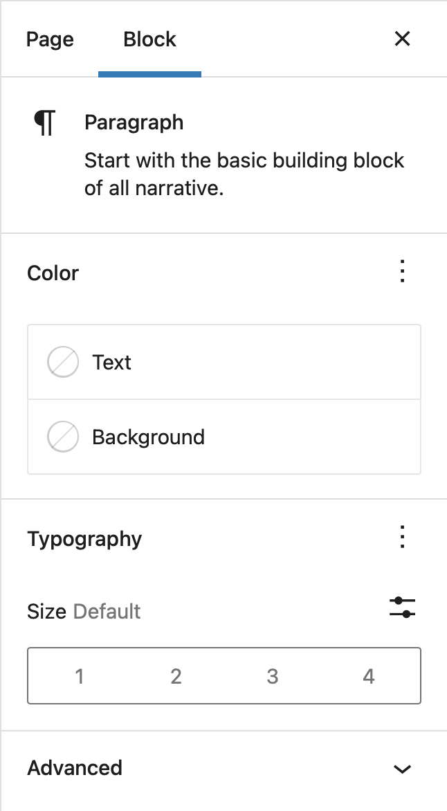
Inspector Controls appear in the post settings sidebar when a block is being edited. The controls appear in both HTML and visual editing modes, and thus should contain settings that affect the entire block.
import { registerBlockType } from '@wordpress/blocks';
import {
	CheckboxControl,
	RadioControl,
	TextControl,
	ToggleControl,
	SelectControl,
	PanelBody,
} from '@wordpress/components';
import {
	RichText,
	InspectorControls,
	useBlockProps,
} from '@wordpress/block-editor';

registerBlockType( 'my-plugin/inspector-controls-example', {
	apiVersion: 3,

	title: 'Inspector controls example',

	icon: 'universal-access-alt',

	category: 'design',

	attributes: {
		content: {
			type: 'string',
			source: 'html',
			selector: 'p',
		},
		checkboxField: {
			type: 'boolean',
			default: true,
		},
		radioField: {
			type: 'string',
			default: 'yes',
		},
		textField: {
			type: 'string',
		},
		toggleField: {
			type: 'boolean',
		},
		selectField: {
			type: 'string',
		},
	},

	edit( { attributes, setAttributes } ) {
		const blockProps = useBlockProps();
		const {
			content,
			checkboxField,
			radioField,
			textField,
			toggleField,
			selectField,
		} = attributes;

		function onChangeContent( newContent ) {
			setAttributes( { content: newContent } );
		}

		function onChangeCheckboxField( newValue ) {
			setAttributes( { checkboxField: newValue } );
		}

		function onChangeRadioField( newValue ) {
			setAttributes( { radioField: newValue } );
		}

		function onChangeTextField( newValue ) {
			setAttributes( { textField: newValue } );
		}

		function onChangeToggleField( newValue ) {
			setAttributes( { toggleField: newValue } );
		}

		function onChangeSelectField( newValue ) {
			setAttributes( { selectField: newValue } );
		}

		return (
			<>
				<InspectorControls>
					<PanelBody title={ __( 'Settings' ) }>
						<CheckboxControl
							heading="Checkbox Field"
							label="Tick Me"
							help="Additional help text"
							checked={ checkboxField }
							onChange={ onChangeCheckboxField }
						/>

						<RadioControl
							label="Radio Field"
							selected={ radioField }
							options={ [
								{ label: 'Yes', value: 'yes' },
								{ label: 'No', value: 'no' },
							] }
							onChange={ onChangeRadioField }
						/>

						<TextControl
							label="Text Field"
							help="Additional help text"
							value={ textField }
							onChange={ onChangeTextField }
						/>

						<ToggleControl
							label="Toggle Field"
							checked={ toggleField }
							onChange={ onChangeToggleField }
						/>

						<SelectControl
							label="Select Control"
							value={ selectField }
							options={ [
								{ value: 'a', label: 'Option A' },
								{ value: 'b', label: 'Option B' },
								{ value: 'c', label: 'Option C' },
							] }
							onChange={ onChangeSelectField }
						/>
					</PanelBody>
				</InspectorControls>

				<RichText
					{ ...blockProps }
					key="editable"
					tagName="p"
					onChange={ onChangeContent }
					value={ content }
				/>
			</>
		);
	},

	save( { attributes } ) {
		const {
			content,
			checkboxField,
			radioField,
			textField,
			toggleField,
			selectField,
		} = attributes;
		const blockProps = useBlockProps.save();

		return (
			<div { ...blockProps }>
				<RichText.Content value={ content } tagName="p" />

				<h2>Inspector Control Fields</h2>
				<ul>
					<li>Checkbox Field: { checkboxField }</li>
					<li>Radio Field: { radioField }</li>
					<li>Text Field: { textField }</li>
					<li>Toggle Field: { toggleField }</li>
					<li>Select Field: { selectField }</li>
				</ul>
			</div>
		);
	},
} );
Inspector Advanced Controls appear under the Advanced panel of a block's InspectorControls -- that is, they appear as a specific set of controls within a block's settings panels. As the name suggests, InspectorAdvancedControls is meant for controls that most users aren't meant to interact with most of the time, such as adding an HTML anchor or custom CSS classes to a block.
import { TextControl } from '@wordpress/components';
import {
	InspectorControls,
	InspectorAdvancedControls,
} from '@wordpress/block-editor';

function MyBlockEdit( { attributes, setAttributes } ) {
	return (
		<>
			<div>{ /* Block markup goes here */ }</div>
			<InspectorControls>
				{ /* Regular control goes here */ }
			</InspectorControls>
			<InspectorAdvancedControls>
				<TextControl
					label="HTML anchor"
					value={ attributes.anchor }
					onChange={ ( nextValue ) => {
						setAttributes( {
							anchor: nextValue,
						} );
					} }
				/>
			</InspectorAdvancedControls>
		</>
	);
}