Skip to content
New issue

Have a question about this project? Sign up for a free GitHub account to open an issue and contact its maintainers and the community.

By clicking “Sign up for GitHub”, you agree to our terms of service and privacy statement. We’ll occasionally send you account related emails.

Already on GitHub? Sign in to your account

Utilize top bar area to place the most common / most used blocks #8224

Closed
dazunE opened this issue Jul 26, 2018 · 2 comments
Closed

Utilize top bar area to place the most common / most used blocks #8224

dazunE opened this issue Jul 26, 2018 · 2 comments
Labels
[Feature] UI Components Impacts or related to the UI component system [Type] Enhancement A suggestion for improvement.

Comments

@dazunE
Copy link

dazunE commented Jul 26, 2018

The Gutenberg interface nice and clean, however when it comes to making a layout that uses lots of blocks, the user always needs to navigate top + icon or + icon near the block, then search or select the block.
I found a really nice article about the same issue I've faced in details ( https://10up.com/blog/2018/user-testing-gutenberg/ )

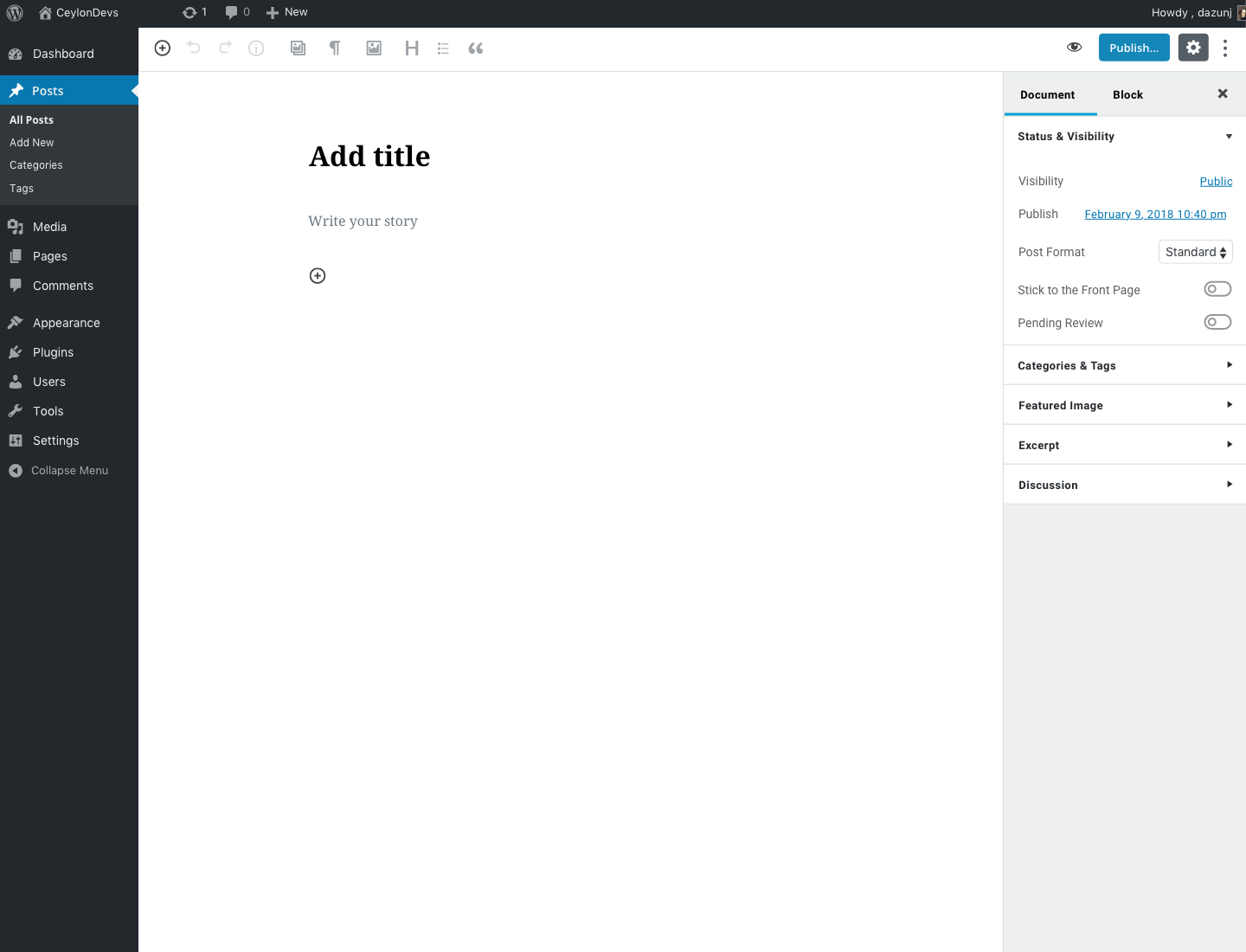
My solution is to utilize the top toolbar to place mostly used / commonly used blocks which considerably solve the above issue.
Propsed Design
Becuse toolbar's postion is fixed and it is always visible for users. It increase the affrodance of the designs by adding signifires in the toolbar.

The alternative solutions would be adding direct navigation to different block types in the toolbar,

@dazunE dazunE changed the title Utlize top bar area to place the most common / most used blocks Utilize top bar area to place the most common / most used blocks Jul 26, 2018
@designsimply designsimply added [Type] Enhancement A suggestion for improvement. [Feature] UI Components Impacts or related to the UI component system labels Jul 26, 2018
@ZebulanStanphill
Copy link
Member

ZebulanStanphill commented Jul 27, 2018

I would say that quick insert buttons should go next to the inserter icon. Additionally, I think this overlaps with the purpose of the Most Used category in the inserter, as well as the quick-insert buttons in empty placeholder blocks. There is also the slash inserter in empty Paragraph/placeholder blocks that lets you quickly insert a block by typing something like "/list" to insert a List block. On top of that, the Paragraph block supports markdown shortcuts for inserting blocks, e.g. "- " in an empty Paragraph to replace it with a List block.

Additionally, the block formatting toolbar can be docked to the top bar, which may conflict with this idea.

I am not really convinced there is a need for this. There should definitely be some improvements to the existing inserters like the sibling inserter, though. See the discussion in #7271. Perhaps the tips shown to new users should also mention things like the slash inserter to make them more obvious.

On a somewhat related note, I actually suggested something else be put in the top bar area, but it was decided that it would be better put somewhere else. See the discussion in #6459.

@designsimply
Copy link
Member

Closing based on @SuperGeniusZeb's comment noting there are already a few different ways to quickly insert the most-used blocks and adding screenshots for reference.

screen shot 2018-07-27 at fri jul 27 6 15 30 pm

screen shot 2018-07-27 at fri jul 27 6 15 17 pm

screen shot 2018-07-27 at fri jul 27 6 21 04 pm

Seen at alittletestblog.com/wp-admin/post.php?post=14069&action=edit running WordPress 4.9.7 and Gutenberg 3.3.0 using Firefox 61.0.1 on macOS 10.13.6.

Thank you for your feedback!

Sign up for free to join this conversation on GitHub. Already have an account? Sign in to comment
Labels
[Feature] UI Components Impacts or related to the UI component system [Type] Enhancement A suggestion for improvement.
Projects
None yet
Development

No branches or pull requests

3 participants