
Source from this data set from Kaggle
240 stars and various properties taken from "Stars and Galaxies" by Seeds and Backman.
7 properties of a star, such as its temperature, luminosity, radius, absolute magnitude, star type, star color, and spectral class.
Please note that the star type, denoted as integers, are translated as the following:
- Brown Dwarf -> Star Type = 0
- Red Dwarf -> Star Type = 1
- White Dwarf -> Star Type = 2
- Main Sequence -> Star Type = 3
- Supergiant -> Star Type = 4
- Hypergiant -> Star Type = 5
Since the topic is stars, I shall visualize the stars! (through graphs)
The general aim is to see any correlations between the categories, and that is reinforced through the two paths I took to get to regression.
Tools I used are: Python, Pandas, Matplotlib, Seaborn
I did several methods of correlation,
- brute force looping through columns of the dataframe to run the correlation methods,
- seaborn-enabled correlation and regression for all columns (bulk in one go)
[]
[]
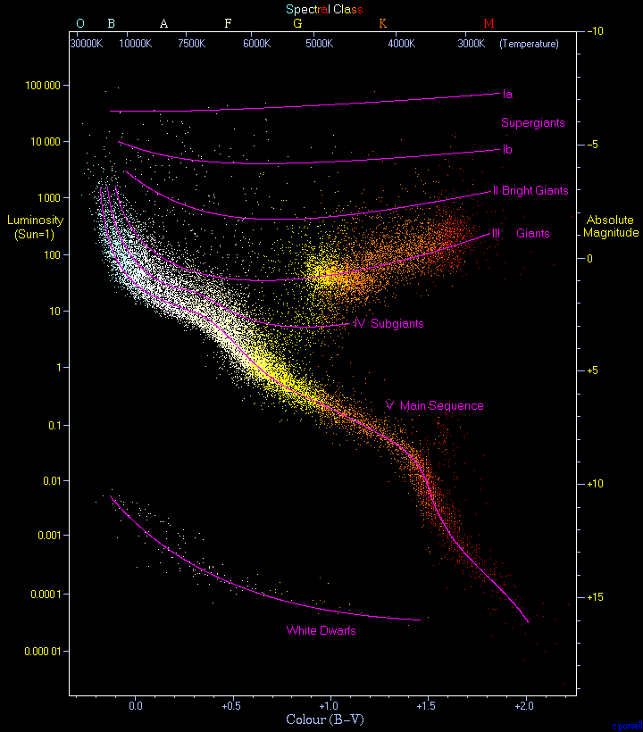
Extra: I also did pseudo-Hertzsprung-Russell Diagram. With Temperature as x-axis, Luminosity as y-axis. Size of stars (tweaked with logarithm to scale better fitted for a graph) as size of dots and colors of dots (in a gradient), to better showcase the relative sizes of stars on a 2D graph.
Other diagrams I did with combinations of a selected value of each of the remaining properties, in a graph with 3 attributes in one 2D graphs.
- Implement colors attributes from dataset to plot on graphs (2D and 3D)
Color category was too hard to work with with compound colors string such as 'Yellowish', 'Orange-Red', and 'Blue-white', which would be a reach goal, to analyze the string and break them down into 2 colors, and then take an average of the colors, then aggregate that for each star entry, to use in the parameter of scatter plot function
-
multivariable regression, for 3D graphs, for every combinations of numerical columns
-
properly replicate the Hertzsprung-Russell Diagram like this image, with multiple regressions lines, one for each of the star types datas, and all in one graph, and display 4 axes with colors of the stars and size of stars scaled with size of dots
https://sparkbyexamples.com/pandas/pandas-correlation-of-columns/
https://www.w3schools.com/python/pandas/default.asp
https://www.geeksforgeeks.org/matplotlib-tutorial/