- 安装
npm install wangs-ui
- 使用
import wangsUi from 'wangs-ui'
import 'wangs-ui/lib/wangs-ui.css';
Vue.use(wangsUi)
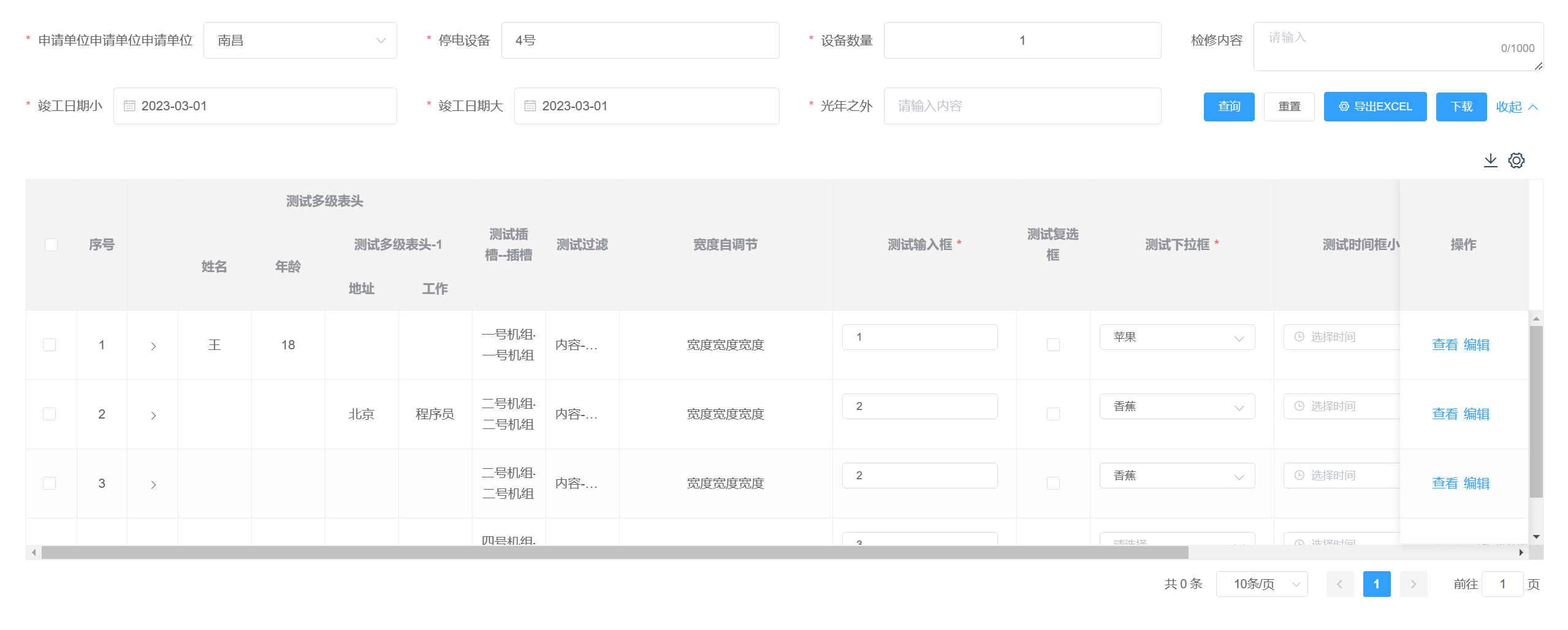
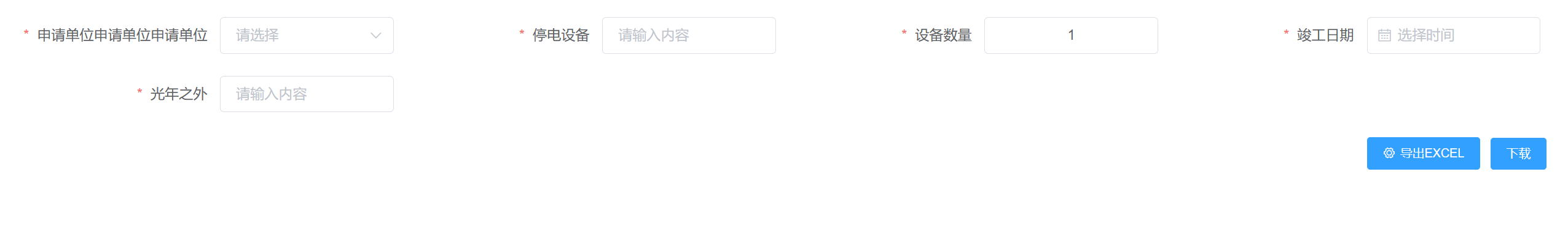
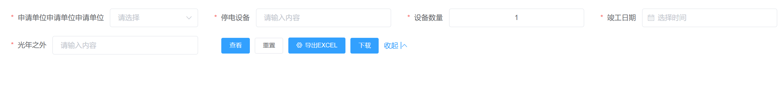
- 配置化开发
- 带有搜索栏,分页栏
- 嵌套 el-form 组件,支持单行和多行校验表单元素, 支持双击切换表单元素
- 可根据列内容自适应宽度
- 封装工具栏,支持表格纯前端下载、列勾选功能、单行展示
- 解决树形表格,复选框勾选不联动问题
- 保留
elementui el-table原有功能
- 组件使用
<ws-table
  ref="wsTable"
  showSearch
  style="height: 100%"
  placeholder="-"
  :loading="loading"
  utilsList="download,showSingle"
  :data="tableData"
  :tableColumns="tableColumns"
  :allOptions="allOptions"
  :pageInfo.sync="pageInfo"
  :formData.sync="formData"
  :operationConfig="{
      buttonConfigList: formButtons,
    }"
  :seachConfig="{
      formConfigList,
      buttonConfigList: formButtons,
      allOptions,
    }"
  switchMode="rowControl, dblclick"
  @happenEvent="happenEvent"
  @selection-change="selectionChange"
>
  <!-- 指向table组件的插槽 -->
  <template v-slot:expand="{ row }">
    <div>{{ JSON.stringify(row) }}</div>
  </template>
  <template v-slot:testTableSlot_header="{ column }">
    {{ column.label + '--表头插槽' }}
  </template>
  <template v-slot:testTableSlot="{ row, column }">
    {{ row[column.property] + '--内容插槽' }}
  </template>
  <!-- 指向ws-form组件的插槽 -->
  <template #testSlot="{ fieldItem, formData }">
    <el-input
      clearable
      v-model="formData[fieldItem.prop]"
      :placeholder="fieldItem.disabled ? '' : '请输入内容'"
      :disabled="fieldItem.disabled"
    ></el-input>
  </template>
  <!-- 指向ws-buttons组件的插槽 -->
  <template #download="scope">
    <el-button type="primary" size="small" @click="happenEvent(scope)"
      >下载</el-button
    >
  </template>
  <!-- <template v-slot:append> append </template> -->
</ws-table>- 配置示例
// 表格列配置
export const tableColumns = [
  { type: 'selection' },
  { type: 'index', label: '序号' },
  { type: 'expand', slotName: 'expand' },
  // 基本配置
  {
    prop: 'testNormal',
    label: '一般情况',
  },
  // 测试多级表头
  {
    label: '多级表头',
    children: [
      {
        prop: 'testHeader1',
        label: '多级表头-1',
        alwaysVisible: true, // 在列选择器中始终显示
        width: 100,
      },
      {
        label: '多级表头-2',
        children: [
          {
            prop: 'testHeader21',
            label: '表头-2-1',
          },
          {
            prop: 'testHeader22',
            label: '表头-2-2',
          },
        ],
      },
    ],
  },
  // 自定义表头,内容
  {
    headerSlotName: 'testTableSlot_header',
    slotName: 'testTableSlot',
    prop: 'testTableSlot',
    label: '插槽',
    showOverflowTooltip: true,
  },
  // 过滤举例
  {
    prop: 'testFormatter',
    label: '过滤',
    formatter: function (row, column, cellValue, index) {
      return cellValue + '-过滤'
    },
    showOverflowTooltip: true,
  },
  // 富文本举例
  {
    prop: 'testRich',
    label: '富文本',
    rich: true,
  },
  // 宽度自调节举例
  { prop: 'testAdjust', label: '宽度自调节', selfAdjust: true },
  // 输入框模式举例
  {
    prop: 'testInput',
    label: '输入框',
    component: 'el-input',
    // '如果输入格式为数字加小数点, 去掉小数点'
    blurHandler: function (value) {
      if (/^\d*\.$/.test(value)) {
        return value.replace('.', '')
      }
      return value
    },
    // 限制输入6位小数
    inputHandler: function (value) {
      value = value.replace(/[^0-9.]/g, '')
      return value.replace(/^\D*((0|[1-9][0-9]*)(?:\.\d{0,6})?).*$/g, '$1')
    },
    width: 200,
    required: true,
  },
  // 复选框模式 对应的值不等于0或者1则代表禁用
  {
    prop: 'testCheckbox',
    label: '复选框',
    component: 'el-checkbox',
    alwaysVisible: true,
  },
  // 测试下拉框
  {
    prop: 'testSelect',
    label: '下拉框',
    component: 'el-select',
    width: 200,
    required: true,
  },
  // 测试时间框模式
  {
    prop: 'testMinDatetime',
    label: '小时间',
    width: 200,
    component: 'el-date-picker',
    required: true,
    maxTimeProp: 'testMaxDatetime', // 用于比较的最大时间对应字段
    minDate: '2022-01-01', // 用于比较的最小时间固定值
    maxDate: '2024-01-01', // 用于比较的最大时间固定值
    timeDisabled: true, // 时间限制精度是否到时分秒
    minAllowEqual: false, // 不允许和用于比较的最小时间相等  精度到天
    maxAllowEqual: false, // 不允许和用于比较的最大时间相等  精度到天
    componentAttrs: {
      type: 'datetime',
      valueFormat: 'yyyy-MM-dd HH:mm',
      format: 'yyyy-MM-dd HH:mm',
    },
  },
  {
    prop: 'testMaxDatetime',
    label: '大时间',
    width: 200,
    component: 'el-date-picker',
    required: true,
    minTimeProp: 'testMinDatetime', // 用于比较的最小时间对应字段
    minDate: '2022-01-01', // 用于比较的最小时间固定值
    maxDate: '2024-01-01', // 用于比较的最大时间固定值
    timeDisabled: true, // 时间限制精度是否到时分秒
    minAllowEqual: false, // 不允许和用于比较的最小时间相等  精度到天
    maxAllowEqual: false, // 不允许和用于比较的最大时间相等  精度到天
    componentAttrs: {
      type: 'datetime',
      valueFormat: 'yyyy-MM-dd HH:mm',
      format: 'yyyy-MM-dd HH:mm',
    },
  },
  {
    type: 'operation',
    buttonConfigList: [
      {
        method: 'validateRow',
        label: '单验',
      },
      {
        method: 'validateAll',
        label: '全验',
      },
      {
        method: 'edit',
        label: '编辑',
      },
      {
        method: 'notEdit',
        label: '不编辑',
      },
    ],
  },
]- 下拉框选项
const allOptions = {
  testSelect: [
    { label: '选项一', value: '1' },
    { label: '选项二', value: '2' },
  ],
}| 参数 | 说明 | 类型 | 可选值 | 默认值 |
|---|---|---|---|---|
| allOptions | 所有表单下拉框选项集合 | Object | - | - |
| tableColumns | 所有列的对象集合数组 | Array | - | - |
| utilsList | 工具栏 | Array | - | - |
| operationConfig | 表格头部操作按钮配置,对应 ws-buttons 配置 | Object | - | - |
| showPagination | 展示分页组件 | Boolean | - | true |
| paginationConfig | 分页配置 | Object | - | - |
| showSearch | 是否显示搜索框 | Boolean | - | false |
| showSearchRow | 首行是搜索栏 | Boolean | - | false |
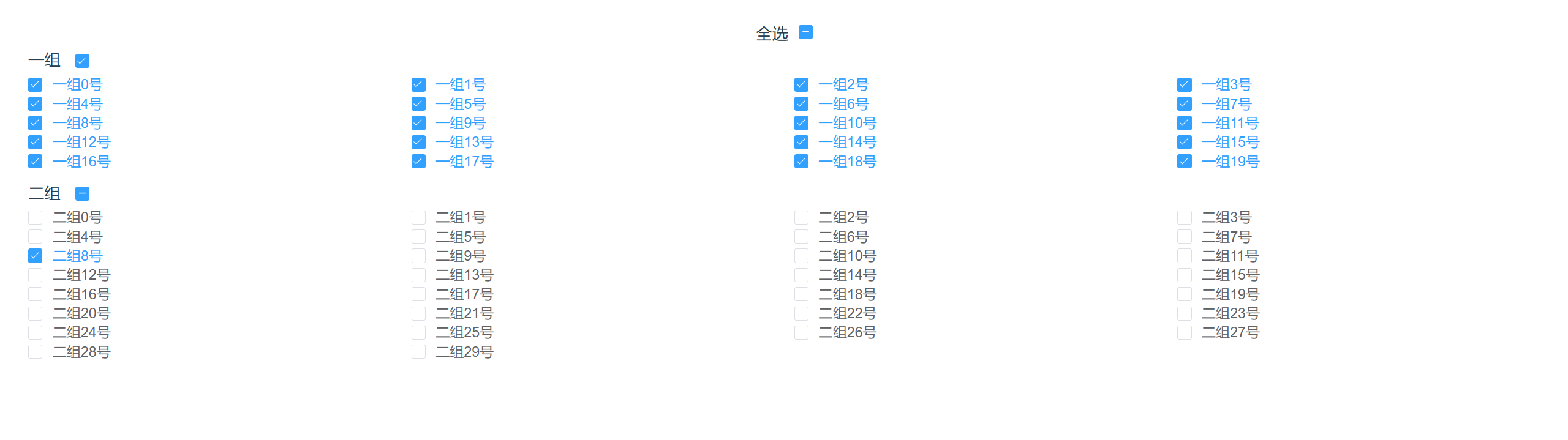
| checkStrictly | 在显示复选框的情况下,是否严格的遵循父子不互相关联的做法 | Boolean | - | false |
| pageInfo | 分页数据, 不传则没有分页栏 | Object | - | - |
| loading | 加载样式 | Boolean | - | false |
| placeholder | 表格空单元占位 | String | - | - |
| switchMode | 列切换模式 | String | dblclick/rowControl | - |
| switchKey | 列切换字段 | String | isEdit__table | - |
| seachConfig | 搜索栏配置, 同 ws-form, 不传则没有搜索栏 | Object | - | - |
| formData | 搜索栏数据 | Object | - | - |
- tableColumns 内部对象属性(兼容 el-table-column 自带的属性, 不另作说明)
| 参数 | 说明 | 类型 | 可选值 | 默认值 |
|---|---|---|---|---|
| slotName | 对应列插槽名 | String | - | - |
| headerSlotName | 对应列表头插槽名 | String | - | - |
| selectSlotName | 对应搜索框 el-option 插槽 | String | - | - |
| children | 多级表头配置 | Array | - | - |
| formatter | 同 el-table formatter | Function | - | - |
| selfAdjust | 列宽根据内容自调节 | Boolean | - | false |
| rich | 列内容是富文本 | Boolean | - | false |
| component | 组件名,用于表单组件 | String | - | - |
| blurHandler | el-input 组件失焦时值过滤 | Function(value) | - | - |
| inputHandler | el-input 组件输入时值过滤 | Function(value) | - | - |
| required | 是否必填 | Boolean | - | false |
| alwaysVisible | 列是否一直展示 | Boolean | - | false |
| maxTimeProp | 时间组件最大值对应的字段 | String | - | - |
| minTimeProp | 时间组件最小值对应的字段 | String | - | - |
| minDate | 固定的最小时间 | String | - | - |
| maxDate | 固定的最大时间 | String | - | - |
| timeDisabled | 时间限制精度是否到时分秒 | Boolean | - | - |
| minAllowEqual | 允许和用于比较的最小时间相等, 精度到天 | Boolean | - | true |
| maxAllowEqual | 允许和用于比较的最大时间相等, 精度到天 | Boolean | - | true |
| placeholder | 表格空单元占位 | String | - | - |
| componentAttrs | 组件对应的属性 | Object | - | - |
| buttonConfigList | 每行按钮组,type 为 operation 时生效 | Array | - | - |
| filterButtons | 行按钮组过滤函数,type 为 operation 时生效 | Function(buttonConfigList, row) | - | - |
| 事件名 | 说明 | 参数 |
|---|---|---|
| happenEvent | 行按钮点击事件 | eventData |
| 事件名 | 说明 | 参数 |
|---|---|---|
| validateRow | 校验单行 | row:行数据 |
| validateAll | 校验全部行 | - |
| getRowsByRowKeys | 根据 id 数组获取多行数据,支持树结构 | rowKeys:id 数组 |
| getSelection | 获取选中行 | - |
| setSelection | 设置选择行(处理了树形表格多选逻辑) | selection: id 数组或者 row 数组, flag:是否选中 |
tableColumns 配置 slotName 和 headerSlotName 和 selectSlotName ,也支持按钮组 ws-buttons 配置的插槽
- 配置化开发
- 支持搜索栏模式和普通表单模式
- 搜索栏模式自适应增加折叠按钮
- 增加默认按钮,默认进行校验
- 保留
elementui el-form原有功能
- 组件使用
<ws-form
  :formConfigList="formConfigList"
  :buttonConfigList="formButtons"
  :allOptions="allOptions"
  isSearchForm
  @happenEvent="happenEvent"
  :formData.sync="formData"
  :extraComponents="extraComponents"
  ref="wsForm"
>
  <!-- 指向ws-form组件的插槽 -->
  <template #testSlot="{ fieldItem, formData }">
    <el-input
      clearable
      v-model="formData[fieldItem.prop]"
      :placeholder="fieldItem.disabled ? '' : '请输入内容'"
      :disabled="fieldItem.disabled"
    ></el-input>
  </template>
  <!-- 指向ws-buttons组件的插槽 -->
  <template #download="scope">
    <el-button type="primary" size="small" @click="happenEvent(scope)"
      >下载</el-button
    >
  </template>
</ws-form>- 配置示例
// 表单配置
export const formConfigList = [
  {
    component: 'el-select',
    prop: 'testSelect',
    label: '下拉框',
    required: true,
  },
  {
    component: 'el-input',
    prop: 'testInput',
    label: '输入框',
    required: true,
    // '如果输入格式为数字加小数点, 去掉小数点'
    blurHandler: function (value) {
      if (/^\d*\.$/.test(value)) {
        return value.replace('.', '')
      }
      return value
    },
    // 限制输入6位小数
    inputHandler: function (value) {
      value = value.replace(/[^0-9.]/g, '')
      return value.replace(/^\D*((0|[1-9][0-9]*)(?:\.\d{0,6})?).*$/g, '$1')
    },
  },
  {
    component: 'el-input',
    prop: 'testTextarea',
    label: '文本域',
    componentAttrs: {
      type: 'textarea',
    },
  },
  {
    component: 'el-date-picker',
    prop: 'testMinDatetime',
    label: '小时间',
    required: true,
    maxTimeProp: 'testMaxDatetime', // 用于比较的最大时间对应字段
    timeDisabled: true, // 时间限制精度是否到时分秒
    defaultTimeType: 'today', // 默认当前时间
    componentAttrs: {
      type: 'date',
      valueFormat: 'yyyy-MM-dd',
    },
  },
  {
    component: 'el-date-picker',
    prop: 'testMaxDatetime',
    label: '大时间',
    required: true,
    minTimeProp: 'testMinDatetme', // 用于比较的最小时间对应字段
    timeDisabled: true, // 时间限制精度是否到时分秒
    // isShowCurrent: true,
    minAllowEqual: false, // 允许和用于比较的最小时间相等 精度到天
    maxAllowEqual: false, // 允许和用于比较的最大时间相等 精度到天
    componentAttrs: {
      type: 'date',
      valueFormat: 'yyyy-MM-dd',
    },
  },
  {
    component: 'el-radio-group',
    prop: 'testRadio',
    label: '单选框',
    required: true,
  },
  {
    component: 'el-checkbox-group',
    prop: 'testCheckbox',
    label: '复选框',
    required: true,
  },
  {
    slotName: 'testSlot',
    prop: 'testSlot',
    label: '插槽',
    required: true,
  },
]| 参数 | 说明 | 类型 | 可选值 | 默认值 |
|---|---|---|---|---|
| allOptions | 所有表单下拉框选项集合,同 ws-table | Object | - | - |
| formConfigList | 表单元素配置数组 | Array | - | - |
| buttonConfigList | 按钮组配置 | Array | - | - |
| buttonSize | 按钮组尺寸 | String | - | small |
| formData | 表单数据 | Object | - | - |
| isSearchForm | 是否是搜索控件 | Boolean | - | false |
| useDefaultButtons | 是否使用默认的查询重置按钮 | Boolean | - | true |
| gutter | el-row 属性 | Number | - | 12 |
- formConfigList 内部对象属性(兼容 el-form-item 自带的属性, 不另作说明)
| 参数 | 说明 | 类型 | 可选值 | 默认值 |
|---|---|---|---|---|
| slotName | 表单元素内容插槽 | String | - | - |
| selectSlotName | 对应搜索框 el-option 插槽 | String | - | - |
| component | 组件名,用于表单组件 | String | - | - |
| blurHandler | el-input 组件失焦时值过滤 | Function(value) | - | - |
| inputHandler | el-input 组件输入时值过滤 | Function(value) | - | - |
| required | 是否必填 | Boolean | - | false |
| maxTimeProp | 时间组件最大值对应的字段 | String | - | - |
| minTimeProp | 时间组件最小值对应的字段 | String | - | - |
| minDate | 固定的最小时间 | String | - | - |
| maxDate | 固定的最大时间 | String | - | - |
| timeDisabled | 时间限制精度是否到时分秒 | Boolean | - | - |
| minAllowEqual | 允许和用于比较的最小时间相等,精度到天 | Boolean | - | true |
| maxAllowEqual | 允许和用于比较的最大时间相等,精度到天 | Boolean | - | true |
| defaultTimeType | 默认时间类型,支持去年/今年/明年的昨天/明天/今天 | String | - | '' |
| componentAttrs | 组件对应的属性 | Object | - | - |
| 事件名 | 说明 | 参数 |
|---|---|---|
| happenEvent | 行按钮点击事件 | eventData |
formConfigList 配置 slotName 和 selectSlotName, 也支持按钮组 ws-buttons 配置的插槽
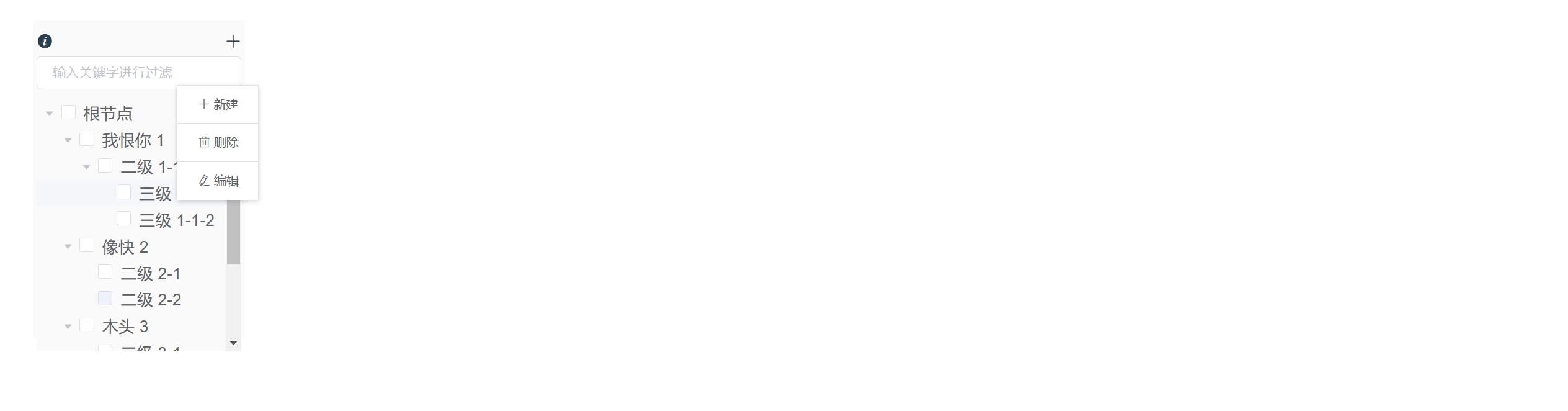
- 支持悬浮和鼠标右键控制按钮显示
- 搜索功能
- 支持拼音首字母搜索
- 支持文字超出浮动显示
- 保留
elementui el-tree原有功能
- 组件使用
<ws-tree
  showCheckbox
  draggable
  excludeFirstSearch
  changeMode="contextMenu, hover"
  style="height: 300px; width: 240px"
  showOverflowTooltip
  default-expand-all
  showHeader
  :dataIsFlat="false"
  :data="treeData"
  current-node-key="9"
  :default-checked-keys="['9', '10']"
  :disabledFn="disabledFn"
  :disabledContextmenuFn="disabledContextmenuFn"
  :filterButtonsFn="filterButtonsFn"
  :useDefaultButtons="false"
  :extraOperations="extraOperations"
  @check-change="handleCheckChange"
  @node-click="handleNodeClick"
  @check="handleCheck"
  @happenEvent="happenEvent"
>
  <template v-slot="{ data }">
    <i class="el-icon-s-tools" style="font-size: 10px"></i>
    <span>{{ data.label + '插槽' }}</span>
  </template>
</ws-tree>| 参数 | 说明 | 类型 | 可选值 | 默认值 |
|---|---|---|---|---|
| changeMode | 增删改查模式 | String | 'contextMenu' - 右键编辑 'hover' - 悬浮编辑 | |
| excludeFirstSearch | 后续搜索 不被第一次的搜索操作影响 | Boolean | - | false |
| extraOperations | 额外的按钮 | Array | - | - |
| backgroundColor | 组件背景色,包括树 | String | - | - |
| nodeSpaceBetween | 节点内容和按钮之间的布局是否采取 SpaceBetween 布局 | Boolean | - | false |
| headerConfig | 头部内容配置 | Object | - | - |
| showHeader | 是否显示头部 | Boolean | - | false |
| showSearch | 是否显示搜索框 | Boolean | - | true |
| noFilter | 是否需要进行过滤, 通常结合远程搜索使用 | Boolean | - | false |
| showOverflowTooltip | 是否取消横向滚动,文字超出部分显示省略号,悬浮显示文字 | Boolean | - | false |
| dataIsFlat | 传入的数据是否是扁平的, 扁平就自动转为树结构 | Boolean | - | true |
| useDefaultButtons | 是否使用默认的增删改按钮 | Boolean | - | true |
| disabledFn | 结点是否禁用的回调函数,会自动添加 disabled 属性 | Function(data, node) | - | - |
| filterButtonsFn | 过滤操作按钮回调函数 | Function(operationsList, data, node, type) | - | - |
| 事件名 | 说明 | 参数 |
|---|---|---|
| happenEvent | 行按钮点击事件 | eventData |