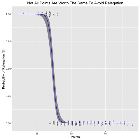
This project uses historical Engligh Premier League (EPL) tables to understand the how many points a team will need to earn in a typical EPL season to avoid relegation. By using a logistic regression model, its possible to estimate the probability of relegation associated with a given points total. The result suggest that the old manager maxim "forty points clear", doesn't gurantee safety from relegation.
Data on historical EPL tables was pulled from Wikipedia.
Code written in R.
# Author:       Ariel Aguilar Gonzalez
# Date:         Wednesday, September 28 2016
# Tile:         Forty Points Clear?
# Description:  Using historical EPL data to predict relegation
#  ----------------------------------------------------------------------------

library(ggplot2)

# Import data
Points_Relegation_Data <- read.csv("...Points_Relegation_Data.csv")
attach(Points_Relegation_Data)

# Mean Points
mean(Points)
# 52.00

# Create an average EPL table
mean_EPL <- matrix(NA,20,1)
`colnames<-`(mean_EPL, "AvgPts")
# Loop through
r <- 20
for (i in 1:r){
  mean_EPL[i,1] <- mean(Points[Rank=i])
}
mean_EPL

# Looks like 38 points puts you on edge of relegation
# 40 points lands you clear!

# How much does a marginal point decrease a team's chances of relegation?
# Test out different logistic regression models

# Create a grid of values for Points at which we want predictions
ptslims <- range(Points)
pts.grid <- seq(from=ptslims[1], to=ptslims[2])

# Model 1, simple linear Logit coef
fit1 <- glm(Relegated~Points, family = binomial(link = "logit"), data=Points_Relegation_Data)
# Make predictions
preds1 <- predict(fit1,newdata = list(Points=pts.grid), se=T)
# Convert to probabilties
pfit1 <- exp(preds1$fit)/(1+exp(preds1$fit))
# Define confidence intervals
se.bands.logit1 <- cbind(preds1$fit+2*preds1$se.fit,preds1$fit-2*preds1$se.fit)
# Convert into probabilities
se.bands1 <- exp(se.bands.logit1)/(1+exp(se.bands.logit1))
# Plot Model 1
plot(Points, Relegated, xlim = ptslims, type="n", main=)
points(jitter(Points), Relegated, cex=.5, pch="|", col="darkgrey")
lines(pts.grid,pfit1,lwd=2,col="blue")
matlines(pts.grid,se.bands1,lwd=1,col="blue", lty=3)
# Looks pretty good

# Model 2, quadratic Logit coef
fit2 <- glm(Relegated~poly(Points,2), family = binomial(link="logit"), data=Points_Relegation_Data)
# Make predictions
preds2 <- predict(fit2,newdata = list(Points=pts.grid), se=T)
# Define confidence intervals
pfit2 <- exp(preds2$fit)/(1+exp(preds2$fit))
se.bands.logit2 <- cbind(preds2$fit+2*preds2$se.fit,preds2$fit-2*preds2$se.fit)
# Convert into probabilities
se.bands2 <- exp(se.bands.logit2)/(1+exp(se.bands.logit2))
# Plot Model 2
plot(Points, Relegated, xlim = ptslims, type="n")
points(jitter(Points), Relegated, cex=.5, pch="|", col="darkgrey")
lines(pts.grid,pfit2,lwd=2,col="blue")
matlines(pts.grid,se.bands2,lwd=1,col="blue", lty=3)
# Confidence interval starts to blow up around 70 points

# Model 3, Logit coef to the third degree
fit3 <- glm(Relegated~poly(Points,3), family = binomial(link="logit"), data=Points_Relegation_Data)
# Make predictions
preds3 <- predict(fit3,newdata = list(Points=pts.grid), se=T)
# Define confidence intervals
pfit3 <- exp(preds3$fit)/(1+exp(preds3$fit))
se.bands.logit3 <- cbind(preds3$fit+2*preds3$se.fit,preds3$fit-2*preds3$se.fit)
# Convert into probabilities
se.bands3 <- exp(se.bands.logit3)/(1+exp(se.bands.logit3))
# Plot Model 3
plot(Points, Relegated, xlim = ptslims, type="n")
points(jitter(Points), Relegated, cex=.5, pch="|", col="darkgrey")
lines(pts.grid,pfit3,lwd=2,col="blue")
matlines(pts.grid,se.bands3,lwd=1,col="blue", lty=3)
# Really ugly confidence intervals

# Model 1, simple Logit model looks like the best

# ggplot of model 1

# Create a temporary data frame of hypothetical values
temp.data <- data.frame(list(Points=pts.grid))
# Predict the fitted values given the model and hypothetical data
predicted.data <- as.data.frame(predict(fit1, newdata = temp.data,
                                        type="link", se=TRUE))
# Combine the hypothetical data and predicted values
new.data <- cbind(temp.data, predicted.data)
# Assign confidence intervals
ymin.log <- preds1$fit-2*preds1$se.fit
ymin.prob <- exp(ymin.log)/(1+exp(ymin.log))
ymax.log <- preds1$fit+2*preds1$se.fit
ymax.prob <-exp(ymax.log)/(1+exp(ymax.log))
new.data$ymin <- ymin.prob
new.data$ymax <- ymax.prob
new.data$fit <- pfit1

# Plot everything
p <- ggplot(Points_Relegation_Data, aes(x=Points, y=Relegated))
p +
  scale_shape_identity() +
  geom_jitter(width = 0.05, height = 0.05, shape=108) +
  geom_ribbon(data=new.data, aes(y=fit, ymin=ymin, ymax=ymax), alpha=0.5) +
  geom_line(data=new.data, aes(y=fit), colour="blue") +
  labs(x="Points", y="Probability of Relegation (%)") +
  ggtitle("Not All Points Are Worth The Same To Avoid Relegation")
dev.copy(jpeg, 'relegationmodel.jpeg')
dev.off()