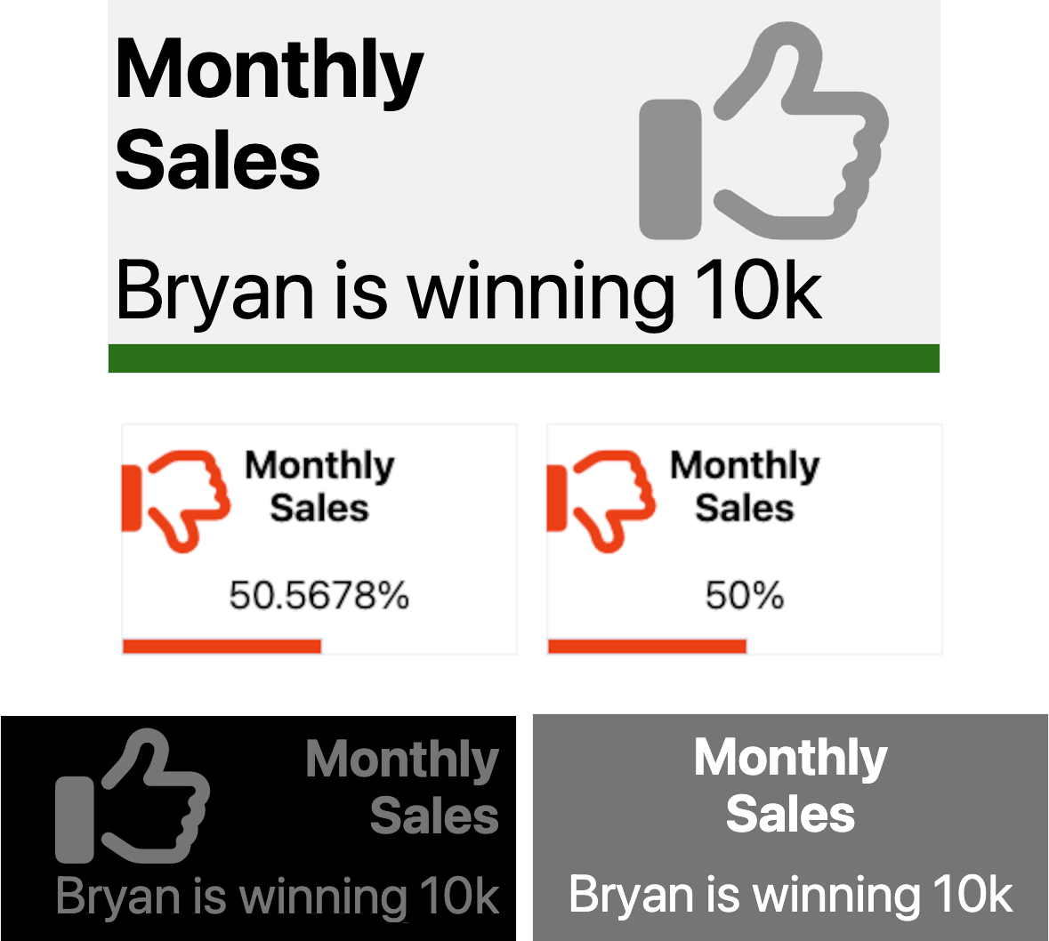
Streamlit component for displaying KPIs, easy layout to fit all your needs !
pip install streamlit-kpiimport streamlit as st
from streamlit_kpi import streamlit_kpi
streamlit_kpi(key="first_kpi",height='200',title='Monthly Sales',value=25000,icon='fa-solid fa-globe',progressValue=100,unit='K€')
"""
Parameters:
key: Optional str, default is '', the streamlit component key, higly recommended
title: Mandatory str, the title...
value: Mandatory str or int or float, the value...
icon: Optional str, default is 'fa-solid fa-globe', any Font Awesome class (v6.3). See https://fontawesome.com/search?o=r&m=free
icon: Optional str, default is '', the value unit appended after the value
textAlign: Optional str, default is 'left', title and value alignement
backgroundColor: Optional str, default is '#f3f3f3', widget background color can be str like blue, orange, transparent... or HEX color
titleColor: Optional str, default is 'dark', title font color, can be str like blue, orange... or HEX color
valueColor: Optional str, default is 'dark', value font color, can be str like blue, orange... or HEX color
progressColor: Optional str, default is 'green', progress color, can be str like blue, orange... or HEX color
iconColor: Optional str, default is 'black', icon font color, can be str like blue, orange... or HEX color
animate: Optional bool, default is True, activate or not the animation
animateDuration: Optional int, default is 2000, the animation duration in milliseconds
progressValue: Optional int, default is 100, the progress bar completion, from 0 to 100
iconOpacity: Optional int, default is 50, the opacity of the icon, from 0 to 100, 0 is invisible
iconTop: Optional int, default is 24, the icon position from the top, from 0 to 100
iconLeft: Optional int, default is 91, the icon position from the left, from 0 to 100
showProgress: Optional bool, default is True, show or hide the progress bar
showIcon: Optional bool, default is True, show or hide the icon
height: Optional int, default is 250, the height of the whole widget
"""