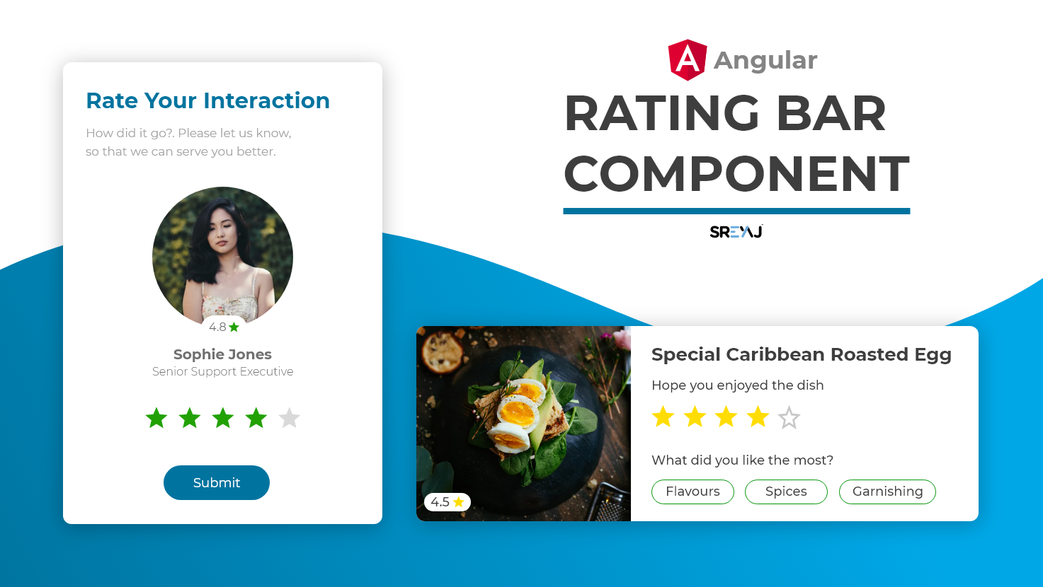
Simple Rating Component for your next Angular Project. Very simple to setup and use and comes with a lot of customizations.
- Simple and Easy to Setup
- Ease to use
- Dependency on only the icons
- Supports half-star rating
- Supports Rating Mode and also Display only Mode
The component uses material icons and there are no other dependencies.
npm i material-icons
- Create a component in your project.
- Copy and paste the rating bar component codes into your newly created component
You can now start using it in any component of your project.
| Feature | Description | Attribute | Type | Default |
|---|---|---|---|---|
| No of Stars | You can change the total rating number | total | number | 5 |
| Display Mode | Star Rating component can be used to just display the rating | readonly | boolean | false |
| Size of Stars | The size of the stars displayed can be changed to your needs | size | string | 24px |
| Type of Stars | The component supports filled stars and hollow stars design | type | filled or hollow | hollow |
| Rating Color | The color for the filled Stars | filledColor | string | #3db700 |
| Rating Color | The color for the empty Stars | emptyColor | string | #e0e0e0 |
| Rating Event | Rating Emitted when user clicks on the rating | rated | number | nil |
![@dependabot[bot]](https://avatars.githubusercontent.com/in/29110?s=64&v=4)